Book Image

Instant jQuery Flot Visual Data Analysis

By : Brian Peiris
Book Image

Instant jQuery Flot Visual Data Analysis

By: Brian Peiris

Overview of this book

Data visualization and analysis is a crucial skill in many software projects. Flot uses jQuery and HTML5 to add easy and powerful visualization capabilities to any web application. Flot produces beautiful visualizations with a minimal amount of code. It is also highly configurable, extensible, and includes many plugins out of the box. A practical guide to take you through the basics of using Flot to visualize your data; the book describes Flot's functionality in dedicated sections that include code, screenshots, and detailed explanations so that you can learn to produce charts in minutes. As you progress though this book, it will guide you through real-world examples to show you how to use statistical techniques with Flot for interactive data visualization and analysis. Starting with the very basics, you will learn exactly what you need to do to display the simplest chart using Flot. This step-by-step guide takes you through Flot's many features and settings until you can finally master the techniques you'll need to apply Flot to your application's data. You'll learn to create basic point, line, and bar charts and to use Flot's stack, pie, and time plugins to create specialized chart types. Along with learning to display complex data with multiple customizable axes you will learn to make your charts interactive with Flot's crosshair plugin. Finally, this book will guide you through learning statistical techniques via the jStat JavaScript library to analyse data; along with Flot's errorbars and fillbetween plugins to display error margins and data percentiles. Instant jQuery Flot Visual Data Analysis will give you a head start so that you can add data visualization features to your applications with ease.
Table of Contents (7 chapters)

Creating stacked charts (Must know)


Flot includes a plugin that allows you to create stacked charts. Stacked charts are especially useful when the data in your series is meant to add up to some total value, for example percentage data.

Getting ready

Using the same boilerplate that we wrote in the Creating basic charts recipe, we just need to include the stack plugin, as shown in the following code:

...
  <script src="jquery.js"></script>
  <script src="jquery.flot.js"></script>
  <script src="jquery.flot.stack.js"></script>
...

How to do it...

Using the stack plugin is simply a matter of specifying the stack option. Stacked charts work best with bar charts and area charts.

Stacked bar charts

...
  <script src="jquery.flot.stack.js"></script>
  <script>
    $('#sampleChart').plot(
      [
        { color: 'orange', 
          data: [[0, 3], [1, 4], [2, 2]] },
        { color: 'lightblue', 
          data: [[0, 6], [1, 3], [2, 6]] },
        { color: 'darkred', 
          data: [[0, 1], [1, 3], [2, 2]] }
      ], 
      { 
        series: { 
          stack: true, 
          bars: {
            show: true,
            barWidth: 0.2, align: 'center'
          }
        } 
      }
    );
  </script>
...

The stack plugin will draw a chart that stacks the first points of each series together into one composite bar and the second points of each series into another bar, and so on:

Stacked area charts

Stacked area charts are simply stack line charts with the fill option set to true:

... 
      { 
        series: {
          stack: true,
          lines: { show: true, fill: true }
        }
      }
...

The stack plugin will draw an area chart with each filled area stacked on top of each other:

How it works...

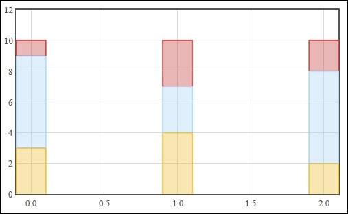
The stack plugin takes the data you specify and readjusts it in such a way that the corresponding data points in the series are offset from each other. The stack plugin assumes that the series are already ordered from bottom to top. In this case, the first series is yellow in the chart, the second is blue, and the last is red.

There's more...

The stack plugin is quite simple. It only has one option, stack, but it can be used in an alternate way to create multiple groups of stacks on the same chart.

Grouping series in to multiple stacks

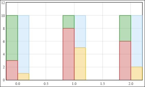
The stack plugin also has the ability to group series to separate stacks. This is done by specifying a unique key on the stack option of each series. The key can be any unique number or string. We combine this option with Flot's align option on bar charts in order to display the stacks side-by-side:

...
    $('#sampleChart').plot(
      [
        { color: 'orange',
          data: [[0, 1], [1, 5], [2, 2]],
          stack: 0, bars: {align: 'left'} },
        { color: 'lightblue',
          data: [[0, 9], [1, 5], [2, 8]],
          stack: 0, bars: {align: 'left'} },
        { color: 'darkred',
          data: [[0, 3], [1, 8], [2, 6]],
          stack: 1, bars: {align: 'right'} },
        { color: 'green',
          data: [[0, 7], [1, 2], [2, 4]],
          stack: 1, bars: {align: 'right'} }
      ], 
      { 
        series: {
          bars: { show: true, barWidth: 0.2 }
        }
      }
    );
...

The stack plugin now draws a chart where the light blue and orange series are grouped into stack 0 and the green and dark red series are grouped into stack 1: