
Similar to the stack plugin, Flot also includes a plugin that adds pie chart capabilities.
Include the following pie plugin:
...
  <script src="jquery.js"></script>
  <script src="jquery.flot.js"></script>
  <script src="jquery.flot.pie.js"></script>
...The pie plugin uses sensible defaults for all of its options, just like Flot. We simply need to enable the plugin in order to create a simple pie chart and a labelled pie chart.
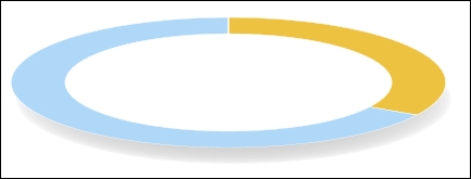
The pie plugin expects multiple series. It takes the first y coordinate in each series and uses it to draw the pie section for that series, as shown in the following code:
...
  <script src="jquery.flot.pie.js"></script>
  <script>
    $('#sampleChart').plot(
      [
        [[0, 1]],
        [[0, 2]]
      ],
      {
        series: {
          pie: { show: true }
        }
      }
    );
  </script>
...
The pie plugin draws a bare pie chart based on our data:
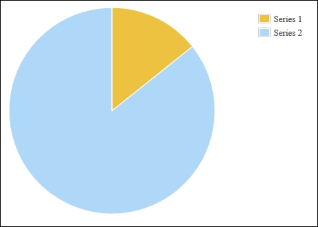
The pie plugin also supports a secondary format that allows you to specify a label corresponding to each pie section. The labels are displayed in a legend as follows:
...
  <script src="jquery.flot.pie.js"></script>
  <script>
    $('#sampleChart').plot(
      [
        {label: 'Series 1', data: 10},
        {label: 'Series 2', data: 60}
      ],
      {
        series: {
          pie: { show: true }
        }
      }
    );
  </script>
...
The legend is drawn to the right of the pie chart with the names and corresponding colors of the series:
Like the stack plugin, enabling the pie plugin is simply a matter of setting the show property of the pie settings object to true. However, the pie plugin will not accept the typical data format we've used so far. Since each series is represented by one section of the pie, the chart data can only have one data point per series.
The sum of the data points represents the whole of the pie chart. So, datapoint [0, 1] and datapoint [0, 2] represent one third of the pie and two thirds of the pie, respectively.
The pie plugin includes many settings that determine how the pie chart is displayed. The settings affect the size of the pie, its shape, its rendering style including its border and shadow style, the format and styles for labels, and the behavior of "combined" sections of the pie. All of these settings are described in full on the documentation page at http://www.flotcharts.org/flot/examples/series-pie/index.html. Refer to the following sections for some examples of these settings.
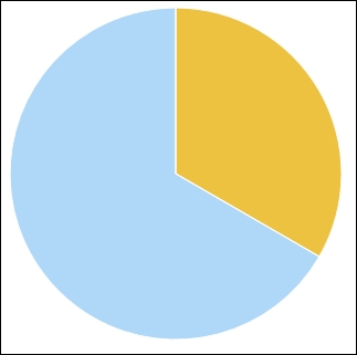
The pie plugin includes settings that allow you to display donut charts. It also has an option that tilts the chart to give it a pseudo-3D effect. We specify an inner radius that turns the chart into a donut chart and a tilt setting as well. The radius setting ensures that the pie chart is small enough for Flot to draw the shadow underneath it as follows:
...
  <script src="jquery.flot.pie.js"></script>
  <script>
    $('#sampleChart').plot(
      [
        [[0, 1]],
        [[0, 2]]
      ],
      {
        series: {
          pie: {
            show: true,
            radius: 0.8,
            innerRadius: 0.6,
            tilt: 0.3
          }
        }
      }
    );
  </script>
...
The pie plugin mimics a 3D donut effect by drawing an elliptical pie chart with a white ellipse in the center:
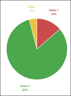
Here we turn the legend setting off, which causes the pie plugin to render labels near the pie sections, and we also use the combine and threshold settings to combine the two smallest sections into one. In this case, we specify a threshold of 0.10, which means that any series that has a value less than 10 percent of the sum of all the series is combined into a single section of the pie labeled Other as follows:
...
$('#sampleChart').plot(
  [
    {label: 'Series 1', data: 1},
    {label: 'Series 2', data: 2},
    {label: 'Series 3', data: 10},
    {label: 'Series 4', data: 60},
  ],
  {
    legend: { show: false },
    series: {
      pie: {
        show: true,
        combine: {
          threshold: 0.10
        }
      }
    }
  }
);
...
This results in a simplified pie chart that eliminates clutter from the visualization: