
The axes are the most configurable parts of the chart. Flot gives you the ability to change the position, type, and colors of the axes. It also gives you full control of the ticks and labels on the axes, letting you adjust the number of ticks and alter the formatting. Axes also determine how the data is displayed; you can change the min and max settings to display only a part of the data on the chart and you can also transform the data in various ways.
The full documentation is available at https://github.com/flot/flot/blob/master/API.md#customizing-the-axes. We will take a look at some examples of the configuration options by creating a chart that has a logarithmic axis and another chart that includes multiple axes.
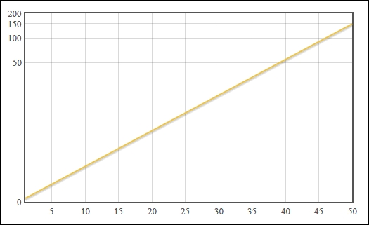
The following code creates some sample data that grows exponentially. We then use the transform and tickSize setting on the Y axis to adjust how our data is displayed:
...
  <script>
    var data = [], i;
    for (i = 1; i <= 50; i++) {
      data.push([i, Math.exp(i / 10, 2)]);
    }

    $('#sampleChart').plot(
      [ data ],
      {
        yaxis: {
          transform: function (v) {
            return v == 0 ? v : Math.log(v);
          },
          tickSize: 50
        }
      }
    );
  </script>
...
Flot draws a chart with a logarithmic Y axis, so that our exponential data is easier to read:
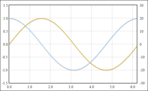
Next, we use Flot's ability to display multiple axes on the same chart as follows:
...
    var sine = [];
    for (i = 0; i < Math.PI * 2; i += 0.1) {
      sine.push([i, Math.sin(i)]);
    }
    var cosine = [];
    for (i = 0; i < Math.PI * 2; i += 0.1) {
      cosine.push([i, Math.cos(i) * 20]);
    }
    $('#sampleChart').plot(
      [
        {label: 'sine', data: sine},
        {
          label: 'cosine',
          data: cosine,
          yaxis: 2
        }
      ],
      { yaxes: [ {}, { position: 'right' } ] }
    );
...
Flot draws the two series overlapping each other. The Y axis for the sine series is drawn on the left by default and the Y axis for the cosine series is drawn on the right as specified:
The transform setting expects a function that takes a value, which is the y coordinate of our data, and returns a transformed value. In this case, we calculate the logarithm of our original data value so that our exponential data is displayed on a linear scale. We also use the tickSize setting to ensure that our labels do not overlap after the axis has been transformed.
The yaxis setting under the series object is a number that specifies which axis the series should be associated with. When we specify the number 2, Flot automatically draws a second axis on the chart. We then use the yaxes setting to specify that the second axis should be positioned on the right of the chart.
In this case, the sine data ranges from -1.0 to 1.0, whereas the cosine data ranges from -20 to 20. The cosine axis is drawn on the right and is independent of the sine axis.
Flot doesn't have a built-in ability to interact with axes, but it does give you all the information you need to construct a solution.
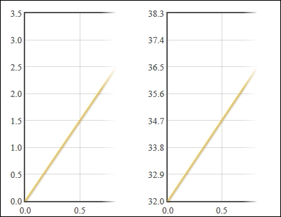
Here, we use Flot's getAxes method to add interactivity to our axes as follows:
...
    var
      showFahrenheit = false,

      temperatureFormatter = function (val, axis) {
        if (showFahrenheit) {
          val = val * 9 / 5 + 32;
        }
        return val.toFixed(1);
      },

      drawPlot = function () {
        var plot = $.plot(
          '#sampleChart',
          [[[0, 0], [1, 3], [3, 1]]],
          { yaxis: { tickFormatter: temperatureFormatter } }
        );

        var plotPlaceholder = plot.getPlaceholder();

        $.each(plot.getAxes(), function (i, axis) {
          var box = axis.box;
          var axisTarget = $('<div />');

          axisTarget.
            css({
              position: 'absolute',
              left: box.left,
              top: box.top,
              width: box.width,
              height: box.height
            }).
            click(function () {
              showFahrenheit = !showFahrenheit;
              drawPlot();
            }).
            appendTo(plotPlaceholder);
        });
      };

    drawPlot();
...
First, note that we use a different way of creating a plot. Instead of calling the plot method on a jQuery collection that matches the placeholder element, we use the plot method directly from the jQuery object. This gives us immediate access to the Flot object, which we use to get the axes of our chart. You could have also used the following data method to gain access to the Flot object:
var plot = $('#sampleChart').plot(...).data('plot');Once we have the Flot object, we use the getAxes method to retrieve a list of axis objects. We use jQuery's each method to iterate over each axis and we create a div element that acts as a target for interaction. We set the div element's CSS so that it is in the same position and size as the axis' bounding box, and we attach an event handler to the click event before appending the div element to the plot's placeholder element.
In this case, the event handler toggles a Boolean flag and redraws the plot. The flag determines whether the axis labels are displayed in Fahrenheit or Celsius, by changing the result of the function specified in the tickFormatter setting.