
Throughout the book, we have worked with our custom style file, mystyle.mplstyle. As covered before, in matplotlib, there are numerous style files already included. To print out the styles available in your distribution, simply open a Jupyter Notebook and run the following:
import matplotlib.pyplot as plt
print(plt.style.available())
I am running matplotlib 1.5, and so I will get the following output:
['seaborn-deep', 'grayscale', 'dark_background', 'seaborn-whitegrid', 'seaborn-talk', 'seaborn-dark-palette', 'seaborn-colorblind', 'seaborn-notebook', 'seaborn-dark', 'seaborn-paper', 'seaborn-muted', 'seaborn-white', 'seaborn-ticks', 'bmh', 'fivethirtyeight', 'seaborn-pastel', 'ggplot', 'seaborn-poster', 'seaborn-bright', 'seaborn-darkgrid', 'classic']
To get an idea of how a few of these styles look like, let's create a test plot function:
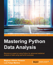
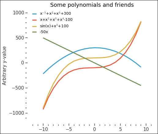
def test_plot():
        x = np.arange(-10,10,1)
        p3 = np.poly1d([-5,2,3])
        p4 = np.poly1d([1,2,3,4])
        plt.figure(figsize=(7,6))
        plt.plot(x,p3(x)+300, label='x$^{-5}$+x$^2$+x$^3$+300')
        plt.plot(x,p4(x)-100, label='x+x$^2$+x$^3$+x$^4$-100')
        plt.plot(x,np.sin(x)+x**3+100, label='sin(x)+x$^{3}$+100')
        plt.plot(x,-50*x, label='-50x')
        plt.legend(loc=2)
        plt.ylabel('Arbitrary y-value')
        plt.title('Some polynomials and friends',
                  fontsize='large')
        plt.margins(x=0.15, y=0.15)
        plt.tight_layout()
        return plt.gca()
It will plot a few different polynomials and a trigonometric function. With this, we can create plots with different styles applied and compare them directly. If you do not do anything special and just call it, that is, test_plot(), you will get something that looks like the following image:
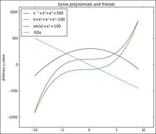
This is the default style in matplotlib 1.5; now we want to test some of the different styles from the preceding list. As the Jupyter Notebook inline graphics display uses the style parameters differently (that is, rcParams), we cannot reset the parameters that each style sets as we could if we were running a normal Python prompt. Thus, we cannot plot different styles in a row without keeping some parameters from the old style if they are not set in the new. What we can do is the following, where we call the plot function with the 'fivethirtyeight' style set:
with plt.style.context('fivethirtyeight'):
    test_plot()
By putting in the with statement, we confine whatever we set in that statement, thus, not changing any of the overall parameters:
This is what the 'fivethirtyeight' style looks like, a gray background with thick colored lines. It is inspired by the statistics site,
http://fivethirtyeight.com
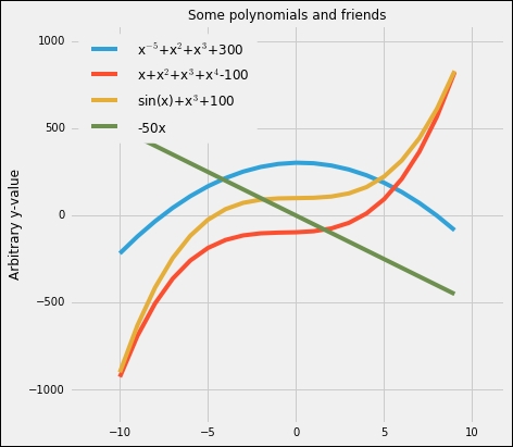
. To spare you a bunch of figures showcasing several different styles, I suggest you run some on your own. One interesting thing is the 'dark-background' style, which can be used if you, for example, usually run presentations with a dark background. I will quickly show you what the with statement lets us do as well. Take our mystyle.mplstyle file and plot it as follows:
import os
stylepath = os.path.join(os.getcwd(), 'mystyle.mplstyle')
with plt.style.context(stylepath):
    test_plot()
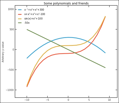
You might not always be completely satisfied with what the figure looks like—the fonts are too small and the big frame around the plot is unnecessary. To make some changes, we can still just call functions to fix things as usual within the with statement:
from helpfunctions import despine
plt.rcParams['font.size'] = 15
with plt.style.context(stylepath):
    plt.rcParams['legend.fontsize'] ='Small'
    ax = test_plot()
    despine(ax)
    ax.spines['right'].set_visible(False)
    ax.spines['top'].set_visible(False)
    ax.spines['left'].set_color('w')
    ax.spines['bottom'].set_color('w')
    plt.minorticks_on()
The output will be something as follows:
This looks much better and clearer. Could you incorporate some of these extra changes into the mystyle.mplstyle file directly? Try to do this—much of it is possible—and in the end, you have a nice style file that you can use.
One last important remark about style files. It is possible to chain several in a row. This means that you can create one style that changes the size of things (axis, lines, and so on) and another, the colors. In this way, you can adapt the one changing sizes if you are using the figure in a presentation or written report.