Book Image

Learning Pentaho CTools

By : Miguel Gaspar
Book Image

Learning Pentaho CTools

By: Miguel Gaspar

Overview of this book

Pentaho and CTools are two of the fastest and most rapidly growing tools for practical solutions not found in any other tool available on the market. Using Pentaho allows you to build a complete analytics solution, and CTools brings an advanced flexibility to customizing them in a remarkable way. CTools provides its users with the ability to utilize Web technologies and data visualization concepts, and make the most of best practices to create a huge visual impact. The book starts with the basics of the framework and how to get data to your dashboards. We'll take you all the way through to create your custom and advanced dashboards that will create an effective visual impact and provide the best user experience. You will be given deep insights into the lifecycle of dashboards and the working of various components. Further, you will create a custom dashboard using the Community Dashboards Editor and use datasources to load data on the components. You will also create custom content using Query, the Freeform Addins Popup, and text components. Next, you will make use of widgets to create similar sections and duplicate components to reproduce other components on a dashboard. You will then learn to build a plugin without writing Java code, use Sparkl as a CPK plugin manager, and understand the application of deployment and version control to dashboard development. Finally, you will learn tips and tricks that can be very useful while embedding dashboards into other applications. This guide is an invaluable tutorial if you are planning to use custom and advanced dashboards among the solutions that you are building with Pentaho.
Table of Contents (17 chapters)
Learning Pentaho CTools
Credits
About the Author
About the Reviewers
www.PacktPub.com
Preface
Index

Customizing tooltips


CCC provides the ability to change the default tooltip format, and can be changed using the tooltipFormat property. We can change it, making it look like the following image, on the right. You can also compare it to the one on the left, which is the default one:

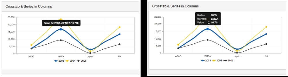
The tooltip default format might change depending on the chart type, but also on some options that you apply to the chart, mainly crosstabMode and seriesInRows. The property accepts a function that receives one argument, the scene, which will be a similar structure as already covered for the click event. You should return the HTML to be shown on the dashboard when we hover the chart.

In the previous image, you will see on the chart on the left side the defiant tooltip, and on the right a different tooltip. That's because the following code was applied:

tooltipFormat: function(scene){
  var year = scene.atoms.series.label;
  var territory = scene.atoms.category.value;
  var sales = Utils.numberFormat(scene.vars.value...