
Responsive Design is a method for designing applications that can adapt their appearance and behavior to the user's device. It makes the application look and feel good across all different devices, and most often, it makes them usable on all devices.
An important paradigm in Responsive Design is to use relative dimensions instead of fixed widths, heights, margins, paddings, and font sizes throughout all the application to adapt the design to the various types of devices.
For web browsers, Responsive Design was enabled through CSS3 and HTML5 features, such as Media Queries, the viewport meta tag, and new dimension units.
Media Queries were introduced in CSS3 as a more flexible extension of Media Types. They allow the developer to apply conditional CSS styles only when a statement (a so-called query) matches a certain CSS property (so-called Media Features) and a Media Type. A typical Media Query has the following structure:
@media [Media Type [and|not|only]] (Media Feature) {
   ...
}
Here is a small selection of properties that can be used as Media Features:
width,min-width, andmax-widthheight,min-height, andmax-heightdevice-width,min-device-width, andmax-device-widthdevice-height,min-device-height, andmax-device-heightresolution,min-resolution, andmax-resolution
Note
A complete list of Media Features and Types can be found on MDN at https://developer.mozilla.org/de/docs/Web/CSS/Media_Queries/Using_media_queries.
In Responsive Design, we are mostly interested in querying the min-width or max-width property to apply different styles to devices that have different widths.
Let's see an example where we can apply a different background color depending on the minimal width of the browser window:
div {
background-color: blue;
}
@media screen and (min-width: 992px) {
div {
background-color: red;
}
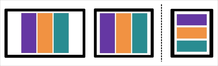
}In the preceding example, all the div elements in the page have the background color red as long as the browser window's width is larger or equal to, 992 px (see the following figure):
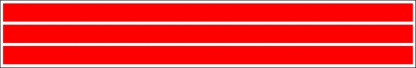
Browser window width larger than 992px
Once the window width is smaller than 992 px, the background color of the div elements jumps to blue (see the following figure):
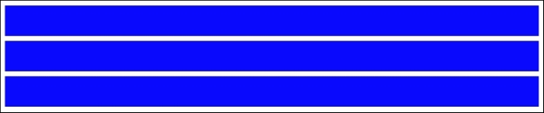
Browser window with width smaller than 992px
As we can see in the following figure, Media Queries are supported across all major browsers and Internet Explorer starting from version 9:
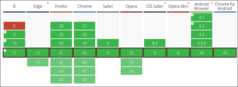
Cross-browser compatibility Media Queries from http://caniuse.com/#feat=css-mediaqueries
In Responsive Design, we call a state when a certain layout and Media Query is active, and we call a breakpoint the transition from one state to another.
Let's look at an example. First, we define some screen dimensions for the following devices:
<768pxis for phones768px-992pxis for tablets992px-1200pxis for desktops≥1200pxis for large devices and TVs
Create a CSS snippet using Media Queries for these device dimensions:
/* phones, default no query */
/* tablets */
@media (min-width: 768px) { ... }
/* desktops */
@media (min-width: 992px) { ...}
/* large devices */
@media (min-width: 1200px) { ... }
In the preceding code, we defined four states with three breakpoints between these states where each state corresponds to a typical screen dimension and device type.
We can also see these breakpoints by reducing the size of a browser window while looking at a responsive web page; we observe how the design breaks at a certain width of the browser window. In the following figure, the breakpoint is visualized as a dashed line, showing the moment when one state breaks into a new one:
Breakpoint in Responsive Design
We can observe the same effect when we look at the Google Plus web page in the following figure. In the first two figures, the size of browser window changes, but the three-column layout stays the same. In the third image, the design breaks into a new layout with only two columns:
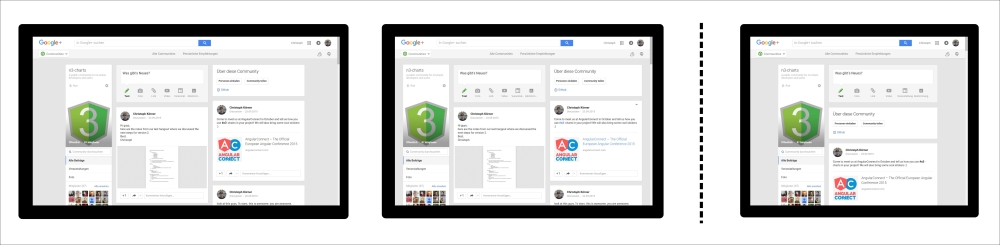
Breakpoints of the Google Plus page
Across mobile and desktop devices, there exists a vast variety of different pixel densities and screen resolutions. Displays with much higher resolution would render pages much smaller than displays with a lower resolution; this immediately leads to readability problems. To prevent this effect and fit bigger pages into smaller screens, a virtual window—the so-called viewport (the visible area of a web page)—was introduced. This allowed websites to render in the correct pixel resolution and scale to the full device width for maximal accessibility; however, developers had no control over this device-specific setting. Later, in HTML5, the viewport meta tag was introduced in order to give developers full control over these viewport settings.
Today, a mobile-optimized application usually defines the following viewport tag in the head section of the web page to render the website normally and scale the content to the width of the device:
<meta name="viewport" content="width=device-width, initial-scale=1">
Note
More information about all the valid viewport options can be found on MDN at https://developer.mozilla.org/en-US/docs/Mozilla/Mobile/Viewport_meta_tag.
When dealing with Responsive Design, it is always a good idea to use relative units to describe the element's dimensions based on its parent element. Thus, when the parent container changes the size, all children elements adapt their sizes accordingly.
The most popular unit for relative dimensions is %, which defines the dimension based on a certain percent of the next absolute positioned parent element.
However, there are more useful units to describe relative dimensions; for example, the following two are based on the font-size:
em: This is relative to the font size of the elementrem: This is relative to the font size of the root element
These units have a big advantage; they are affected by the changes of the font-size setting in the browser. A simple example can be the adaption of the paddings when the user increases the font size of the browser.
Note
A short summary and explanation of all different CSS units can be found on MDN at https://developer.mozilla.org/de/docs/Web/CSS/length.
Responsive applications should look and feel great (or work at all) on a huge number of devices with a huge number of different screen sizes and resolutions; they usually run on mobile devices as well as big TV screens. Thus, in the beginning of a project, every developer has to choose an approach to design the responsive application to master this transition; in general, we distinguish between the following methods:
Mobile first
Desktop first
In the desktop first method, we design for desktop devices and mouse input first, then we adjust and scale the design down for mobile devices and touch interactions. This often results in a web application with a reduced functionality for mobile devices due to a much smaller screen dimension and the lack of touch support.
In the mobile first method, we design for mobile devices and touch interactions first, and then we adjust and scale the design up for bigger devices and mouse interactions. This approach makes sure that mobile devices support a complete set of features, which can even be used on desktop clients.
Both methods are equally correct, accepted, and popular nowadays. The only exception is that mobile first became a buzzword due to an increase of mobile devices accessing the web during the previous years. Throughout the book, we will choose a mobile first approach and design for mobile devices and touch support. However, we will, of course, extend the visualizations to support mouse input and bigger screens. That's what the responsive design is all about.