Descriptive data exploration is, without a doubt, one of the most important steps in an ML project. If you want to clean data and build derived features or select an ML algorithm to predict a target variable in your dataset, then you need to understand your data first. Your data will define many of the necessary cleaning and preprocessing steps; it will define which algorithms you can choose and it will ultimately define the performance of your predictive model.
Hence, data exploration should be considered an important analytical step to understanding whether your data is informative to build an ML model in the first place. By analytical step, we mean that the exploration should be done as a structured analytical process rather than a set of experimental tasks. Therefore, we will go through a checklist of data exploration tasks that you can perform as an initial step in every ML project—before starting any data cleaning, preprocessing, feature engineering, or model selection.
Once the data is provided, we will work through the following data exploration checklist and try to get as many insights as possible about the data and its relation to the target variable:
- Analyze the data distribution and check for the following:
- Data types (continuous, ordinal, nominal, or text)
- Mean, median, and percentiles
- Data skew
- Outliers and minimum and maximum values
- Null and missing values
- Most common values
- The number of unique values (in categorical features)
- Correlations (in continuous features)
- Analyze how the target variable is influenced by the features and check for the following:
- The regression coefficient (in regression)
- Feature importance (in classification)
- Categorical values with high error rates (in binary classification)
- Analyze the difficulty of your prediction task.
By applying these steps, you will be able to understand the data and gain knowledge about the required preprocessing tasks for your data—features and target variables. Along with that, it will give you a good estimate of what difficulties you can expect in your prediction task, which is essential for judging required algorithms and validation strategies. You will also gain an insight into what possible feature engineering methods could apply to your dataset and have a better understanding of how to select a good error metric.
Note
You can use a representative subset of the data and extrapolate your hypothesis and insights to the whole dataset
Moving data to the cloud
Before we can start exploring the data, we need to make it available in our cloud environment. While this seems like a trivial task, efficiently accessing data from a new environment inside a corporate environment is not always easy. Also, uploading, copying, and distributing the same data to many Virtual Machines (VMs) and data science environments is not sustainable and doesn't scale well. For data exploration, we only need a significant subset of the data that can easily be connected to all other environments—rather than live access to a production database or data warehouse.
There is no wrong practice of uploading Comma-Separated Values (CSV) or Tab-Separated Values (TSV) files to your experimentation environment or accessing data via Java Database Connectivity (JDBC) from the source system. However, there are a few easy tricks to optimize your workflow.
First, we will choose a data format optimized for data exploration. In the exploration phase, we need to glance at the source data multiple times and explore the values, feature dimensions, and target variables. Hence, using a human-readable text format is usually very practical. In order to parse it efficiently, a delimiter-separated file, such as CSV, is strongly recommended. CSV can be parsed efficiently and you can open and browse it using any text editor.
Another small tweak that will bring you a significant performance improvement is compressing the file using Gzip before uploading it to the cloud. This will make uploads, loading, and downloads of this file much faster, while the compute resources spent on decompression are minimal. Thanks to the nature of the tabular data, the compression ratio will be very high. Most analytical frameworks for data processing, such as pandas and Spark, can read and parse Gzipped files natively, which requires minimal-to-no code changes. In addition, this only adds a small extra step for reading and analyzing the file manually with an editor.
Once your training data is compressed, it's recommended to upload the Gzipped CSV file to an Azure Storage container; a good choice would be Azure Blob storage. When the data is stored in Blob storage, it can be conveniently accessed from any other services within Azure, as well as from your local machine. This means if you scale your experimentation environment from an Azure notebook to a compute cluster, your code for accessing and reading the data will stay the same.
A fantastic cross-platform GUI tool to interact with many different Azure Storage services is Azure Storage Explorer. Using this tool, it is very easy to efficiently upload small and large files to Blob storage. It also allows you to generate direct links to your files with an embedded access key. This technique is simple yet also super effective when uploading hundreds of terabytes (TBs) from your local machine to the cloud. We will discuss this in much more detail in Chapter 4, ETL, data preparation, and feature extraction.
Understanding missing values
Once the data is uploaded to the cloud—for example, using Azure Storage Explorer and Azure Blob storage for your files—we can bring up a Notebook environment and start exploring the data. The goal is to thoroughly explore your data in an analytical process to understand the distribution of each dimension of your data. This is essential for choosing any appropriate data preprocessing feature engineering and ML algorithms for your use case.
Note
Please keep in mind that not only the feature dimensions but also the target variable needs to be preprocessed and thoroughly analyzed.
Analyzing each dimension of a dataset with more than 100 feature dimensions is an extremely time-consuming task. However, instead of randomly exploring feature dimensions, you can analyze the dimensions ordered by feature importance and hence significantly reduce your time working through the data. Like many other areas of computer science, it is good to use an 80/20 principle for the initial data exploration and so only use 20% of the features to achieve 80% of the performance. This sets you up for a great start and you can always come back later to add more dimensions if needed.
The first thing to look for in a new dataset is missing values for each feature dimension. This will help you to gain a deeper understanding of the dataset and what actions could be taken to resolve those. It's not uncommon to remove missing values or impute them with zeros at the beginning of a project—however, this approach bears the risk of not properly analyzing missing values in the first place.
Note
Missing values can be disguised as valid numeric or categorical values. Typical examples are minimum or maximum values, -1, 0, or NaN. Hence, if you find the values 32,767 (= 215-1) or 65,535 (= 216-1) appearing multiple times in an integer data column, they might well be missing values disguised as the maximum signed or unsigned 16-bit integer representation. Always assume that your data contains missing values and outliers in different shapes and representations. Your task is to uncover, find, and clean them.
Any prior knowledge about the data or domain will give you a competitive advantage when working with the data. The reason for this is that you will be able to understand missing values, outliers, and extremes in relation to the data and domain—which will help you to perform better imputation, cleansing, or transformation. As the next step, you should look for these outliers in your data, specifically for the following values:
- The absolute number (or percentage) of the null values (look for Null, "Null", "", NaN, and so on)
- The absolute number (or percentage) of minimum and maximum values The absolute number (or percentage) of the most common value (MODE) The absolute number (or percentage) of value 0
- The absolute number (or percentage) of unique values
Once you have identified these values, we can use different preprocessing techniques to impute missing values and normalize or exclude dimensions with outliers. You will find many of these techniques, such as group mean imputation, in action in Chapter 4, ETL, data preparation, and feature extraction.
Visualizing data distributions
Knowing the outliers, you can finally approach exploring the value distribution of your dataset. This will help you understand which transformation and normalization techniques should be applied during data preparation. Common distribution statistics to look for in a continuous variable are the following:
- The mean or median value
- The minimum and maximum value
- The 25th, 50th (median), and 75th percentiles
- The data skew
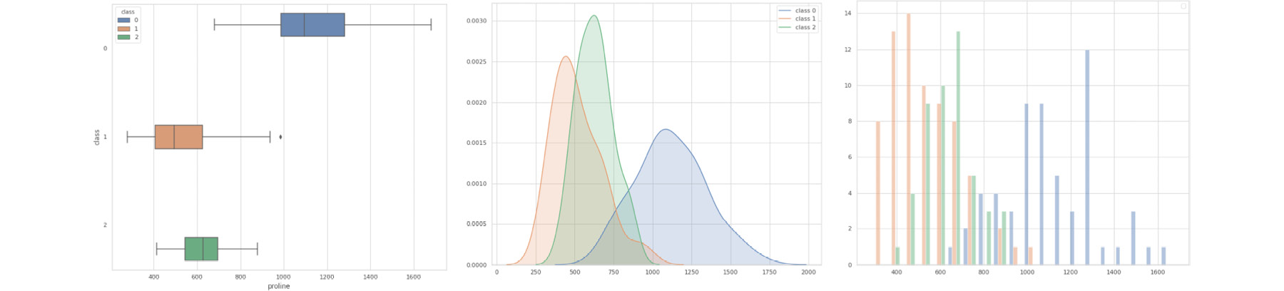
Common techniques for visualizing these distributions are boxplots, density plots, or histograms. Figure 1.1 shows these different visualization techniques plotted per target class for a multi-class recognition dataset. Each of those methods has advantages and disadvantages—boxplots show all relevant metrics, while being a bit harder to read; density plots show very smooth shapes, while hiding some of the outliers; and histograms don't let you spot the median and percentiles easily, while giving you a good estimate for the data skew:
Figure 1.1: Common techniques for visualizing data distributions—namely, boxplots, density plots, and histograms
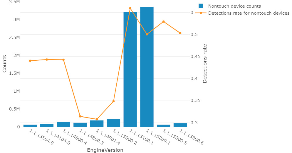
From the preceding visualization techniques, only histograms work well for categorical data (both nominal and ordinal)—however, you could look at the number of values per category. Another nice way to display the value distribution versus the target rate is in a binary classification task. Figure 1.2 shows the version number of Windows Defender against the malware detection rate (for non-touch devices) from the Microsoft malware detection dataset:
Figure 1.2: The version number of Windows Defender against the malware detection rate (for non-touch devices)
Many statistical ML algorithms require that the data is normally distributed and hence needs to be normalized or standardized. Knowing the data distribution helps you to choose which transformations need to be applied during data preparation. In practice, it is often the case that data needs to be transformed, scaled, or normalized.
Finding correlated dimensions
Another common task in data exploration is looking for correlations in the dataset. This will help you dismiss feature dimensions that are highly correlated and therefore might influence your ML model. In linear regression models, for example, two highly correlated independent variables will lead to large coefficients with opposite signs that ultimately cancel each other out. A much more stable regression model can be found by removing one of the correlated dimensions.
The Pearson correlation coefficient, for example, is a popular technique used to measure the linear relationship between two variables on a scale from -1 (strongly negatively correlated) to 1 (strongly positively correlated). 0 indicates no linear relation between the two variables in the Pearson correlation coefficient.
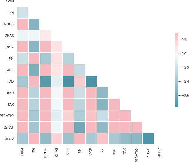
Figure 1.3 shows an example of a correlation matrix of the Boston housing price dataset, consisting of only continuous variables. The correlations range from -1 to 1 and are colored accordingly. The last row shows us the linear correlation between each feature dimension and the target variable. We can immediately tell that the median value (MEDV) of owner-occupied homes and the lower status (LSTAT) percentage of the population are negatively correlated:
Figure 1.3: An example of a correlation matrix of the Boston housing price dataset, consisting continuous variables
It is worth mentioning that many correlation coefficients can only be between numerical values. Ordinal variables can be encoded, for example, using integer encoding and can also compute a meaningful correlation coefficient. For nominal data, you need to fall back on different methods, such as Cramér's V to compute correlation. It is worth noting that the input data doesn't need to be normalized (linearly scaled) before computing the correlation coefficient.
Measuring feature and target dependencies for regression
Once we have analyzed missing values, data distribution, and correlations, we can start analyzing the relationship between the features and the target variable. This will give us a good indication of the difficulty of the prediction problem and hence, the expected baseline performance— which is essential for prioritizing feature engineering efforts and choosing an appropriate ML model. Another great benefit of measuring this dependency is ranking the feature dimensions by the impact on the target variable, which you can use as a priority list for data exploration and preprocessing.
In a regression task, the target variable is numerical or ordinal. Therefore, we can compute the correlation coefficient between the individual features and the target variable to compute the linear dependency between the feature and the target. High correlation, and so a high absolute correlation coefficient, indicates a strong linear relationship exists. This gives us a great place to start for further exploration. However, in many practical problems, it is rare to see a high (linear) correlation between the feature and target variables.
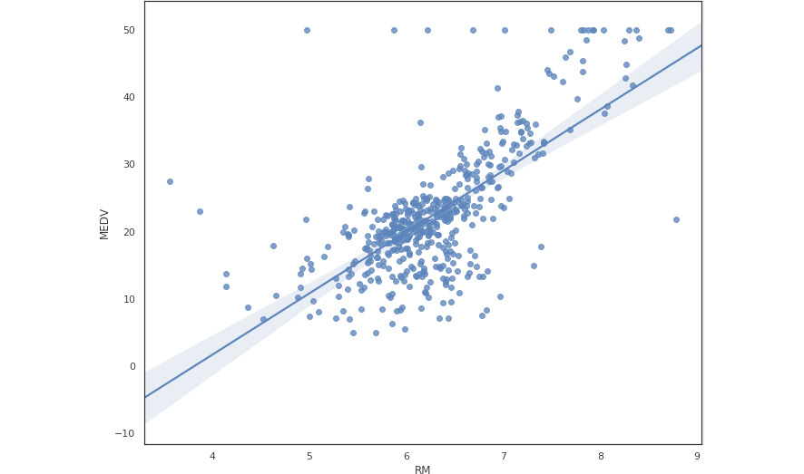
One can also visualize this dependency between the feature and the target variable using a scatter or regression plot. Figure 1.4 shows a regression plot between the feature average number of rooms per dwelling (RM) and the target variable median value of owner-occupied homes (MEDV) from the UCI Boston housing dataset. If the regression line is at 45 degrees, then we have a perfect linear correlation:
Figure 1.4: A regression plot between the feature, RM, and the target variable, MEDV
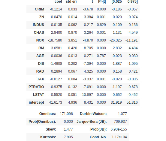
Another great approach to determining this dependency is to fit a linear or logistic regression model to the training data. The resulting model coefficients now give a good explanation of the relationship—the higher the coefficient, the larger the linear (for linear regression) or marginal (for logistic regression) dependency on the target variable. Hence, sorting by coefficients results in a list of features ordered by importance. Depending on the regression type, the input data should be normalized or standardized.
Figure 1.5 shows an example of the correlation coefficients (the first column) of a fitted Ordinary Least Squares (OLS) regression model:
Figure 1.5: The correlation coefficients of the OLS regression model
While the resulting R-squared metric (not shown) might not be good enough for a baseline model, the ordering of the coefficients can help us to prioritize further data exploration, preprocessing, and feature engineering.
Visualizing feature and label dependency for classification
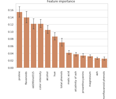
In a classification task with a multi-class nominal target variable, we can't use the regression coefficients without further preprocessing the data. Another popular method that works well out of the box is fitting a simple tree-based classifier to the training data. Depending on the size of the training data, we could use a decision tree or a tree-based ensemble classifier, such as random forest or gradient-boosted trees. Doing so results in a feature importance ranking of the feature dimensions according to the chosen split criterion. In the case of splitting by entropy, the features would be sorted by information gain and hence, indicate which variables carry the most information about the target.
Figure 1.6 shows the feature importance fitted by a tree-based ensemble classifier using the entropy criterion from the UCI wine recognition dataset:
Figure 1.6: A tree-based ensemble classifier using the entropy criterion
The lines represent variations in the information gain of features between individual trees. This output is a great first step to further data analysis and exploration in order of feature importance.
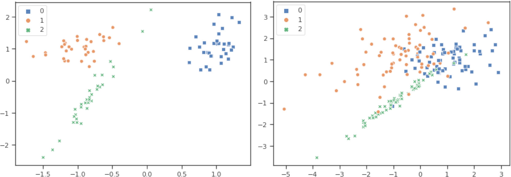
Here is another popular approach to discovering the separability of your dataset. Figure 1.7 shows two graphs—one that is linearly separable (left) and one that is not separable (right)—show a dataset with three classes:
Figure 1.7: The graphs showing the separability of the dataset
You can see this when looking at the three clusters and the overlaps between these clusters. Having clearly separated clusters means that a trained classification model will perform very well on this dataset. On the other hand, when we know that the data is not linearly separable, we know that this task will require advanced feature engineering and modeling to produce good results.
The preceding figure showed two datasets in two dimensions; we actually used the first two feature dimensions for visualization. However, high-dimensional most data cannot be easily and accurately visualized in two dimensions. To achieve this, we need a projection or embedding technique to embed the feature space in two dimensions. Many linear and non- linear embedding techniques to produce two-dimensional projections of data exist; here are the most common ones:
- Principal Component Analysis (PCA)
- Linear Discriminant Analysis (LDA)
- t-Distributed Stochastic Neighbor Embedding (t-SNE)
- Uniform Manifold Approximation and Projection (UMAP)
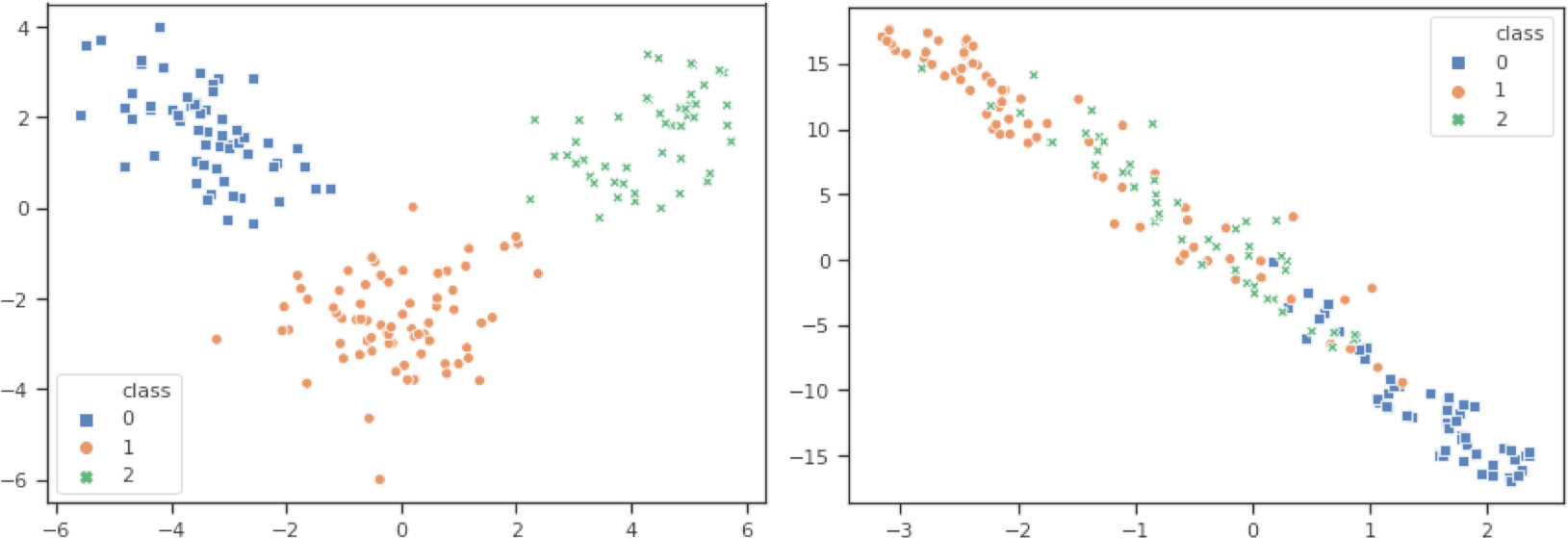
Figure 1.8 shows, the LDA (left) and t-SNE (right) embeddings for the 13-dimensional UCI wine recognition dataset (https:/). In the LDA embedding, we can see that all the classes should be linearly separable. That's a lot we have learned from using two lines of code to plot the embedding before we even start with model selection or training:
Figure 1.8: LDA (left) and t-SNE (right) embeddings for the 13-dimensional UCI wine recognition dataset
Both the LDA and t-SNE embeddings are extremely helpful for judging the separability of the individual classes and hence the difficulty of your classification task. It's always good to assess how well a particular model will perform on your data before you start selecting and training a specific algorithm. You will learn more about these techniques in Chapter 3, Data experimentation and visualization using Azure.






 Free Chapter