

Statistical algorithms for intrusion detection
Now that we have taken a look at the data, let us look at basic statistical algorithms that can help us isolate anomalies and thus identify intrusions.
Univariate outlier detection
In the most basic form of anomaly detection, known as univariate anomaly detection, we build a model that considers the trends and detects anomalies based on a single feature at a time. We can build multiple such models, each operating on a single feature of the data.
z-score
This is the most fundamental method to detect outliers and a cornerstone of statistical anomaly detection. It is based on the central limit theorem (CLT), which says that in most observed distributions, data is clustered around the mean. For every data point, we calculate a z-score that indicates how far it is from the mean. Because absolute distances would depend on the scale and nature of data, we measure how many standard deviations away from the mean the point falls. If the mean and standard deviation of a feature are μ and σ respectively, the z-score for a point x is calculated as follows:
z = x− μ _ σ
The value of z is the number of standard deviations away from the mean that x falls. The CLT says that most data (99%) falls within two standard deviations (on either side) of the mean. Thus, the higher the value of z, the higher the chances of the point being an anomaly.
Recall our defining characteristic of anomalies: they are rare and few in number. To simulate this setup, we sample from our dataset. We choose only those rows for which the target is either normal or teardrop. In this new dataset, the examples labeled teardrop are anomalies. We assign a label of 0 to the normal data points and 1 to the anomalous ones:
data_resampled = data.loc[data["target"].isin(["normal.","teardrop."])]
def map_label(target):
  if target == "normal.":
    return 0
  return 1
data_resampled["Label"] = data_resampled ["target"].apply(map_label)
As univariate outlier detection operates on only one feature at a time, let us choose wrong_fragment as the feature for demonstration. To calculate the z-score for every data point, we first calculate the mean and standard deviation of wrong_fragment. We then subtract the mean of the entire group from the wrong_fragment value in each row and divide it by the standard deviation:
mu = data_resampled ['wrong_fragment'].mean()
sigma = data_resampled ['wrong_fragment'].std()
data_resampled["Z"] = (data_resampled ['wrong_fragment'] – mu) / sigma
We can plot the distribution of the z-score to visually discern the nature of the distribution. The following line of code can generate a density plot:
data_resampled["Z"].plot.density()
It should give you something like this:
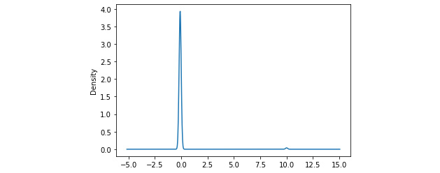
Figure 2.5 – Density plot of z-scores
We see a sharp spike in the density around 0, which indicates that most of the data points have a z-score around 0. Also, notice the very small blip around 10; these are the small number of outlier points that have high z-scores.
Now, all we have to do is filter out those rows that have a z-score of more than 2 or less than -2. We want to assign a label of 1 (predicted anomalies) to these rows, and 0 (predicted normal) to the others:
def map_z_to_label(z):
    if z > 2 or z < -2:
      return 1
    return 0
data_resampled["Predicted_Label"] = data_resampled["Z"].apply(map_z_to_label)
Now we have the actual and predicted labels for each row, we can evaluate the performance of our model using the confusion matrix (described earlier in Chapter 1, On Cybersecurity and Machine Learning). Fortunately, the scikit-learn package in Python provides a very convenient built-in method that allows us to compute the matrix, and another package called seaborn allows us to quickly plot it. The code is illustrated in the following snippet:
from sklearn.metrics import confusion_matrix
from matplotlib import pyplot as plt
import seaborn as sns
confusion = confusion_matrix(data_resampled["Label"],
                data_resampled["Predicted_Label"])
plt.figure(figsize = (10,8))
sns.heatmap(confusion, annot = True, fmt = 'd', cmap="YlGnBu")
This will produce a confusion matrix as shown:
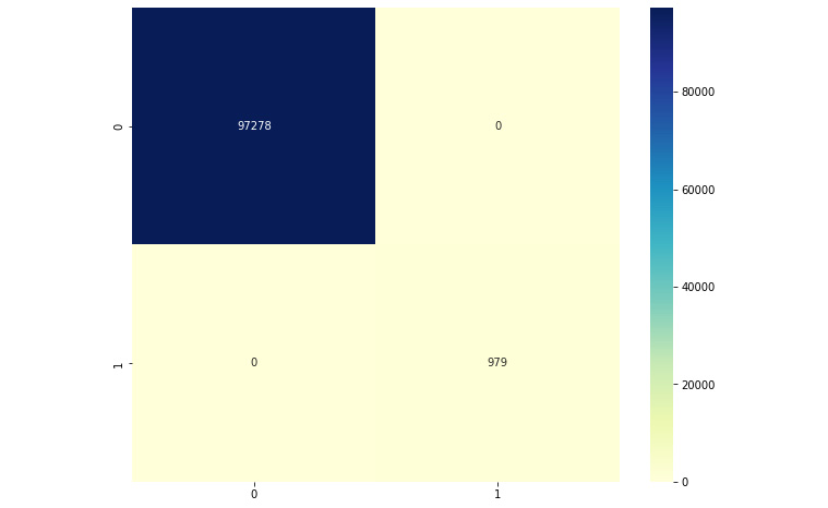
Figure 2.6 – Confusion matrix
Observe the confusion matrix carefully, and compare it with the skeleton confusion matrix from Chapter 1, On Cybersecurity and Machine Learning. We can see that our model is able to perform very well; all of the data points have been classified correctly. We have only true positives and negatives, and no false positives or false negatives.
Elliptic envelope
Elliptic envelope is an algorithm to detect anomalies in Gaussian data. At a high level, the algorithm models the data as a high-dimensional Gaussian distribution. The goal is to construct an ellipse covering most of the data—points falling outside the ellipse are anomalies or outliers. Statistical methods such as covariance matrices of features are used to estimate the size and shape of the ellipse.
The concept of elliptic envelope is easier to visualize in a two-dimensional space. A very idealized representation is shown in Figure 2.7. The points colored blue are within the boundary of the ellipse and hence considered normal or benign. Points in red fall outside, and hence are anomalies:
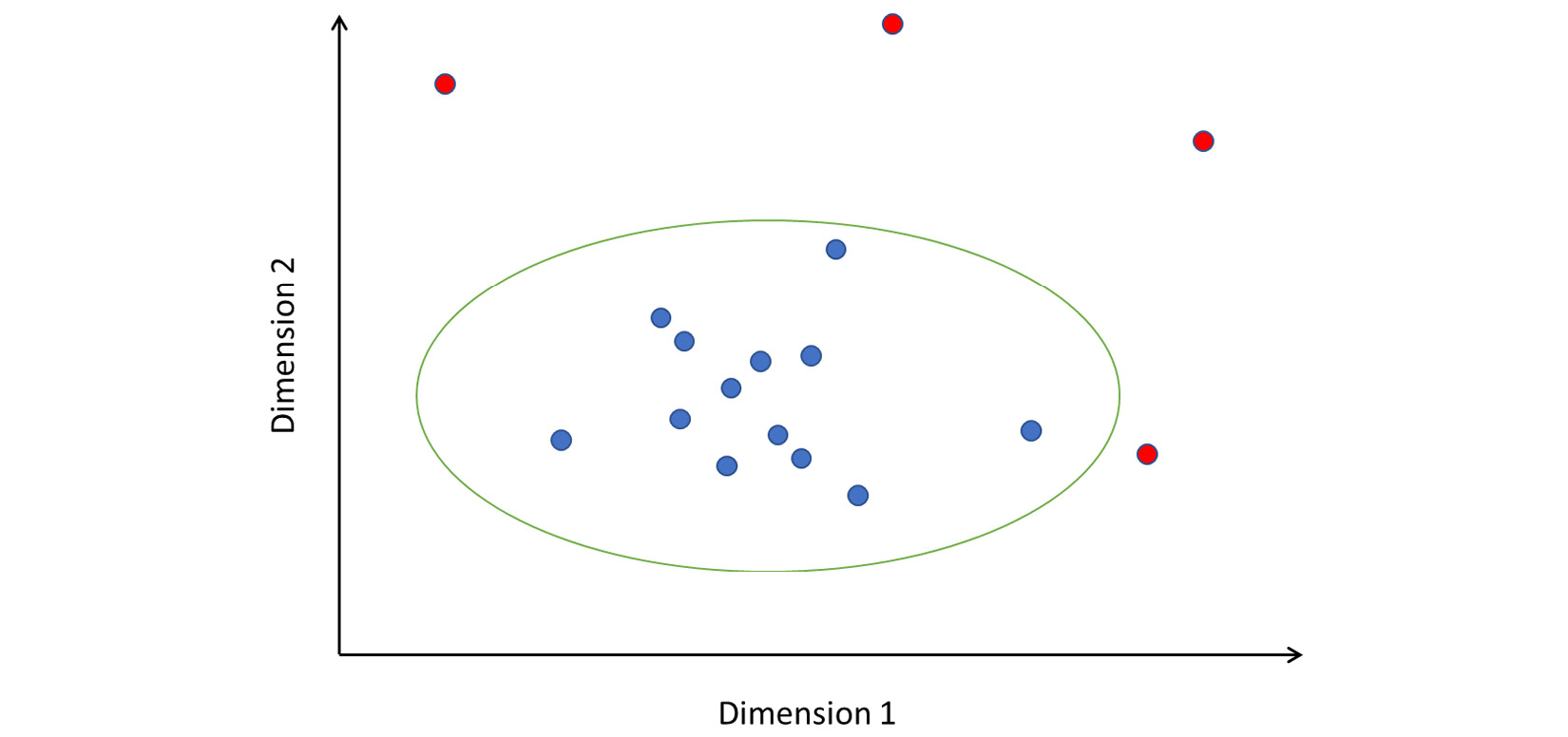
Figure 2.7 – How elliptic envelope detects anomalies
Note that the axes are labeled Dimension 1 and Dimension 2. These dimensions can be features you have extracted from your data; or, in the case of high-dimensional data, they might represent principal component features.
Implementing elliptic envelope as an anomaly detector in Python is straightforward. We will use the resampled data (consisting of only normal and teardrop data points) and drop the categorical features, as before:
from sklearn.covariance import EllipticEnvelope
actual_labels = data4["Label"]
X = data4.drop(["Label", "target",
                "protocol_type", "service",
                "flag"], axis=1)
clf = EllipticEnvelope(contamination=.1,random_state=0)
clf.fit(X)
predicted_labels = clf.predict(X)
The implementation of the algorithm is such that it produces -1 if a point is outside the ellipse, and 1 if it is within. To be consistent with our ground truth labeling, we will reassign -1 to 1 and 1 to 0:
predicted_labels_rescored =
[1 if pred == -1 else 0 for pred in predicted_labels]
Plot the confusion matrix as described previously. The result should be something like this:

Figure 2.8 – Confusion matrix for elliptic envelope
Note that this model has significant false positives and negatives. While the number may appear small, recall that our data had very few examples of the positive class (labeled 1) to begin with. The confusion matrix tells us that there were 931 false negatives and only 48 true positives. This indicates that the model has extremely low precision and is unable to isolate anomalies properly.
Local outlier factor
Local outlier factor (also known as LOF) is a density-based anomaly detection algorithm. It examines points in the local neighborhood of a point to detect whether that point is anomalous. While other algorithms consider a point with respect to the global data distribution, LOF considers only the local neighborhood and determines whether the point fits in. This is particularly useful to identify hidden outliers, which may be part of a cluster of points that is not an anomaly globally. Look at Figure 2.9, for instance:
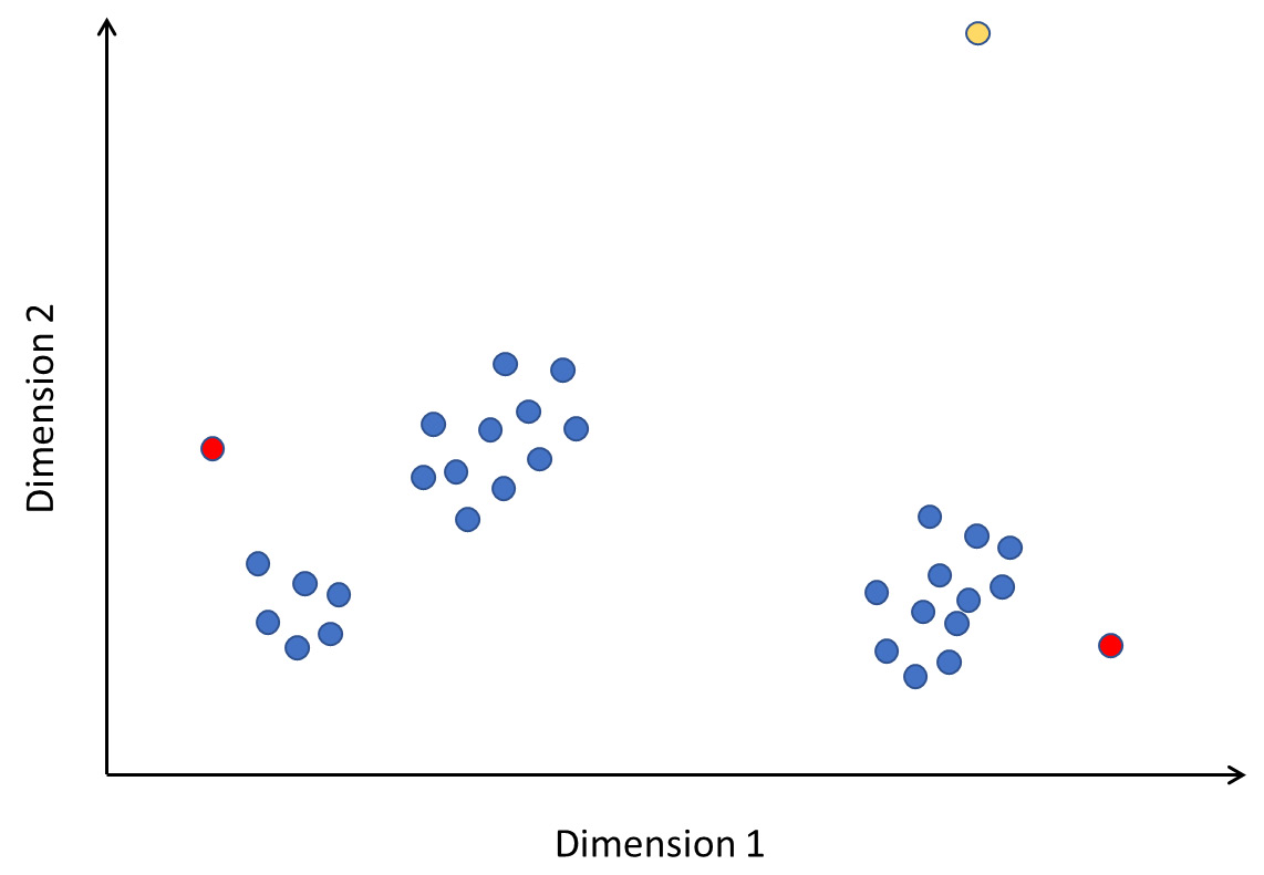
Figure 2.9 – Local outliers
In this figure, the yellow point is clearly an outlier. The points marked in red are not really outliers if you consider the entirety of the data. However, observe the neighborhood of the points; they are far away and stand apart from the local clusters they are in. Therefore, they are anomalies local to the area. LOF can detect such local anomalies in addition to global ones.
In brief, the algorithm works as follows. For every point P, we do the following:
- Compute the distances from P to every other point in the data. This distance can be computed using a metric called Manhattan distance. If (x1, y1) and (x2, y2) are two distinct points, the Manhattan distance between them is |x1 – x2| + |y1 – y2|. This can be generalized to multiple dimensions.
- Based on the distance, calculate the K closest points. This is the neighborhood of point P.
- Calculate the local reachability density, which is nothing but the inverse of the average distance between P and the K closest points. The local reachability density measures how close the neighborhood points are to P. A smaller value of density indicates that P is far away from its neighbors.
- Finally, calculate the LOF. This is the sum of distances from P to the neighboring points weighted by the sum of densities of the neighborhood points.
- Based on the LOF, we can determine whether P represents an anomaly in the data or not.
A high LOF value indicates that P is far from its neighbors and the neighbors have high densities (that is, they are close to their neighbors). This means that P is a local outlier in its neighborhood.
A low LOF value indicates that either P is far from the neighbors or that neighbors possibly have low densities themselves. This means that it is not an outlier in the neighborhood.
Note that the performance of our model here depends on the selection of K, the number of neighbors to form the neighborhood. If we set K to be too high, we would basically be looking for outliers at the global dataset level. This would lead to false positives because points that are in a cluster (so not locally anomalous) far away from the high-density regions would also be classified as anomalies. On the other hand, if we set K to be very small, our neighborhood would be very sparse and we would be looking for anomalies with respect to very small regions of points, which would also lead to misclassification.
We can try this out in Python using the built-in off-the-shelf implementation. We will use the same data and features that we used before:
from sklearn.neighbors import LocalOutlierFactor
actual_labels = data["Label"]
X = data.drop(["Label", "target",
                "protocol_type", "service",
                "flag"], axis=1)
k = 5
clf = LocalOutlierFactor(n_neighbors=k, contamination=.1)
predicted_labels = clf.fit_predict(X)
After rescoring the predicted labels for consistency as described before, we can plot the confusion matrix. You should see something like this:

Figure 2.10 – Confusion matrix for LOF with K = 5
Clearly, the model has an extremely high number of false negatives. We can examine how the performance changes by changing the value of K. Note that we first picked a very small value. If we rerun the same code with K = 250, we get the following confusion matrix:
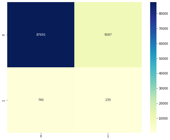
Figure 2.11 – Confusion matrix for LOF with K = 250
This second model is slightly better than the first. To find the best K value, we can try doing this over all possible values of K, and observe how our metrics change. We will vary K from 100 to 10,000, and for each iteration, we will calculate the accuracy, precision, and recall. We can then plot the trends in metrics with increasing K to check which one shows the best performance.
The complete code listing for this is shown next. First, we define empty lists that will hold our measurements (accuracy, precision, and recall) for each value of K that we test. We then fit an LOF model and compute the confusion matrix. Recall the definition of a confusion matrix from Chapter 1, On Cybersecurity and Machine Learning, and note which entries of the matrix define the true positives, false positives, and false negatives.
Using the matrix, we compute accuracy, precision, and recall, and record them in the arrays. Note the calculation of the precision and recall; we deviate from the formula slightly by adding 1 to the denominator. Why do we do this? In extreme cases, we will have zero true or false positives, and we do not want the denominator to be 0 in order to avoid a division-by-zero error:
from sklearn.neighbors import LocalOutlierFactor
actual_labels = data4["Label"]
X = data4.drop(["Label", "target","protocol_type", "service","flag"], axis=1)
all_accuracies = []
all_precision = []
all_recall = []
all_k = []
total_num_examples = len(X)
start_k = 100
end_k = 3000
for k in range(start_k, end_k,100):
  print("Checking for k = {}".format(k))
  # Fit a model
  clf = LocalOutlierFactor(n_neighbors=k, contamination=.1)
  predicted_labels = clf.fit_predict(X)
  predicted_labels_rescored = [1 if pred == -1 else 0 for pred in predicted_labels]
  confusion = confusion_matrix(actual_labels, predicted_labels_rescored)
  # Calculate metrics
  accuracy = 100 * (confusion[0][0] + confusion[1][1]) / total_num_examples
  precision = 100 * (confusion[1][1])/(confusion[1][1] + confusion[1][0] + 1)
  recall = 100 * (confusion[1][1])/(confusion[1][1] + confusion[0][1] + 1)
  # Record metrics
  all_k.append(k)
  all_accuracies.append(accuracy)
  all_precision.append(precision)
  all_recall.append(recall)
Once complete, we can plot the three series to show how the value of K affects the metrics. We can do this using matplotlib, as follows:
plt.plot(all_k, all_accuracies, color='green', label = 'Accuracy')
plt.plot(all_k, all_precision, color='blue', label = 'precision')
plt.plot(all_k, all_recall, color='red', label = 'Recall')
plt.show()
This is what the output looks like:
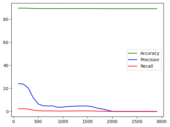
Figure 2.12 – Accuracy, precision, and recall trends with K
We see that while accuracy and recall have remained more or less similar, the value of precision shows a declining trend as we increase K.
This completes our discussion of statistical measures and methods for anomaly detection and their application to intrusion detection. In the next section, we will look at a few advanced unsupervised methods for doing the same.