Sign In Start Free Trial
Account

Add to playlist

Create a Playlist

Modal Close icon
You need to login to use this feature.
  • Book Overview & Buying Python in Excel for Data Analytics
  • Table Of Contents Toc
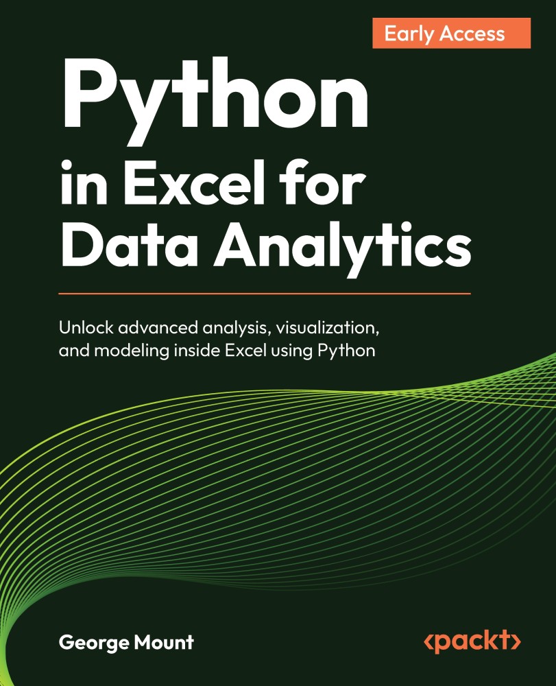
Python in Excel for Data Analytics

Python in Excel for Data Analytics

By : George Mount
close
close
Python in Excel for Data Analytics

Python in Excel for Data Analytics

By: George Mount

Overview of this book

Excel is one of the most widely used tools for business analysis, but many analytical tasks quickly reach the limits of formulas and built-in features. Python in Excel changes that by allowing you to perform advanced analysis directly within the spreadsheet environment. This book shows how to combine Excel’s structure and usability with Python’s analytical power. You will learn how to move data between Excel and Python DataFrames, clean and transform datasets efficiently, and explore data using modern visualization techniques. As you progress, you will apply Python to real analytical problems including statistical testing, regression modeling, forecasting, and simulation. You will also learn how to integrate Python outputs into Excel dashboards and reports, creating workflows that are both powerful and practical. Designed for Excel users with no prior programming experience, this book introduces Python concepts gradually and focuses on real-world applications rather than theory. By the end, you will be able to extend Excel in meaningful ways, helping you analyze data more effectively and support better decision-making.
Table of Contents (7 chapters)
close
close

Practical tips for chart workflows

As you build more charts, a few workflow habits will help keep your workbook organized. Keep the following in mind:

  • First, consider dedicating one worksheet to your source data and separate worksheets for your chart outputs. This mirrors the way many analysts work with Excel PivotCharts: data on one sheet, analysis on another.
  • Second, remember that each chart lives in a single Python cell. If you need to modify a chart, whether changing its title, adjusting the color palette, or switching the hue variable, you edit the code in that cell and re-run it. The chart updates instantly.
  • Third, use create reference (see Figure 3.2) for any chart you want to display prominently. Linked images can be resized and repositioned freely, and they update automatically when the source cell recalculates.
  • Finally, keep in mind that Python charts in Excel are static images. They do not support hover-over tooltips, click-through drill-downs, or the other interactive features...
CONTINUE READING
83
Tech Concepts
36
Programming languages
73
Tech Tools
Icon Unlimited access to the largest independent learning library in tech of over 8,000 expert-authored tech books and videos.
Icon Innovative learning tools, including AI book assistants, code context explainers, and text-to-speech.
Icon 50+ new titles added per month and exclusive early access to books as they are being written.
Python in Excel for Data Analytics
notes
bookmark Notes and Bookmarks search Search in title playlist Add to playlist download Download options font-size Font size

Change the font size

margin-width Margin width

Change margin width

day-mode Day/Sepia/Night Modes

Change background colour

Close icon Search
Country selected

Close icon Your notes and bookmarks

Confirmation

Modal Close icon
claim successful

Buy this book with your credits?

Modal Close icon
Are you sure you want to buy this book with one of your credits?
Close
YES, BUY

Submit Your Feedback

Modal Close icon
Modal Close icon
Modal Close icon