
In this chapter, we will cover the important features that enable us to create great maps. We will first go into advanced vector styling, building on what we covered in Chapter 2, Viewing Spatial Data. Then, you will learn how to label features by following examples for point labels as well as more advanced road labels with road shield graphics. We will also cover how to tweak labels manually. Then, you will get to know the print composer and how to use it to create printable maps and map books. Finally, we will explain how to create web maps directly in QGIS to present our results online.
Note
If you want to get an idea about what kind of map you can create using QGIS, visit the QGIS Map Showcase Flickr group at https://www.flickr.com/groups/qgis/, which is dedicated to maps created with QGIS without any further postprocessing.
This section introduces more advanced vector styling features, building on the basics that we covered in Chapter 2, Viewing Spatial Data. We will cover how to create detailed custom visualizations using the following features:
- Graduated styles
- Categorized styles
- Rule-based styles
- Data-defined styles
- Heatmap styles
- 2.5D styles
- Layer effects
Graduated styles are great for visualizing distributions of numerical values in choropleth or similar maps. The graduated renderer supports two methods:
- Color: This method changes the color of the feature according to the configured attribute
- Size: This method changes the symbol size for the feature according to the configured attribute (this option is only available for point and line layers)
In our sample data, there is a climate.shp file that contains locations and mean temperature values. We can visualize this data using a graduated style by simply selecting the T_F_MEAN value for the Column field and clicking on Classify. Using the Color method, as shown in the following screenshot, we can pick a Color ramp from the corresponding drop-down list. Additionally, we can reverse the order of the colors within the color ramp using the Invert option:

Graduated styles are available in different classification modes, as follows:
- Equal Interval: This mode creates classes by splitting at equal intervals between the maximum and minimum values found in the specified column.
- Quantile (Equal Count): This mode creates classes so that each class contains an equal number of features.
- Natural Breaks (Jenks): This mode uses the Jenks natural breaks algorithm to create classes by reducing variance within classes and maximizing variance between classes.
- Standard Deviation: This mode uses the column values' standard deviation to create classes.
- Pretty Breaks: This mode is the only classification that doesn't strictly create the specified number of classes. Instead, its main goal is to create class boundaries that are round numbers.
We can also manually edit the class values by double-clicking on the values in the list and changing the class bounds. A more convenient way to edit the classes is the Histogram view, as shown in the next screenshot. Switch to the Histogram tab and click on the Load values button in the bottom-right corner to enable the histogram. You can now edit the class bounds by moving the vertical lines with your mouse. You can also add new classes by adding a new vertical line, which you can do by clicking on empty space in the histogram:

Besides the symbols that are drawn on the map, another important aspect of the styling is the legend that goes with it. To customize the legend, we can define Legend Format as well as the Precision (that is, the number of decimal places) that should be displayed. In the Legend Format string, %1 will be replaced by the lower limit of the class and %2 by the upper limit. You can change this string to suit your needs, for example, to this: from %1 to %2. If you activate the Trim option, excess trailing zeros will be removed as well.
When we use the Size method, as shown in the following screenshot, the dialog changes a little, and we can now configure the desired symbol sizes:
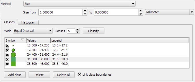
The next screenshot shows the results of using a Graduated renderer option with five classes using the Equal Interval classification mode. The left-hand side shows the results of the Color method (symbol color changes according to the T_F_MEAN value), while the right-hand side shows the results of the Size method (symbol size changes according to the T_F_MEAN value).

In the previous example, we used an existing color ramp to style our layer. Of course, we can also create our own color ramps. To create a new color ramp, we can scroll down the color ramp list to the New color ramp… entry. There are four different color ramp types, which we can chose from:
- Gradient: With this type, we can create color maps with two or more colors. The resulting color maps can be smooth gradients (using the Continuous type option) or distinct colors (using the Discrete type option), as shown in the following screenshot:

- Random: This type allows us to create a gradient with a certain number of random colors
- ColorBrewer: This type provides access to the ColorBrewer color schemes
- cpt-city: This type provides access to a wide variety of preconfigured color schemes, including schemes for typography and bathymetry, as shown in this screenshot:

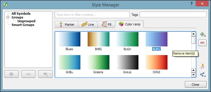
To manage all our color ramps and symbols, we can go to Settings | Style Manager. Here, we can add, delete, edit, export, or import color ramps and styles using the corresponding buttons on the right-hand side of the dialog, as shown in the following screenshot:
Just as graduated styles are very useful for visualizing numeric values, categorized styles are great for text values or—more generally speaking—all kinds of values on a nominal scale. A good example for this kind of data can be found in the trees.shp file in our sample data. For each area, there is a VEGDESC value that describes the type of forest found there. Using a categorized style, we can easily generate a style with one symbol for every unique value in the VEGDESC column, as shown in the following screenshot. Once we click on OK, the style is applied to our trees layer in order to visualize the distribution of different tree types in the area:

Of course, every symbol is editable and can be customized. Just double-click on the symbol preview to open the Symbol selector dialog, which allows you to select and combine different symbols.
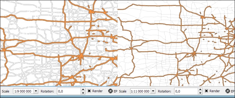
With rule-based styles, we can create a layer style with a hierarchy of rules. Rules can take into account anything from attribute values to scale and geometry properties such as area or length. In this example, we will create a rule-based renderer for the ne_10m_roads.shp file from Natural Earth (you can download it from http://www.naturalearthdata.com/downloads/10m-cultural-vectors/roads/). As you can see here, our style will contain different road styles for major and secondary highways as well as scale-dependent styles:

As you can see in the preceding screenshot, on the first level of rules, we distinguish between roads of "type" = 'Major Highway' and those of "type" = 'Secondary Highway'. The next level of rules handles scale-dependence. To add this second layer of rules, we can use the Refine selected rules button and select Add scales to rule. We simply input one or more scale values at which we want the rule to be split.
Note
Note that there are no symbols specified on the first rule level. If we had symbols specified on the first level as well, the renderer would draw two symbols over each other. While this can be useful in certain cases, we don't want this effect right now. Symbols can be deactivated in Rule properties, which is accessible by double-clicking on the rule or clicking on the edit button below the rule's tree view (the button between the plus and minus buttons).
In the following screenshot, we can see the rule-based renderer and the scale rules in action. While the left-hand side shows wider white roads with grey outlines for secondary highways, the right-hand side shows the simpler symbology with thin grey lines:
Tip
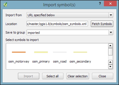
You can download the symbols used in this style by going to Settings | Style Manager, clicking on the sharing button in the bottom-right corner of the dialog, and selecting Import. The URL is https://raw.githubusercontent.com/anitagraser/QGIS-resources/master/qgis1.8/symbols/osm_symbols.xml. Paste the URL in the Location textbox, click on Fetch Symbols, then click on Select all, and finally click on Import. The dialog will look like what is shown in the following screenshot:
In previous examples, we created categories or rules to define how features are drawn on a map. An alternative approach is to use values from the layer attribute table to define the styling. This can be achieved using a QGIS feature called Data defined override. These overrides can be configured using the corresponding buttons next to each symbol property, as described in the following example.
In this example, we will again use the ne_10m_roads.shp file from Natural Earth. The next screenshot shows a configuration that creates a style where the line's Pen width depends on the feature's scalerank and the line Color depends on the toll attribute. To set a data-defined override for a symbol property, you need to click on the corresponding button, which is located right next to the property, and choose Edit. The following two expressions are used:
CASE WHEN toll = 1 THEN 'red' ELSE 'lightgray' END: This expression evaluates thetollvalue. If it is1, the line is drawn in red; otherwise, it is drawn in gray.2.5 / scalerank: This expression computes Pen width. Since a low scale rank should be represented by a wider line, we use a division operation instead of multiplication.
When data-defined overrides are active, the corresponding buttons are highlighted in yellow with an ε sign on them, as shown in the following screenshot:

In this example, you have seen that you can specify colors using color names such as 'red', 'gold', and 'deepskyblue'. Another especially useful group of functions for data-defined styles is the Color functions. There are functions for the following
color models:
- RGB:
color_rgb(red, green, blue) - HSL:
color_hsl(hue, saturation, lightness) - HSV:
color_hsv(hue, saturation, value) - CMYK:
color_cmyk(cyan, magenta, yellow, black)
There are also functions for accessing the color ramps. Here are two examples of how to use these functions:
ramp_color('Reds', T_F_MEAN / 46): This expression returns a color from theRedscolor ramp depending on theT_F_MEANvalue. Since the second parameter has to be a value between0and1, we divide theT_F_MEANvalue by the maximum value,46.color_rgba(0, 0, 180, scale_linear(T_F_JUL - T_F_JAN, 20, 70, 0, 255)): This expression computes the color depending on the difference between the July and January temperatures,T_F_JUL - T_F_JAN. The difference value is transformed into a value between0and255by thescale_linearfunction according to the following rule: any value up to20will be translated to0, any value of70and above will be translated to255, and anything in between will be interpolated linearly. Bigger difference values result in darker colors because of the higher alpha parameter value.
In Chapter 4, Spatial Analysis, you learned how to create a heatmap raster. However, there is a faster, more convenient way to achieve this look if you want a heatmap only for displaying purposes (and not for further spatial analysis)—the Heatmap renderer option.
The following screenshot shows a Heatmap renderer set up for our populated places dataset, popp.shp. We can specify a color ramp that will be applied to the resulting heatmap values between 0 and the defined Maximum value. If Maximum value is set to Automatic, QGIS automatically computes the highest value in the heatmap. As in the previously discussed heatmap tool, we can define point weights as well as the kernel Radius (for an explanation of this term, check out Creating a heatmap from points in Chapter 4, Spatial Analysis). The final Rendering quality option controls the quality of the rendered output with coarse, big raster cells for the Fastest option and a fine-grained look when set to Best:

If you want to create a pseudo-3D look, for example, to style building blocks or to create a thematic map, try the 2.5D renderer. The next screenshot shows the current configuration options that include controls for the feature's Height (in layer units), the viewing Angle, and colors. Since this renderer is still being improved at the time of writing this book, you might find additional options in this dialog when you see it for yourself.

Once you have configured the 2.5D renderer to your liking, you can switch to another renderer to, for example, create classified or graduated versions of symbols.
With layer effects, we can change the way our symbols look even further. Effects can be added by enabling the Draw effects checkbox at the bottom of the symbol dialog, as shown in the following screenshot. To configure the effects, click on the Star button in the bottom-right corner of the dialog. The Effect Properties dialog offers access to a wide range of Effect types:
- Blur: This effect creates a blurred, fuzzy version of the symbol.
- Colorise: This effect changes the color of the symbol.
- Source: This is the original unchanged symbol.
- Drop Shadow: This effect creates a shadow.
- Inner Glow: This effect creates a glow-like gradient that extends inwards, starting from the symbol border.
- Inner Shadow: This effect creates a shadow that is restricted to the inside of the symbol.
- Outer Glow: This effect creates a glow that radiates from the symbol outwards.
- Transform: This effect can be used to transform the symbol. The available transformations include reflect, shear, scale, rotate, and translate:

As you can see in the previous screenshot, we can combine multiple layer effects and they are organized in effect layers in the list in the bottom-left corner of the Effect Properties dialog.
When we create elaborate styles, we might want to save them so that we can reuse them in other projects or share them with other users. To save a style, click on the Style button in the bottom-left corner of the style dialog and go to Save Style | QGIS Layer Style File…, as shown in the following screenshot. This will create a .qml file, which you can save anywhere, copy, and share with others. Similarly, to use the .qml file, click on the Style button and select Load Style:

We can also save multiple different styles for one layer. For example, for our airports layer, we might want one style that displays airports using plane symbols and another style that renders a heatmap. To achieve this, we can do the following:
- Configure the plane style.
- Click on the Style button and select Add to add the current style to the list of styles for this layer.
- In the pop-up dialog, enter a name for the new style, for example,
planes. - Add another style by clicking on Style and Add and call it
heatmap. - Now, you can change the renderer to Heatmap and configure it. Click on the Apply button when ready.
- In the Style button menu, you can now see both styles, as shown in the next screenshot. Changing from one style to the other is now as simple as selecting one of the two entries from the list at the bottom of this menu:

Finally, we can also access these layer styles through the layer context menu Styles entry in the Layers Panel, as shown in the following screenshot. This context menu also provides a way to copy and paste styles between layers using the Copy Style and Paste Style entries, respectively. Furthermore, this context menu provides a shortcut to quickly change the symbol color using a color wheel or by picking a color from the Recent colors section:

We can activate labeling by going to Layer Properties | Labels, selecting Show labels for this layer, and selecting the attribute field that we want to Label with. This is all we need to do to display labels with default settings. While default labels are great for a quick preview, we will usually want to customize labels if we create visualizations for reports or standalone maps.
Using Expressions (the button that is right beside the attribute drop-down list), we can format the label text to suit our needs. For example, the NAME field in our sample airports.shp file contains text in uppercase. To display the airport names in mixed case instead, we can set the title(NAME) expression, which will reformat the name text in title case. We can also use multiple fields to create a label, for example, combining the name and elevation in brackets using the concatenation operator (||), as follows:
title(NAME) || ' (' || "ELEV" || ')'Note the use of simple quotation marks around text, such as ' (', and double quotation marks around field names, such as "ELEV". The dialog will look like what is shown in this screenshot:

The big preview area at the top of the dialog, titled Text/Buffer sample, shows a preview of the current settings. The background color can be adjusted to test readability on different backgrounds. Under the preview area, we find the different label settings, which will be described in detail in the following sections.
In the Text section (shown in the previous screenshot), we can configure the text style. Besides changing Font, Style, Size, Color, and Transparency, we can also modify the Spacing between letters and words, as well as Blend mode, which works like the layer blending mode that we covered in Chapter 2, Viewing Spatial Data.
Note the column of buttons on the right-hand side of every setting. Clicking on these buttons allows us to create data-defined overrides, similar to those that we discussed at the beginning of the chapter when we talked about advanced vector styling. These data-defined overrides can be used, for example, to define different label colors or change the label size depending on an individual feature's attribute value or an expression.
In the Formatting section, which is shown in the following screenshot, we can enable multiline labels by specifying a Wrap on character. Additionally, we can control Line height and Alignment. Besides the typical alignment options, the QGIS labeling engine also provides a Follow label placement option, which ensures that multiline labels are aligned towards the same side as the symbol the label belongs to:

Finally, the Formatted numbers option offers a shortcut to format numerical values to a certain number of Decimal places.
An alternative to wrapping text on a certain character is the wordwrap function, available in expressions. It wraps the input string to a certain maximum or minimum number of characters. The following screenshot shows an example of wrapping a longer piece of text to a maximum of 22 characters per line:

In the Buffer section, we can adjust the buffer Size, Color, and Transparency, as well as Pen join style and Blend mode. With transparency and blending, we can improve label readability without blocking out the underlying map too much, as shown in the following screenshot.
In the Background section, we can add a background shape in the form of a rectangle, square, circle, ellipsoid, or SVG. SVG backgrounds are great for creating effects such as highway shields, which we will discuss shortly.
Similarly, in the Shadow section, we can add a shadow to our labels. We can control everything from shadow direction to Color, Blur radius, Scale, and Transparency.
In the Placement section, we can configure which rules should be used to determine where the labels are placed. The available automatic label placement options depend on the layer geometry type.
For point layers, we can choose from the following:
- The flexible Around point option tries to find the best position for labels by distributing them around the points without overlaps. As you can see in the following screenshot, some labels are put in the top-right corner of their point symbol while others appear at different positions on the left (for example, Anchorage Intl (129)) or right (for example, Big Lake (135)) side.
- The Offset from point option forces all labels to a certain position; for example, all labels can be placed above their point symbol.
The following screenshot shows airport labels with a 50 percent transparent Buffer and Drop Shadow, placed using Around point. The Label distance is 1 mm.

For line layers, we can choose from the following placement options:
- Parallel for straight labels that are rotated according to the line orientation
- Curved for labels that follow the shape of the line
- Horizontal for labels that keep a horizontal orientation, regardless of the line orientation
For further fine-tuning, we can define whether the label should be placed Above line, On line, or Below line, and how far above or below it should be placed using Label distance.
For polygon layers, the placement options are as follows:
- Offset from centroid uses the polygon centroid as an anchor and works like Offset from point for point layers
- Around centroid works in a manner similar to Around point
- Horizontal places a horizontal label somewhere inside the polygon, independent of the centroid
- Free fits a freely rotated label inside the polygon
- Using perimeter places the label on the polygon's outline
The following screenshot shows lake labels (lakes.shp) using the Multiple lines feature wrapping on the empty space character, Center Alignment, a Letter spacing of 2, and positioning using the Free option:

Besides automatic label placement, we also have the option to use data-defined placement to position labels exactly where we want them to be. In the labeling toolbar, we find tools for moving and rotating labels by hand. They are active and available only for layers that have set up data-defined placement for at least X and Y coordinates:
- To start using the tools, we can simply add three new columns,
label_x,label_y, andlabel_rotto, for example, theairports.shpfile. We don't have to enter any values in the attribute table right now. The labeling engine will check for values, and if it finds the attribute fields empty, it will simply place the labels automatically. - Then, we can specify these columns in the label Placement section. Configure the data-defined overrides by clicking on the buttons beside Coordinate X, Coordinate Y, and Rotation, as shown in the following screenshot:

- By specifying data-defined placement, the labeling toolbar's tools are now available (note that the editing mode has to be turned on), and we can use the Move label and Rotate label tools to manipulate the labels on the map. The changes are written back to the attribute table.
- Try moving some labels, especially where they are placed closely together, and watch how the automatically placed labels adapt to your changes.
In the Rendering section, we can define Scale-based visibility limits to display labels only at certain scales and Pixel size-based visibility to hide labels for small features. Here, we can also tell the labeling engine to Show all labels for this layer (including colliding labels), which are normally hidden by default.
The following example shows labels with road shields. You can download a blank road shield SVG from http://upload.wikimedia.org/wikipedia/commons/c/c3/Blank_shield.svg. Note how only Interstates are labeled. This can be achieved using the Data defined Show label setting in the Rendering section with the following expression:
"level" = 'Interstate'
The labels are positioned using the Horizontal option (in the Placement section). Additionally, Merge connected lines to avoid duplicate labels and Suppress labeling of features smaller than are activated; for example, 5 mm helps avoid clutter by not labeling pieces of road that are shorter than 5 mm in the current scale.

To set up the road shield, go to the Background section and select the blank shield SVG from the folder you downloaded it in. To make sure that the label fits nicely inside the shield, we additionally specify the Size type field as a buffer with a Size of 1 mm. This makes the shield a little bigger than the label it contains.
If you click on Apply now, you will notice that the labels are not centered perfectly inside the shields. To fix this, we apply a small Offset in the Y direction to the shield position, as shown in the following screenshot. Additionally, it is recommended that you deactivate any label buffers as they tend to block out parts of the shield, and we don't need them anyway.

Customizing label text styles
In the Text section (shown in the previous screenshot), we can configure the text style. Besides changing Font, Style, Size, Color, and Transparency, we can also modify the Spacing between letters and words, as well as Blend mode, which works like the layer blending mode that we covered in Chapter 2, Viewing Spatial Data.
Note the column of buttons on the right-hand side of every setting. Clicking on these buttons allows us to create data-defined overrides, similar to those that we discussed at the beginning of the chapter when we talked about advanced vector styling. These data-defined overrides can be used, for example, to define different label colors or change the label size depending on an individual feature's attribute value or an expression.
In the Formatting section, which is shown in the following screenshot, we can enable multiline labels by specifying a Wrap on character. Additionally, we can control Line height and Alignment. Besides the typical alignment options, the QGIS labeling engine also provides a Follow label placement option, which ensures that multiline labels are aligned towards the same side as the symbol the label belongs to:
Finally, the Formatted numbers option offers a shortcut to format numerical values to a certain number of Decimal places.
An alternative to wrapping text on a certain character is the wordwrap function, available in expressions. It wraps the input string to a certain maximum or minimum number of characters. The following screenshot shows an example of wrapping a longer piece of text to a maximum of 22 characters per line:
In the Buffer section, we can adjust the buffer Size, Color, and Transparency, as well as Pen join style and Blend mode. With transparency and blending, we can improve label readability without blocking out the underlying map too much, as shown in the following screenshot.
In the Background section, we can add a background shape in the form of a rectangle, square, circle, ellipsoid, or SVG. SVG backgrounds are great for creating effects such as highway shields, which we will discuss shortly.
Similarly, in the Shadow section, we can add a shadow to our labels. We can control everything from shadow direction to Color, Blur radius, Scale, and Transparency.
In the Placement section, we can configure which rules should be used to determine where the labels are placed. The available automatic label placement options depend on the layer geometry type.
For point layers, we can choose from the following:
- The flexible Around point option tries to find the best position for labels by distributing them around the points without overlaps. As you can see in the following screenshot, some labels are put in the top-right corner of their point symbol while others appear at different positions on the left (for example, Anchorage Intl (129)) or right (for example, Big Lake (135)) side.
- The Offset from point option forces all labels to a certain position; for example, all labels can be placed above their point symbol.
The following screenshot shows airport labels with a 50 percent transparent Buffer and Drop Shadow, placed using Around point. The Label distance is 1 mm.
For line layers, we can choose from the following placement options:
- Parallel for straight labels that are rotated according to the line orientation
- Curved for labels that follow the shape of the line
- Horizontal for labels that keep a horizontal orientation, regardless of the line orientation
For further fine-tuning, we can define whether the label should be placed Above line, On line, or Below line, and how far above or below it should be placed using Label distance.
For polygon layers, the placement options are as follows:
- Offset from centroid uses the polygon centroid as an anchor and works like Offset from point for point layers
- Around centroid works in a manner similar to Around point
- Horizontal places a horizontal label somewhere inside the polygon, independent of the centroid
- Free fits a freely rotated label inside the polygon
- Using perimeter places the label on the polygon's outline
The following screenshot shows lake labels (lakes.shp) using the Multiple lines feature wrapping on the empty space character, Center Alignment, a Letter spacing of 2, and positioning using the Free option:
Besides automatic label placement, we also have the option to use data-defined placement to position labels exactly where we want them to be. In the labeling toolbar, we find tools for moving and rotating labels by hand. They are active and available only for layers that have set up data-defined placement for at least X and Y coordinates:
- To start using the tools, we can simply add three new columns,
label_x,label_y, andlabel_rotto, for example, theairports.shpfile. We don't have to enter any values in the attribute table right now. The labeling engine will check for values, and if it finds the attribute fields empty, it will simply place the labels automatically. - Then, we can specify these columns in the label Placement section. Configure the data-defined overrides by clicking on the buttons beside Coordinate X, Coordinate Y, and Rotation, as shown in the following screenshot:
- By specifying data-defined placement, the labeling toolbar's tools are now available (note that the editing mode has to be turned on), and we can use the Move label and Rotate label tools to manipulate the labels on the map. The changes are written back to the attribute table.
- Try moving some labels, especially where they are placed closely together, and watch how the automatically placed labels adapt to your changes.
In the Rendering section, we can define Scale-based visibility limits to display labels only at certain scales and Pixel size-based visibility to hide labels for small features. Here, we can also tell the labeling engine to Show all labels for this layer (including colliding labels), which are normally hidden by default.
The following example shows labels with road shields. You can download a blank road shield SVG from http://upload.wikimedia.org/wikipedia/commons/c/c3/Blank_shield.svg. Note how only Interstates are labeled. This can be achieved using the Data defined Show label setting in the Rendering section with the following expression:
"level" = 'Interstate'
The labels are positioned using the Horizontal option (in the Placement section). Additionally, Merge connected lines to avoid duplicate labels and Suppress labeling of features smaller than are activated; for example, 5 mm helps avoid clutter by not labeling pieces of road that are shorter than 5 mm in the current scale.
To set up the road shield, go to the Background section and select the blank shield SVG from the folder you downloaded it in. To make sure that the label fits nicely inside the shield, we additionally specify the Size type field as a buffer with a Size of 1 mm. This makes the shield a little bigger than the label it contains.
If you click on Apply now, you will notice that the labels are not centered perfectly inside the shields. To fix this, we apply a small Offset in the Y direction to the shield position, as shown in the following screenshot. Additionally, it is recommended that you deactivate any label buffers as they tend to block out parts of the shield, and we don't need them anyway.
Controlling label formatting
In the Formatting section, which is shown in the following screenshot, we can enable multiline labels by specifying a Wrap on character. Additionally, we can control Line height and Alignment. Besides the typical alignment options, the QGIS labeling engine also provides a Follow label placement option, which ensures that multiline labels are aligned towards the same side as the symbol the label belongs to:
Finally, the Formatted numbers option offers a shortcut to format numerical values to a certain number of Decimal places.
An alternative to wrapping text on a certain character is the wordwrap function, available in expressions. It wraps the input string to a certain maximum or minimum number of characters. The following screenshot shows an example of wrapping a longer piece of text to a maximum of 22 characters per line:
In the Buffer section, we can adjust the buffer Size, Color, and Transparency, as well as Pen join style and Blend mode. With transparency and blending, we can improve label readability without blocking out the underlying map too much, as shown in the following screenshot.
In the Background section, we can add a background shape in the form of a rectangle, square, circle, ellipsoid, or SVG. SVG backgrounds are great for creating effects such as highway shields, which we will discuss shortly.
Similarly, in the Shadow section, we can add a shadow to our labels. We can control everything from shadow direction to Color, Blur radius, Scale, and Transparency.
In the Placement section, we can configure which rules should be used to determine where the labels are placed. The available automatic label placement options depend on the layer geometry type.
For point layers, we can choose from the following:
- The flexible Around point option tries to find the best position for labels by distributing them around the points without overlaps. As you can see in the following screenshot, some labels are put in the top-right corner of their point symbol while others appear at different positions on the left (for example, Anchorage Intl (129)) or right (for example, Big Lake (135)) side.
- The Offset from point option forces all labels to a certain position; for example, all labels can be placed above their point symbol.
The following screenshot shows airport labels with a 50 percent transparent Buffer and Drop Shadow, placed using Around point. The Label distance is 1 mm.
For line layers, we can choose from the following placement options:
- Parallel for straight labels that are rotated according to the line orientation
- Curved for labels that follow the shape of the line
- Horizontal for labels that keep a horizontal orientation, regardless of the line orientation
For further fine-tuning, we can define whether the label should be placed Above line, On line, or Below line, and how far above or below it should be placed using Label distance.
For polygon layers, the placement options are as follows:
- Offset from centroid uses the polygon centroid as an anchor and works like Offset from point for point layers
- Around centroid works in a manner similar to Around point
- Horizontal places a horizontal label somewhere inside the polygon, independent of the centroid
- Free fits a freely rotated label inside the polygon
- Using perimeter places the label on the polygon's outline
The following screenshot shows lake labels (lakes.shp) using the Multiple lines feature wrapping on the empty space character, Center Alignment, a Letter spacing of 2, and positioning using the Free option:
Besides automatic label placement, we also have the option to use data-defined placement to position labels exactly where we want them to be. In the labeling toolbar, we find tools for moving and rotating labels by hand. They are active and available only for layers that have set up data-defined placement for at least X and Y coordinates:
- To start using the tools, we can simply add three new columns,
label_x,label_y, andlabel_rotto, for example, theairports.shpfile. We don't have to enter any values in the attribute table right now. The labeling engine will check for values, and if it finds the attribute fields empty, it will simply place the labels automatically. - Then, we can specify these columns in the label Placement section. Configure the data-defined overrides by clicking on the buttons beside Coordinate X, Coordinate Y, and Rotation, as shown in the following screenshot:
- By specifying data-defined placement, the labeling toolbar's tools are now available (note that the editing mode has to be turned on), and we can use the Move label and Rotate label tools to manipulate the labels on the map. The changes are written back to the attribute table.
- Try moving some labels, especially where they are placed closely together, and watch how the automatically placed labels adapt to your changes.
In the Rendering section, we can define Scale-based visibility limits to display labels only at certain scales and Pixel size-based visibility to hide labels for small features. Here, we can also tell the labeling engine to Show all labels for this layer (including colliding labels), which are normally hidden by default.
The following example shows labels with road shields. You can download a blank road shield SVG from http://upload.wikimedia.org/wikipedia/commons/c/c3/Blank_shield.svg. Note how only Interstates are labeled. This can be achieved using the Data defined Show label setting in the Rendering section with the following expression:
"level" = 'Interstate'
The labels are positioned using the Horizontal option (in the Placement section). Additionally, Merge connected lines to avoid duplicate labels and Suppress labeling of features smaller than are activated; for example, 5 mm helps avoid clutter by not labeling pieces of road that are shorter than 5 mm in the current scale.
To set up the road shield, go to the Background section and select the blank shield SVG from the folder you downloaded it in. To make sure that the label fits nicely inside the shield, we additionally specify the Size type field as a buffer with a Size of 1 mm. This makes the shield a little bigger than the label it contains.
If you click on Apply now, you will notice that the labels are not centered perfectly inside the shields. To fix this, we apply a small Offset in the Y direction to the shield position, as shown in the following screenshot. Additionally, it is recommended that you deactivate any label buffers as they tend to block out parts of the shield, and we don't need them anyway.
Configuring label buffers, background, and shadows
In the Buffer section, we can adjust the buffer Size, Color, and Transparency, as well as Pen join style and Blend mode. With transparency and blending, we can improve label readability without blocking out the underlying map too much, as shown in the following screenshot.
In the Background section, we can add a background shape in the form of a rectangle, square, circle, ellipsoid, or SVG. SVG backgrounds are great for creating effects such as highway shields, which we will discuss shortly.
Similarly, in the Shadow section, we can add a shadow to our labels. We can control everything from shadow direction to Color, Blur radius, Scale, and Transparency.
In the Placement section, we can configure which rules should be used to determine where the labels are placed. The available automatic label placement options depend on the layer geometry type.
For point layers, we can choose from the following:
- The flexible Around point option tries to find the best position for labels by distributing them around the points without overlaps. As you can see in the following screenshot, some labels are put in the top-right corner of their point symbol while others appear at different positions on the left (for example, Anchorage Intl (129)) or right (for example, Big Lake (135)) side.
- The Offset from point option forces all labels to a certain position; for example, all labels can be placed above their point symbol.
The following screenshot shows airport labels with a 50 percent transparent Buffer and Drop Shadow, placed using Around point. The Label distance is 1 mm.
For line layers, we can choose from the following placement options:
- Parallel for straight labels that are rotated according to the line orientation
- Curved for labels that follow the shape of the line
- Horizontal for labels that keep a horizontal orientation, regardless of the line orientation
For further fine-tuning, we can define whether the label should be placed Above line, On line, or Below line, and how far above or below it should be placed using Label distance.
For polygon layers, the placement options are as follows:
- Offset from centroid uses the polygon centroid as an anchor and works like Offset from point for point layers
- Around centroid works in a manner similar to Around point
- Horizontal places a horizontal label somewhere inside the polygon, independent of the centroid
- Free fits a freely rotated label inside the polygon
- Using perimeter places the label on the polygon's outline
The following screenshot shows lake labels (lakes.shp) using the Multiple lines feature wrapping on the empty space character, Center Alignment, a Letter spacing of 2, and positioning using the Free option:
Besides automatic label placement, we also have the option to use data-defined placement to position labels exactly where we want them to be. In the labeling toolbar, we find tools for moving and rotating labels by hand. They are active and available only for layers that have set up data-defined placement for at least X and Y coordinates:
- To start using the tools, we can simply add three new columns,
label_x,label_y, andlabel_rotto, for example, theairports.shpfile. We don't have to enter any values in the attribute table right now. The labeling engine will check for values, and if it finds the attribute fields empty, it will simply place the labels automatically. - Then, we can specify these columns in the label Placement section. Configure the data-defined overrides by clicking on the buttons beside Coordinate X, Coordinate Y, and Rotation, as shown in the following screenshot:
- By specifying data-defined placement, the labeling toolbar's tools are now available (note that the editing mode has to be turned on), and we can use the Move label and Rotate label tools to manipulate the labels on the map. The changes are written back to the attribute table.
- Try moving some labels, especially where they are placed closely together, and watch how the automatically placed labels adapt to your changes.
In the Rendering section, we can define Scale-based visibility limits to display labels only at certain scales and Pixel size-based visibility to hide labels for small features. Here, we can also tell the labeling engine to Show all labels for this layer (including colliding labels), which are normally hidden by default.
The following example shows labels with road shields. You can download a blank road shield SVG from http://upload.wikimedia.org/wikipedia/commons/c/c3/Blank_shield.svg. Note how only Interstates are labeled. This can be achieved using the Data defined Show label setting in the Rendering section with the following expression:
"level" = 'Interstate'
The labels are positioned using the Horizontal option (in the Placement section). Additionally, Merge connected lines to avoid duplicate labels and Suppress labeling of features smaller than are activated; for example, 5 mm helps avoid clutter by not labeling pieces of road that are shorter than 5 mm in the current scale.
To set up the road shield, go to the Background section and select the blank shield SVG from the folder you downloaded it in. To make sure that the label fits nicely inside the shield, we additionally specify the Size type field as a buffer with a Size of 1 mm. This makes the shield a little bigger than the label it contains.
If you click on Apply now, you will notice that the labels are not centered perfectly inside the shields. To fix this, we apply a small Offset in the Y direction to the shield position, as shown in the following screenshot. Additionally, it is recommended that you deactivate any label buffers as they tend to block out parts of the shield, and we don't need them anyway.
Controlling label placement
In the Placement section, we can configure which rules should be used to determine where the labels are placed. The available automatic label placement options depend on the layer geometry type.
For point layers, we can choose from the following:
- The flexible Around point option tries to find the best position for labels by distributing them around the points without overlaps. As you can see in the following screenshot, some labels are put in the top-right corner of their point symbol while others appear at different positions on the left (for example, Anchorage Intl (129)) or right (for example, Big Lake (135)) side.
- The Offset from point option forces all labels to a certain position; for example, all labels can be placed above their point symbol.
The following screenshot shows airport labels with a 50 percent transparent Buffer and Drop Shadow, placed using Around point. The Label distance is 1 mm.
For line layers, we can choose from the following placement options:
- Parallel for straight labels that are rotated according to the line orientation
- Curved for labels that follow the shape of the line
- Horizontal for labels that keep a horizontal orientation, regardless of the line orientation
For further fine-tuning, we can define whether the label should be placed Above line, On line, or Below line, and how far above or below it should be placed using Label distance.
For polygon layers, the placement options are as follows:
- Offset from centroid uses the polygon centroid as an anchor and works like Offset from point for point layers
- Around centroid works in a manner similar to Around point
- Horizontal places a horizontal label somewhere inside the polygon, independent of the centroid
- Free fits a freely rotated label inside the polygon
- Using perimeter places the label on the polygon's outline
The following screenshot shows lake labels (lakes.shp) using the Multiple lines feature wrapping on the empty space character, Center Alignment, a Letter spacing of 2, and positioning using the Free option:
Besides automatic label placement, we also have the option to use data-defined placement to position labels exactly where we want them to be. In the labeling toolbar, we find tools for moving and rotating labels by hand. They are active and available only for layers that have set up data-defined placement for at least X and Y coordinates:
- To start using the tools, we can simply add three new columns,
label_x,label_y, andlabel_rotto, for example, theairports.shpfile. We don't have to enter any values in the attribute table right now. The labeling engine will check for values, and if it finds the attribute fields empty, it will simply place the labels automatically. - Then, we can specify these columns in the label Placement section. Configure the data-defined overrides by clicking on the buttons beside Coordinate X, Coordinate Y, and Rotation, as shown in the following screenshot:
- By specifying data-defined placement, the labeling toolbar's tools are now available (note that the editing mode has to be turned on), and we can use the Move label and Rotate label tools to manipulate the labels on the map. The changes are written back to the attribute table.
- Try moving some labels, especially where they are placed closely together, and watch how the automatically placed labels adapt to your changes.
In the Rendering section, we can define Scale-based visibility limits to display labels only at certain scales and Pixel size-based visibility to hide labels for small features. Here, we can also tell the labeling engine to Show all labels for this layer (including colliding labels), which are normally hidden by default.
The following example shows labels with road shields. You can download a blank road shield SVG from http://upload.wikimedia.org/wikipedia/commons/c/c3/Blank_shield.svg. Note how only Interstates are labeled. This can be achieved using the Data defined Show label setting in the Rendering section with the following expression:
"level" = 'Interstate'
The labels are positioned using the Horizontal option (in the Placement section). Additionally, Merge connected lines to avoid duplicate labels and Suppress labeling of features smaller than are activated; for example, 5 mm helps avoid clutter by not labeling pieces of road that are shorter than 5 mm in the current scale.
To set up the road shield, go to the Background section and select the blank shield SVG from the folder you downloaded it in. To make sure that the label fits nicely inside the shield, we additionally specify the Size type field as a buffer with a Size of 1 mm. This makes the shield a little bigger than the label it contains.
If you click on Apply now, you will notice that the labels are not centered perfectly inside the shields. To fix this, we apply a small Offset in the Y direction to the shield position, as shown in the following screenshot. Additionally, it is recommended that you deactivate any label buffers as they tend to block out parts of the shield, and we don't need them anyway.
Configuring point labels
For point layers, we can choose from the following:
- The flexible Around point option tries to find the best position for labels by distributing them around the points without overlaps. As you can see in the following screenshot, some labels are put in the top-right corner of their point symbol while others appear at different positions on the left (for example, Anchorage Intl (129)) or right (for example, Big Lake (135)) side.
- The Offset from point option forces all labels to a certain position; for example, all labels can be placed above their point symbol.
The following screenshot shows airport labels with a 50 percent transparent Buffer and Drop Shadow, placed using Around point. The Label distance is 1 mm.
For line layers, we can choose from the following placement options:
- Parallel for straight labels that are rotated according to the line orientation
- Curved for labels that follow the shape of the line
- Horizontal for labels that keep a horizontal orientation, regardless of the line orientation
For further fine-tuning, we can define whether the label should be placed Above line, On line, or Below line, and how far above or below it should be placed using Label distance.
For polygon layers, the placement options are as follows:
- Offset from centroid uses the polygon centroid as an anchor and works like Offset from point for point layers
- Around centroid works in a manner similar to Around point
- Horizontal places a horizontal label somewhere inside the polygon, independent of the centroid
- Free fits a freely rotated label inside the polygon
- Using perimeter places the label on the polygon's outline
The following screenshot shows lake labels (lakes.shp) using the Multiple lines feature wrapping on the empty space character, Center Alignment, a Letter spacing of 2, and positioning using the Free option:
Besides automatic label placement, we also have the option to use data-defined placement to position labels exactly where we want them to be. In the labeling toolbar, we find tools for moving and rotating labels by hand. They are active and available only for layers that have set up data-defined placement for at least X and Y coordinates:
- To start using the tools, we can simply add three new columns,
label_x,label_y, andlabel_rotto, for example, theairports.shpfile. We don't have to enter any values in the attribute table right now. The labeling engine will check for values, and if it finds the attribute fields empty, it will simply place the labels automatically. - Then, we can specify these columns in the label Placement section. Configure the data-defined overrides by clicking on the buttons beside Coordinate X, Coordinate Y, and Rotation, as shown in the following screenshot:
- By specifying data-defined placement, the labeling toolbar's tools are now available (note that the editing mode has to be turned on), and we can use the Move label and Rotate label tools to manipulate the labels on the map. The changes are written back to the attribute table.
- Try moving some labels, especially where they are placed closely together, and watch how the automatically placed labels adapt to your changes.
In the Rendering section, we can define Scale-based visibility limits to display labels only at certain scales and Pixel size-based visibility to hide labels for small features. Here, we can also tell the labeling engine to Show all labels for this layer (including colliding labels), which are normally hidden by default.
The following example shows labels with road shields. You can download a blank road shield SVG from http://upload.wikimedia.org/wikipedia/commons/c/c3/Blank_shield.svg. Note how only Interstates are labeled. This can be achieved using the Data defined Show label setting in the Rendering section with the following expression:
"level" = 'Interstate'
The labels are positioned using the Horizontal option (in the Placement section). Additionally, Merge connected lines to avoid duplicate labels and Suppress labeling of features smaller than are activated; for example, 5 mm helps avoid clutter by not labeling pieces of road that are shorter than 5 mm in the current scale.
To set up the road shield, go to the Background section and select the blank shield SVG from the folder you downloaded it in. To make sure that the label fits nicely inside the shield, we additionally specify the Size type field as a buffer with a Size of 1 mm. This makes the shield a little bigger than the label it contains.
If you click on Apply now, you will notice that the labels are not centered perfectly inside the shields. To fix this, we apply a small Offset in the Y direction to the shield position, as shown in the following screenshot. Additionally, it is recommended that you deactivate any label buffers as they tend to block out parts of the shield, and we don't need them anyway.
Configuring line labels
For line layers, we can choose from the following placement options:
- Parallel for straight labels that are rotated according to the line orientation
- Curved for labels that follow the shape of the line
- Horizontal for labels that keep a horizontal orientation, regardless of the line orientation
For further fine-tuning, we can define whether the label should be placed Above line, On line, or Below line, and how far above or below it should be placed using Label distance.
For polygon layers, the placement options are as follows:
- Offset from centroid uses the polygon centroid as an anchor and works like Offset from point for point layers
- Around centroid works in a manner similar to Around point
- Horizontal places a horizontal label somewhere inside the polygon, independent of the centroid
- Free fits a freely rotated label inside the polygon
- Using perimeter places the label on the polygon's outline
The following screenshot shows lake labels (lakes.shp) using the Multiple lines feature wrapping on the empty space character, Center Alignment, a Letter spacing of 2, and positioning using the Free option:
Besides automatic label placement, we also have the option to use data-defined placement to position labels exactly where we want them to be. In the labeling toolbar, we find tools for moving and rotating labels by hand. They are active and available only for layers that have set up data-defined placement for at least X and Y coordinates:
- To start using the tools, we can simply add three new columns,
label_x,label_y, andlabel_rotto, for example, theairports.shpfile. We don't have to enter any values in the attribute table right now. The labeling engine will check for values, and if it finds the attribute fields empty, it will simply place the labels automatically. - Then, we can specify these columns in the label Placement section. Configure the data-defined overrides by clicking on the buttons beside Coordinate X, Coordinate Y, and Rotation, as shown in the following screenshot:
- By specifying data-defined placement, the labeling toolbar's tools are now available (note that the editing mode has to be turned on), and we can use the Move label and Rotate label tools to manipulate the labels on the map. The changes are written back to the attribute table.
- Try moving some labels, especially where they are placed closely together, and watch how the automatically placed labels adapt to your changes.
In the Rendering section, we can define Scale-based visibility limits to display labels only at certain scales and Pixel size-based visibility to hide labels for small features. Here, we can also tell the labeling engine to Show all labels for this layer (including colliding labels), which are normally hidden by default.
The following example shows labels with road shields. You can download a blank road shield SVG from http://upload.wikimedia.org/wikipedia/commons/c/c3/Blank_shield.svg. Note how only Interstates are labeled. This can be achieved using the Data defined Show label setting in the Rendering section with the following expression:
"level" = 'Interstate'
The labels are positioned using the Horizontal option (in the Placement section). Additionally, Merge connected lines to avoid duplicate labels and Suppress labeling of features smaller than are activated; for example, 5 mm helps avoid clutter by not labeling pieces of road that are shorter than 5 mm in the current scale.
To set up the road shield, go to the Background section and select the blank shield SVG from the folder you downloaded it in. To make sure that the label fits nicely inside the shield, we additionally specify the Size type field as a buffer with a Size of 1 mm. This makes the shield a little bigger than the label it contains.
If you click on Apply now, you will notice that the labels are not centered perfectly inside the shields. To fix this, we apply a small Offset in the Y direction to the shield position, as shown in the following screenshot. Additionally, it is recommended that you deactivate any label buffers as they tend to block out parts of the shield, and we don't need them anyway.
Configuring polygon labels
For polygon layers, the placement options are as follows:
- Offset from centroid uses the polygon centroid as an anchor and works like Offset from point for point layers
- Around centroid works in a manner similar to Around point
- Horizontal places a horizontal label somewhere inside the polygon, independent of the centroid
- Free fits a freely rotated label inside the polygon
- Using perimeter places the label on the polygon's outline
The following screenshot shows lake labels (lakes.shp) using the Multiple lines feature wrapping on the empty space character, Center Alignment, a Letter spacing of 2, and positioning using the Free option:
Besides automatic label placement, we also have the option to use data-defined placement to position labels exactly where we want them to be. In the labeling toolbar, we find tools for moving and rotating labels by hand. They are active and available only for layers that have set up data-defined placement for at least X and Y coordinates:
- To start using the tools, we can simply add three new columns,
label_x,label_y, andlabel_rotto, for example, theairports.shpfile. We don't have to enter any values in the attribute table right now. The labeling engine will check for values, and if it finds the attribute fields empty, it will simply place the labels automatically. - Then, we can specify these columns in the label Placement section. Configure the data-defined overrides by clicking on the buttons beside Coordinate X, Coordinate Y, and Rotation, as shown in the following screenshot:
- By specifying data-defined placement, the labeling toolbar's tools are now available (note that the editing mode has to be turned on), and we can use the Move label and Rotate label tools to manipulate the labels on the map. The changes are written back to the attribute table.
- Try moving some labels, especially where they are placed closely together, and watch how the automatically placed labels adapt to your changes.
In the Rendering section, we can define Scale-based visibility limits to display labels only at certain scales and Pixel size-based visibility to hide labels for small features. Here, we can also tell the labeling engine to Show all labels for this layer (including colliding labels), which are normally hidden by default.
The following example shows labels with road shields. You can download a blank road shield SVG from http://upload.wikimedia.org/wikipedia/commons/c/c3/Blank_shield.svg. Note how only Interstates are labeled. This can be achieved using the Data defined Show label setting in the Rendering section with the following expression:
"level" = 'Interstate'
The labels are positioned using the Horizontal option (in the Placement section). Additionally, Merge connected lines to avoid duplicate labels and Suppress labeling of features smaller than are activated; for example, 5 mm helps avoid clutter by not labeling pieces of road that are shorter than 5 mm in the current scale.
To set up the road shield, go to the Background section and select the blank shield SVG from the folder you downloaded it in. To make sure that the label fits nicely inside the shield, we additionally specify the Size type field as a buffer with a Size of 1 mm. This makes the shield a little bigger than the label it contains.
If you click on Apply now, you will notice that the labels are not centered perfectly inside the shields. To fix this, we apply a small Offset in the Y direction to the shield position, as shown in the following screenshot. Additionally, it is recommended that you deactivate any label buffers as they tend to block out parts of the shield, and we don't need them anyway.
Placing labels manually
Besides automatic label placement, we also have the option to use data-defined placement to position labels exactly where we want them to be. In the labeling toolbar, we find tools for moving and rotating labels by hand. They are active and available only for layers that have set up data-defined placement for at least X and Y coordinates:
- To start using the tools, we can simply add three new columns,
label_x,label_y, andlabel_rotto, for example, theairports.shpfile. We don't have to enter any values in the attribute table right now. The labeling engine will check for values, and if it finds the attribute fields empty, it will simply place the labels automatically. - Then, we can specify these columns in the label Placement section. Configure the data-defined overrides by clicking on the buttons beside Coordinate X, Coordinate Y, and Rotation, as shown in the following screenshot:
- By specifying data-defined placement, the labeling toolbar's tools are now available (note that the editing mode has to be turned on), and we can use the Move label and Rotate label tools to manipulate the labels on the map. The changes are written back to the attribute table.
- Try moving some labels, especially where they are placed closely together, and watch how the automatically placed labels adapt to your changes.
In the Rendering section, we can define Scale-based visibility limits to display labels only at certain scales and Pixel size-based visibility to hide labels for small features. Here, we can also tell the labeling engine to Show all labels for this layer (including colliding labels), which are normally hidden by default.
The following example shows labels with road shields. You can download a blank road shield SVG from http://upload.wikimedia.org/wikipedia/commons/c/c3/Blank_shield.svg. Note how only Interstates are labeled. This can be achieved using the Data defined Show label setting in the Rendering section with the following expression:
"level" = 'Interstate'
The labels are positioned using the Horizontal option (in the Placement section). Additionally, Merge connected lines to avoid duplicate labels and Suppress labeling of features smaller than are activated; for example, 5 mm helps avoid clutter by not labeling pieces of road that are shorter than 5 mm in the current scale.
To set up the road shield, go to the Background section and select the blank shield SVG from the folder you downloaded it in. To make sure that the label fits nicely inside the shield, we additionally specify the Size type field as a buffer with a Size of 1 mm. This makes the shield a little bigger than the label it contains.
If you click on Apply now, you will notice that the labels are not centered perfectly inside the shields. To fix this, we apply a small Offset in the Y direction to the shield position, as shown in the following screenshot. Additionally, it is recommended that you deactivate any label buffers as they tend to block out parts of the shield, and we don't need them anyway.
Controlling label rendering
In the Rendering section, we can define Scale-based visibility limits to display labels only at certain scales and Pixel size-based visibility to hide labels for small features. Here, we can also tell the labeling engine to Show all labels for this layer (including colliding labels), which are normally hidden by default.
The following example shows labels with road shields. You can download a blank road shield SVG from http://upload.wikimedia.org/wikipedia/commons/c/c3/Blank_shield.svg. Note how only Interstates are labeled. This can be achieved using the Data defined Show label setting in the Rendering section with the following expression:
"level" = 'Interstate'
The labels are positioned using the Horizontal option (in the Placement section). Additionally, Merge connected lines to avoid duplicate labels and Suppress labeling of features smaller than are activated; for example, 5 mm helps avoid clutter by not labeling pieces of road that are shorter than 5 mm in the current scale.
To set up the road shield, go to the Background section and select the blank shield SVG from the folder you downloaded it in. To make sure that the label fits nicely inside the shield, we additionally specify the Size type field as a buffer with a Size of 1 mm. This makes the shield a little bigger than the label it contains.
If you click on Apply now, you will notice that the labels are not centered perfectly inside the shields. To fix this, we apply a small Offset in the Y direction to the shield position, as shown in the following screenshot. Additionally, it is recommended that you deactivate any label buffers as they tend to block out parts of the shield, and we don't need them anyway.
In QGIS, print maps are designed in the print composer. A QGIS project can contain multiple composers, so it makes sense to pick descriptive names. Composers are saved automatically whenever we save the project. To see a list of all the compositions available in a project, go to Project | Composer Manager.
We can open a new composer by going to Project | New Print Composer or using Ctrl + P. The composer window consists of the following:
- A preview area for the map composition displaying a blank page when a new composer is created
- Panels for configuring Composition, Item properties, and Atlas generation, as well as a Command history panel for quick undo and redo actions
- Toolbars to manage, save, and export compositions; navigate in the preview area; as well as add and arrange different composer items
Once you have designed your print map the way you want it, you can save the template to a composer template .qpt file by going to Composer | Save as template and reuse it in other projects by going to Composer | Add Items from Template.
In this example, we will create a basic map with a scalebar, a north arrow, some explanatory text, and a legend.
When we start the print composer, we first see the Composition panel on the right-hand side. This panel gives us access to paper options such as size, orientation, and number of pages. It is also the place to configure snapping behavior and output resolution.
First, we add a map item to the paper using the Add new map button, or by going to Layout | Add Map and drawing the map rectangle on the paper. Click on the paper, keep the mouse button pressed down, and drag the rectangle open. We can move and resize the map using the mouse and the Select/Move item tools. Alternatively, it is possible to configure all the map settings in the Item properties panel.
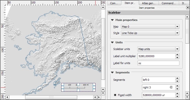
The Item properties panel's content depends on the currently selected composition item. If a map item is selected, we can adjust the map's Scale and Extents as well as the Position and size tool of the map item itself. At a Scale of 10,000,000 (with the CRS set to EPSG:2964), we can more or less fit a map of Alaska on an A4-size paper, as shown in the following screenshot. To move the area that is displayed within the map item and change the map scale, we can use the Move item content tool.

After the map looks like what we want it to, we can add a scalebar using the Add new scalebar button or by going to Layout | Add Scalebar and clicking on the map. The Item properties panel now displays the scalebar's properties, which are similar to what you can see in the next screenshot. Since we can add multiple map items to one composition, it is important to specify which map the scale belongs to. The second main property is the scalebar style, which allows us to choose between different scalebar types, or a Numeric type for a simple textual representation, such as 1:10,000,000. Using the Units properties, we can convert the map units in feet or meters to something more manageable, such as miles or kilometers. The Segments properties control the number of segments and the size of a single segment in the scalebar. Further, the properties control the scalebar's color, font, background, and so on.
North arrows can be added to a composition using the Add Image button or by going to Layout | Add image and clicking on the paper. To use one of the SVGs that are part of the QGIS installation, open the Search directories section in the Item properties panel. It might take a while for QGIS to load the previews of the images in the SVG folder. You can pick a North arrow from the list of images or select your own image by clicking on the button next to the Image source input. More map decorations, such as arrows or rectangle, triangle, and ellipse shapes can be added using the appropriate toolbar buttons: Add Arrow, Add Rectangle, and so on.

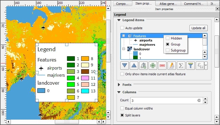
Legends are another vital map element. We can use the Add new legend button or go to Layout | Add legend to add a default legend with entries for all currently visible map layers. Legend entries can be reorganized (sorted or added to groups), edited, and removed from the legend items' properties. Using the Wrap text on option, we can split long labels on multiple rows. The following screenshot shows the context menu that allows us to change the style (Hidden, Group, or Subgroup) of an entry. The corresponding font, size, and color are configurable in the Fonts section.
Additionally, the legend in this example is divided into three Columns, as you can see in the bottom-right section of the following screenshot. By default, QGIS tries to keep all entries of one layer in a single column, but we can override this behavior by enabling Split layers.
To add text to the map, we can use the Add new label button or go to Layout | Add label. Simple labels display all text using the same font. By enabling Render as HTML, we can create more elaborate labels with headers, lists, different colors, and highlights in bold or italics using normal HTML notation. Here is an example:
<h1>Alaska</h1>
<p>The name <i>"Alaska"</i> means "the mainland".</p>
<ul><li>one list entry</li><li>another entry</li></ul>
<p style="font-size:70%;">[% format_date( $now ,'yyyy-mm-dd')%]</p>
Labels can also contain expressions such as these:
[% $now %]: This expression inserts the current timestamp, which can be formatted using theformat_datefunction, as shown in the following screenshot[% $page %] of [% $numpages %]: This expression can be used to insert page numbers in compositions with multiple pages
Other common features of maps are grids and frames. Every map item can have one or more grids. Click on the + button in the Grids section to add a grid. The Interval and Offset values have to be specified in map units. We can choose between the following Grid types:
- A normal Solid grid with customizable lines
- Crosses at specified intervals with customizable styles
- Customizable Markers at specified intervals
- Frame and annotation only will hide the grid while still displaying the frame and coordinate annotations
For Grid frame, we can select from the following Frame styles:
- Zebra, with customizable line and fill colors, as shown in the following screenshot
- Interior ticks, Exterior ticks, or Interior and exterior ticks for tick marks pointing inside the map, outside it, or in both directions
- Line border for a simple line frame
Using Draw coordinates, we can label the grid with the corresponding coordinates. The labels can be aligned horizontally or vertically and placed inside or outside the frame, as shown here:

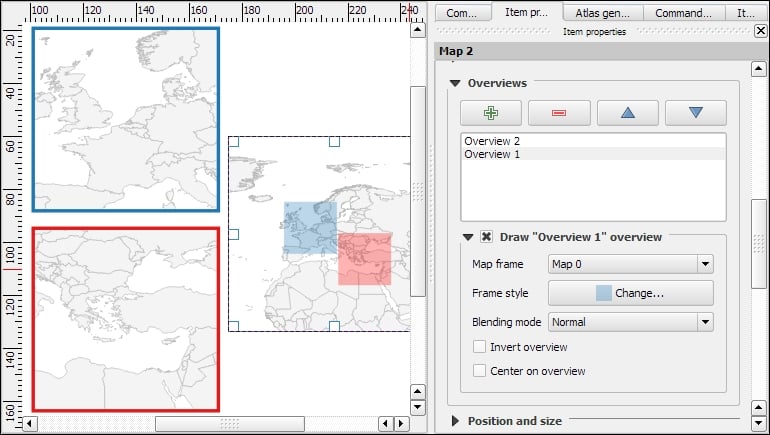
Maps that show an area close up are often accompanied by a second map that tells the reader where the area is located in a larger context. To create such an overview map, we add a second map item and an overview by clicking on the + button in the Overviews section. By setting the Map frame, we can define which detail map's extent should be highlighted. By clicking on the + button again, we can add more map frames to the overview map. The following screenshot shows an example with two detail maps both of which are added to an overview map. To distinguish between the two maps, the overview highlights are color-coded (by changing the overview Frame style) to match the colors of the frames of the detail maps.
Tip
Every map item in a composition can display a different combination of layers. Generally, map items in a composer are synced with the map in the main QGIS window. So, if we turn a layer off in the main window, it is removed from the print composer map as well. However, we can stop this automatic synchronization by enabling Lock layers for a map item in the map item's properties.
To insert additional details into the map, the composer also offers the possibility of adding an attribute table to the composition using the Add attribute table button or by going to Layout | Add attribute table. By enabling Show only features visible within a map, we can filter the table and display only the relevant results. Additional filter expressions can be set using the Filter with option. Sorting (by name for example, as shown in the following screenshot) and renaming of columns is possible via the Attributes button. To customize the header row with bold and centered text, go to the Fonts and text styling section and change the Table heading settings.

Even more advanced content can be added using the Add html frame button. We can point the item's URL reference to any HTML page on our local machines or online, and the content (text and images as displayed in a web browser) will be displayed on the composer page.
With the print composer's Atlas feature, we can create a series of maps using one print composition. The tool will create one output (which can be image files, PDFs, or multiple pages in one PDF) for every feature in the so-called Coverage layer.
Atlas can control and update multiple map items within one composition. To enable Atlas for a map item, we have to enable the Controlled by atlas option in the Item properties of the map item. When we use the Fixed scale option in the Controlled by atlas section, all maps will be rendered using the same scale. If we need a more flexible output, we can switch to the Margin around feature option instead, which zooms to every Coverage layer feature and renders it in addition to the specified margin surrounding area.

To finish the configuration, we switch to the Atlas generation panel. As mentioned before, Atlas will create one map for every feature in the layer configured in the Coverage layer dropdown. Features in the coverage layer can be displayed like regular features or hidden by enabling Hidden coverage layer. Adding an expression to the Feature filtering option or enabling the Sort by option makes it possible to further fine-tune the results. The Output field can be one image or PDF for each coverage layer feature, or you can create a multipage PDF by enabling Single file export when possible before going to Composer | Export as PDF.
Once these configurations are finished, we can preview the map series by enabling the Preview Atlas button, which you can see in the top-left corner of the following screenshot. The arrow buttons next to the preview button are used to navigate between the Atlas maps.

Creating a basic map
In this example, we will create a basic map with a scalebar, a north arrow, some explanatory text, and a legend.
When we start the print composer, we first see the Composition panel on the right-hand side. This panel gives us access to paper options such as size, orientation, and number of pages. It is also the place to configure snapping behavior and output resolution.
First, we add a map item to the paper using the Add new map button, or by going to Layout | Add Map and drawing the map rectangle on the paper. Click on the paper, keep the mouse button pressed down, and drag the rectangle open. We can move and resize the map using the mouse and the Select/Move item tools. Alternatively, it is possible to configure all the map settings in the Item properties panel.
The Item properties panel's content depends on the currently selected composition item. If a map item is selected, we can adjust the map's Scale and Extents as well as the Position and size tool of the map item itself. At a Scale of 10,000,000 (with the CRS set to EPSG:2964), we can more or less fit a map of Alaska on an A4-size paper, as shown in the following screenshot. To move the area that is displayed within the map item and change the map scale, we can use the Move item content tool.
After the map looks like what we want it to, we can add a scalebar using the Add new scalebar button or by going to Layout | Add Scalebar and clicking on the map. The Item properties panel now displays the scalebar's properties, which are similar to what you can see in the next screenshot. Since we can add multiple map items to one composition, it is important to specify which map the scale belongs to. The second main property is the scalebar style, which allows us to choose between different scalebar types, or a Numeric type for a simple textual representation, such as 1:10,000,000. Using the Units properties, we can convert the map units in feet or meters to something more manageable, such as miles or kilometers. The Segments properties control the number of segments and the size of a single segment in the scalebar. Further, the properties control the scalebar's color, font, background, and so on.
North arrows can be added to a composition using the Add Image button or by going to Layout | Add image and clicking on the paper. To use one of the SVGs that are part of the QGIS installation, open the Search directories section in the Item properties panel. It might take a while for QGIS to load the previews of the images in the SVG folder. You can pick a North arrow from the list of images or select your own image by clicking on the button next to the Image source input. More map decorations, such as arrows or rectangle, triangle, and ellipse shapes can be added using the appropriate toolbar buttons: Add Arrow, Add Rectangle, and so on.
Legends are another vital map element. We can use the Add new legend button or go to Layout | Add legend to add a default legend with entries for all currently visible map layers. Legend entries can be reorganized (sorted or added to groups), edited, and removed from the legend items' properties. Using the Wrap text on option, we can split long labels on multiple rows. The following screenshot shows the context menu that allows us to change the style (Hidden, Group, or Subgroup) of an entry. The corresponding font, size, and color are configurable in the Fonts section.
Additionally, the legend in this example is divided into three Columns, as you can see in the bottom-right section of the following screenshot. By default, QGIS tries to keep all entries of one layer in a single column, but we can override this behavior by enabling Split layers.
To add text to the map, we can use the Add new label button or go to Layout | Add label. Simple labels display all text using the same font. By enabling Render as HTML, we can create more elaborate labels with headers, lists, different colors, and highlights in bold or italics using normal HTML notation. Here is an example:
<h1>Alaska</h1>
<p>The name <i>"Alaska"</i> means "the mainland".</p>
<ul><li>one list entry</li><li>another entry</li></ul>
<p style="font-size:70%;">[% format_date( $now ,'yyyy-mm-dd')%]</p>
Labels can also contain expressions such as these:
[% $now %]: This expression inserts the current timestamp, which can be formatted using theformat_datefunction, as shown in the following screenshot[% $page %] of [% $numpages %]: This expression can be used to insert page numbers in compositions with multiple pages
Other common features of maps are grids and frames. Every map item can have one or more grids. Click on the + button in the Grids section to add a grid. The Interval and Offset values have to be specified in map units. We can choose between the following Grid types:
- A normal Solid grid with customizable lines
- Crosses at specified intervals with customizable styles
- Customizable Markers at specified intervals
- Frame and annotation only will hide the grid while still displaying the frame and coordinate annotations
For Grid frame, we can select from the following Frame styles:
- Zebra, with customizable line and fill colors, as shown in the following screenshot
- Interior ticks, Exterior ticks, or Interior and exterior ticks for tick marks pointing inside the map, outside it, or in both directions
- Line border for a simple line frame
Using Draw coordinates, we can label the grid with the corresponding coordinates. The labels can be aligned horizontally or vertically and placed inside or outside the frame, as shown here:
Maps that show an area close up are often accompanied by a second map that tells the reader where the area is located in a larger context. To create such an overview map, we add a second map item and an overview by clicking on the + button in the Overviews section. By setting the Map frame, we can define which detail map's extent should be highlighted. By clicking on the + button again, we can add more map frames to the overview map. The following screenshot shows an example with two detail maps both of which are added to an overview map. To distinguish between the two maps, the overview highlights are color-coded (by changing the overview Frame style) to match the colors of the frames of the detail maps.
Tip
Every map item in a composition can display a different combination of layers. Generally, map items in a composer are synced with the map in the main QGIS window. So, if we turn a layer off in the main window, it is removed from the print composer map as well. However, we can stop this automatic synchronization by enabling Lock layers for a map item in the map item's properties.
To insert additional details into the map, the composer also offers the possibility of adding an attribute table to the composition using the Add attribute table button or by going to Layout | Add attribute table. By enabling Show only features visible within a map, we can filter the table and display only the relevant results. Additional filter expressions can be set using the Filter with option. Sorting (by name for example, as shown in the following screenshot) and renaming of columns is possible via the Attributes button. To customize the header row with bold and centered text, go to the Fonts and text styling section and change the Table heading settings.
Even more advanced content can be added using the Add html frame button. We can point the item's URL reference to any HTML page on our local machines or online, and the content (text and images as displayed in a web browser) will be displayed on the composer page.
With the print composer's Atlas feature, we can create a series of maps using one print composition. The tool will create one output (which can be image files, PDFs, or multiple pages in one PDF) for every feature in the so-called Coverage layer.
Atlas can control and update multiple map items within one composition. To enable Atlas for a map item, we have to enable the Controlled by atlas option in the Item properties of the map item. When we use the Fixed scale option in the Controlled by atlas section, all maps will be rendered using the same scale. If we need a more flexible output, we can switch to the Margin around feature option instead, which zooms to every Coverage layer feature and renders it in addition to the specified margin surrounding area.
To finish the configuration, we switch to the Atlas generation panel. As mentioned before, Atlas will create one map for every feature in the layer configured in the Coverage layer dropdown. Features in the coverage layer can be displayed like regular features or hidden by enabling Hidden coverage layer. Adding an expression to the Feature filtering option or enabling the Sort by option makes it possible to further fine-tune the results. The Output field can be one image or PDF for each coverage layer feature, or you can create a multipage PDF by enabling Single file export when possible before going to Composer | Export as PDF.
Once these configurations are finished, we can preview the map series by enabling the Preview Atlas button, which you can see in the top-left corner of the following screenshot. The arrow buttons next to the preview button are used to navigate between the Atlas maps.
Adding a scalebar
After the map looks like what we want it to, we can add a scalebar using the Add new scalebar button or by going to Layout | Add Scalebar and clicking on the map. The Item properties panel now displays the scalebar's properties, which are similar to what you can see in the next screenshot. Since we can add multiple map items to one composition, it is important to specify which map the scale belongs to. The second main property is the scalebar style, which allows us to choose between different scalebar types, or a Numeric type for a simple textual representation, such as 1:10,000,000. Using the Units properties, we can convert the map units in feet or meters to something more manageable, such as miles or kilometers. The Segments properties control the number of segments and the size of a single segment in the scalebar. Further, the properties control the scalebar's color, font, background, and so on.
North arrows can be added to a composition using the Add Image button or by going to Layout | Add image and clicking on the paper. To use one of the SVGs that are part of the QGIS installation, open the Search directories section in the Item properties panel. It might take a while for QGIS to load the previews of the images in the SVG folder. You can pick a North arrow from the list of images or select your own image by clicking on the button next to the Image source input. More map decorations, such as arrows or rectangle, triangle, and ellipse shapes can be added using the appropriate toolbar buttons: Add Arrow, Add Rectangle, and so on.
Legends are another vital map element. We can use the Add new legend button or go to Layout | Add legend to add a default legend with entries for all currently visible map layers. Legend entries can be reorganized (sorted or added to groups), edited, and removed from the legend items' properties. Using the Wrap text on option, we can split long labels on multiple rows. The following screenshot shows the context menu that allows us to change the style (Hidden, Group, or Subgroup) of an entry. The corresponding font, size, and color are configurable in the Fonts section.
Additionally, the legend in this example is divided into three Columns, as you can see in the bottom-right section of the following screenshot. By default, QGIS tries to keep all entries of one layer in a single column, but we can override this behavior by enabling Split layers.
To add text to the map, we can use the Add new label button or go to Layout | Add label. Simple labels display all text using the same font. By enabling Render as HTML, we can create more elaborate labels with headers, lists, different colors, and highlights in bold or italics using normal HTML notation. Here is an example:
<h1>Alaska</h1>
<p>The name <i>"Alaska"</i> means "the mainland".</p>
<ul><li>one list entry</li><li>another entry</li></ul>
<p style="font-size:70%;">[% format_date( $now ,'yyyy-mm-dd')%]</p>
Labels can also contain expressions such as these:
[% $now %]: This expression inserts the current timestamp, which can be formatted using theformat_datefunction, as shown in the following screenshot[% $page %] of [% $numpages %]: This expression can be used to insert page numbers in compositions with multiple pages
Other common features of maps are grids and frames. Every map item can have one or more grids. Click on the + button in the Grids section to add a grid. The Interval and Offset values have to be specified in map units. We can choose between the following Grid types:
- A normal Solid grid with customizable lines
- Crosses at specified intervals with customizable styles
- Customizable Markers at specified intervals
- Frame and annotation only will hide the grid while still displaying the frame and coordinate annotations
For Grid frame, we can select from the following Frame styles:
- Zebra, with customizable line and fill colors, as shown in the following screenshot
- Interior ticks, Exterior ticks, or Interior and exterior ticks for tick marks pointing inside the map, outside it, or in both directions
- Line border for a simple line frame
Using Draw coordinates, we can label the grid with the corresponding coordinates. The labels can be aligned horizontally or vertically and placed inside or outside the frame, as shown here:
Maps that show an area close up are often accompanied by a second map that tells the reader where the area is located in a larger context. To create such an overview map, we add a second map item and an overview by clicking on the + button in the Overviews section. By setting the Map frame, we can define which detail map's extent should be highlighted. By clicking on the + button again, we can add more map frames to the overview map. The following screenshot shows an example with two detail maps both of which are added to an overview map. To distinguish between the two maps, the overview highlights are color-coded (by changing the overview Frame style) to match the colors of the frames of the detail maps.
Tip
Every map item in a composition can display a different combination of layers. Generally, map items in a composer are synced with the map in the main QGIS window. So, if we turn a layer off in the main window, it is removed from the print composer map as well. However, we can stop this automatic synchronization by enabling Lock layers for a map item in the map item's properties.
To insert additional details into the map, the composer also offers the possibility of adding an attribute table to the composition using the Add attribute table button or by going to Layout | Add attribute table. By enabling Show only features visible within a map, we can filter the table and display only the relevant results. Additional filter expressions can be set using the Filter with option. Sorting (by name for example, as shown in the following screenshot) and renaming of columns is possible via the Attributes button. To customize the header row with bold and centered text, go to the Fonts and text styling section and change the Table heading settings.
Even more advanced content can be added using the Add html frame button. We can point the item's URL reference to any HTML page on our local machines or online, and the content (text and images as displayed in a web browser) will be displayed on the composer page.
With the print composer's Atlas feature, we can create a series of maps using one print composition. The tool will create one output (which can be image files, PDFs, or multiple pages in one PDF) for every feature in the so-called Coverage layer.
Atlas can control and update multiple map items within one composition. To enable Atlas for a map item, we have to enable the Controlled by atlas option in the Item properties of the map item. When we use the Fixed scale option in the Controlled by atlas section, all maps will be rendered using the same scale. If we need a more flexible output, we can switch to the Margin around feature option instead, which zooms to every Coverage layer feature and renders it in addition to the specified margin surrounding area.
To finish the configuration, we switch to the Atlas generation panel. As mentioned before, Atlas will create one map for every feature in the layer configured in the Coverage layer dropdown. Features in the coverage layer can be displayed like regular features or hidden by enabling Hidden coverage layer. Adding an expression to the Feature filtering option or enabling the Sort by option makes it possible to further fine-tune the results. The Output field can be one image or PDF for each coverage layer feature, or you can create a multipage PDF by enabling Single file export when possible before going to Composer | Export as PDF.
Once these configurations are finished, we can preview the map series by enabling the Preview Atlas button, which you can see in the top-left corner of the following screenshot. The arrow buttons next to the preview button are used to navigate between the Atlas maps.
Adding a North arrow image
North arrows can be added to a composition using the Add Image button or by going to Layout | Add image and clicking on the paper. To use one of the SVGs that are part of the QGIS installation, open the Search directories section in the Item properties panel. It might take a while for QGIS to load the previews of the images in the SVG folder. You can pick a North arrow from the list of images or select your own image by clicking on the button next to the Image source input. More map decorations, such as arrows or rectangle, triangle, and ellipse shapes can be added using the appropriate toolbar buttons: Add Arrow, Add Rectangle, and so on.
Legends are another vital map element. We can use the Add new legend button or go to Layout | Add legend to add a default legend with entries for all currently visible map layers. Legend entries can be reorganized (sorted or added to groups), edited, and removed from the legend items' properties. Using the Wrap text on option, we can split long labels on multiple rows. The following screenshot shows the context menu that allows us to change the style (Hidden, Group, or Subgroup) of an entry. The corresponding font, size, and color are configurable in the Fonts section.
Additionally, the legend in this example is divided into three Columns, as you can see in the bottom-right section of the following screenshot. By default, QGIS tries to keep all entries of one layer in a single column, but we can override this behavior by enabling Split layers.
To add text to the map, we can use the Add new label button or go to Layout | Add label. Simple labels display all text using the same font. By enabling Render as HTML, we can create more elaborate labels with headers, lists, different colors, and highlights in bold or italics using normal HTML notation. Here is an example:
<h1>Alaska</h1>
<p>The name <i>"Alaska"</i> means "the mainland".</p>
<ul><li>one list entry</li><li>another entry</li></ul>
<p style="font-size:70%;">[% format_date( $now ,'yyyy-mm-dd')%]</p>
Labels can also contain expressions such as these:
[% $now %]: This expression inserts the current timestamp, which can be formatted using theformat_datefunction, as shown in the following screenshot[% $page %] of [% $numpages %]: This expression can be used to insert page numbers in compositions with multiple pages
Other common features of maps are grids and frames. Every map item can have one or more grids. Click on the + button in the Grids section to add a grid. The Interval and Offset values have to be specified in map units. We can choose between the following Grid types:
- A normal Solid grid with customizable lines
- Crosses at specified intervals with customizable styles
- Customizable Markers at specified intervals
- Frame and annotation only will hide the grid while still displaying the frame and coordinate annotations
For Grid frame, we can select from the following Frame styles:
- Zebra, with customizable line and fill colors, as shown in the following screenshot
- Interior ticks, Exterior ticks, or Interior and exterior ticks for tick marks pointing inside the map, outside it, or in both directions
- Line border for a simple line frame
Using Draw coordinates, we can label the grid with the corresponding coordinates. The labels can be aligned horizontally or vertically and placed inside or outside the frame, as shown here:
Maps that show an area close up are often accompanied by a second map that tells the reader where the area is located in a larger context. To create such an overview map, we add a second map item and an overview by clicking on the + button in the Overviews section. By setting the Map frame, we can define which detail map's extent should be highlighted. By clicking on the + button again, we can add more map frames to the overview map. The following screenshot shows an example with two detail maps both of which are added to an overview map. To distinguish between the two maps, the overview highlights are color-coded (by changing the overview Frame style) to match the colors of the frames of the detail maps.
Tip
Every map item in a composition can display a different combination of layers. Generally, map items in a composer are synced with the map in the main QGIS window. So, if we turn a layer off in the main window, it is removed from the print composer map as well. However, we can stop this automatic synchronization by enabling Lock layers for a map item in the map item's properties.
To insert additional details into the map, the composer also offers the possibility of adding an attribute table to the composition using the Add attribute table button or by going to Layout | Add attribute table. By enabling Show only features visible within a map, we can filter the table and display only the relevant results. Additional filter expressions can be set using the Filter with option. Sorting (by name for example, as shown in the following screenshot) and renaming of columns is possible via the Attributes button. To customize the header row with bold and centered text, go to the Fonts and text styling section and change the Table heading settings.
Even more advanced content can be added using the Add html frame button. We can point the item's URL reference to any HTML page on our local machines or online, and the content (text and images as displayed in a web browser) will be displayed on the composer page.
With the print composer's Atlas feature, we can create a series of maps using one print composition. The tool will create one output (which can be image files, PDFs, or multiple pages in one PDF) for every feature in the so-called Coverage layer.
Atlas can control and update multiple map items within one composition. To enable Atlas for a map item, we have to enable the Controlled by atlas option in the Item properties of the map item. When we use the Fixed scale option in the Controlled by atlas section, all maps will be rendered using the same scale. If we need a more flexible output, we can switch to the Margin around feature option instead, which zooms to every Coverage layer feature and renders it in addition to the specified margin surrounding area.
To finish the configuration, we switch to the Atlas generation panel. As mentioned before, Atlas will create one map for every feature in the layer configured in the Coverage layer dropdown. Features in the coverage layer can be displayed like regular features or hidden by enabling Hidden coverage layer. Adding an expression to the Feature filtering option or enabling the Sort by option makes it possible to further fine-tune the results. The Output field can be one image or PDF for each coverage layer feature, or you can create a multipage PDF by enabling Single file export when possible before going to Composer | Export as PDF.
Once these configurations are finished, we can preview the map series by enabling the Preview Atlas button, which you can see in the top-left corner of the following screenshot. The arrow buttons next to the preview button are used to navigate between the Atlas maps.
Adding a legend
Legends are another vital map element. We can use the Add new legend button or go to Layout | Add legend to add a default legend with entries for all currently visible map layers. Legend entries can be reorganized (sorted or added to groups), edited, and removed from the legend items' properties. Using the Wrap text on option, we can split long labels on multiple rows. The following screenshot shows the context menu that allows us to change the style (Hidden, Group, or Subgroup) of an entry. The corresponding font, size, and color are configurable in the Fonts section.
Additionally, the legend in this example is divided into three Columns, as you can see in the bottom-right section of the following screenshot. By default, QGIS tries to keep all entries of one layer in a single column, but we can override this behavior by enabling Split layers.
To add text to the map, we can use the Add new label button or go to Layout | Add label. Simple labels display all text using the same font. By enabling Render as HTML, we can create more elaborate labels with headers, lists, different colors, and highlights in bold or italics using normal HTML notation. Here is an example:
<h1>Alaska</h1>
<p>The name <i>"Alaska"</i> means "the mainland".</p>
<ul><li>one list entry</li><li>another entry</li></ul>
<p style="font-size:70%;">[% format_date( $now ,'yyyy-mm-dd')%]</p>
Labels can also contain expressions such as these:
[% $now %]: This expression inserts the current timestamp, which can be formatted using theformat_datefunction, as shown in the following screenshot[% $page %] of [% $numpages %]: This expression can be used to insert page numbers in compositions with multiple pages
Other common features of maps are grids and frames. Every map item can have one or more grids. Click on the + button in the Grids section to add a grid. The Interval and Offset values have to be specified in map units. We can choose between the following Grid types:
- A normal Solid grid with customizable lines
- Crosses at specified intervals with customizable styles
- Customizable Markers at specified intervals
- Frame and annotation only will hide the grid while still displaying the frame and coordinate annotations
For Grid frame, we can select from the following Frame styles:
- Zebra, with customizable line and fill colors, as shown in the following screenshot
- Interior ticks, Exterior ticks, or Interior and exterior ticks for tick marks pointing inside the map, outside it, or in both directions
- Line border for a simple line frame
Using Draw coordinates, we can label the grid with the corresponding coordinates. The labels can be aligned horizontally or vertically and placed inside or outside the frame, as shown here:
Maps that show an area close up are often accompanied by a second map that tells the reader where the area is located in a larger context. To create such an overview map, we add a second map item and an overview by clicking on the + button in the Overviews section. By setting the Map frame, we can define which detail map's extent should be highlighted. By clicking on the + button again, we can add more map frames to the overview map. The following screenshot shows an example with two detail maps both of which are added to an overview map. To distinguish between the two maps, the overview highlights are color-coded (by changing the overview Frame style) to match the colors of the frames of the detail maps.
Tip
Every map item in a composition can display a different combination of layers. Generally, map items in a composer are synced with the map in the main QGIS window. So, if we turn a layer off in the main window, it is removed from the print composer map as well. However, we can stop this automatic synchronization by enabling Lock layers for a map item in the map item's properties.
To insert additional details into the map, the composer also offers the possibility of adding an attribute table to the composition using the Add attribute table button or by going to Layout | Add attribute table. By enabling Show only features visible within a map, we can filter the table and display only the relevant results. Additional filter expressions can be set using the Filter with option. Sorting (by name for example, as shown in the following screenshot) and renaming of columns is possible via the Attributes button. To customize the header row with bold and centered text, go to the Fonts and text styling section and change the Table heading settings.
Even more advanced content can be added using the Add html frame button. We can point the item's URL reference to any HTML page on our local machines or online, and the content (text and images as displayed in a web browser) will be displayed on the composer page.
With the print composer's Atlas feature, we can create a series of maps using one print composition. The tool will create one output (which can be image files, PDFs, or multiple pages in one PDF) for every feature in the so-called Coverage layer.
Atlas can control and update multiple map items within one composition. To enable Atlas for a map item, we have to enable the Controlled by atlas option in the Item properties of the map item. When we use the Fixed scale option in the Controlled by atlas section, all maps will be rendered using the same scale. If we need a more flexible output, we can switch to the Margin around feature option instead, which zooms to every Coverage layer feature and renders it in addition to the specified margin surrounding area.
To finish the configuration, we switch to the Atlas generation panel. As mentioned before, Atlas will create one map for every feature in the layer configured in the Coverage layer dropdown. Features in the coverage layer can be displayed like regular features or hidden by enabling Hidden coverage layer. Adding an expression to the Feature filtering option or enabling the Sort by option makes it possible to further fine-tune the results. The Output field can be one image or PDF for each coverage layer feature, or you can create a multipage PDF by enabling Single file export when possible before going to Composer | Export as PDF.
Once these configurations are finished, we can preview the map series by enabling the Preview Atlas button, which you can see in the top-left corner of the following screenshot. The arrow buttons next to the preview button are used to navigate between the Atlas maps.
Adding explanatory text to the map
To add text to the map, we can use the Add new label button or go to Layout | Add label. Simple labels display all text using the same font. By enabling Render as HTML, we can create more elaborate labels with headers, lists, different colors, and highlights in bold or italics using normal HTML notation. Here is an example:
<h1>Alaska</h1>
<p>The name <i>"Alaska"</i> means "the mainland".</p>
<ul><li>one list entry</li><li>another entry</li></ul>
<p style="font-size:70%;">[% format_date( $now ,'yyyy-mm-dd')%]</p>
Labels can also contain expressions such as these:
[% $now %]: This expression inserts the current timestamp, which can be formatted using theformat_datefunction, as shown in the following screenshot[% $page %] of [% $numpages %]: This expression can be used to insert page numbers in compositions with multiple pages
Other common features of maps are grids and frames. Every map item can have one or more grids. Click on the + button in the Grids section to add a grid. The Interval and Offset values have to be specified in map units. We can choose between the following Grid types:
- A normal Solid grid with customizable lines
- Crosses at specified intervals with customizable styles
- Customizable Markers at specified intervals
- Frame and annotation only will hide the grid while still displaying the frame and coordinate annotations
For Grid frame, we can select from the following Frame styles:
- Zebra, with customizable line and fill colors, as shown in the following screenshot
- Interior ticks, Exterior ticks, or Interior and exterior ticks for tick marks pointing inside the map, outside it, or in both directions
- Line border for a simple line frame
Using Draw coordinates, we can label the grid with the corresponding coordinates. The labels can be aligned horizontally or vertically and placed inside or outside the frame, as shown here:
Maps that show an area close up are often accompanied by a second map that tells the reader where the area is located in a larger context. To create such an overview map, we add a second map item and an overview by clicking on the + button in the Overviews section. By setting the Map frame, we can define which detail map's extent should be highlighted. By clicking on the + button again, we can add more map frames to the overview map. The following screenshot shows an example with two detail maps both of which are added to an overview map. To distinguish between the two maps, the overview highlights are color-coded (by changing the overview Frame style) to match the colors of the frames of the detail maps.
Tip
Every map item in a composition can display a different combination of layers. Generally, map items in a composer are synced with the map in the main QGIS window. So, if we turn a layer off in the main window, it is removed from the print composer map as well. However, we can stop this automatic synchronization by enabling Lock layers for a map item in the map item's properties.
To insert additional details into the map, the composer also offers the possibility of adding an attribute table to the composition using the Add attribute table button or by going to Layout | Add attribute table. By enabling Show only features visible within a map, we can filter the table and display only the relevant results. Additional filter expressions can be set using the Filter with option. Sorting (by name for example, as shown in the following screenshot) and renaming of columns is possible via the Attributes button. To customize the header row with bold and centered text, go to the Fonts and text styling section and change the Table heading settings.
Even more advanced content can be added using the Add html frame button. We can point the item's URL reference to any HTML page on our local machines or online, and the content (text and images as displayed in a web browser) will be displayed on the composer page.
With the print composer's Atlas feature, we can create a series of maps using one print composition. The tool will create one output (which can be image files, PDFs, or multiple pages in one PDF) for every feature in the so-called Coverage layer.
Atlas can control and update multiple map items within one composition. To enable Atlas for a map item, we have to enable the Controlled by atlas option in the Item properties of the map item. When we use the Fixed scale option in the Controlled by atlas section, all maps will be rendered using the same scale. If we need a more flexible output, we can switch to the Margin around feature option instead, which zooms to every Coverage layer feature and renders it in addition to the specified margin surrounding area.
To finish the configuration, we switch to the Atlas generation panel. As mentioned before, Atlas will create one map for every feature in the layer configured in the Coverage layer dropdown. Features in the coverage layer can be displayed like regular features or hidden by enabling Hidden coverage layer. Adding an expression to the Feature filtering option or enabling the Sort by option makes it possible to further fine-tune the results. The Output field can be one image or PDF for each coverage layer feature, or you can create a multipage PDF by enabling Single file export when possible before going to Composer | Export as PDF.
Once these configurations are finished, we can preview the map series by enabling the Preview Atlas button, which you can see in the top-left corner of the following screenshot. The arrow buttons next to the preview button are used to navigate between the Atlas maps.
Adding map grids and frames
Other common features of maps are grids and frames. Every map item can have one or more grids. Click on the + button in the Grids section to add a grid. The Interval and Offset values have to be specified in map units. We can choose between the following Grid types:
- A normal Solid grid with customizable lines
- Crosses at specified intervals with customizable styles
- Customizable Markers at specified intervals
- Frame and annotation only will hide the grid while still displaying the frame and coordinate annotations
For Grid frame, we can select from the following Frame styles:
- Zebra, with customizable line and fill colors, as shown in the following screenshot
- Interior ticks, Exterior ticks, or Interior and exterior ticks for tick marks pointing inside the map, outside it, or in both directions
- Line border for a simple line frame
Using Draw coordinates, we can label the grid with the corresponding coordinates. The labels can be aligned horizontally or vertically and placed inside or outside the frame, as shown here:
Maps that show an area close up are often accompanied by a second map that tells the reader where the area is located in a larger context. To create such an overview map, we add a second map item and an overview by clicking on the + button in the Overviews section. By setting the Map frame, we can define which detail map's extent should be highlighted. By clicking on the + button again, we can add more map frames to the overview map. The following screenshot shows an example with two detail maps both of which are added to an overview map. To distinguish between the two maps, the overview highlights are color-coded (by changing the overview Frame style) to match the colors of the frames of the detail maps.
Tip
Every map item in a composition can display a different combination of layers. Generally, map items in a composer are synced with the map in the main QGIS window. So, if we turn a layer off in the main window, it is removed from the print composer map as well. However, we can stop this automatic synchronization by enabling Lock layers for a map item in the map item's properties.
To insert additional details into the map, the composer also offers the possibility of adding an attribute table to the composition using the Add attribute table button or by going to Layout | Add attribute table. By enabling Show only features visible within a map, we can filter the table and display only the relevant results. Additional filter expressions can be set using the Filter with option. Sorting (by name for example, as shown in the following screenshot) and renaming of columns is possible via the Attributes button. To customize the header row with bold and centered text, go to the Fonts and text styling section and change the Table heading settings.
Even more advanced content can be added using the Add html frame button. We can point the item's URL reference to any HTML page on our local machines or online, and the content (text and images as displayed in a web browser) will be displayed on the composer page.
With the print composer's Atlas feature, we can create a series of maps using one print composition. The tool will create one output (which can be image files, PDFs, or multiple pages in one PDF) for every feature in the so-called Coverage layer.
Atlas can control and update multiple map items within one composition. To enable Atlas for a map item, we have to enable the Controlled by atlas option in the Item properties of the map item. When we use the Fixed scale option in the Controlled by atlas section, all maps will be rendered using the same scale. If we need a more flexible output, we can switch to the Margin around feature option instead, which zooms to every Coverage layer feature and renders it in addition to the specified margin surrounding area.
To finish the configuration, we switch to the Atlas generation panel. As mentioned before, Atlas will create one map for every feature in the layer configured in the Coverage layer dropdown. Features in the coverage layer can be displayed like regular features or hidden by enabling Hidden coverage layer. Adding an expression to the Feature filtering option or enabling the Sort by option makes it possible to further fine-tune the results. The Output field can be one image or PDF for each coverage layer feature, or you can create a multipage PDF by enabling Single file export when possible before going to Composer | Export as PDF.
Once these configurations are finished, we can preview the map series by enabling the Preview Atlas button, which you can see in the top-left corner of the following screenshot. The arrow buttons next to the preview button are used to navigate between the Atlas maps.
Creating overview maps
Maps that show an area close up are often accompanied by a second map that tells the reader where the area is located in a larger context. To create such an overview map, we add a second map item and an overview by clicking on the + button in the Overviews section. By setting the Map frame, we can define which detail map's extent should be highlighted. By clicking on the + button again, we can add more map frames to the overview map. The following screenshot shows an example with two detail maps both of which are added to an overview map. To distinguish between the two maps, the overview highlights are color-coded (by changing the overview Frame style) to match the colors of the frames of the detail maps.
Tip
Every map item in a composition can display a different combination of layers. Generally, map items in a composer are synced with the map in the main QGIS window. So, if we turn a layer off in the main window, it is removed from the print composer map as well. However, we can stop this automatic synchronization by enabling Lock layers for a map item in the map item's properties.
To insert additional details into the map, the composer also offers the possibility of adding an attribute table to the composition using the Add attribute table button or by going to Layout | Add attribute table. By enabling Show only features visible within a map, we can filter the table and display only the relevant results. Additional filter expressions can be set using the Filter with option. Sorting (by name for example, as shown in the following screenshot) and renaming of columns is possible via the Attributes button. To customize the header row with bold and centered text, go to the Fonts and text styling section and change the Table heading settings.
Even more advanced content can be added using the Add html frame button. We can point the item's URL reference to any HTML page on our local machines or online, and the content (text and images as displayed in a web browser) will be displayed on the composer page.
With the print composer's Atlas feature, we can create a series of maps using one print composition. The tool will create one output (which can be image files, PDFs, or multiple pages in one PDF) for every feature in the so-called Coverage layer.
Atlas can control and update multiple map items within one composition. To enable Atlas for a map item, we have to enable the Controlled by atlas option in the Item properties of the map item. When we use the Fixed scale option in the Controlled by atlas section, all maps will be rendered using the same scale. If we need a more flexible output, we can switch to the Margin around feature option instead, which zooms to every Coverage layer feature and renders it in addition to the specified margin surrounding area.
To finish the configuration, we switch to the Atlas generation panel. As mentioned before, Atlas will create one map for every feature in the layer configured in the Coverage layer dropdown. Features in the coverage layer can be displayed like regular features or hidden by enabling Hidden coverage layer. Adding an expression to the Feature filtering option or enabling the Sort by option makes it possible to further fine-tune the results. The Output field can be one image or PDF for each coverage layer feature, or you can create a multipage PDF by enabling Single file export when possible before going to Composer | Export as PDF.
Once these configurations are finished, we can preview the map series by enabling the Preview Atlas button, which you can see in the top-left corner of the following screenshot. The arrow buttons next to the preview button are used to navigate between the Atlas maps.
Adding more details with attribute tables and HTML frames
To insert additional details into the map, the composer also offers the possibility of adding an attribute table to the composition using the Add attribute table button or by going to Layout | Add attribute table. By enabling Show only features visible within a map, we can filter the table and display only the relevant results. Additional filter expressions can be set using the Filter with option. Sorting (by name for example, as shown in the following screenshot) and renaming of columns is possible via the Attributes button. To customize the header row with bold and centered text, go to the Fonts and text styling section and change the Table heading settings.
Even more advanced content can be added using the Add html frame button. We can point the item's URL reference to any HTML page on our local machines or online, and the content (text and images as displayed in a web browser) will be displayed on the composer page.
With the print composer's Atlas feature, we can create a series of maps using one print composition. The tool will create one output (which can be image files, PDFs, or multiple pages in one PDF) for every feature in the so-called Coverage layer.
Atlas can control and update multiple map items within one composition. To enable Atlas for a map item, we have to enable the Controlled by atlas option in the Item properties of the map item. When we use the Fixed scale option in the Controlled by atlas section, all maps will be rendered using the same scale. If we need a more flexible output, we can switch to the Margin around feature option instead, which zooms to every Coverage layer feature and renders it in addition to the specified margin surrounding area.
To finish the configuration, we switch to the Atlas generation panel. As mentioned before, Atlas will create one map for every feature in the layer configured in the Coverage layer dropdown. Features in the coverage layer can be displayed like regular features or hidden by enabling Hidden coverage layer. Adding an expression to the Feature filtering option or enabling the Sort by option makes it possible to further fine-tune the results. The Output field can be one image or PDF for each coverage layer feature, or you can create a multipage PDF by enabling Single file export when possible before going to Composer | Export as PDF.
Once these configurations are finished, we can preview the map series by enabling the Preview Atlas button, which you can see in the top-left corner of the following screenshot. The arrow buttons next to the preview button are used to navigate between the Atlas maps.
Creating a map series using the Atlas feature
With the print composer's Atlas feature, we can create a series of maps using one print composition. The tool will create one output (which can be image files, PDFs, or multiple pages in one PDF) for every feature in the so-called Coverage layer.
Atlas can control and update multiple map items within one composition. To enable Atlas for a map item, we have to enable the Controlled by atlas option in the Item properties of the map item. When we use the Fixed scale option in the Controlled by atlas section, all maps will be rendered using the same scale. If we need a more flexible output, we can switch to the Margin around feature option instead, which zooms to every Coverage layer feature and renders it in addition to the specified margin surrounding area.
To finish the configuration, we switch to the Atlas generation panel. As mentioned before, Atlas will create one map for every feature in the layer configured in the Coverage layer dropdown. Features in the coverage layer can be displayed like regular features or hidden by enabling Hidden coverage layer. Adding an expression to the Feature filtering option or enabling the Sort by option makes it possible to further fine-tune the results. The Output field can be one image or PDF for each coverage layer feature, or you can create a multipage PDF by enabling Single file export when possible before going to Composer | Export as PDF.
Once these configurations are finished, we can preview the map series by enabling the Preview Atlas button, which you can see in the top-left corner of the following screenshot. The arrow buttons next to the preview button are used to navigate between the Atlas maps.
Besides print maps, web maps are another popular way of publishing maps. In this section, we will use different QGIS plugins to create different types of web map.
To create web maps from within QGIS, we can use the qgis2web plugin, which we have to install using the Plugin Manager. Once it is installed, go to Web | qgis2web | Create web map to start it. qgis2web supports the two most popular open source web mapping libraries: OpenLayers 3, and Leaflet.
The following screenshot shows an example of our airports dataset. In this example, we are using the Leaflet library (as configured in the bottom-left corner of the following screenshot) because at the time of writing this book, only Leaflet supports SVG markers:
- In the top-left corner, you can configure which layers from your project should be displayed on the web map, as well as the Info popup content, which is displayed when the user clicks on or hovers over a feature (depending on the Show popups on hover setting).
- In the bottom-right corner, you can pick a background map for your web map. Pick one and click on the Update preview button to see the result.
- In the bottom-left corner, you can further configure the web map. All available settings are documented in the Help tab, so the content is not reproduced here. Again, don't forget to click on the Update preview button when you make changes.

When you are happy with the configuration, click on the Export button. This will save the web map at the location specified as the Export folder and open the resulting web map in your web browser. You can copy the contents in the Export folder to a web server to publish the map.
Another popular way to share maps on the Web is map tiles. These are basically just collections of images. These image tiles are typically 256 × 256 pixels and are placed side by side in order to create an illusion of a very large, seamless map image. Each tile has a z coordinate that describes its zoom level and x and y coordinates that describe its position within a square grid for that zoom level. On zoom level 0 (z0), the whole world fits in one tile. From there on, each consecutive zoom level is related to the previous one by a power of 4. This means z0 contains 1 tile, z1 contains 4 tiles, and z2 contains 16 tiles, and so on.
In QGIS, we can use the QTiles plugin, which has to be installed using the Plugin Manager, to create map tiles for our project. Once it is installed, you can go to Plugins | QTiles to start it. The following screenshot shows the plugin dialog where we can configure the Output location, the Extent of the map that we want to export as tiles, as well as the Zoom levels we want to create tiles for.

When you click on OK, the plugin will create a .zip file containing all tiles. Using map tiles in web mapping libraries is out of the scope of this book. Please refer to the documentation of your web mapping library for instructions on how to embed the tiles. If you are using Leaflet, for example, you can refer to https://switch2osm.org/using-tiles/getting-started-with-leaflet for detailed instructions.
To create stunning 3D web maps, we need the Qgis2threejs plugin, which we can install using the Plugin Manager.
For example, we can use our srtm_05_01.tif elevation dataset to create a 3D view of that part of Alaska. The following screenshot shows the configuration of DEM Layer in the Qgis2threejs dialog. By selecting Display type as Map canvas image, we furthermore define that the current map image (which is shown on the right-hand side of the dialog) will be draped over the 3D surface:

Besides creating a 3D surface, this plugin can also label features. For example, we can add our airports and label them with their names, as shown in the next screenshot. By setting Label height to Height from point, we let the plugin determine automatically where to place the label, but of course, you can manually override this by changing to Fixed value or one of the feature attributes.

If you click on Run now, the plugin will create the export and open the 3D map in your web browser. On the first try, it is quite likely that the surface looks too flat. Luckily, this can be changed easily by adjusting the Vertical exaggeration setting in the World section of the plugin configuration. The following example was created with a Vertical exaggeration of 10:

Qgis2threejs exports all files to the location specified in the Output HTML file path. You can copy the contents in that folder on a web server to publish the map.
Exporting a web map
To create web maps from within QGIS, we can use the qgis2web plugin, which we have to install using the Plugin Manager. Once it is installed, go to Web | qgis2web | Create web map to start it. qgis2web supports the two most popular open source web mapping libraries: OpenLayers 3, and Leaflet.
The following screenshot shows an example of our airports dataset. In this example, we are using the Leaflet library (as configured in the bottom-left corner of the following screenshot) because at the time of writing this book, only Leaflet supports SVG markers:
- In the top-left corner, you can configure which layers from your project should be displayed on the web map, as well as the Info popup content, which is displayed when the user clicks on or hovers over a feature (depending on the Show popups on hover setting).
- In the bottom-right corner, you can pick a background map for your web map. Pick one and click on the Update preview button to see the result.
- In the bottom-left corner, you can further configure the web map. All available settings are documented in the Help tab, so the content is not reproduced here. Again, don't forget to click on the Update preview button when you make changes.
When you are happy with the configuration, click on the Export button. This will save the web map at the location specified as the Export folder and open the resulting web map in your web browser. You can copy the contents in the Export folder to a web server to publish the map.
Another popular way to share maps on the Web is map tiles. These are basically just collections of images. These image tiles are typically 256 × 256 pixels and are placed side by side in order to create an illusion of a very large, seamless map image. Each tile has a z coordinate that describes its zoom level and x and y coordinates that describe its position within a square grid for that zoom level. On zoom level 0 (z0), the whole world fits in one tile. From there on, each consecutive zoom level is related to the previous one by a power of 4. This means z0 contains 1 tile, z1 contains 4 tiles, and z2 contains 16 tiles, and so on.
In QGIS, we can use the QTiles plugin, which has to be installed using the Plugin Manager, to create map tiles for our project. Once it is installed, you can go to Plugins | QTiles to start it. The following screenshot shows the plugin dialog where we can configure the Output location, the Extent of the map that we want to export as tiles, as well as the Zoom levels we want to create tiles for.
When you click on OK, the plugin will create a .zip file containing all tiles. Using map tiles in web mapping libraries is out of the scope of this book. Please refer to the documentation of your web mapping library for instructions on how to embed the tiles. If you are using Leaflet, for example, you can refer to https://switch2osm.org/using-tiles/getting-started-with-leaflet for detailed instructions.
To create stunning 3D web maps, we need the Qgis2threejs plugin, which we can install using the Plugin Manager.
For example, we can use our srtm_05_01.tif elevation dataset to create a 3D view of that part of Alaska. The following screenshot shows the configuration of DEM Layer in the Qgis2threejs dialog. By selecting Display type as Map canvas image, we furthermore define that the current map image (which is shown on the right-hand side of the dialog) will be draped over the 3D surface:
Besides creating a 3D surface, this plugin can also label features. For example, we can add our airports and label them with their names, as shown in the next screenshot. By setting Label height to Height from point, we let the plugin determine automatically where to place the label, but of course, you can manually override this by changing to Fixed value or one of the feature attributes.
If you click on Run now, the plugin will create the export and open the 3D map in your web browser. On the first try, it is quite likely that the surface looks too flat. Luckily, this can be changed easily by adjusting the Vertical exaggeration setting in the World section of the plugin configuration. The following example was created with a Vertical exaggeration of 10:
Qgis2threejs exports all files to the location specified in the Output HTML file path. You can copy the contents in that folder on a web server to publish the map.
Creating map tiles
Another popular way to share maps on the Web is map tiles. These are basically just collections of images. These image tiles are typically 256 × 256 pixels and are placed side by side in order to create an illusion of a very large, seamless map image. Each tile has a z coordinate that describes its zoom level and x and y coordinates that describe its position within a square grid for that zoom level. On zoom level 0 (z0), the whole world fits in one tile. From there on, each consecutive zoom level is related to the previous one by a power of 4. This means z0 contains 1 tile, z1 contains 4 tiles, and z2 contains 16 tiles, and so on.
In QGIS, we can use the QTiles plugin, which has to be installed using the Plugin Manager, to create map tiles for our project. Once it is installed, you can go to Plugins | QTiles to start it. The following screenshot shows the plugin dialog where we can configure the Output location, the Extent of the map that we want to export as tiles, as well as the Zoom levels we want to create tiles for.
When you click on OK, the plugin will create a .zip file containing all tiles. Using map tiles in web mapping libraries is out of the scope of this book. Please refer to the documentation of your web mapping library for instructions on how to embed the tiles. If you are using Leaflet, for example, you can refer to https://switch2osm.org/using-tiles/getting-started-with-leaflet for detailed instructions.
To create stunning 3D web maps, we need the Qgis2threejs plugin, which we can install using the Plugin Manager.
For example, we can use our srtm_05_01.tif elevation dataset to create a 3D view of that part of Alaska. The following screenshot shows the configuration of DEM Layer in the Qgis2threejs dialog. By selecting Display type as Map canvas image, we furthermore define that the current map image (which is shown on the right-hand side of the dialog) will be draped over the 3D surface:
Besides creating a 3D surface, this plugin can also label features. For example, we can add our airports and label them with their names, as shown in the next screenshot. By setting Label height to Height from point, we let the plugin determine automatically where to place the label, but of course, you can manually override this by changing to Fixed value or one of the feature attributes.
If you click on Run now, the plugin will create the export and open the 3D map in your web browser. On the first try, it is quite likely that the surface looks too flat. Luckily, this can be changed easily by adjusting the Vertical exaggeration setting in the World section of the plugin configuration. The following example was created with a Vertical exaggeration of 10:
Qgis2threejs exports all files to the location specified in the Output HTML file path. You can copy the contents in that folder on a web server to publish the map.
Exporting a 3D web map
To create stunning 3D web maps, we need the Qgis2threejs plugin, which we can install using the Plugin Manager.
For example, we can use our srtm_05_01.tif elevation dataset to create a 3D view of that part of Alaska. The following screenshot shows the configuration of DEM Layer in the Qgis2threejs dialog. By selecting Display type as Map canvas image, we furthermore define that the current map image (which is shown on the right-hand side of the dialog) will be draped over the 3D surface:
Besides creating a 3D surface, this plugin can also label features. For example, we can add our airports and label them with their names, as shown in the next screenshot. By setting Label height to Height from point, we let the plugin determine automatically where to place the label, but of course, you can manually override this by changing to Fixed value or one of the feature attributes.
If you click on Run now, the plugin will create the export and open the 3D map in your web browser. On the first try, it is quite likely that the surface looks too flat. Luckily, this can be changed easily by adjusting the Vertical exaggeration setting in the World section of the plugin configuration. The following example was created with a Vertical exaggeration of 10:
Qgis2threejs exports all files to the location specified in the Output HTML file path. You can copy the contents in that folder on a web server to publish the map.
In this chapter, we took a closer look at how we can create more complex maps using advanced vector layer styles, such as categorized or rule-based styles. We also covered the automatic and manual feature labeling options available in QGIS. This chapter also showed you how to create printable maps using the print composer and introduced the Atlas functionality for creating map books. Finally, we created web maps, which we can publish online.
Congratulations! In the chapters so far, you have learned how to install and use QGIS to create, edit, and analyze spatial data and how to present it in an effective manner. In the following and final chapter, we will take a look at expanding QGIS functionality using Python.