Book Image

Python GUI Programming with Tkinter, 2nd edition - Second Edition

By : Alan D. Moore
4.5 (2)
Book Image

Python GUI Programming with Tkinter, 2nd edition - Second Edition

4.5 (2)
By: Alan D. Moore

Overview of this book

Tkinter is widely used to build GUIs in Python due to its simplicity. In this book, you’ll discover Tkinter’s strengths and overcome its challenges as you learn to develop fully featured GUI applications. 
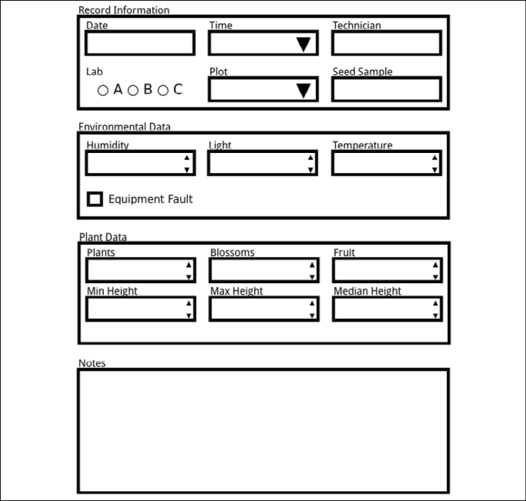
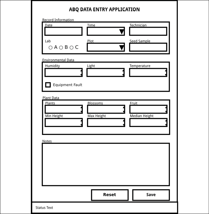
Python GUI Programming with Tkinter, Second Edition, will not only provide you with a working knowledge of the Tkinter GUI library, but also a valuable set of skills that will enable you to plan, implement, and maintain larger applications. You’ll build a full-blown data entry application from scratch, learning how to grow and improve your code in response to continually changing user and business needs. You’ll develop a practical understanding of tools and techniques used to manage this evolving codebase and go beyond the default Tkinter widget capabilities. You’ll implement version control and unit testing, separation of concerns through the MVC design pattern, and object-oriented programming to organize your code more cleanly. You’ll also gain experience with technologies often used in workplace applications, such as SQL databases, network services, and data visualization libraries. Finally, you’ll package your application for wider distribution and tackle the challenge of maintaining cross-platform compatibility.
Table of Contents (22 chapters)
19
Other Books You May Enjoy
20
Index
Appendices

Designing the application

With our specification in hand and our requirements clear, it's time to start designing our solution. The main focus of our application is the data entry form itself, so we'll begin with that GUI component.

We're going to create a basic design for our form in three steps:

  1. Determine the appropriate input widget type for each data field
  2. Group together related items to create a sense of organization
  3. Lay out our widgets within their groups

Deciding on input widgets

Without committing ourselves to a particular GUI library or widget set, we can start our form design by deciding on an appropriate input widget type for each field. Most toolkits come with the same basic types of inputs for different types of data.

We've already seen some of these in our look at Tkinter, but let's see what sort of options are likely to be available:

Widget type

Tkinter example

Used for

Line entry

Entry

Single-line strings

Number entry

Spinbox

Integer or decimal values

Select list (drop-down)

Listbox, OptionMenu

Choice between many distinct values

Check box

Checkbutton

True/false value

Radio button

Radiobutton

Choice between a few distinct values

Text entry

Text

Multi-line text entry

Date entry

(None specific)

Dates

Looking at our data dictionary, what sort of widgets should we pick out for each of our fields? Let's consider:

  • There are several decimal fields, many with clear boundary ranges, like Min Height, Max Height, Median Height, Humidity, Temperature, and Light. We'll need some kind of number entry, perhaps a Tkinter Spinbox, for these.
  • There are also some integer fields, such as Plants, Blossoms, and Fruit. Again, a number entry like the Spinbox widget is the right choice.
  • There are a couple of fields with a limited set of possible values: Time and Lab. For these we could go with radio buttons or a select list of some kind. It really depends on the number of options and how we want to lay it out: radio buttons take a lot of space with more than a few choices, but select list widgets take additional interaction and slow down a user. We'll choose a select/drop-down for the Time field, and radio buttons for the Lab field.
  • The Plot field is a tricky case. At face value, it looks like an integer field, but think about it: the plots could just as well be identified by letters, or symbols, or names. Numbers just happen to be an easy set of values with which to assign arbitrary identifiers. The Plot ID, like the Lab ID, is actually a constrained set of values; so, it would make more sense to use a select list here.
  • The Notes field is multiline text, so the Text widget is appropriate here.
  • There is one Boolean field, Fault. A check box type widget is a good choice here, especially since this value is normally false and represents an exceptional circumstance.
  • For the Date field, it would be nice to use a date entry of some sort. We don't know of one in Tkinter yet, but we'll see if we can solve that when we write our application.
  • The remaining lines are simple, one-line character fields. We'll use a text entry-type widget for those fields.

Our final analysis comes to the following:

Field

Widget type

Date

Date entry

Time

Select list

Lab

Radio buttons

Technician

Text entry

Plot

Select list

Seed Sample

Text entry

Fault

Check box

Humidity

Number entry

Light

Number entry

Temperature

Number entry

Blossoms

Number entry

Fruit

Number entry

Plants

Number entry

Max Height

Number entry

Median Height

Number entry

Min Height

Number entry

Notes

Text entry

Bear in mind, this analysis is not set in stone; it will almost certainly be revised as we receive feedback from our users, as the application's use case evolves, or as we become more familiar with the capabilities and limitations of Python and Tkinter. This is simply a starting place from which we can create an initial design.

Grouping our fields

Humans tend to get confused when staring at a huge wall of inputs in no particular order. You can do your users a big favor by breaking up the input form into sets of related fields. Of course, that assumes that your data has related sets of fields, doesn't it? Does our data have groups?

Recall some of the information we gathered during our interviews:

  • One of the employees requested separate forms for "environmental data" and "plant data"
  • The layout of the paper form has Time, Date, Lab, and Technician, all together at the top; these things help identify the data recording session

Details like this tell you a lot about how your users think about their data, and that should inform how the application presents that data.

Considering all this, you identify the following related groups:

  • The Date, Lab, Plot, Seed Sample, Technician, and Time fields are identifying data or metadata about the record itself. You could group these together under a heading calling Record Information.
  • The Blossoms, Fruit, three Height fields, and Plants fields are all measurements that have to do with the plants in the Plot field. You could group these together under the heading Plant Data.
  • The Humidity, Light, Temperature, and Equipment Fault fields are all information from the environmental sensor. You could group these as Environmental Data.
  • The Notes field could be related to anything, so it's in a category of its own.

Most GUI libraries offer a variety of ways to group sections of a form together; think of some you have seen. A few are listed in this table:

Widget type

Description

Tabs (notebook)

Allows multiple tabbed pages that the user can switch between

Frames/boxes

Draws boxes around sections of a form, sometimes with a header

Accordion

Divides a form into sections that can be hidden or expanded one at a time

Framed boxes are the simplest way to break up a GUI. In cases where there are a lot of fields, a tabbed or accordion widget can help by hiding fields the user isn't working with. However, they require additional user interaction to switch between pages or sections. You decide, after some consideration, that framed boxes with headers will be perfectly adequate for this form. There are not really enough fields to justify separate pages, and switching between them would just add more overhead to the data entry process.

Laying out the form

So far, we know that we have 17 inputs, which are grouped as follows:

  • Six fields under Record Information
  • Four fields under Environmental Data
  • Six fields under Plant Data
  • One large Notes field

We want to group the preceding inputs using some kind of box or frame with a header label. Notice that two of the first three sections have widgets in multiples of three. That suggests that we could arrange them in a grid with three items across. How should we order the fields within each group?

Ordering of fields seems like a trivial item, but for the user it can make a significant difference in usability. Users who have to jump around a form haphazardly to match their workflow are more likely to make mistakes.

As you learned, the data is entered from paper forms filled out by the lab technicians. Refer back to the screenshot of the paper form shown in Figure 2.1 in the previous section. It looks like items are mostly grouped the way our records are grouped, so we'll use the ordering on this form to order our fields. That way, data entry clerks can zip right through the form from top to bottom, left to right, without having to bounce around the screen.

Remember, user workflow is important! When designing a new application to replace some part of an existing procedure, it's crucial to respect the established workflow. While improving the status quo may require adjusting the workflow, be careful that you aren't making someone else's job harder without a good reason.

One last consideration in our design is where to place field labels in relation to the fields. There is a good deal of debate in the UI design community over the best placement of labels, but the consensus is that one of the following two options is best:

  • Labels above fields
  • Labels to the left of fields

You might try sketching out both to see which you prefer, but for this application, labels above fields will probably work better for the following reasons:

  • Since both fields and labels are rectangular in shape, our form will be more compact by stacking them
  • It's a lot easier to make the layout work, since we don't have to find a label width that works for all the labels without distancing them too far from the fields

The one exception is the check button field; check buttons are typically labeled to the right of the widget.

Take a moment to make a mockup of your form, using paper and pencil, or a drawing program if you prefer. Your form should look something like this:

Figure 2.3: The form layout

Laying out the application

With your form designed, it's time to consider the rest of the application's GUI:

  • You'll need a save button to trigger storage of the entered data.
  • It's customary to include a button to reset the form, so the user can start over if needed.
  • Sometimes, we might need to provide status information to the user. For example, we might want to let them know when a record was successfully saved, or if there is an error in a particular field. Applications typically have a status bar that displays these kinds of messages at the bottom of the window.
  • Finally, it might be good to have a header indicating what the form is.

Adding the following things to our sketch, we have something like the following screenshot:

Figure 2.4: The application layout

Looks good! Your final step is to show these designs to your users and the director for any feedback or approval. Good luck!

Keep stakeholders – your boss, users, and others who will be affected by your program – involved as much as possible in your application design process. This reduces the possibility that you'll have to go back and redesign your application later.