


-
Book Overview & Buying
-
Table Of Contents

Python Automation Cookbook - Third Edition
By :


Python Automation Cookbook
By:
Overview of this book
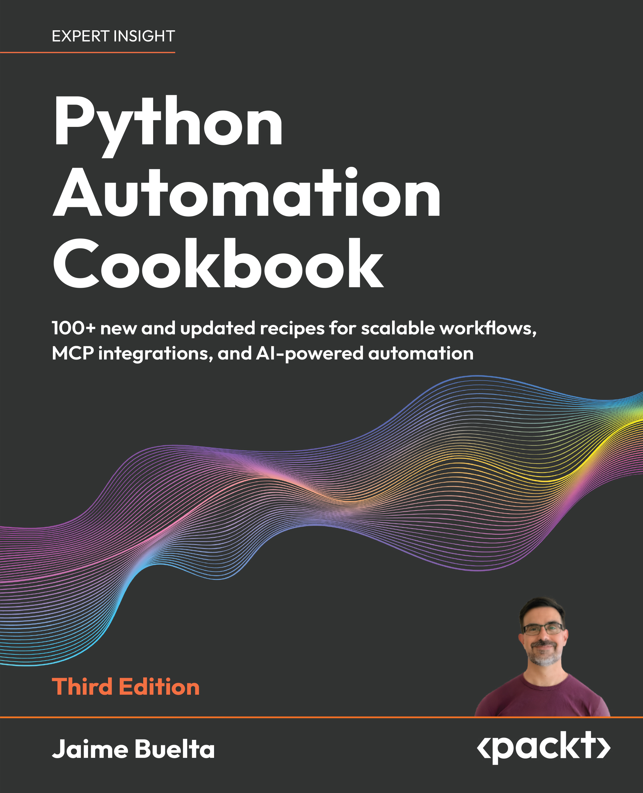
Automating repetitive tasks and integrating systems efficiently becomes increasingly complex as workflows scale. This book helps you solve that problem with practical Python recipes that guide you from foundational automation to advanced, AI-powered workflows.
You start by building a strong base in Python automation, exploring tested solutions for file handling, web scraping, APIs, testing, and system operations, and learning how to design reliable automation workflows. The cookbook approach enables you to quickly apply solutions to real problems while building a deeper understanding through hands-on practice.
This third edition expands the scope of automation by introducing AI-powered capabilities. You learn how to call AI models within your scripts, use and implement the Model Context Protocol (MCP) for system integration, and design intelligent agents that automate decision-making processes. New chapters provide real-world examples of AI agents in business automation, helping you move beyond scripts to adaptive systems. This book combines practical knowledge with modern techniques to ensure you stay current with evolving automation practices.
By the end of this book, you will be able to design, build, and extend Python automation workflows, including AI-driven solutions, to handle complex real-world tasks with confidence.
Table of Contents (20 chapters)
Preface


 Free Chapter
Chapter 1: Let's Begin Our Automation Journey
Chapter 2: Automating Tasks Made Easy
Chapter 3: Building Your First Web Scraping Application
Chapter 4: Searching and Reading Local Files
Chapter 5: Generating Fantastic Reports
Chapter 6: Fun with Spreadsheets
Chapter 7: Cleaning and Processing Data
Chapter 8: Developing Stunning Graphs

Chapter 9: Dealing with Communication Channels
Chapter 10: Why Not Automate Your Marketing Campaign?
Chapter 11: Calling AI Models
Chapter 12: Adding Tools to GenAI
Chapter 13: Building AI Agents for Business Automation
Chapter 14: Real-World AI Example
Chapter 15: Automatic Testing Routines
Chapter 16: Debugging Techniques
Chapter 17: Unlock Your Exclusive Benefits
Other Books You May Enjoy
Index


