
According to Wikipedia, a bar chart or bar graph is a chart with rectangular bars with lengths proportional to the values that they represent. The bars can be plotted vertically or horizontally. A vertical bar chart is sometimes called a column bar chart.
Before we fully jump into bar charts, it is important to have some insight into Wijmo dependencies and how to reference them in our source code.
|
Wijmo Dependency |
Download URL |
|---|---|
|
Wijmo Complete CDN (87 KB) | |
|
Wijmo Open CDN (52 KB) | |
|
jQuery 1.7.1 (minified) | |
|
jQuery UI (minified) |
http://ajax.aspnetcdn.com/ajax/jquery.ui/1.8.17/jquery-ui.min.js |
|
Wijmo complete CSS |
http://cdn.wijmo.com/jquery.wijmo-complete.all.2.0.0.min.css |
|
Wijmo theme CSS |
Having listed the requisite Wijmo dependencies, we will see how to reference them in any project and customize them further. All the latest dependencies can be found at http://wijmo.com/downloads/#wijmo-cdn.
Create an HTML file and reference the dependencies listed in the preceding table. We can achieve this by inserting the links listed in the preceding table.
<html>
    <head>
  <!--jQuery References-->
  <script src="http://ajax.aspnetcdn.com/ajax/jquery/jquery-1.7.1.min.js"
       type="text/javascript"></script>
  <script src="http://ajax.aspnetcdn.com/ajax/jquery.ui/1.8.17/jquery-ui.min.js" type="text/javascript"></script>
  <!--Wijmo Widgets JavaScript-->
  <script src="http://cdn.wijmo.com/jquery.wijmo-open.all.2.0.0.min.js"
       type="text/javascript"></script>
  <script src=http://cdn.wijmo.com/jquery.wijmo-complete.all.2.0.0.min.js"
      type="text/javascript"></script>
 <!--Theme-->
 <link href="http://cdn.wijmo.com/themes/rocket/jquery-wijmo.css" rel="stylesheet"
      type="text/css" title="rocket-jqueryui" />
 <!--Wijmo Widgets CSS-->
 <link href="http://cdn.wijmo.com/jquery.wijmo-complete.all.2.0.0.min.css"
 rel="stylesheet" type="text/css" />
    </head>
    <body></body>
</html>
The
wijbarchartobject needs a target in the HTML document to render itself to. Create adivtag within the HTML tags, with a reference ID or class forwijbarchartto render to.<div id="wijbarchart" class="ui-widget ui-widget-content ui-corner-all" style="width: 400px;height: 300px"></div>
Let us initialize the
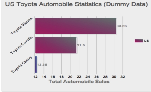
wijbarchartobject and populate it with some data. This can be achieved via the following jQuery code:<script id="scriptInit" type="text/javascript"> //wait for the page to completely load… $(document).ready(function () { $("#wijbarchart").wijbarchart({ //define the values for x and y axes… axis: { y: { text: "Total Automobile Sales (Per Hundred Thousand)" }, x: { text: "" } }, //the hint will display on hover of the chart hint: { content: function () { return this.data.label + '\n ' + this.y + ''; } }, //The chart's title or header header: { text: "US Toyota Automobile Statistics (Dummy Data)" }, //seriesList defines the label, legend and data for x and y… seriesList: [{ label: "US", legendEntry: true, data: { x: ['Toyota Camry', 'Toyota Corolla', 'Toyota Sienna'], y: [12.35, 21.50, 30.56] } }], //define the color, stroke and opacity for the chart seriesStyles: [{ fill: "#8ede43", stroke: "#7fc73c", opacity: 0.8 }], seriesHoverStyles: [{ "stroke-width": "1.5", opacity: 1 }] }); }); </script>Now we save the code and run the widget by launching the HTML file in any web browser of our choice. The
wijbarchartobject shown will be similar to the following screenshot:
There are various aspects of the wijbarchart object one might want to customize. Let us customize the appearance of the wijbarchart object by changing the color of the bars, applying some gradient to it, and specifying the opacity.
Changing the appearance of a Wijmo bar chart is easily achievable by updating the seriesStyles property as follows:
  seriesStyles: [{
                fill: "40-#BD0070-#718680", stroke: "#1261C0", opacity: 0.5
               }]
The fill property of the object in the seriesStyles array is set to the gradient value "40-#BD0070-#718680". If we run the code after replacing the previous seriesStyles value with the new one, we will have something like this:

Another useful customization is the ability to rotate labels on the axes. This will slant the labels in a specified angle of your choice. To achieve this, we would have to update the axis property of our wijbarchart object as follows:
axis: {
                y: {
                    text: "Total Automobile Sales",

                },
                x: {
                    text: "",
                    labels: {
                        style: {
                            rotation: -45
                        }
                    }
                }
            },
Applying this axis property update to our wijbarchart object and running it will render a widget similar to this:
This completes our section on creating a simple Wijmo bar chart widget. This has obviously been a simple and painless process. We set up all references or links to the requisite Wijmo files, which are available and hosted in the Wijmo CDN, as listed in the preceding table. We continued to develop the wijbarchart object by setting the various configurations required for a proper widget display, such as the axis, hint, header, seriesList, seriesStyles, and seriesHoverStyles properties.
These configurations, also known as options, are not the only ones available for creating a bar chart widget. The team at Wijmo actually did create a ton of options for user customizations; a few useful Wijmo bar chart options are listed as follows:
animation: This option handles all animation effects, such as easing and duration. All charts are animated by default. By animation, I refer to the duration for completely drawing the chart. Its default value is{enabled: true, duration: 400}.Here is an example of how to use the
animationproperty:$("#wijbarchart).wijbarchart({ animation:{ enabled:true, duration:800 }... });footer: This option designates the footer of the chart widget. Its default value is{visible:false, style:{fill:"#fff", stroke:"none"}, textStyle:{fill:"#000", stroke:"none"}, compass:"south", orientation:"horizontal"}.Here is an example of how to use the
footerproperty:$("#wijbarchart").wijbarchart({ footer: { text:"widget footer", style:{ fill:"#f1f1f1", stroke:"#010101" } } });horizontal: This option value determines whether to render a horizontal or vertical bar chart. Its default value istrue.Here is an example of how to use the
horizontalproperty:$("#wijbarchart).wijbarchart({ horizontal: true });
For more information on Wijmo bar chart options, please visit the Wijmo bar chart wiki at http://wijmo.com/wiki/index.php/Barchart.