Book Image

Mastering CSS

By : Rich Finelli
Book Image

Mastering CSS

By: Rich Finelli

Overview of this book

Rich Finelli trains you in CSS deep learning and shows you the techniques you need to work in the world of responsive, feature-rich web applications. Based on his bestselling Mastering CSS training video, you can now learn with Rich in this book! Rich shares with you his skills in creating advanced layouts, and the critical CSS insights you need for responsive web designs, fonts, transitions, animations, and using flexbox. Rich begins your CSS training with a review of CSS best practices, such as using a good text editor to automate your authoring and setting up a CSS baseline. You then move on to create a responsive layout making use of floats and stylable drop-down menus, with Rich guiding you toward a modular-organized approach to CSS. Your training with Rich Finelli then dives into detail about working with CSS and the best solutions to make your websites work. You'll go with him into CSS3 properties, transforms, transitions, and animations. You’ll gain his understanding of responsive web designs, web fonts, icon fonts, and the techniques used to support retina devices. Rich expands your knowledge of CSS so you can master one of the most valuable tools in modern web design.
Table of Contents (12 chapters)

The box model and block versus inline elements

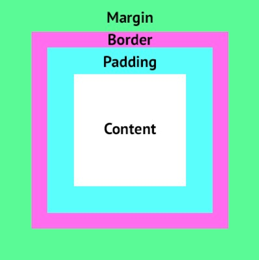
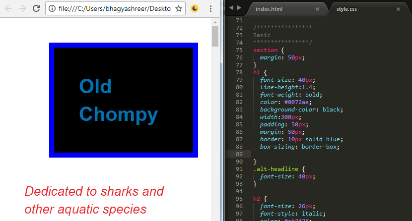
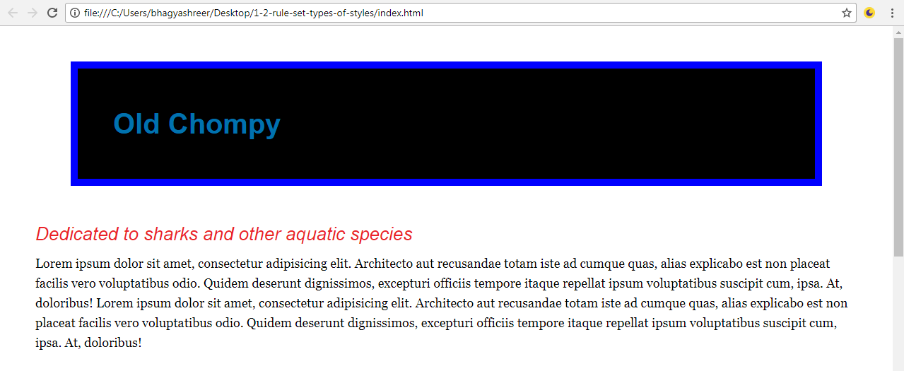
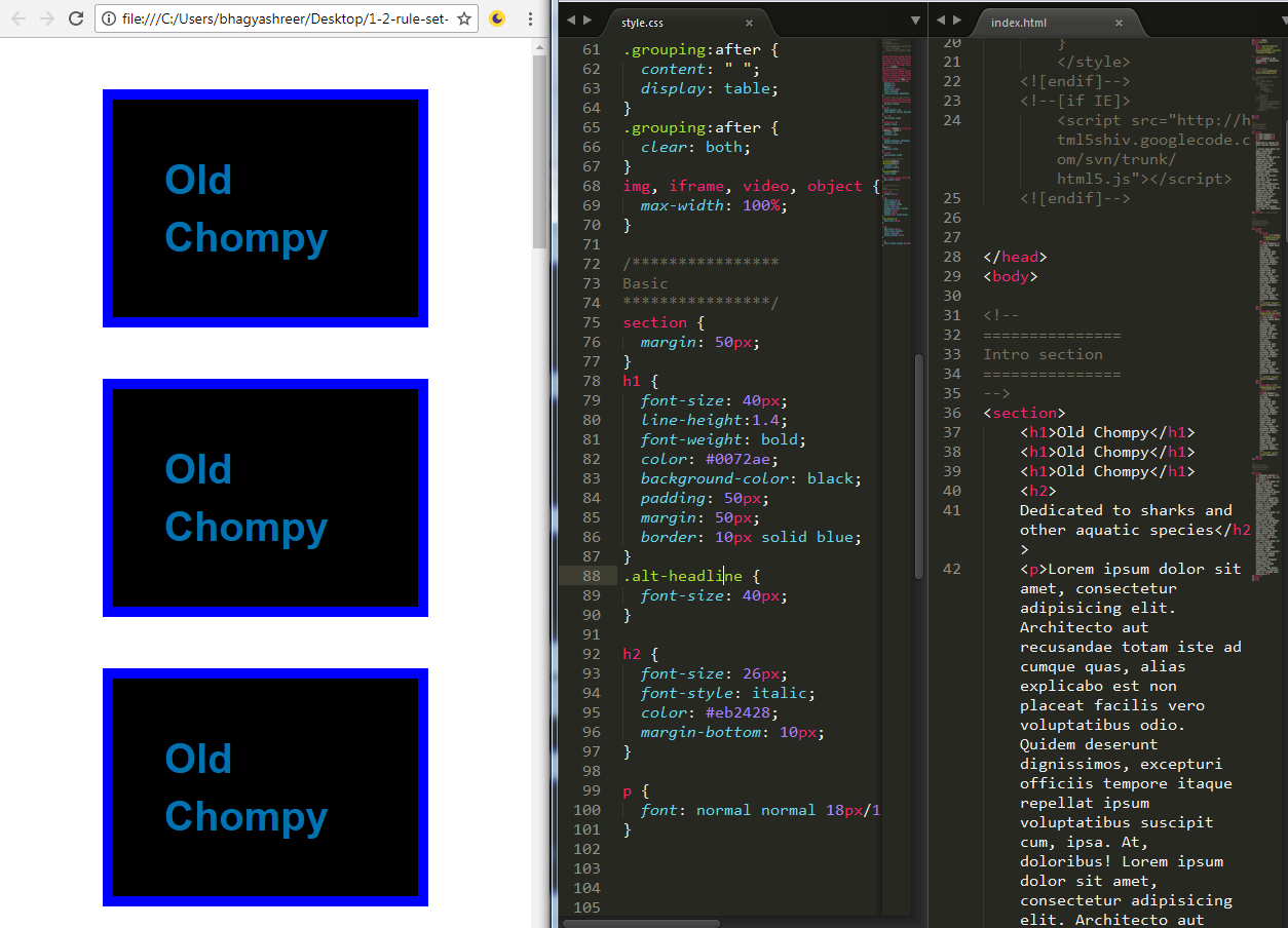
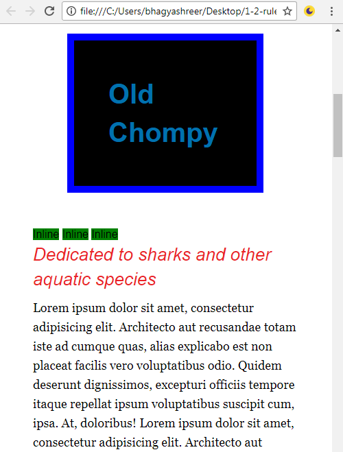
In this section, we'll review two more foundations of CSS: the box model and block versus inline elements. Fully grasping these two concepts is key in laying the ground work for CSS mastery later. First, we will review the box model and then we'll look at how that relates to block level elements. We'll follow that up with the characteristics of inline elements.

The box model

The box model defines how wide and tall elements on a page will be. To determine the horizontal space an element occupies, you add up the content + padding-left + padding-right + border-left + border-right + margin-left + margin-right:

So let's take a look at this in practice by looking at the h1 on our site, which is the blue text that says, "Old Chompy".

Here is the ruleset that makes this headline look the way it does:

h1 { 
  font-size: 40px; 
  line-height:1.4; 
  font-weight: bold; 
  color: #0072ae 
} 

Let's add in the following properties to give it a width, padding, border, and margin. As well as a noticeable background-color:

h1 { 
  font-size: 40px; 
  line-height:1.4; 
  font-weight: bold; 
  color: #0072ae 
background-color: black;
width: 300px;
padding: 50px;
border: 10px solid blue;
margin: 50px;
}

Here's what our headline looks like now. One big box:

So those 5 properties that contribute to this element's box model are now in place; looking at the browser in the preceding screenshot, this h1 really looks like a box. We can see the border of 10px, the margin, which is outside the border, is 50px, and the padding, which is between the border and the text, is 50px. Then the width inside the padding is 300px. So this element's width is actually 300 + 20 + 100 + 100, which adds up to a total size of 520px. So even though we said the width is 300px by defining the width property in our CSS file, the true space this element occupies is 520px.

Now, that is the traditional box model. I can modify this traditional box model using the box-sizing property with the border-box value. So let's use the box-sizing property and see how that affects the site. Add the property and value to the bottom of the h1 declaration block, as shown here:

h1 { 
  font-size: 40px; 
  line-height:1.4; 
  font-weight: bold; 
  color: #0072ae 
background-color: black;
width: 300px;
padding: 50px;
margin: 50px;
border: 10px solid blue;
box-sizing: border-box;
}

As illustrated in the following screenshot, border-box will include essentially subtract the padding and border from the width and height calculation. If I use 300px as my width, the border of 20px and the padding of 100px will be subtracted from the 300px I specified. This is a more intuitive box model and it is compatible with Internet Explorer 8 and higher, as well as all other major browsers. The final horizontal space this element now occupies goes from 520px to 400px.

Block level elements versus inline elements

Let's talk a little bit about block level elements. The heading 1 (h1), heading 2 (h2), paragraphs (p), list items (li), and divs (div) are all examples of natural block level elements. Block level elements have two defining traits: they expand the full width available, and they force elements that come after them to appear on the next line, meaning they stack on top of each other. So let's remove the box-sizing property from our declaration block as well as the width property to demonstrate how they take up the full width available if no width is specified:

h1 { 
  font-size: 40px; 
  line-height:1.4; 
  font-weight: bold; 
  color: #0072ae 
background-color: black;
padding: 50px;
margin: 50px;
border: 10px solid blue;
}

Save this and refresh the site. You can see in the following screenshot that, as you make your browser window larger, it takes up the full width available, apart from the margin that we set of 50px on all sides:

Now let's go into the HTML file, add two more of these h1 tags into the HTML, and save it:

<section> 
  <h1>Old Chompy</h1> 
  <h1>Old Chompy</h1> 
  <h1&gt;Old Chompy</h1> 

Here's what that looks like:

Now you can see how these block level elements stack on top of each other: good ol' block level elements.

Inline elements, on the other hand, behave differently. They sit next to each other horizontally and they don't take up the full width available. They only take up as much width as they need. A few elements that are naturally inline elements are the anchor (<a>), <span>, <i>, <b>, <strong>, and <em> tags.

Alright, so let me go into the HTML and add three span tags to the page:

<section> 
  <h1>Old Chompy</h1> 
  <h1>Old Chompy</h1> 
  <h1>Old Chompy</h1> 
  <span>Inline</span> 
  <span>Inline</span> 
  <span>Inline</span> 

What I'll also do is generally target those span elements in a rule set and give them a green background, just to kind of see that they're distinct:

span { 
  background-color: green; 
} 

Here's how that looks:

You can notice how the green inline elements sit next to each other horizontally instead of stacking vertically. Nothing special, but we can see how they do not take up the full width available, they only take as much as they need.

There are some things that inline elements do not do. They don't respond to width or margin-top or margin-bottom. So if an element is naturally inline and you give it a width and a margin-top or margin-bottom, as shown in the following code, it's going to do absolutely nothing:

span { 
background-color: green;
width: 1000px;
margin-top: 1000px;

}

Nothing changes:

Inline elements just don't respect those properties, and those properties don't have an impact on them, so we'll remove those.

There's one last interesting thing you can do. There's a display property that allows you to change a natural block level element to inline and vice versa. So let's add a display property with the block value to our span selector and view that in the browser. So, I can just say display: block and also add some margin-top:

span { 
  background-color: green; 
  display: block; 
margin-top: 10px;
}

We can see that these elements now stack on top of each other and now respect the margin-top and margin-bottom values:

Elements with the display property set to block would respect any width value I give it, but it also takes up the full width available. You can see that it extends all the way to the edge of our screen. We could've just as easily used the display: inline property on our h1 selector to change the nature of the display from block to inline. Lastly though, we can use display: none, which totally hides the element from the page and is often used for various reasons. So let's go to our h1 declaration and say display: none:

h1 { 
  font-size: 40px; 
  line-height:1.4; 
  font-weight: bold; 
  color: #0072ae; 
  background-color: black; 
  padding: 50px; 
  margin: 50px; 
  border: 10px solid blue; 
  display: none; 
} 

Now, if we look at our site, that h1 is invisible. It's no longer something that the browser is going to show us:

To sum up, all elements conform to a box model. The box model changes a little depending on how the box-sizing property is used, if used at all. Also, the box model changes based on whether the element is block or inline, the two most common display properties.