

Creating the race standings app
The home page of the app is going to immediately provide our users with a quick way to see both race results and driver standings. Other kinds of information, such as upcoming races or a potential settings page, should be placed on other pages.
This is what the app looks like on the web, desktop, or any other device with a large horizontal viewport:
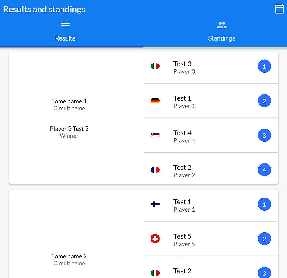
Figure 2.1 – The app’s home page on a device with a large horizontal viewport
Having everything on a single screen would make the UI too dense because there would be too much information for the user to see. Tabs are great when it comes to splitting contents into multiple pages and they’re also very easy to handle – it’s just a matter of swiping!
On mobile devices, or smaller screen sizes, the home page looks like this:
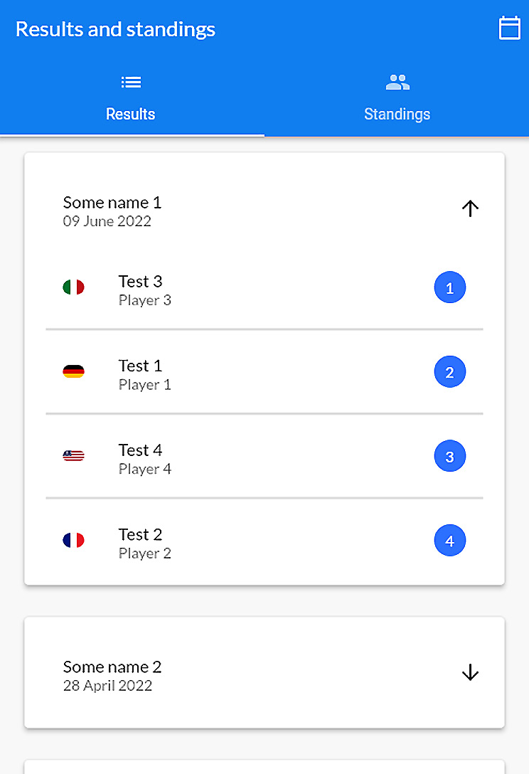
Figure 2.2 – The app’s home page on smaller devices
As you can see, since there is less horizontal space, we need to rearrange the contents so that it fits with less space. Laying down contents on two columns would take too much space, so we’ve decided to create a sort of dropdown menu. The black arrow slides up and down to show or hide contents. The app has two main pages:
- The
HomePagewidget, where we show the results of the past races and the current drivers’ standings. - The
NextRaceswidget, where we show a brief list of the upcoming races.
Now, let’s start creating the HomePage widget!
The HomePage widget
The home page is going to have two main tabs to display core information. This already gives us a pretty important hint regarding what we need to do: we need to create two widgets to hold the contents of each tab and we want them to be constant.
The following is the build() method for the HomePage widget:
@override
  Widget build(BuildContext context) {
    return DefaultTabController(
      length: 2,
      child: Scaffold(
        appBar: AppBar(
          title: Text(context.l10n.app_title),
          elevation: 5,
          bottom: TabBar(
            tabs: [
              Tab(
                icon: const Icon(Icons.list),
                text: context.l10n.results,
              ),
              Tab(
                icon: const Icon(Icons.group),
                text: context.l10n.standings,
              ),
            ],
          ),
        ),
        body: const TabBarView(
          children: [
            ResultsTab(),
            StandingsTab(),
          ],
        ),
      ),
    );
  }
Thanks to widget composition, we can use const TabBarView because both children have a constant constructor. Now, let’s learn how to build the ResultsTab and StandingsTab widgets.
The results tab
This page is responsive because it dynamically rearranges its contents to best fit the current horizontal and vertical viewport constraints. In other words, this widget lays out the contents in different ways based on the different screen sizes, thanks to LayoutBuilder:
return LayoutBuilder(
  builder: (context, dimensions) {
    // Small devices
    if (dimensions.maxWidth <= mobileResultsBreakpoint) {
      return ListView.builder(
        itemCount: resultsList.length,
        itemBuilder: (context, index) =>
          _CompactResultCard(
          results: resultsList[index],
        ),
      );
    }
    // Larger devices
    return Padding(
      padding: const EdgeInsets.symmetric(
        vertical: 20,
      ),
      child: ListView.builder(
        itemCount: resultsList.length,
        itemBuilder: (context, index) =>
          _ExpandedResultCard(
          results: resultsList[index],
        ),
      ),
    );
  },
);
Here, the mobileResultsBreakpoint constant has been put in lib/utils/breakpoints.dart. We are gathering all of our responsive breakpoint constants into a single file to simplify both maintenance and testing. Thanks to LayoutBuilder, we can retrieve the viewport dimensions and decide which widget we want to return.
The ExpandedResultCard widget is meant to be displayed or larger screens, so we can safely assume that there is enough horizontal space to lay down contents in two columns. Let’s learn how to do this:
Card(
  elevation: 5,
  child: Row(
    children: [
      // Race details
      Expanded(
        flex: leftFlex,
        child: Column(
          mainAxisSize: MainAxisSize.min,
          children: [ … ],
        ),
      ),
      // Drivers final positions
      Expanded(
        flex: 3,
        child: DriversList(
          results: results,
        ),
      ),
    ],
  ),
),
To make this widget even more responsive, we can also control the relative widths of the columns. We’re still using LayoutBuilder to decide on the flex of the Expanded widget to ensure that the content fits the space in the best possible way:
return LayoutBuilder(
  builder: (context, dimensions) {
    var cardWidth = max<double>(
      mobileResultsBreakpoint,
      dimensions.maxWidth,
    );
    if (cardWidth >= maxStretchResultCards - 50) {
      cardWidth = maxStretchResultCards;
    }
    final leftFlex =
      cardWidth < maxStretchResultCards ? 2 : 3;
    return Center(
      child: SizedBox(
        width: cardWidth - 50,
        child: Card( ... ),
      ),
    );
);
Here, we compute the overall width of the surrounding Card and then determine the widths of the columns by computing the flex value.
The _CompactResultCard widget is meant to be displayed on smaller screens, so we need to arrange the widgets along the vertical axis using a single column. To do this, we must create a simple widget called Collapsible that has a short header and holds the contents on a body that slides up and down:
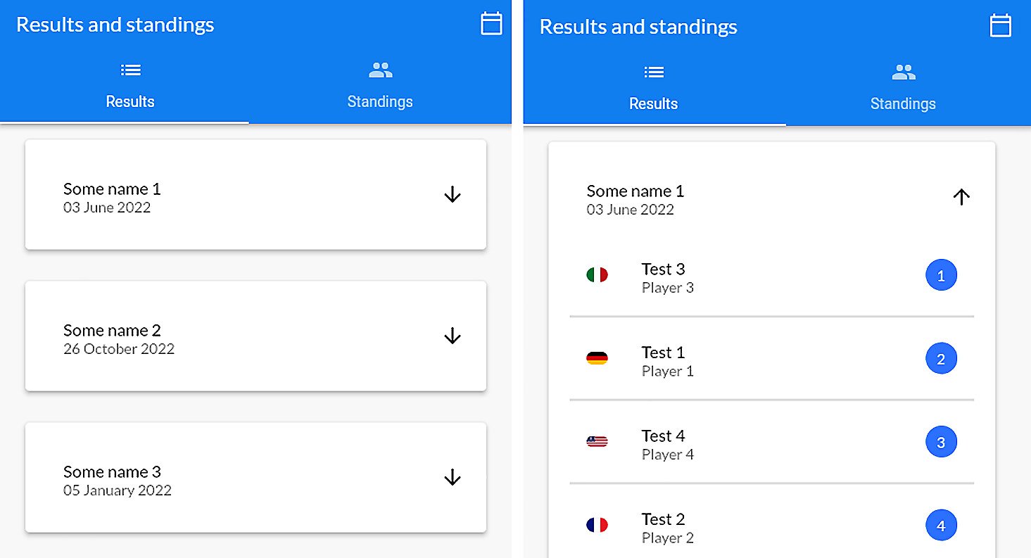
Figure 2.3 – On the left, the content is hidden; on the right, the content is visible
This approach is very visually effective because, considering there isn’t much horizontal space available, we immediately show the most important information. Then, if the user wants to know more, they can tap the arrow to reveal additional (but still important) information. First, we store the open/closed state of the card in an inherited widget:
/// Handles the state of a [Collapsible] widget.
class CollapsibleState extends InheritedWidget {
  /// The state of the [Collapsible] widget.
  final ValueNotifier<bool> state;
  /// Creates a [CollapsibleState] inherited widget.
  const CollapsibleState({
    Key? key,
    required this.state,
    required Widget child,
  }) : super(key: key, child: child);
  /// Conventional static access of the instance above the
  /// tree.
  static CollapsibleState of(BuildContext context) {
    return context.dependOnInheritedWidgetOfExactType<
      CollapsibleState>()!;
  }
  @override
  bool updateShouldNotify(CollapsibleState oldWidget) =>
      state != oldWidget.state;
}
Then, we use the SizeTransition widget to make the contents underneath appear and disappear with a sliding transition. The animation is driven by ValueListenableBuilder:
return ValueListenableBuilder<bool>(
  valueListenable: CollapsibleState.of(context).state,
  builder: (context, value, child) {
    if (!value) {
      controller.reverse();
    } else {
      controller.forward();
    }
    return child!;
  },
  child: Padding(
    padding: widget.edgeInsets,
    child: Column(
      mainAxisSize: MainAxisSize.min,
      crossAxisAlignment: CrossAxisAlignment.start,
      children: regions,
    ),
  ),
);
We use the child parameter to ensure that the builder won’t unnecessarily rebuild Column over and over. We only need to make sure that reverse() or forward() is called whenever the boolean’s state is changed.
Since both _CompactResultCard and _ExpandedResultCard need to display a date, we have created a mixin for the state class to be able to easily share a common formatting method:
/// A date generator utility.
mixin RandomDateGenerator on Widget {
  /// Creates a random date in 2022 and formats it as 'dd
  /// MMMM y'.
  /// For more info on the format, check the [Intl]
  /// package.
  String get randomDate {
    final random = Random();
    final month = random.nextInt(12) + 1;
    final day = random.nextInt(27) + 1;
    return DateFormat('dd MMMM y').format(
      DateTime(2022, month, day + 1),
    );
  }
}
The DateFormat class is included in the intl package, and it can automatically translate the date string into various languages. In this case, the 'dd MMMM y' combination prints the day in double digits, the name of the month with a capital letter, and the year in 4-digit format.
Tip
You can format the date in many ways – you just need to change the tokens in the string. We won’t cover them all here because there are thousands of possible combinations; if you do want to know more, we recommend that you look at the documentation: https://pub.dev/documentation/intl/latest/intl/DateFormat-class.html.
Now, let’s create the drivers’ standings tab.
The drivers’ standings tab
Even though this page contains a simple list of people and their country flags and scores, there are still some considerations to make. The first one is that we don’t want to always use the entirety of the viewport’s width, like this:
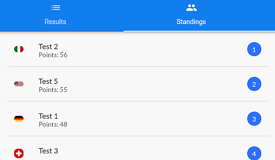
Figure 2.4 – Example of bad space management in the drivers list
The user may have trouble gathering all of the information at first glance because there is too much space between the important UI parts. We need to make sure that the content can shrink to fit smaller sizes, but we don’t want to always use the entire available width.
As shown in the preceding screenshot, always using the entire horizontal viewport may lead to bad user experiences. To avoid this, we’re going to set up a breakpoint that limits how the list can grow in the horizontal axis:
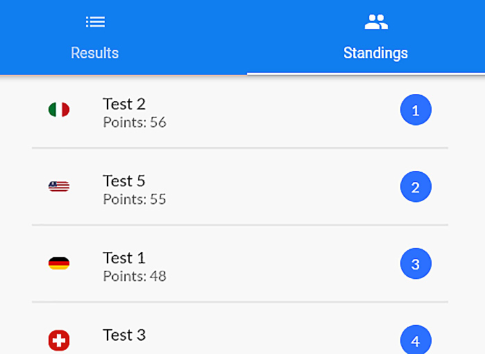
Figure 2.5 – Example of good space management in the drivers list
Here, we’ve created a new breakpoint called maxStretchStandingsCards that imposes horizontal bounds to the list so that it doesn’t grow too much. This is how the standings list is being built:
ListView.separated(
  shrinkWrap: true,
  itemCount: standingsList.length,
  itemBuilder: (context, index) {
    final item = standingsList[index];
    return ListTile(
      title: Text(item.name),
      subtitle: Text('${context.l10n.points}:
        ${item.points}'),
      leading: Column( ... ),
      trailing: NumberIndicator( ... ),
    );
  },
  separatorBuilder: (_, __) {
    return const Divider(
      thickness: 1,
      height: 10,
    );
  }
),
The official Flutter documentation states that both ListView.builder() and ListView.separated() are very efficient builders when you have a fixed, long list of children to paint. They build children on demand because the builder is only called on visible widgets.
We could have achieved the same result by wrapping a Column in a scrollable widget, but it wouldn’t be as efficient as using lazy builders, as we did in the previous code block. For example, we don’t suggest that you do this with fixed-length lists:
SingleChildScrollView(
  child: Column(
    children: [
      for (item in itemsList)
        item,
    ],
  ),
)
The Column widget always renders all of its children, even if they’re out of the currently visible viewport. If the user doesn’t scroll the column, the widgets that aren’t in the viewport would still be rendered, even if they never appeared on the screen. This is why we suggest that you use list builders rather than columns when you have a long list of widgets to render.
Another point we want to touch on is using SVG and PNG files for images. We’ve been using both and we recommend that you do too because vectorial images are not always a good choice.
Vectorial images guarantee that you keep the quality high on scaling, and probably have a smaller file size than a PNG, but they may be very complicated to parse. PNGs may not scale very well but they’re quick to load and, when compressed, they can be really small. Here are some suggestions:
- Always compress the SVG and PNG files you use to make sure they occupy the least possible amount of memory.
- When you see that the SVG file is big and takes a few seconds to load, consider using a PNG image instead.
- When you know that the image is going to scale a lot and the width/height ratio may now linearly change, consider using vectorial images instead.
In this project, we have used PNG images for country flags since they’re small, and we aren’t resizing them.
For our vectorial assets, we’ve used a popular and well-tested package called flutter_svg that makes managing vectorial assets very easy. For example, here’s how we load an SVG file in the project:
SvgPicture.asset(
  'assets/svg/trophy.svg',
  width: square / 1.8,
  height: square / 1.8,
  placeholderBuilder: (_) => const Center(
    child: CircularProgressIndicator(),
  ),
),
We can dynamically define its dimensions with width and height and also use placeholderBuilder to show a progress indicator in case the file vectorial was expensive to parse.
Now, let’s create the NextRaces widget.
The NextRaces widget
While showing the upcoming races of the championship is still part of the app, this isn’t its primary focus. The user can still check this data but it’s optional, so let’s create a new route to hide it on a separated page. So that we don’t have a static list with a few colors on it, we want to split the page into two main pieces:
- At the top, we want to show how many races there are left in the championship. To make it visually attractive, we’ve used an image and a fancy circular progress indicator.
- At the bottom, we have the list of upcoming races.
The page is simple, but it only shows data about the upcoming races and nothing more. We haven’t filled the UI with distracting background animations, low-contrast colors, or widgets that are too complex.
Tip
Always try to strive for a good balance between providing the necessary content and making the app as simple as possible. Having too many animations, images, or content on a page might be distracting. However, at the same time, a UI that is too minimal may not impress the user and give the feeling of a poorly designed app.
Here’s what the Next races UI is going to look like:
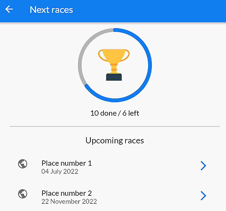
Figure 2.6 – The app’s Next races page
At the top, you can see a trophy surrounded by something similar to CircularProgressIndicator. Flutter doesn’t have a widget that allows us to achieve that exact result and nor do we have an easy way to build it. We may start with a Stack but then the rail and the progress bar may be difficult to render with common widgets.
In this case, we want to create a specific widget with particular constraints and shapes that’s not built in the Flutter framework. All of these hints lead us in a single direction: custom painters! Once again, we’re making the sizes responsive by dynamically calculating the width and height using the square variable:
LayoutBuilder(
  builder: (context, dimensions) {
    final square = min<double>(
      maxCircularProgress,
      dimensions.maxWidth,
    );
    return Center(
      child: CustomPaint(
        painter: const CircularProgressPainter(
          progression: 0.65,
        ),
        child: SizedBox(
          width: square,
          height: square,
          child: Center(
            child: SvgPicture.asset(
              'assets/svg/trophy.svg',
            ),
          ),
        ),
      ),
    );
  }
);
Thanks to CustomPaint, we can normally render a child and additionally paint some custom graphics in the background using the painter parameter. In the same way, we could have painted the same circular progress indicator in the foreground using foregroundPainter.
Custom painters aren’t the easiest thing to use but they give you a lot of power. You’re given a Canvas object where you can paint everything: lines, Bézier curves, shapes, images, and more. Here’s how we’ve created the painter for the circular progress indicator:
/// A circular progress indicator with a grey rail and a
/// blue line.
class CircularProgressPainter extends CustomPainter {
  /// The progression status.
  final double progression;
  /// Creates a [CircularProgressPainter] painter.
  const CircularProgressPainter({
    required this.progression,
  });
  @override
  void paint(Canvas canvas, Size size) {
    // painting the arcs...
  }
  @override
  bool shouldRepaint(covariant CircularProgressPainter old)
  {
    return progression != old.progression;
  }
}
We need to extend CustomPainter and override two very important methods:
shouldRepaint: This method tells the custom painter when it should repaint the contents. If you have no external dependencies, this method can safely justreturn false. In our case, if the progression changes, we need to also change the arc span, so we need to check whetherprogression != old.progression.paint: This method provides aCanvas, along with its dimensions. It’s responsible for painting the content to the UI.
Here’s how we have implemented paint to draw the arcs:
// The background rail
final railPaint = Paint()
  ..color = Colors.grey.withAlpha(150)
  ..strokeCap = StrokeCap.round
  ..style = PaintingStyle.stroke
  ..strokeWidth = 8;
// The arc itself
final arcPaint = Paint()
  ..color = Colors.blue
  ..strokeCap = StrokeCap.round
  ..style = PaintingStyle.stroke
  ..strokeWidth = 8;
// Drawing the rail
final center = size.width / 2;
canvas.drawArc(
  Rect.fromCircle(
    center: Offset(center, center),
    radius: center,
  ),
  -pi / 2,
  pi * 2,
  false,
  railPaint,
);
// Drawing the arc
canvas.drawArc(
  Rect.fromCircle(
    center: Offset(center, center),
    radius: center,
  ),
  -pi / 2,
  pi * 2 * progression,
  false,
  arcPaint,
);
The Paint class defines the properties (thickness, color, border fill style, and more) of the lines or shapes we’re going to paint, while the Canvas class contains a series of methods for drawing various things on the UI, such as the following:
drawLinedrawCircledrawImagedrawOvaldrawRectclipPath
And much more! Some mathematical skills are required here because we need to compute the arc length of the progress bar based on the progression percentage. The background track is just a full arc, so it’s easy to paint. On the other hand, the swipe of the progress bar needs to start from the top (-pi / 2) and be as wide as the percentage allows (pi * 2 * progression).
We’ve done it! The app now has two main pages: the first one shows rankings and standings, while the other one is about the upcoming races in the championship.