-
Book Overview & Buying
-
Table Of Contents

Graph Machine Learning
By :
Graph Machine Learning
By:
Overview of this book
Graph Machine Learning will introduce you to a set of tools used for processing network data and leveraging the power of the relation between entities that can be used for predictive, modeling, and analytics tasks. The first chapters will introduce you to graph theory and graph machine learning, as well as the scope of their potential use. You’ll then learn all you need to know about the main machine learning models for graph representation learning: their purpose, how they work, and how they can be implemented in a wide range of supervised and unsupervised learning applications. You'll build a complete machine learning pipeline, including data processing, model training, and prediction in order to exploit the full potential of graph data. After covering the basics, you’ll be taken through real-world scenarios such as extracting data from social networks, text analytics, and natural language processing (NLP) using graphs and financial transaction systems on graphs. You’ll also learn how to build and scale out data-driven applications for graph analytics to store, query, and process network information, and explore the latest trends on graphs. By the end of this machine learning book, you will have learned essential concepts of graph theory and all the algorithms and techniques used to build successful machine learning applications.
Table of Contents (15 chapters)
Preface

Section 1 – Introduction to Graph Machine Learning
 Free Chapter
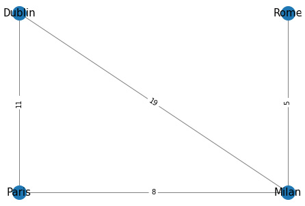
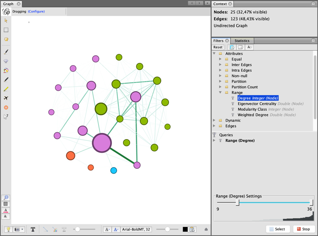
Chapter 1: Getting Started with Graphs
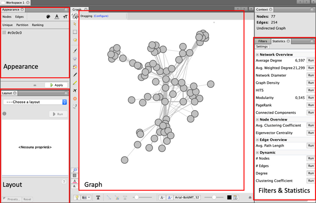
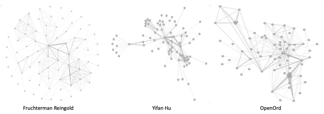
Chapter 2: Graph Machine Learning
Section 2 – Machine Learning on Graphs
Chapter 3: Unsupervised Graph Learning
Chapter 4: Supervised Graph Learning
Chapter 5: Problems with Machine Learning on Graphs
Section 3 – Advanced Applications of Graph Machine Learning
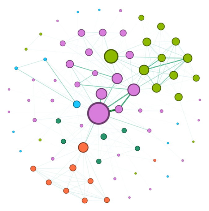
Chapter 6: Social Network Graphs
Chapter 7: Text Analytics and Natural Language Processing Using Graphs
Chapter 8:Graph Analysis for Credit Card Transactions
Chapter 9: Building a Data-Driven Graph-Powered Application
Chapter 10: Novel Trends on Graphs