
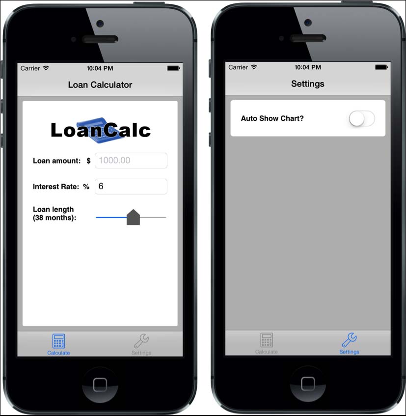
Sliders and switches are two UI components that are simple to implement and can bring that extra level of interactivity into your apps. Switches, as the name suggests, have only two states—on and off—which are represented by boolean values (true and false).
Sliders, on the other hand, take two float values—a minimum value and a maximum value—and allow the user to select any number between and including these two values. In addition to its default styling, the slider API also allows you to use images for both sides of the track and the slider thumb image that runs along it. This allows you to create some truly customized designs.
We are going to add a switch to indicate an on/off state and a slider to hold the loan length, with values ranging from a minimum of 6 months to a maximum of 72 months. Also, we'll add some event handlers to capture the changed value from each component, and in the case of the slider, we will update an existing label with the new slider value. Don't worry if you aren't yet 100 percent sure about how event handlers work, as we'll cover them in further detail in Chapter 6, Getting to Grips With Properties and Events.
If you're following with the LoanCalc app, the next code should replace the code in your window2.js file. We'll also add a label to identify what the switch component does and a view component to hold it all together:
//create an instance of a window
module.exports = (function(){
var win = Ti.UI.createWindow({
  backgroundColor: '#BBB',
  title: 'Settings'
});

//create the view, this will hold all of our UI controls
var view = Ti.UI.createView({
  width: 300,
  height: 70,
  left: 10,
  top: 10,
  backgroundColor: '#fff',
  borderRadius: 5
});

//create a label to identify the switch control to the user
var labelSwitch = Ti.UI.createLabel({
    width: Ti.UI.SIZE,
    height: 30,
    top: 20,
    left: 20,
    font: {fontSize: 14, fontFamily: 'Helvetica',
          fontWeight: 'bold'},
    text: 'Auto Show Chart?'
});
view.add(labelSwitch);

//create the switch object
var switchChartOption = Ti.UI.createSwitch({
  right: 20,
  top: 20,
  value: false
});
view.add(switchChartOption);


win.add(view);

return win;
})();
Now let's write the slider code; go back to your app.js file and type the following code underneath the interestRateRow.add(tfInterestRate); line:
//create the slider to change the loan length
var lengthSlider = Ti.UI.createSlider({
  width: 140,
  top: 200,
  right: 20,
  min: 12,
  max: 60,
  value: numberMonths,
  thumbImage: 'sliderThumb.png',
  highlightedThumbImage: 'sliderThumbSelected.png'
});

lengthSlider.addEventListener('change', function(e){
  //output the value to the console for debug
   console.log(lengthSlider.value);
   //update our numberMonths variable
  numberMonths = Math.round(lengthSlider.value);
   //update label
  labelLoanLength.text = 'Loan length (' + Math.round(numberMonths) + ' months):';
});

loanLengthRow.add(lengthSlider);In this recipe, we added two new components to two separate views within two separate windows. The first component—a switch—is fairly straightforward, and apart from the standard layout and positioning properties, it takes one main boolean value to determine its on or off status. It also has only one event, change, which is executed whenever the switch changes from the on to off position or vice versa.
On the Android platform, the switch can be altered to appear as a toggle button (default) or a checkbox. Additionally, Android users can display a text label using the title property, which can be changed programmatically by using the titleOff and titleOn properties.
The slider component is more interesting and has many more properties than a Switch. sliders are useful for instances where we want to allow the user to choose between a range of values; in this case, it is a numeric range of months from 12 to 60. This is a much more effective method of choosing a number from a range than listing all the possible options in a picker, and is much safer than letting a user enter possibly invalid values via a textfield or textarea component.
Pretty much all of the slider can be styled using the default properties available in the Titanium API, including thumbImage and highlightedThumbImage, as we did in this recipe. The highlightedThumbImage property allows you to specify the image that is used when the slider is being selected and used, allowing you to have a default and an active state.