
The quest for a standards-based approach to responsive images is underway. However, no solution has yet been adopted, nor has any consistent approach been implemented by browser vendors. For that reason, the best current techniques rely on server-side or client-side solutions.
Smashing Magazine has recently published a good article named Choosing a Responsive Image Solution, by Sherri Alexander, summarizing some leading current options. You can review the article at http://mobile.smashingmagazine.com/2013/07/08/choosing-a-responsive-image-solution/.
In this and other reviews, Scott Jehl's Picturefill technique consistently emerges as a leading contender. This is because the Picturefill solution admirably addresses problems of both performance and design. And it does so rather elegantly.
The approach requires just a few steps, as follows:
Prepare optimal images for your targeted viewports.
Download and include the Picturefill JavaScript.
Employ the Picturefill markup pattern for your images.
As always, there are two additional steps to any development process, as follows:
Test
Adjust as required
Let's walk through the steps together.
If you look in the exercise files for this appendix, I've provided a set of specially sized and optimized images in the img folder. You'll see these named with a –sm.jpg suffix.
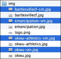
If you view these images, you'll see that they are cropped narrower and have a somewhat taller aspect ratio, filling more vertical space on a narrow viewport as shown in the following image:

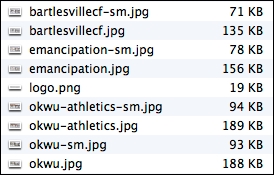
The images are also smaller. They measure 900 x 600px, still enough to provide decent pixel density to a retina screen, but much less than the original 1600 x 800px images. And the smaller images average approximately 50 percent of the file size.
Note the comparatively smaller file sizes of the images ending with –sm.jpg in the following screenshot:
With our images ready and in place, it's time to grab the JavaScript.
The Picturefill files and documentation are hosted at GitHub at https://github.com/scottjehl/picturefill.
Take a few minutes to read the documentation. We'll soon be using elements recommended there. For now, we need to grab the JavaScript and include it in our project files. So, perform the following steps:
At the Picturefill GitHub repository, download the files or click through them and find the
picturefill.jsfile.Copy the code, including the opening comment. We need to copy it to our
plugins.jsfile.In our project files, open
js/plugins.jsand paste the Picturefill code either before or after the code for our other plugins.Save. (And of course, remember to minify and compress
plugins.jsbefore going to production.)
Now, let's implement the Picturefill markup structure.
In index.html, we'll update the markup for each image using Picturefill's pattern of nested span elements. We'll structure it to provide the smaller images by default, except for browsers with viewports 640px wide or larger and Internet Explorer 8.
The following is the markup pattern for the structure, as implemented for the first image:
<span data-picture data-alt="OKWU Homepage">
  <span data-src="img/okwu-sm.jpg"></span>
  <span data-src="img/okwu.jpg" data-media="(min-width: 640px)"></span>
  <!--[if (lt IE 9) & (!IEMobile)]>
    <span data-src="img/okwu.jpg"></span>
  <![endif]-->
  <noscript>
    <img src="img/okwu.jpg" alt="OKWU Athletics Homepage">
  </noscript>
</span>
Let me give you a quick overview of how the preceding code works:
The top-level
spantag identifies the entire element as a responsive image using thedata-pictureattribute.The
data-altattribute provides thealttext for the image.The initial
<span data-src ...>tag specifies the default image to be used for smaller devices.The
data-mediaattribute allows us to specify under what conditions the larger version of the image is to be used. In our case, we've specifiedmin-width: 640pxso that window screens wider than 640px will load the larger image.The conditional comment ensures that Internet Explorer 8, which does not support media queries, receives the larger image size, as it should.
The
no-scriptelement provides a standard image tag that will be used only in cases where a browser is not running JavaScript.
For further insight, review the documentation found at https://github.com/scottjehl/picturefill.
Now, be sure to update the markup for the other three images using the same pattern.
If you save and test, you may notice that the carousel images no longer adjust to fit the width of the carousel. This is because the Picturefill markup pattern throws off the selectors used in Bootstrap's carousel styles.
We need to update one selector group in the _carousel.less file to ensure our images adapt to their available space, as follows:
Open
_carousel.less.Search for the following section of code. Replace the
> imgand> a > imgchild selectors with a simple descendantimgselector so that it will successfully select the images that are now nested deeper in our Picturefill markup:// Account for jankitude on images // > img, // commented out // > a > img // commented out img { // added to apply to PictureFill responsive image solution .img-responsive(); line-height: 1; min-width: 100%; // added height: auto; // added }
That should take care of it!