Now that we've been introduced to RWD, it's important to understand some of the elements that make up the philosophy of what we know as flexible design. A key part of this is understanding the viewport or visible screen estate available to us; in addition to viewports, we must also consider flexible media, responsive text and grids, and media queries. We will cover each in more detail later in the book, but to start with, let's take a quick overview of the elements that make up RWD.
A key part of RWD is working with the viewport or visible content area on a device. If we're working with desktops, then it is usually the resolution; this is not the case for mobile devices.
There is a temptation to reach for JavaScript (or a library such as jQuery) to set values such as viewport width or height, but there is no need, as we can do this using CSS:
<meta name="viewport" content="width=device-width">
or using this directive:
<meta name="viewport" content="width=device-width, initial-scale=1">
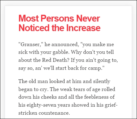
This means that the browser should render the width of the page to the same width as the browser window—if for example the latter is 480px, then the width of the page will be 480px. To see what a difference that not setting a viewport can have, take a look at this example screenshot:

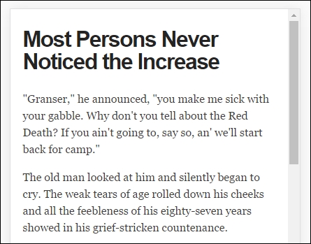
This example was created from displaying some text in Chrome, in iPhone 6 Plus emulation mode, but without a viewport. Now, let's view the same text, but this time with a viewport directive set:

Even though this is a simple example, do you notice any difference? Yes, the title color has changed, but more importantly the width of our display has increased. This is all part of setting a viewport—browsers frequently assume we want to view content as if we're on a desktop PC. If we don't tell it that the viewport area has been shrunk in size (and that we have not set the scaling correctly), it will try to shoehorn all of the content into a smaller size. This will result in a page that will appear to be zoomed out, which doesn't work very well!
It's critical, therefore, that we set the right viewport for our design, and that we allow it to scale up or down in size, irrespective of the device. We will explore this in more detail, in Chapter 2, Creating Fluid Layouts.
When designing responsive sites, we can either create our own layout or use a grid system already created for use, such as Bootstrap. The key here though is ensuring that the mechanics of our layout sizes and spacing are set according to the content we want to display for our users, and that when the browser is resized in width, it realigns itself correctly.
For many developers, the standard unit of measure has been pixel values; a key part of responsive design is to make the switch to using percentage and em (or preferably rem) units. The latter scales better than standard pixels, although there is a certain leap of faith needed to get accustomed to working with the replacements!
Two key parts of our layout are of course images and text—the former though can give designers a bit of a headache, as it is not enough to simply use large images and set overflow—hidden to hide the parts that are not visible!
Images in a responsive site must be as flexible as the grid used to host them—for some, this may be a big issue if the site is very content heavy; now is a good time to consider if some of that content is no longer needed, and can be removed from the site. We can of course simply apply display: none to any image which shouldn't be displayed, according to the viewport set. However, this isn't a good idea though, as content still has to be downloaded before styles can be applied; it means we're downloading more than is necessary! Instead, we should assess the level of content, make sure it is fully optimized and then apply percentage values so it can be resized automatically to a suitable size when the browser viewport changes.
With content and media in place, we must turn our attention to media queries—there is a temptation to create queries that suit specific devices, but this can become a maintenance headache.
We can avoid the headache by designing queries based on where the content breaks rather than for specific devices—the trick to this is to start small and gradually enhance the experience, with the use of media queries:
<link rel="stylesheet" media="(max-device-width: 320px)" href="mobile.css" />
<link rel="stylesheet" media="(min-width: 1600px)" href="widescreen.css" />
We should aim for around 75 characters per line, to maintain an optimal length for our content.


