Using CSS3 for styling your HTML
In web design, you will use HTML to describe the structure of your documents and the CSS language to describe their presentation, including fonts, colors, and layout. The current standard HTML5 and CSS3 versions work on most modern browsers and mobile devices. CSS3 extends the old CSS with new selectors, text effects, background gradients, and animations. The power of CSS3, its new functionalities, and high acceptance on mobile devices using HTML5 and CSS3, makes it the standard for modern web design. The combination of HTML5 and CSS3 is ideal for building responsive websites because of their high acceptance on mobile phones and other devices.
Together, HTML5 and CSS3 introduce many new features. In this book, you will be shown and taught about the concepts of the most significant ones.
Using the CSS selectors to style your HTML
With Less (and CSS), you can style your HTML code using selectors. The CSS selectors are patterns or names that identify which HTML elements of the web page should be styled. The CSS selectors play an important role in writing the Less code.
For body p.article {color:red}, the selector here is body p.article. Selectors don't refer exclusively to one element. They can point to more than one element and different ones can refer to the same element. For instance, a single p selector refers to all the p elements, including the p elements with a .article class. In case of conflicts, cascade and specificity determine the styles that should be applied. When writing the Less code, we should keep the aforementioned rules in mind. Less makes it easier to write complex CSS without changing how your website looks. It doesn't introduce any limitations on your final CSS. With Less, you can edit well-structured code instead of changing the effect of the final CSS.
CSS3 introduces many new and handy selectors. One of them is :nth-child(n), which makes it possible to style, for example, every fourth paragraph's p tag in an HTML document. The CSS code for the preceding description will look as follows:
Tip
Downloading the example code
You can download the example code files from your account at http://www.packtpub.com for all the Packt Publishing books you have purchased. If you purchased this book elsewhere, you can visit http://www.packtpub.com/support and register to have the files e-mailed directly to you.
Such selectors add powerful functions to CSS3. Nowadays, we are able to perform operations with CSS alone. However, in the past, we needed JavaScript or hardcoded styles (or classes at the very least). Less helps you organize and maintain these new selectors well and this is one of the reasons to learn it. Powerful selectors make CSS more important, but the CSS code also becomes cumbersome and difficult to maintain. Less will prevent this problem in CSS, even making complex code flexible and easy to maintain.
Specificity, inheritance, and cascade in CSS
In most cases, many CSS styles can be applied on the same HTML element, but only one declaration for each individual property will win. The properties of an element may come from declarations in different rules. The W3C specifications describe the rules for which CSS styles will get the most precedence and will ultimately be applied. You can find these specifications in the next section.
The rules regarding the order of importance have not significantly changed with CSS3. They are briefly mentioned to help you understand some of the common pitfalls with Less/CSS and how to solve them. Sooner or later, you will be in a situation where you're trying to apply a CSS style to an element, but its effect stays invisible. You will reload, pull out your hair, and check for typos again and again, but nothing will help. This is because in most of these cases, your style will be overruled by another style that has a higher precedence.
The global rules for cascade in CSS are as follows:
- Find all the CSS declarations that apply to the element and property in question
- Inline styles have the highest precedence, except for
!important.The !important statement in CSS is a keyword used to add weight to a declaration. The !important statement is added at the end of a CSS property value. After this, check who set the declaration; styles set by the author get a higher precedence than the styles defined by the user or browser (default). Author styles are defined by CSS in the web page; user styles are set by the user via the settings of his or her web browser; and default styles are set by the web browsers. The importance of the user is higher than the default, and the code with the !important statement (refer to Chapter 2, Using Variables and Mixins, for its meaning in Less) will always get the highest precedence.
Note that browsers such as Firefox have options to disable pages in order to use other alternatives to user-defined fonts. Here, the user settings overrule CSS of the web page. This way of overruling the page settings is not part of the CSS precedence unless they are set using !important.
- Calculate the specificity, which is discussed in the next section.
- If two or more rules have the same precedence and specificity, the one declared last wins.
As a Less/CSS designer, you will be making use of the calculated CSS specificity in most cases.
How CSS specificity works
Every CSS declaration gets a specificity, which will be calculated from the type of declaration and the selectors used in its declaration. Inline styles will always get the highest specificity and will always be applied (unless overwritten by the first two cascade rules). In practice, you should not use inline styles in many cases as it will break the DRY principle. It will also disable you from changing your styles only on a centralized location and will prevent you from using Less for styling.
An example of an inline style declaration is shown as follows:
After this, the number of IDs in the selector will be the next indicator to calculate specificity. The #footer #leftcolumn {} selector has two IDs, the #footer {} selector has one ID, and so on.
Note
Note that in this case, an ID is a unique selector starting with #. The [id=] selector for the same HTML element counts as an attribute. This means that div#unique {} has one ID and div[id="unique"] {} has zero IDs and one attribute.
If the number of IDs for two declarations is equal, the number of classes, pseudo classes, and attributes of the selector will be of importance. Classes start with a dot. For example, .row is a class. Pseudo classes, such as :hover and :after, start with a colon, and attributes, of course, are href, alt, id, and so on.
The #footer a.alert:hover {} selector scores two (one class and one pseudo class) and the #footer div.right a.alert:hover {} selector scores three (two classes and one pseudo class).
If this value is equal for both declarations, we can start counting the elements and pseudo elements. The pseudo elements are defined with a double colon (::) and allow authors to refer to otherwise inaccessible information, such as ::first-letter. The following example shows you how this works.
The #footer div a{} selector scores two (two elements) and the #footer div p a {} selector scores three (three elements).
You should now know what to do when your style isn't directly applied. In most cases, make your selector more specific to get your style applied. For instance, if #header p{} doesn't work, you can try adding a #header #subheader p{} ID, a #header p.head{} class, and so on.
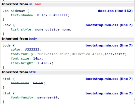
When the cascade and !important rules do not give a conclusive answer, specificity calculation seems to be a difficult and time-consuming job. Although Less won't help you here, tools such as Firebug (and other developer tools) can make the specificity visible. An example using Firebug is shown in the following screenshot, where the selector with the highest specificity is displayed at the top of the screen and the overruled styles are struck out:
Building your layouts with flexible boxes
The
flexbox layout (also called flexible boxes) is a new feature of CSS3. It is extremely useful in creating responsive and flexible layouts. Flexbox provides the ability to dynamically change the layout for different screen resolutions. It does not use floats and contains margins that do not collapse with their content. The latest versions of all major browsers, except from Opera mini, now support the flexbox layouts. Unfortunately, this support is not provided by many older browsers. Information about browser support can also be found at http://caniuse.com/#feat=flexbox.
We will focus on flexbox, due to its power. Also, as it is an important feature of CSS, we can also produce and maintain it using Less. You can access a set of Less mixins for CSS3 flexbox at https://gist.github.com/bassjobsen/8068034. You can use these mixins to create the flexbox layouts with Less, without using duplicate code.
These mixins will not be explained in great detail right now, but the following example shows how Less reduces the code needed to create a flex container. Using CSS, you might use the following code:
The preceding example uses the .flex-display (); mixin to set the vendor prefixes for the flex value of the display property. In the Vendor-specific rules section, you will learn more about vendor prefixes and the Less autoprefix plugin. The Less autoprefix plugin makes it unnecessary to use vendor prefixes in your Less code. You can find the Less autoprefix plugin at https://github.com/less/less-plugin-autoprefix. Also, the .flex-display(); mixin becomes unnecessary. Some ancient browsers use an older syntax for the flexbox layout, autoprefixing does not fix old syntaxes and polyfills.
The flexbox grid is a grid system based on the flex display property. This grid system can be used with the Bootstrap grid as a fall back for older browsers. The Less code to build the flexbox grid can be found at https://github.com/bassjobsen/flexboxgrid and the official website of the flexbox grid is http://flexboxgrid.com/.
Flexboxes have been mentioned because they have the potential to play an important role in the future of web design. In Chapter 5, Integrating Less in Your Own Projects, you can read about the flexboxgrid.com and flexible.gs grid systems, which are built with flexboxes. However, this book will mainly focus on creating responsive and flexible layouts with Less using the CSS media queries and the float property.


 Free Chapter


