The box-sizing property is the one that sets the CSS-box model used for calculating the dimensions of an element. In fact, box-sizing is not new in CSS, but nonetheless, switching your code to box-sizing: border-box will make your work a lot easier. When using the border-box settings, calculation of the width of an element includes border width and padding. So, changing the border of padding won't break your layouts. You can find a copy of the code used in this section in boxsizing.html from the download files.
Nowadays, most web designs use a grid. Grids split your design into columns of equal size. This helps you make things clear and build responsive interfaces. Depending on the available screen size (or width), you can show your content and navigation with a different representation of the same columns.
To handle different screen sizes, some parts of your website will have fluid width or height. Other elements, such as borders, gutters, and the white space, should have a fixed width. The combination of fluid widths as a percentage of the screen width (or viewport) with fixed widths becomes complex. This complexity will be due to the fact that browsers use different calculations for padding and margins of elements.
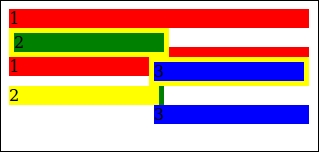
In order for you to see this, look at the following example. A container of 5300 pixels width has been created. Inside this container, you can add two rows and split the second row into two parts of 50 percent or half of its width.
The output will now look like the following screenshot:
The current structure doesn't show a problem until you add some padding, which is used to construct some space or a border between the two columns in the second row (numbers, 2 and 3, in the screenshot of the HTML wrapper). The padding and the border will break our layout as follows:
Finally, the output of this code should look like the following screenshot:
A similar action can be performed, except that the wrappers can be wrapped inside an extra wrapper. The box-sizing: border-box; declaration can then be applied to this. Now, the results should look like the following screenshot:
As you can see, the padding and borders are subtracted by 50 percent from the parent. This will make the calculation a lot easier. Of course, you can do the calculating yourself, once the parent container wrapper has a fixed width. If the parent has 300 pixels, 50 percent of this will be 150 pixels. Taking away the padding and the width of the border will give you the fixed size of a column. This won't work when your parent has a fluid width (the percentage of the viewport). Fluid layouts change their width with the width of the screen. If your screen becomes smaller, all the elements become smaller too and the percentage stays equal. You will quickly realize that doing calculations for all the possible screen sizes to find the real size of a column that allows all of your elements to align, is a long, challenging, and arduous process.
For these reasons, you should make use of box-sizing: border-box; for all the examples in this book. Note that box-sizing also has to be defined by vendor-specific rules, as follows:
In this example, the Less code will be as follows:
Note
Note that the .box-sizing mixin will become obsolete when you compile your Less code with the Less autoprefix plugin.
With autoprefixing, your Less code can be reduced to the following code:
Tip
The preceding code has been added into a separate file called boxsizing.less. From now on, the basics of our Less files will contain the following code:
In the next chapters, you will learn more about organizing your Less code into files.


 Free Chapter


