
You might have created an application with all the required functionalities. It may even work perfectly without any issues in all scenarios. But the success of your application depends on how well your users can access it. Your application should look good (if not great) and be user-friendly in order for it to be a success.
In this chapter, you are going to learn about the following topics:
- Role of HTML and CSS in the ASP.NET Core application
- Characteristics of front-end frameworks and different frameworks available
- Bootstrap and its grid system along its features
- CSS classes available in Bootstrap for form elements such as input and select elements
- CSS classes for different types of HTML elements such as table
- Using Bootstrap in your ASP.NET Core application
Before discussing how to make our application look good, let us take a step back and discuss the roles that HTML and CSS play in your application.
As mentioned earlier, all browsers can only understand HTML, CSS, and JavaScript. So, the applications that you build should produce output as HTML, CSS, and JavaScript. This holds true for web applications built using other technologies such as Java or Ruby on Rails. Having said that, we will only discuss HTML and CSS.
HTML (Hyper Text Markup Language) is used to structure the content in your web pages. For example, you can add content in a title tag so that it will be available in a browser's tab or window. Let us see an example.
Open any text editor (you can even use Notepad), type the following HTML content and the save file as Bootstrap.html. Please note the extension .html:
<!DOCTYPE html>
<html>
<head>
    <title> Beautify your ASP.NET MVC applications using Bootstrap </title>
</head>
<body>
    <h1> Bootstrap </h1>
    <p>
        Bootstrap is the most popular HTML, CSS, and JS framework for developing responsive, mobile first projects on the web.
    </p>
</body>
</html>
The first line tells that the HTML content follows HTML 5 standards (the latest and the current version of HTML) and should be interpreted as such. The html tag tells the browser it is the start of an HTML document. Information in the head tag represents metadata and tells the browser to the web page rather than the web page itself. Examples include the page title, description about the page, and keywords for the search engine optimization. All the contents of the body tag will be shown in the browser's main window. In the preceding HTML code, we have made Bootstrap the heading and the rest of the content has been made as a paragraph.
Open the file in the browser and you should see something like the following screenshot:
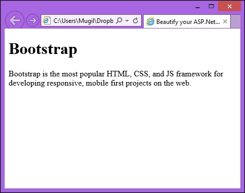
You will notice the content placed in the title tag shown as the browser's tab title, the heading content is made bold and bigger in size, and the paragraph starts on a new line.
CSS is all about styling. You can use CSS to customize how each of the elements in your web page looks. You can change the color of the button, the font of the heading text, the border size of a table, and so on. You can include CSS styles either inline or using a separate file. If you are using inline CSS, it should be within a style tag. If you are using external CSS, we can make use of a link tag and refer to the external CSS file.
CSS is nothing but a set of rules used for the presentation. Each rule consists of two parts—a selector for which a declaration has to be applied and a declaration containing the styling information. The styling information has a property and a value for the property.
Let us take the following simple CSS rule:
    h1{
        color : #0094ff;
    }
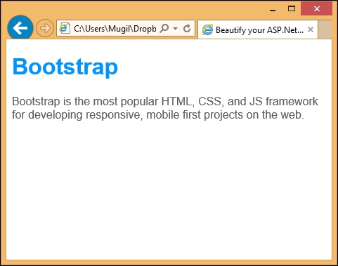
This CSS rule states that all the heading text should be in a blue color. h1 is the selector, which tells the browser the following declaration has to be applied for all h1 tags. In the declaration, we are setting the blue color (#0094ff is blue in hexadecimal format).
The following is the updated HTML file where I've updated the CSS styles (highlighted in bold):
<!DOCTYPE html>
<html>
<head>
    <title> Beautify your ASP.NET MVC applications using Bootstrap </title>
    <style type="text/css">

        body{
            font-family:Arial,Verdana,sans-serif;
        }

        h1{
            color : #0094ff;
        }

        p {
            color: #5f5e5e;
        }
    </style>

</head>
<body>
    <h1> Bootstrap </h1>
    <p>
        Bootstrap is the most popular HTML, CSS, and JS framework for developing responsive, mobile first projects on the web.
    </p>
</body>
</html>
When you open the file in a browser after making the style changes, you will get the following output:
Having said that, you need to create CSS rules to make the elements in your web application look good. But creating different styles for each element is a time-consuming and tedious task. You can choose from any of the frontend frameworks available.
Any application should have the following characteristics:
- Consistency: The elements and the controls that are being used by your application should be familiar to the user. For example, if you use a drop-down list, the user should be able to select only one value from it.
- Responsive: The application that you build should look good across all devices of different sizes. The code that you write should adapt to the screen size of the device of your users.
- Mobile-friendly: This is related to the preceding point. These days, many applications being accessed from mobile devices rather than desktops or laptops. We have to make sure that the application that we build will look great on mobile devices.
- Customizable: If you are going to use any front-end application framework, it should be customizable according to your needs. For example, if you want to update the heading text color, you should be able to update or override the CSS file to make the necessary changes.
- Easy to get started: The learning curve for learning your front-end framework should be minimal as you should be spending time on delivering value to the customer—building and delivering the solution. We are not getting paid to learn a new fancy front-end framework.
There are few front-end frameworks available such as Bootstrap, Foundation, and PureCSS. In this chapter, we are going to use the Bootstrap framework as it is the most widely used front-end framework.
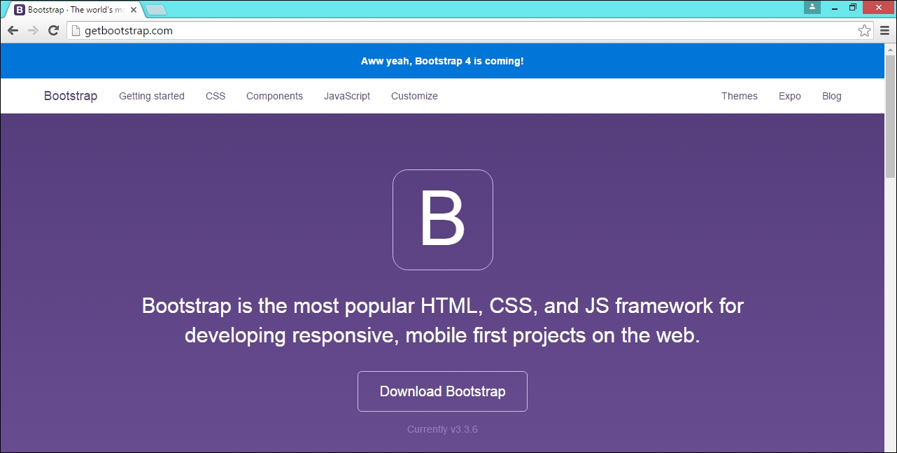
Bootstrap is the most popular HTML, CSS, and JS framework for developing responsive, mobile-first projects on the web and you can access it at http://getbootstrap.com/ .
Bootstrap has many features that meet the various needs of a web application. It has different CSS classes for each of the HTML elements so that you can use it without touching any CSS code. However, if you wish to override it, you can do so.
Let us look at each of the features of Bootstrap in brief.
The grid system in Bootstrap helps you to create a responsive layout for your application. This feature makes your application look great in all devices of different shapes including mobile devices.
Bootstrap provides a fluid grid system, which scales up to twelve columns as the device or viewport size increases. You can think of grid system as being like columns in an Excel sheet (like the one in the following screenshot):
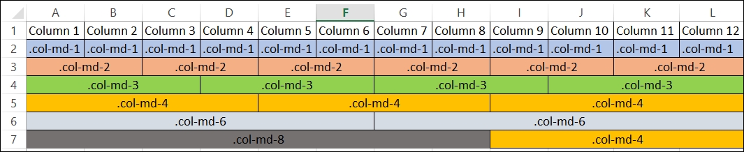
We can combine multiple columns to create a wider column. In the second row in the preceding screenshot, we have used a single column (using class .col-md-1) twelve times. In the third row, we are using a CSS class (.col-md-2) to create six wider columns instead of twelve shorter columns. Likewise, we are creating a lesser number of wider columns.
All form controls receive global styling when you use Bootstrap in your application. The following is one such example (the screenshot is taken from the Bootstrap site):
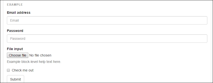
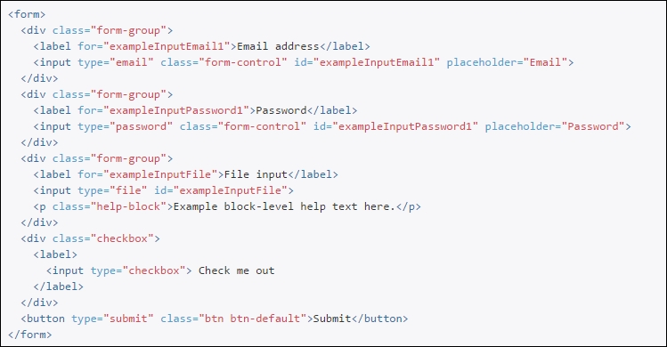
The following is the code for the preceding form. Related HTML elements are grouped together in the form. For example, the labels for the Email and Email address input text boxes are grouped together. The same is the case for Password and File input.
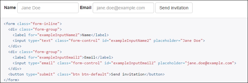
Inline forms are forms where all the form elements are on the same line (as shown in the following screenshot). We need to add the class form-inline to the form element.
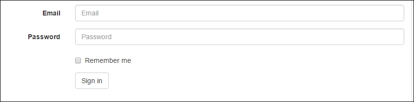
In horizontal forms, we have each element group on a separate line; Email label, Email input on a line and Password label, Password input on a line (as shown in the following screenshot):
To apply the horizontal form styling, we just need to add the class form-horizontal as in the following code. Just like other forms, we need to group the related HTML elements together by applying the CSS class form-group:
For basic styling, add the base CSS class table to the table HTML element as shown in the following screenshot:
In a striped table, the background of alternate rows will be of the same color. In the following screenshot, the background color of the first row and third row are the same color. You can apply the table-striped class to apply the striped table behavior to the table HTML element.
When you move your mouse over any of the rows in the table, the background color of the row is changed. This hover behavior can be achieved by applying the CSS class table-hover along with the class table to the HTML table element.
We can have a bordered table (as in the following screenshot), if we apply the CSS class table-bordered to the table element.
There are times when you want to highlight rows based on the data value. For example, if you are showing inventory data in tabular format, you might want to highlight the rows with a red background color for the items whose count is less than the stipulated count. In this case, you can apply a danger class to table rows to highlight them in a red color. There are different types of contextual class available for highlighting in different colors. You can apply these classes to individual cells instead of the complete rows.
There are different styling options available for making buttons appear in different colors. For all the buttons, the base button class btn has to be applied:
The btn-primary button class is used to highlight the button in blue whereas the btn-success button class highlights the button in green. In the preceding screenshot, different options for styling the button are shown.
Based on the context, you might want to change the color of the text. For example, you might want to make the text appear in green if the previous operation is successful. For an unsuccessful operation, you might want to show the error message in a red. In such scenarios, you might use this helper CSS classes to show them in different colors.
We have seen various features of Bootstrap. Now, let us use Bootstrap to make our application look good. Basically, we have two major components in our view—a form at the top to get the input from the user and a table at the bottom to display the results in a table.
Bootstrap Grid system
The grid system in Bootstrap helps you to create a responsive layout for your application. This feature makes your application look great in all devices of different shapes including mobile devices.
Bootstrap provides a fluid grid system, which scales up to twelve columns as the device or viewport size increases. You can think of grid system as being like columns in an Excel sheet (like the one in the following screenshot):
We can combine multiple columns to create a wider column. In the second row in the preceding screenshot, we have used a single column (using class .col-md-1) twelve times. In the third row, we are using a CSS class (.col-md-2) to create six wider columns instead of twelve shorter columns. Likewise, we are creating a lesser number of wider columns.
All form controls receive global styling when you use Bootstrap in your application. The following is one such example (the screenshot is taken from the Bootstrap site):
The following is the code for the preceding form. Related HTML elements are grouped together in the form. For example, the labels for the Email and Email address input text boxes are grouped together. The same is the case for Password and File input.
Inline forms are forms where all the form elements are on the same line (as shown in the following screenshot). We need to add the class form-inline to the form element.
In horizontal forms, we have each element group on a separate line; Email label, Email input on a line and Password label, Password input on a line (as shown in the following screenshot):
To apply the horizontal form styling, we just need to add the class form-horizontal as in the following code. Just like other forms, we need to group the related HTML elements together by applying the CSS class form-group:
For basic styling, add the base CSS class table to the table HTML element as shown in the following screenshot:
In a striped table, the background of alternate rows will be of the same color. In the following screenshot, the background color of the first row and third row are the same color. You can apply the table-striped class to apply the striped table behavior to the table HTML element.
When you move your mouse over any of the rows in the table, the background color of the row is changed. This hover behavior can be achieved by applying the CSS class table-hover along with the class table to the HTML table element.
We can have a bordered table (as in the following screenshot), if we apply the CSS class table-bordered to the table element.
There are times when you want to highlight rows based on the data value. For example, if you are showing inventory data in tabular format, you might want to highlight the rows with a red background color for the items whose count is less than the stipulated count. In this case, you can apply a danger class to table rows to highlight them in a red color. There are different types of contextual class available for highlighting in different colors. You can apply these classes to individual cells instead of the complete rows.
There are different styling options available for making buttons appear in different colors. For all the buttons, the base button class btn has to be applied:
The btn-primary button class is used to highlight the button in blue whereas the btn-success button class highlights the button in green. In the preceding screenshot, different options for styling the button are shown.
Based on the context, you might want to change the color of the text. For example, you might want to make the text appear in green if the previous operation is successful. For an unsuccessful operation, you might want to show the error message in a red. In such scenarios, you might use this helper CSS classes to show them in different colors.
We have seen various features of Bootstrap. Now, let us use Bootstrap to make our application look good. Basically, we have two major components in our view—a form at the top to get the input from the user and a table at the bottom to display the results in a table.
Forms
All form controls receive global styling when you use Bootstrap in your application. The following is one such example (the screenshot is taken from the Bootstrap site):
The following is the code for the preceding form. Related HTML elements are grouped together in the form. For example, the labels for the Email and Email address input text boxes are grouped together. The same is the case for Password and File input.
Inline forms are forms where all the form elements are on the same line (as shown in the following screenshot). We need to add the class form-inline to the form element.
In horizontal forms, we have each element group on a separate line; Email label, Email input on a line and Password label, Password input on a line (as shown in the following screenshot):
To apply the horizontal form styling, we just need to add the class form-horizontal as in the following code. Just like other forms, we need to group the related HTML elements together by applying the CSS class form-group:
For basic styling, add the base CSS class table to the table HTML element as shown in the following screenshot:
In a striped table, the background of alternate rows will be of the same color. In the following screenshot, the background color of the first row and third row are the same color. You can apply the table-striped class to apply the striped table behavior to the table HTML element.
When you move your mouse over any of the rows in the table, the background color of the row is changed. This hover behavior can be achieved by applying the CSS class table-hover along with the class table to the HTML table element.
We can have a bordered table (as in the following screenshot), if we apply the CSS class table-bordered to the table element.
There are times when you want to highlight rows based on the data value. For example, if you are showing inventory data in tabular format, you might want to highlight the rows with a red background color for the items whose count is less than the stipulated count. In this case, you can apply a danger class to table rows to highlight them in a red color. There are different types of contextual class available for highlighting in different colors. You can apply these classes to individual cells instead of the complete rows.
There are different styling options available for making buttons appear in different colors. For all the buttons, the base button class btn has to be applied:
The btn-primary button class is used to highlight the button in blue whereas the btn-success button class highlights the button in green. In the preceding screenshot, different options for styling the button are shown.
Based on the context, you might want to change the color of the text. For example, you might want to make the text appear in green if the previous operation is successful. For an unsuccessful operation, you might want to show the error message in a red. In such scenarios, you might use this helper CSS classes to show them in different colors.
We have seen various features of Bootstrap. Now, let us use Bootstrap to make our application look good. Basically, we have two major components in our view—a form at the top to get the input from the user and a table at the bottom to display the results in a table.
Inline forms
Inline forms are forms where all the form elements are on the same line (as shown in the following screenshot). We need to add the class form-inline to the form element.
In horizontal forms, we have each element group on a separate line; Email label, Email input on a line and Password label, Password input on a line (as shown in the following screenshot):
To apply the horizontal form styling, we just need to add the class form-horizontal as in the following code. Just like other forms, we need to group the related HTML elements together by applying the CSS class form-group:
For basic styling, add the base CSS class table to the table HTML element as shown in the following screenshot:
In a striped table, the background of alternate rows will be of the same color. In the following screenshot, the background color of the first row and third row are the same color. You can apply the table-striped class to apply the striped table behavior to the table HTML element.
When you move your mouse over any of the rows in the table, the background color of the row is changed. This hover behavior can be achieved by applying the CSS class table-hover along with the class table to the HTML table element.
We can have a bordered table (as in the following screenshot), if we apply the CSS class table-bordered to the table element.
There are times when you want to highlight rows based on the data value. For example, if you are showing inventory data in tabular format, you might want to highlight the rows with a red background color for the items whose count is less than the stipulated count. In this case, you can apply a danger class to table rows to highlight them in a red color. There are different types of contextual class available for highlighting in different colors. You can apply these classes to individual cells instead of the complete rows.
There are different styling options available for making buttons appear in different colors. For all the buttons, the base button class btn has to be applied:
The btn-primary button class is used to highlight the button in blue whereas the btn-success button class highlights the button in green. In the preceding screenshot, different options for styling the button are shown.
Based on the context, you might want to change the color of the text. For example, you might want to make the text appear in green if the previous operation is successful. For an unsuccessful operation, you might want to show the error message in a red. In such scenarios, you might use this helper CSS classes to show them in different colors.
We have seen various features of Bootstrap. Now, let us use Bootstrap to make our application look good. Basically, we have two major components in our view—a form at the top to get the input from the user and a table at the bottom to display the results in a table.
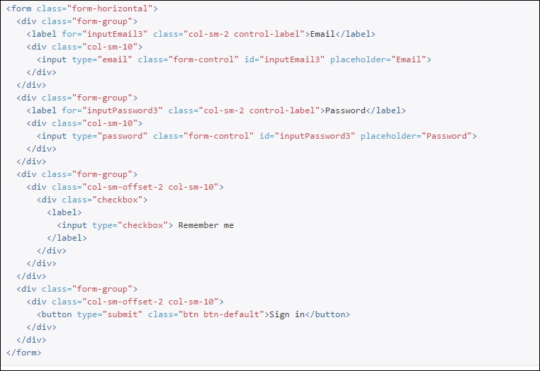
Horizontal forms
In horizontal forms, we have each element group on a separate line; Email label, Email input on a line and Password label, Password input on a line (as shown in the following screenshot):
To apply the horizontal form styling, we just need to add the class form-horizontal as in the following code. Just like other forms, we need to group the related HTML elements together by applying the CSS class form-group:
For basic styling, add the base CSS class table to the table HTML element as shown in the following screenshot:
In a striped table, the background of alternate rows will be of the same color. In the following screenshot, the background color of the first row and third row are the same color. You can apply the table-striped class to apply the striped table behavior to the table HTML element.
When you move your mouse over any of the rows in the table, the background color of the row is changed. This hover behavior can be achieved by applying the CSS class table-hover along with the class table to the HTML table element.
We can have a bordered table (as in the following screenshot), if we apply the CSS class table-bordered to the table element.
There are times when you want to highlight rows based on the data value. For example, if you are showing inventory data in tabular format, you might want to highlight the rows with a red background color for the items whose count is less than the stipulated count. In this case, you can apply a danger class to table rows to highlight them in a red color. There are different types of contextual class available for highlighting in different colors. You can apply these classes to individual cells instead of the complete rows.
There are different styling options available for making buttons appear in different colors. For all the buttons, the base button class btn has to be applied:
The btn-primary button class is used to highlight the button in blue whereas the btn-success button class highlights the button in green. In the preceding screenshot, different options for styling the button are shown.
Based on the context, you might want to change the color of the text. For example, you might want to make the text appear in green if the previous operation is successful. For an unsuccessful operation, you might want to show the error message in a red. In such scenarios, you might use this helper CSS classes to show them in different colors.
We have seen various features of Bootstrap. Now, let us use Bootstrap to make our application look good. Basically, we have two major components in our view—a form at the top to get the input from the user and a table at the bottom to display the results in a table.
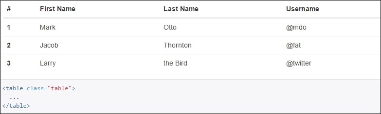
Table CSS classes
For basic styling, add the base CSS class table to the table HTML element as shown in the following screenshot:
In a striped table, the background of alternate rows will be of the same color. In the following screenshot, the background color of the first row and third row are the same color. You can apply the table-striped class to apply the striped table behavior to the table HTML element.
When you move your mouse over any of the rows in the table, the background color of the row is changed. This hover behavior can be achieved by applying the CSS class table-hover along with the class table to the HTML table element.
We can have a bordered table (as in the following screenshot), if we apply the CSS class table-bordered to the table element.
There are times when you want to highlight rows based on the data value. For example, if you are showing inventory data in tabular format, you might want to highlight the rows with a red background color for the items whose count is less than the stipulated count. In this case, you can apply a danger class to table rows to highlight them in a red color. There are different types of contextual class available for highlighting in different colors. You can apply these classes to individual cells instead of the complete rows.
There are different styling options available for making buttons appear in different colors. For all the buttons, the base button class btn has to be applied:
The btn-primary button class is used to highlight the button in blue whereas the btn-success button class highlights the button in green. In the preceding screenshot, different options for styling the button are shown.
Based on the context, you might want to change the color of the text. For example, you might want to make the text appear in green if the previous operation is successful. For an unsuccessful operation, you might want to show the error message in a red. In such scenarios, you might use this helper CSS classes to show them in different colors.
We have seen various features of Bootstrap. Now, let us use Bootstrap to make our application look good. Basically, we have two major components in our view—a form at the top to get the input from the user and a table at the bottom to display the results in a table.
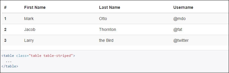
Striped tables
In a striped table, the background of alternate rows will be of the same color. In the following screenshot, the background color of the first row and third row are the same color. You can apply the table-striped class to apply the striped table behavior to the table HTML element.
When you move your mouse over any of the rows in the table, the background color of the row is changed. This hover behavior can be achieved by applying the CSS class table-hover along with the class table to the HTML table element.
We can have a bordered table (as in the following screenshot), if we apply the CSS class table-bordered to the table element.
There are times when you want to highlight rows based on the data value. For example, if you are showing inventory data in tabular format, you might want to highlight the rows with a red background color for the items whose count is less than the stipulated count. In this case, you can apply a danger class to table rows to highlight them in a red color. There are different types of contextual class available for highlighting in different colors. You can apply these classes to individual cells instead of the complete rows.
There are different styling options available for making buttons appear in different colors. For all the buttons, the base button class btn has to be applied:
The btn-primary button class is used to highlight the button in blue whereas the btn-success button class highlights the button in green. In the preceding screenshot, different options for styling the button are shown.
Based on the context, you might want to change the color of the text. For example, you might want to make the text appear in green if the previous operation is successful. For an unsuccessful operation, you might want to show the error message in a red. In such scenarios, you might use this helper CSS classes to show them in different colors.
We have seen various features of Bootstrap. Now, let us use Bootstrap to make our application look good. Basically, we have two major components in our view—a form at the top to get the input from the user and a table at the bottom to display the results in a table.
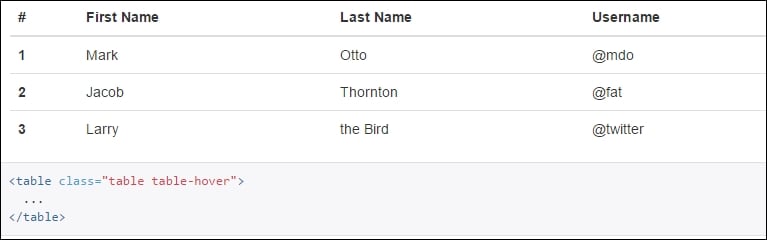
Hover tables
When you move your mouse over any of the rows in the table, the background color of the row is changed. This hover behavior can be achieved by applying the CSS class table-hover along with the class table to the HTML table element.
We can have a bordered table (as in the following screenshot), if we apply the CSS class table-bordered to the table element.
There are times when you want to highlight rows based on the data value. For example, if you are showing inventory data in tabular format, you might want to highlight the rows with a red background color for the items whose count is less than the stipulated count. In this case, you can apply a danger class to table rows to highlight them in a red color. There are different types of contextual class available for highlighting in different colors. You can apply these classes to individual cells instead of the complete rows.
There are different styling options available for making buttons appear in different colors. For all the buttons, the base button class btn has to be applied:
The btn-primary button class is used to highlight the button in blue whereas the btn-success button class highlights the button in green. In the preceding screenshot, different options for styling the button are shown.
Based on the context, you might want to change the color of the text. For example, you might want to make the text appear in green if the previous operation is successful. For an unsuccessful operation, you might want to show the error message in a red. In such scenarios, you might use this helper CSS classes to show them in different colors.
We have seen various features of Bootstrap. Now, let us use Bootstrap to make our application look good. Basically, we have two major components in our view—a form at the top to get the input from the user and a table at the bottom to display the results in a table.
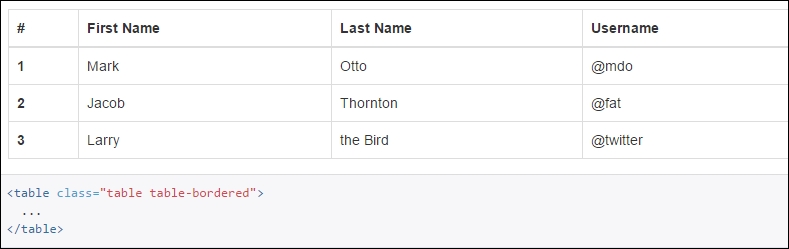
Bordered tables
We can have a bordered table (as in the following screenshot), if we apply the CSS class table-bordered to the table element.
There are times when you want to highlight rows based on the data value. For example, if you are showing inventory data in tabular format, you might want to highlight the rows with a red background color for the items whose count is less than the stipulated count. In this case, you can apply a danger class to table rows to highlight them in a red color. There are different types of contextual class available for highlighting in different colors. You can apply these classes to individual cells instead of the complete rows.
There are different styling options available for making buttons appear in different colors. For all the buttons, the base button class btn has to be applied:
The btn-primary button class is used to highlight the button in blue whereas the btn-success button class highlights the button in green. In the preceding screenshot, different options for styling the button are shown.
Based on the context, you might want to change the color of the text. For example, you might want to make the text appear in green if the previous operation is successful. For an unsuccessful operation, you might want to show the error message in a red. In such scenarios, you might use this helper CSS classes to show them in different colors.
We have seen various features of Bootstrap. Now, let us use Bootstrap to make our application look good. Basically, we have two major components in our view—a form at the top to get the input from the user and a table at the bottom to display the results in a table.
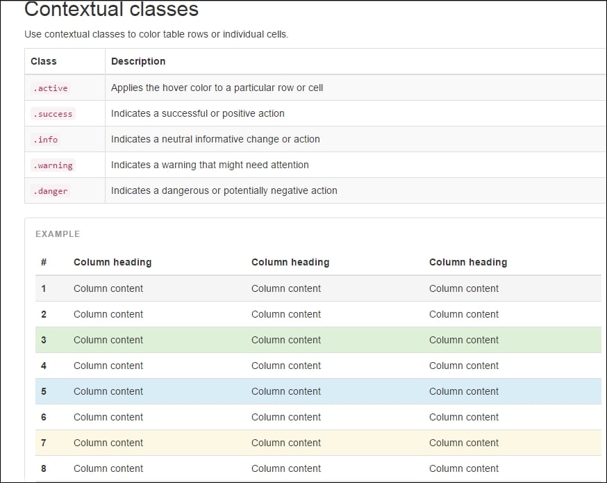
Contextual classes in table
There are times when you want to highlight rows based on the data value. For example, if you are showing inventory data in tabular format, you might want to highlight the rows with a red background color for the items whose count is less than the stipulated count. In this case, you can apply a danger class to table rows to highlight them in a red color. There are different types of contextual class available for highlighting in different colors. You can apply these classes to individual cells instead of the complete rows.
There are different styling options available for making buttons appear in different colors. For all the buttons, the base button class btn has to be applied:
The btn-primary button class is used to highlight the button in blue whereas the btn-success button class highlights the button in green. In the preceding screenshot, different options for styling the button are shown.
Based on the context, you might want to change the color of the text. For example, you might want to make the text appear in green if the previous operation is successful. For an unsuccessful operation, you might want to show the error message in a red. In such scenarios, you might use this helper CSS classes to show them in different colors.
We have seen various features of Bootstrap. Now, let us use Bootstrap to make our application look good. Basically, we have two major components in our view—a form at the top to get the input from the user and a table at the bottom to display the results in a table.
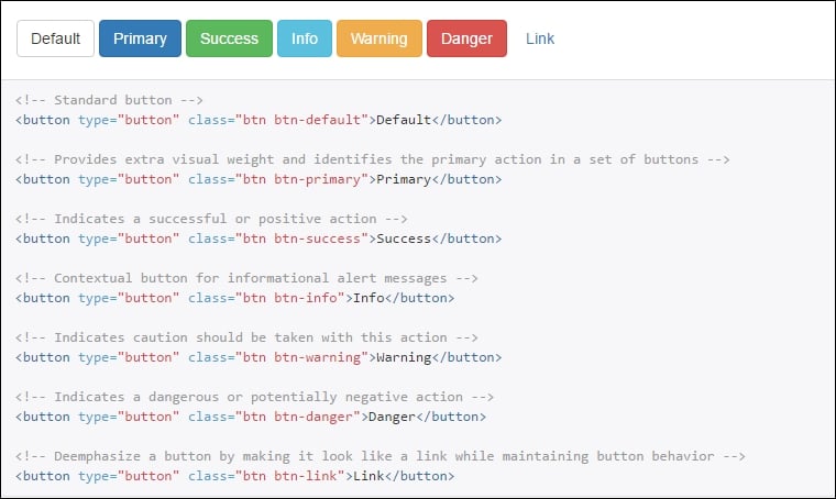
Buttons
There are different styling options available for making buttons appear in different colors. For all the buttons, the base button class btn has to be applied:
The btn-primary button class is used to highlight the button in blue whereas the btn-success button class highlights the button in green. In the preceding screenshot, different options for styling the button are shown.
Based on the context, you might want to change the color of the text. For example, you might want to make the text appear in green if the previous operation is successful. For an unsuccessful operation, you might want to show the error message in a red. In such scenarios, you might use this helper CSS classes to show them in different colors.
We have seen various features of Bootstrap. Now, let us use Bootstrap to make our application look good. Basically, we have two major components in our view—a form at the top to get the input from the user and a table at the bottom to display the results in a table.
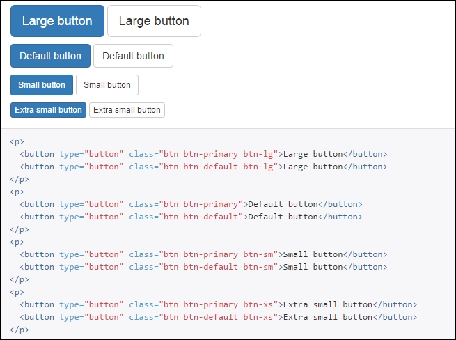
Button sizes
You can change the size of the button according to your needs. The btn-lg class can be applied to a large button and the btn-sm class can be applied to buttons to make them appear small. The following are the different options available to control the size of the button.
Based on the context, you might want to change the color of the text. For example, you might want to make the text appear in green if the previous operation is successful. For an unsuccessful operation, you might want to show the error message in a red. In such scenarios, you might use this helper CSS classes to show them in different colors.
We have seen various features of Bootstrap. Now, let us use Bootstrap to make our application look good. Basically, we have two major components in our view—a form at the top to get the input from the user and a table at the bottom to display the results in a table.
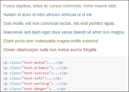
Contextual colors
Based on the context, you might want to change the color of the text. For example, you might want to make the text appear in green if the previous operation is successful. For an unsuccessful operation, you might want to show the error message in a red. In such scenarios, you might use this helper CSS classes to show them in different colors.
We have seen various features of Bootstrap. Now, let us use Bootstrap to make our application look good. Basically, we have two major components in our view—a form at the top to get the input from the user and a table at the bottom to display the results in a table.
There are different ways to get Bootstrap for your application:
- Refer to the Bootstrap file available at the CDN (Content Delivery Network) in your application
- Download the source code
- Install with Bower
- Compile with Grunt
Of these options, the easiest option is the first one.
Open the layout file (_Layout.cshtml) in the application that we created earlier. Include the CSS files at the top (within the head tag) and the scripts at the bottom (at the end of the body tag):
<!DOCTYPE html>

<html>
<head>
    <meta name="viewport" content="width=device-width" />
    <title>@ViewBag.Title</title>
    <!-- Latest compiled and minified CSS -->
    <link rel="stylesheet" href="https://maxcdn.bootstrapcdn.com/bootstrap/3.3.6/css/bootstrap.min.css" integrity="sha384-1q8mTJOASx8j1Au+a5WDVnPi2lkFfwwEAa8hDDdjZlpLegxhjVME1fgjWPGmkzs7" crossorigin="anonymous">
    <!-- Optional theme -->
    <link rel="stylesheet" href="https://maxcdn.bootstrapcdn.com/bootstrap/3.3.6/css/bootstrap-theme.min.css" integrity="sha384-fLW2N01lMqjakBkx3l/M9EahuwpSfeNvV63J5ezn3uZzapT0u7EYsXMjQV+0En5r" crossorigin="anonymous">

</head>
<body>
    <div>
        @RenderBody()
    </div>

    <script src="http://ajax.aspnetcdn.com/ajax/jQuery/jquery-2.2.3.js"></script>
    <script src="https://ajax.aspnetcdn.com/ajax/jquery.validate/1.14.0/jquery.validate.min.js"></script>
    <script src="https://ajax.aspnetcdn.com/ajax/mvc/5.2.3/jquery.validate.unobtrusive.min.js"></script>
    <!-- Latest compiled and minified JavaScript -->
    <script src="https://maxcdn.bootstrapcdn.com/bootstrap/3.3.6/js/bootstrap.min.js" integrity="sha384-0mSbJDEHialfmuBBQP6A4Qrprq5OVfW37PRR3j5ELqxss1yVqOtnepnHVP9aJ7xS" crossorigin="anonymous"></script>
</body>
</html>
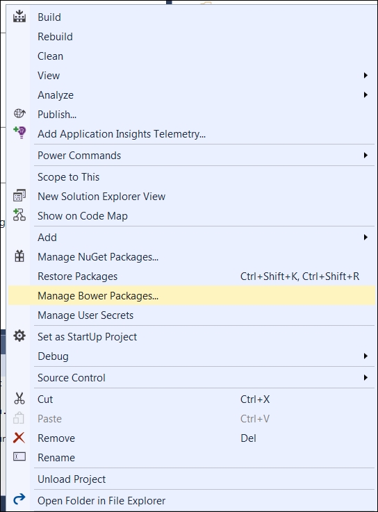
Right click on the Project menu and select the Manage Bower Packages option from the context menu:
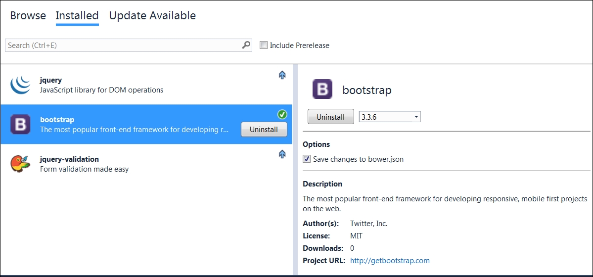
Once you select Manage Bower Packages, you will be able to install or uninstall the Bower package just as you installed or uninstalled the NuGet package.
Bootstrap makes use of certain HTML elements and CSS properties that require the use of HTML 5 doctype. By default, the view that you create in ASP.NET Core will have HTML 5 doctype only. So, we do not need to do anything regarding this.
<!DOCTYPE html>

<html lang="en">
...
</html>
Let us make the following changes to our screen to make use of Bootstrap:
- Apply the CSS class
form-horizontalto the form. - For the label, input, and validation error spans use the CSS
col-sm-2,col-sm-4, andcol-sm-3classes respectively - For labels, apply the CSS class
control-label - For input HTML elements, the
form-controlCSS class is applied - For each of the form groups (containing the HTML elements such as label and input), apply the CSS class
form-group - For all validation error messages, apply the
text-dangerCSS class so that they will be shown in red - Apply the
table,table-borderedCSS class to style the table
The following is the complete updated view code; we have used Bootstrap CSS classes to make our application look great:
@model Validation.ViewModels.EmployeeAddViewModel

<div>
    <br/>
    <br/>
    <form asp-controller="Employee" asp-action="Index" method="post" role="form" class="form-horizontal">

        <div class="form-group">
            <label asp-for="Name" class="col-sm-2 control-label"></label>
            <div class="col-sm-4">
                <input asp-for="Name" class="form-control" />
            </div>
            <div class="col-sm-3 text-danger">
                <span id="validationName" asp-validation-for="Name" ></span>
            </div>
        </div>

        <div class="form-group">
            <label asp-for="Designation" class="col-sm-2 control-label"></label>
            <div class="col-sm-4">
                <input asp-for="Designation" class="form-control" />
            </div>
            <div class="col-sm-3 text-danger">
                <span id="validationDesignation" asp-validation-for="Designation" ></span>
            </div>
        </div>


        <div class="form-group">
            <label asp-for="Salary" class="col-sm-2 control-label"></label>
            <div class="col-sm-4">
                <input asp-for="Salary" class="form-control" />
            </div>
            <div class="col-sm-3 text-danger">
                <span id="validationSalary" asp-validation-for="Salary" ></span>
            </div>
        </div>

        <div class="form-group">
            <div class="col-sm-offset-2 col-sm-10">
                <button type="submit" class="btn btn-primary">Submit</button>
            </div>
        </div>


    </form>

</div>

<br /><br /> <br />

<h4> List of employees:</h4> <br />

    <table class="table table-bordered">
        <tr>
            <th> ID </th>
            <th> Name </th>
            <th> Designation </th>
            <th> Salary </th>
        </tr>
        @foreach (var employee in Model.EmployeesList)
        {
            <tr>
                <td>@employee.EmployeeId</td>
                <td>@employee.Name</td>
                <td>@employee.Designation</td>
                <td>@employee.Salary</td>
            </tr>
        }
    </table>
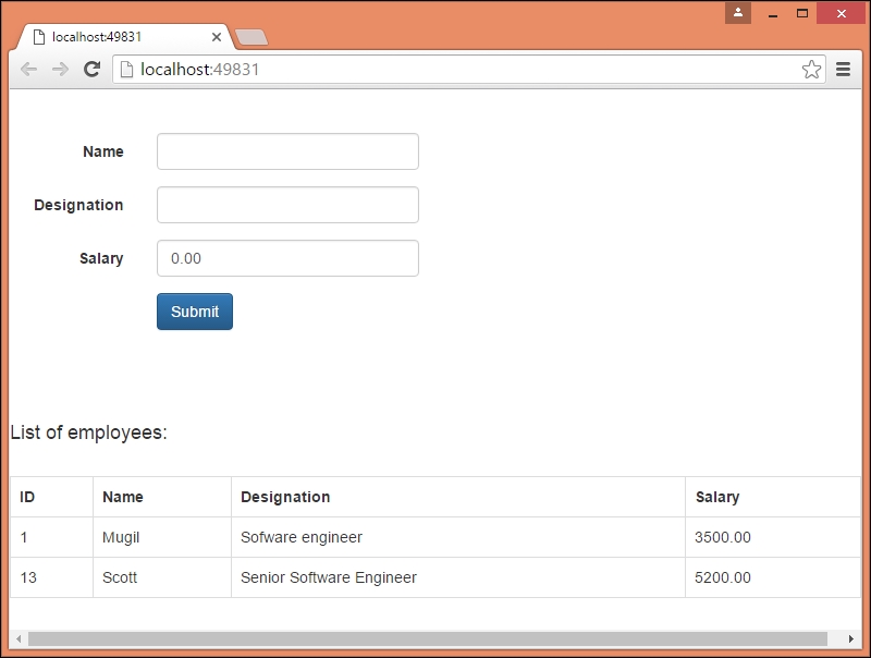
After making the preceding changes, when you run the application, your screen should look something like the following:
In this chapter, we have learned about the role of HTML and CSS in any web application including the ASP.NET Core application. We have analyzed the needs of a frontend framework and discussed the features of Bootstrap—the most popular HTML, CSS, and JS framework for developing responsive, mobile-first projects on the web. We have discussed CSS and components available in Bootstrap for different types of HTML elements with examples. Finally, we have discussed how to incorporate Bootstrap in our ASP.NET Core application.