Sign In Start Free Trial
Account

Add to playlist

Create a Playlist

Modal Close icon
You need to login to use this feature.
  • Book Overview & Buying React Material-UI Cookbook
  • Table Of Contents Toc
React Material-UI Cookbook

React Material-UI Cookbook

By : Adam Boduch
3.5 (6)
close
close
React Material-UI Cookbook

React Material-UI Cookbook

3.5 (6)
By: Adam Boduch

Overview of this book

Material-UI is a component library for rendering UI elements, using modern best practices from React and Material Design. This book will show you how you can create impressive and captivating modern-day web apps by implementing Material Design considerations. The book is designed to help you use a variety of Material-UI components to enhance UI functionality, along with guiding you through React best practices, and using state, context, and other new React 16.8 features. You will start with layout and navigation, exploring the Grid component and understanding how it’s used to build layouts for your Material-UI apps. Using Material-UI components, you’ll then explore the technique of effectively presenting information. In later sections, you will also learn about the different components for user interactions such as the text input component and buttons. Finally, the book will get you up to speed with customizing the look and feel of your app, right from creating a Material-UI theme through to styling icons and text. By the end of this book, you will have developed the skills you need to improve the look and feel of your applications using Material-UI components.
Table of Contents (22 chapters)
close
close

Applying breakpoints

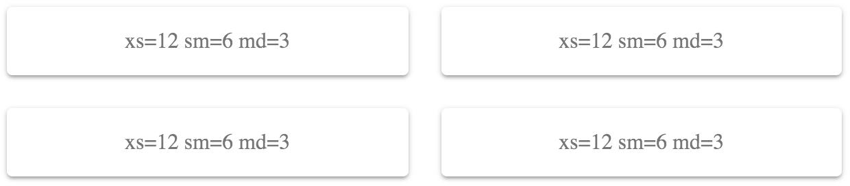
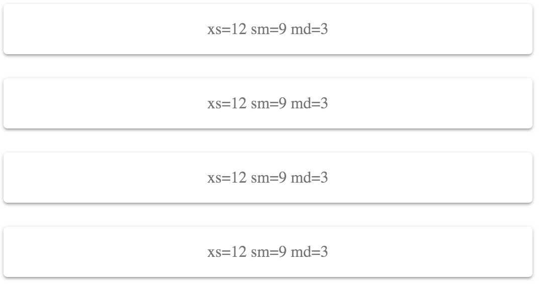
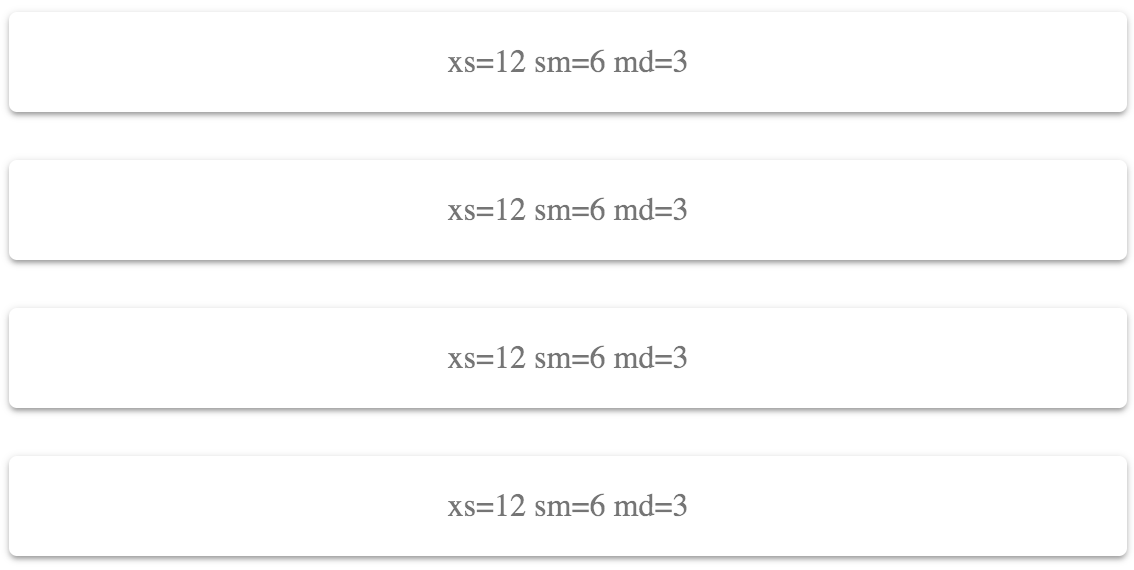
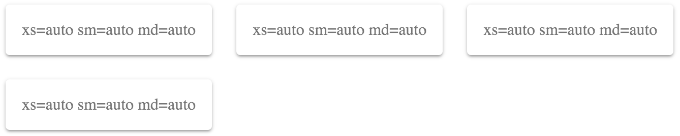
A breakpoint is used by Material-UI to determine at what point to break the flow of content on the screen and continue it on the next line. Understanding how to apply breakpoints with Grid components is fundamental to implementing layouts in Material-UI applications.

How to do it...

Let's say that you have four elements that you want to lay out on the screen so that they're evenly spaced and occupy all available horizontal space. The code for this is as follows:

import React from 'react';
import { withStyles } from '@material-ui/core/styles';
import Paper from '@material-ui/core/Paper';
import Grid from '@material-ui/core/Grid';

const styles = theme => ({
root: {
flexGrow: 1
},
paper: {
padding: theme.spacing(2),
textAlign: 'center',
color: theme.palette.text.secondary
}
});

const UnderstandingBreakpoints = withStyles(styles)(({ classes }) => (
<div className={classes.root}>
<Grid container spacing={4}>
<Grid item xs={12} sm={6} md={3}>
<Paper className={classes.paper}>xs=12 sm=6 md=3</Paper>
</Grid>
<Grid item xs={12} sm={6} md={3}>
<Paper className={classes.paper}>xs=12 sm=6 md=3</Paper>
</Grid>
<Grid item xs={12} sm={6} md={3}>
<Paper className={classes.paper}>xs=12 sm=6 md=3</Paper>
</Grid>
<Grid item xs={12} sm={6} md={3}>
<Paper className={classes.paper}>xs=12 sm=6 md=3</Paper>
</Grid>
</Grid>
</div>
));

export default UnderstandingBreakpoints;

This renders four Paper components. The labels indicate the values used for the xs, sm, and md properties. Here's what the result looks like:

How it works...

Each of the breakpoint properties that you can pass to Grid components correspond to screen widths, as follows:

  • xs >= 0px
  • sm >= 600px
  • md >= 960px
  • lg >= 1280px
  • xl >= 1920px

The screen shown previously had a pixel width of 725, which means that the Grid components used the sm breakpoint. The value passed to this property was 6. This can be a number from 1 to 12 and defines how many items will fit into the grid. This can be confusing, so it's helpful to think of these numbers in terms of percentages. For example, 6 would be 50% and, as the preceding screenshot shows, the Grid items take up 50% of the width.

For example, let's say that you want the width of each Grid item to take up 75% of the screen width when the small breakpoint is active. You could set the sm value to 9 (9/12 = 0.75), as follows:

<div className={classes.root}>
<Grid container spacing={4}>
<Grid item xs={12} sm={9} md={3}>
<Paper className={classes.paper}>xs=12 sm=9 md=3</Paper>
</Grid>
<Grid item xs={12} sm={9} md={3}>
<Paper className={classes.paper}>xs=12 sm=9 md=3</Paper>
</Grid>
<Grid item xs={12} sm={9} md={3}>
<Paper className={classes.paper}>xs=12 sm=9 md=3</Paper>
</Grid>
<Grid item xs={12} sm={9} md={3}>
<Paper className={classes.paper}>xs=12 sm=9 md=3</Paper>
</Grid>
</Grid>
</div>

Here's the result when the screen width is still at 725 pixels:

This combination of screen width and breakpoint value isn't optimal – there's a lot of wasted space to the right. By experimenting, you could make the sm value greater so that there's less wasted space, or you could make the value smaller so that more items fit on the row. For example, 6 looked better because exactly 2 items fit on the screen.

Let's take the screen width down to 575 pixels. This will activate the xs breakpoint with a value of 12 (100%):

This layout works on smaller screens, because it doesn't try to fit too many grid items on one row.

There's more...

You can use the auto value for every breakpoint value if you're unsure of which value to use:

<div className={classes.root}>
<Grid container spacing={4}>
<Grid item xs="auto" sm="auto" md="auto">
<Paper className={classes.paper}>
xs=auto sm=auto md=auto
</Paper>
</Grid>
<Grid item xs="auto" sm="auto" md="auto">
<Paper className={classes.paper}>
xs=auto sm=auto md=auto
</Paper>
</Grid>
<Grid item xs="auto" sm="auto" md="auto">
<Paper className={classes.paper}>
xs=auto sm=auto md=auto
</Paper>
</Grid>
<Grid item xs="auto" sm="auto" md="auto">
<Paper className={classes.paper}>
xs=auto sm=auto md=auto
</Paper>
</Grid>
</Grid>
</div>

This will try to fit as many items as possible on each row. As the screen size changes, items are rearranged so that they fit on the screen accordingly. Here's what this looks like at a screen width of 725 pixels:

I would recommend replacing auto with a value from 112 at some point. The auto value is good enough that you can get started on other things without worrying too much about layout, but it's far from perfect for your production app. At least by setting up auto this way, you have all of your Grid components and breakpoint properties in place. You just need to play with the numbers until everything looks good.

See also

CONTINUE READING
83
Tech Concepts
36
Programming languages
73
Tech Tools
Icon Unlimited access to the largest independent learning library in tech of over 8,000 expert-authored tech books and videos.
Icon Innovative learning tools, including AI book assistants, code context explainers, and text-to-speech.
Icon 50+ new titles added per month and exclusive early access to books as they are being written.
React Material-UI Cookbook
notes
bookmark Notes and Bookmarks search Search in title playlist Add to playlist download Download options font-size Font size

Change the font size

margin-width Margin width

Change margin width

day-mode Day/Sepia/Night Modes

Change background colour

Close icon Search
Country selected

Close icon Your notes and bookmarks

Confirmation

Modal Close icon
claim successful

Buy this book with your credits?

Modal Close icon
Are you sure you want to buy this book with one of your credits?
Close
YES, BUY

Submit Your Feedback

Modal Close icon
Modal Close icon
Modal Close icon