
Viewing and reviewing your website in mobile view
There are two ways you can simulate mobile screen sizes when editing your website: device view and resizing your browser window. Let’s look at both.
Device view
The first is to use the device view button found in the top-right corner of your site’s preview screen, as shown in Figure 8.2:
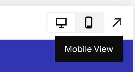
Figure 8.2 – Mobile View button
In the top-right corner, you have a set of three icons: a small desktop, a mobile device, and an arrow that will hide the editor so you can see your site in fullscreen. Clicking between these two screen options will show you a preview of how your site looks at each screen size – approximately 1,040 px (desktop) and 640 px wide (mobile).
At the time of publication, there is no option to view your site in tablet sizing, and there are some spacing issues that can be frustrating to resolve. Squarespace expert Will Myers has created a simple code injection...