
When a GUI has more than one widget, a given widget can come under focus by an explicit mouse-click on the widget. Alternatively, the focus can be shifted to another given widget by pressing the Tab key on the keyboard in the order the widgets were created in the program.
It is therefore vital to create widgets in the order we want the user to traverse through them, or else the user will have a tough time navigating between the widgets using the keyboard.
Different widgets are designed to behave differently to different keyboard strokes. Let's therefore spend some time trying to understand the rules of traversing through widgets using the keyboard.
Let's look at the code of the 8.02 widget traversal.py Python file to understand the keyboard traversal behavior for different widgets. Once you run the mentioned .py file, it shows a window something like the following:
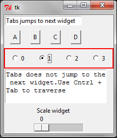
The code is simple. It adds an entry widget, a few buttons, a few radio buttons, a text widget, and a scale widget. However, it also demonstrates some of the most important keyboard traversal behaviors for these widgets.
Here are some important points to note (refer to 8.02 widget traversal.py):
The Tab key can be used to traverse forward, and Shift + Tab can be used to traverse backwards.
The text widget cannot be traversed using the Tab key. This is because the text widget can contain tab characters as its content. Instead, the text widget can be traversed using Ctrl + Tab.
Buttons on the widget can be pressed using the spacebar. Similarly, check buttons and radio buttons can also be toggled using the spacebar.
You can go up and down the items in a Listbox widget using the up and down arrows.
The Scale widget responds to both the left and right keys or up and down keys. Similarly, the Scrollbar widget responds to both the left/right or up/down keys, depending on their orientation.
Most of the widgets (except Frame, Label, and Menus) get an outline by default when they have the focus set on them. This outline normally displays as a thin black border around the widget. You can even set the Frame and Label widgets to show this outline by specifying the
highlightthicknessoption to a non-zeroIntegervalue for these widgets.We change the color of the outline using
highlightcolor= 'red'in our code.Frame, Label, and Menu are not included in the tab navigation path. However, they can be included in the navigation path by using the
takefocus = 1option. You can explicitly exclude a widget from the tab navigation path by setting thetakefocus= 0option.The Tab key traverses widgets in the order they were created. It visits a parent widget first (unless it is excluded using
takefocus = 0) followed by all its children widgets.You can use
widget.focus_force()to force the input focus to the widget.