Matplotlib is the most common Python library for generating charts. There are more modern alternatives, such as Bokeh, which is web-centered, but the advantage of Matplotlib is not only that it is the most widely available and widely documented chart library but also, in the computational biology world, we want a chart library that is both web- and paper-centric. This is because many of our charts will be submitted to scientific journals, which are equally concerned with both formats. Matplotlib can handle this for us.
Many of the examples in this recipe could also be done directly with pandas (hence indirectly with Matplotlib), but the point here is to exercise Matplotlib.
Once again, we are going to use VAERS data to plot some information about the DataFrame’s metadata and summarize the epidemiological data.
Getting ready
Again, we will be using the data from the first recipe. The code can be found in Chapter02/Matplotlib.py.
How to do it...
Follow these steps:
- The first thing that we will do is plot the fraction of nulls per column:
import numpy as np
import pandas as pd
import matplotlib as mpl
import matplotlib.pyplot as plt
vdata = pd.read_csv(
    "2021VAERSDATA.csv.gz", encoding="iso-8859-1",
    usecols=lambda name: name != "SYMPTOM_TEXT")
num_rows = len(vdata)
perc_nan = {}
for col_name in vdata.columns:
    num_nans = len(vdata[col_name][vdata[col_name].isna()])
    perc_nan[col_name] = 100 * num_nans / num_rows
labels = perc_nan.keys()
bar_values = list(perc_nan.values())
x_positions = np.arange(len(labels))
labels is the column names that we are analyzing, bar_values is the fraction of null values, and x_positions is the location of the bars on the bar chart that we are going to plot next.
- Here is the code for the first version of the bar plot:
fig = plt.figure()
fig.suptitle("Fraction of empty values per column")
ax = fig.add_subplot()
ax.bar(x_positions, bar_values)
ax.set_ylabel("Percent of empty values")
ax.set_ylabel("Column")
ax.set_xticks(x_positions)
ax.set_xticklabels(labels)
ax.legend()
fig.savefig("naive_chart.png")
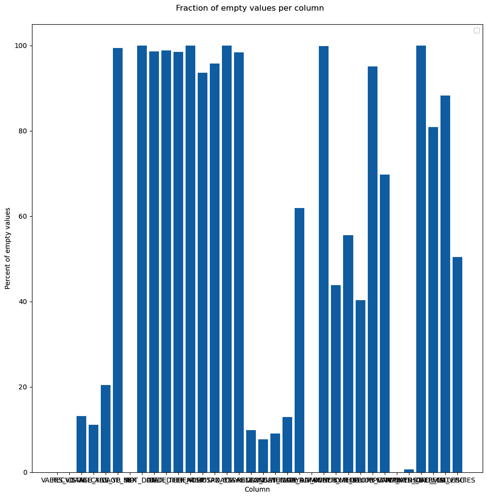
We start by creating a figure object with a title. The figure will have a subplot that will contain the bar chart. We also set several labels and only used defaults. Here is the sad result:
Figure 2.4 – Our first chart attempt, just using the defaults
- Surely, we can do better. Let’s format the chart substantially more:
fig = plt.figure(figsize=(16, 9), tight_layout=True, dpi=600)
fig.suptitle("Fraction of empty values per column", fontsize="48")
ax = fig.add_subplot()
b1 = ax.bar(x_positions, bar_values)
ax.set_ylabel("Percent of empty values", fontsize="xx-large")
ax.set_xticks(x_positions)
ax.set_xticklabels(labels, rotation=45, ha="right")
ax.set_ylim(0, 100)
ax.set_xlim(-0.5, len(labels))
for i, x in enumerate(x_positions):
    ax.text(
        x, 2, "%.1f" % bar_values[i], rotation=90,
        va="bottom", ha="center",
        backgroundcolor="white")
fig.text(0.2, 0.01, "Column", fontsize="xx-large")
fig.savefig("cleaner_chart.png")
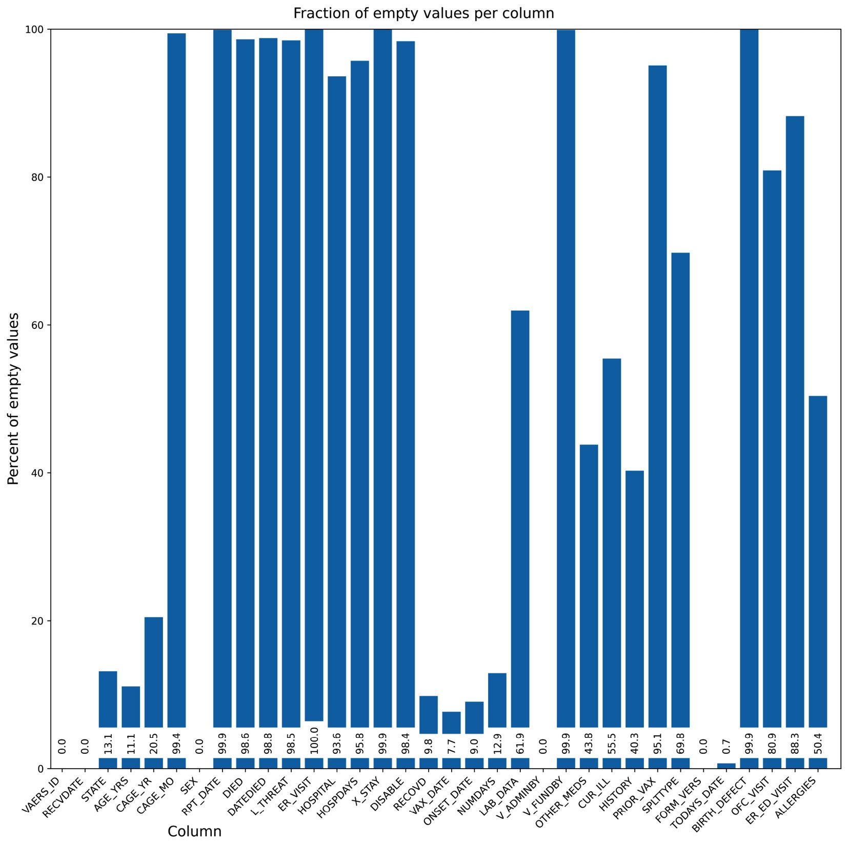
The first thing that we do is set up a bigger figure for Matplotlib to provide a tighter layout. We rotate the x-axis tick labels 45 degrees so that they fit better. We also put the values on the bars. Finally, we do not have a standard x-axis label as it would be on top of the tick labels. Instead, we write the text explicitly. Note that the coordinate system of the figure can be completely different from the coordinate system of the subplot – for example, compare the coordinates of ax.text and fig.text. Here is the result:
Figure 2.5 – Our second chart attempt, while taking care of the layout
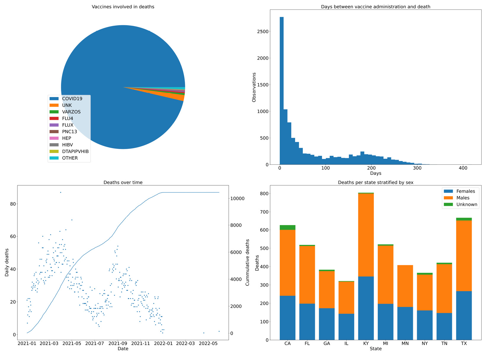
- Now, we are going to do some summary analysis of our data based on four plots on a single figure. We will chart the vaccines involved in deaths, the days between administration and death, the deaths over time, and the sex of people who have died for the top 10 states in terms of their quantity:
dead = vdata[vdata.DIED == "Y"]
vax = pd.read_csv("2021VAERSVAX.csv.gz", encoding="iso-8859-1").set_index("VAERS_ID")
vax_dead = dead.join(vax, on="VAERS_ID", how="inner")
dead_counts = vax_dead["VAX_TYPE"].value_counts()
large_values = dead_counts[dead_counts >= 10]
other_sum = dead_counts[dead_counts < 10].sum()
large_values = large_values.append(pd.Series({"OTHER": other_sum}))
distance_df = vax_dead[vax_dead.DATEDIED.notna() & vax_dead.VAX_DATE.notna()]
distance_df["DATEDIED"] = pd.to_datetime(distance_df["DATEDIED"])
distance_df["VAX_DATE"] = pd.to_datetime(distance_df["VAX_DATE"])
distance_df = distance_df[distance_df.DATEDIED >= "2021"]
distance_df = distance_df[distance_df.VAX_DATE >= "2021"]
distance_df = distance_df[distance_df.DATEDIED >= distance_df.VAX_DATE]
time_distances = distance_df["DATEDIED"] - distance_df["VAX_DATE"]
time_distances_d = time_distances.astype(int) / (10**9 * 60 * 60 * 24)
date_died = pd.to_datetime(vax_dead[vax_dead.DATEDIED.notna()]["DATEDIED"])
date_died = date_died[date_died >= "2021"]
date_died_counts = date_died.value_counts().sort_index()
cum_deaths = date_died_counts.cumsum()
state_dead = vax_dead[vax_dead["STATE"].notna()][["STATE", "SEX"]]
top_states = sorted(state_dead["STATE"].value_counts().head(10).index)
top_state_dead = state_dead[state_dead["STATE"].isin(top_states)].groupby(["STATE", "SEX"]).size()#.reset_index()
top_state_dead.loc["MN", "U"] = 0  # XXXX
top_state_dead = top_state_dead.sort_index().reset_index()
top_state_females = top_state_dead[top_state_dead.SEX == "F"][0]
top_state_males = top_state_dead[top_state_dead.SEX == "M"][0]
top_state_unk = top_state_dead[top_state_dead.SEX == "U"][0]
The preceding code is strictly pandas-based and was made in preparation for the plotting activity.
- The following code plots all the information simultaneously. We are going to have four subplots organized in 2 by 2 format:
fig, ((vax_cnt, time_dist), (death_time, state_reps)) = plt.subplots(
    2, 2,
    figsize=(16, 9), tight_layout=True)
vax_cnt.set_title("Vaccines involved in deaths")
wedges, texts = vax_cnt.pie(large_values)
vax_cnt.legend(wedges, large_values.index, loc="lower left")
time_dist.hist(time_distances_d, bins=50)
time_dist.set_title("Days between vaccine administration and death")
time_dist.set_xlabel("Days")
time_dist.set_ylabel("Observations")
death_time.plot(date_died_counts.index, date_died_counts, ".")
death_time.set_title("Deaths over time")
death_time.set_ylabel("Daily deaths")
death_time.set_xlabel("Date")
tw = death_time.twinx()
tw.plot(cum_deaths.index, cum_deaths)
tw.set_ylabel("Cummulative deaths")
state_reps.set_title("Deaths per state stratified by sex") state_reps.bar(top_states, top_state_females, label="Females")
state_reps.bar(top_states, top_state_males, label="Males", bottom=top_state_females)
state_reps.bar(top_states, top_state_unk, label="Unknown",
               bottom=top_state_females.values + top_state_males.values)
state_reps.legend()
state_reps.set_xlabel("State")
state_reps.set_ylabel("Deaths")
fig.savefig("summary.png")
We start by creating a figure with 2x2 subplots. The subplots function returns, along with the figure object, four axes objects that we can use to create our charts. Note that the legend is positioned in the pie chart, we have used a twin axis on the time distance plot, and we have a way to compute stacked bars on the death per state chart. Here is the result:
Figure 2.6 – Four combined charts summarizing the vaccine data
There’s more...
Matplotlib has two interfaces you can use – an older interface, designed to be similar to MATLAB, and a more powerful object-oriented (OO) interface. Try as much as possible to avoid mixing the two. Using the OO interface is probably more future-proof. The MATLAB-like interface is below the matplotlib.pyplot module. To make things confusing, the entry points for the OO interface are in that module – that is, matplotlib.pyplot.figure and matplotlib.pyplot.subplots.
See also
The following is some extra information that may be useful:
- The documentation for Matplolib is really, really good. For example, there’s a gallery of visual samples with links to the code for generating each sample. This can be found at https://matplotlib.org/stable/gallery/index.html. The API documentation is generally very complete.
- Another way to improve the looks of Matplotlib charts is to use the Seaborn library. Seaborn’s main purpose is to add statistical visualization artifacts, but as a side effect, when imported, it changes the defaults of Matplotlib to something more palatable. We will be using Seaborn throughout this book; check out the plots provided in the next chapter.



 Free Chapter

