To install KNIME Analytics Platform, follow these steps:
- Go to .
- Provide some details about yourself (step 1 in Figure 1.2).
- Download the version that's suitable for your operating system (step 2 in Figure 1.2).
- While you're waiting for the appropriate version to download, browse through the different steps to get started (step 3 in Figure 1.2):
Figure 1.2 – Steps for downloading the KNIME Analytics Platform package
Once you've downloaded the package, locate it, start it, and follow the instructions that appear onscreen to install it in any directory that you have write permissions for.
Once it's been installed, locate your instance of KNIME Analytics Platform – from the appropriate folder, desktop link, application, or link in the start menu – and start it.
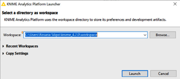
When the splash screen appears, a window will ask for the location of your workspace (Figure 1.3). This workspace is a folder on your machine that will host all your work. The default workspace folder is called knime-workspace:
Figure 1.3 – The KNIME Analytics Platform Launcher window asking for the workspace folder
After clicking Launch, the workbench for KNIME Analytics Platform will open.
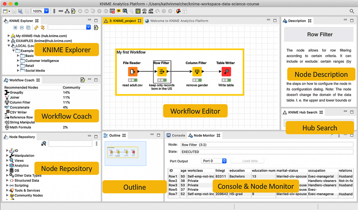
The workbench of KNIME Analytics Platform is organized as depicted in Figure 1.4:
Figure 1.4 – The KNIME Analytics Platform workbench
The KNIME workbench consists of different panels that can be resized, removed by clicking the X on their tab, or reinserted via the View menu. Let's take a look at these panels:
- KNIME Explorer: The KNIME Explorer panel in the upper-left corner displays all the workflows in the selected (LOCAL) workspace, possible connections to mounted KNIME servers, a connection to the EXAMPLES server, and a connection to the My-KNIME-Hub space.
The LOCAL workspace displays all workflows, saved in the workspace folder that were selected when KNIME Analytics Platform was started. The very first time the platform is opened, the LOCAL workspace only contains workflows and data in the Example Workflows folder. These are example applications to be used as starting points for your projects.
The EXAMPLES server is a read-only KNIME hosted server that contains many more example workflows, organized into categories. Just double-click it to be automatically logged in with read-only mode. Once you've done this, you can browse, open, explore, and download all available example workflows. Once you have located a workflow, double-click it to explore it or drag and drop it into LOCAL to create a local editable copy.
My-KNIME-Hub provides access to the KNIME community shared repository (KNIME Hub), either in public or private mode. You can use My-KNIME-Hub/Public to share your work with the KNIME community or My-KNIME-Hub/Private as a space for your current work.
- Workflow Coach: Workflow Coach is a node recommendation engine that aids you when you're building workflows. Based on worldwide user statistics or your own private statistics, it will give you suggestions on which nodes you should use to complete your workflow.
- Node Repository: The Node Repository contains all the KNIME nodes you have currently installed, organized into categories. To help you with orientation, a search box is located at the top of the Node Repository panel. The magnifier lens on its left switches between the exact match and the fuzzy search option.
- Workflow Editor: The Workflow Editor is the canvas at the center of the page and is where you assemble workflows, configure and execute nodes, inspect results, and explore data. Nodes are added from the Node Repository panel to the workflow editor by drag and drop or double-click. Upon starting KNIME Analytics Platform, the Workflow Editor will open on the Welcome Page panel, which includes a number of useful tips on where to find help, courses, events, and the latest news about the software.
- Outline: The Outline view displays the entire workflow, even if only a small part is visible in the workflow editor. This part is marked in gray in the Outline view. Moving the gray rectangle in the Outline view changes the portion of the workflow that's visible in the Workflow Editor.
- Console and Node Monitor: The Console and the Node Monitor share one panel with two tabs. The Console tab prints out possible error and warning messages. The same information is written to a log file, located in the workspace directory. The Node Monitor tab shows you the data that's available at the output ports of the selected executed node in the Workflow Editor. If a node has multiple output ports, you can select the data of interest from a dropdown menu. By default, the data at the top output port is shown.
- KNIME Hub: The KNIME Hub (https://hub.knime.com/) is an external space where KNIME users can share their work. This panel allows you to search for workflows, nodes, and components shared by members of the KNIME community.
- Description: The Description panel displays information about the selected node or category. In particular, for nodes, it explains the node's task, the algorithm behind it (if any), the dialog options, the available views, the expected input data, and the resulting output data. For categories, it displays all contained nodes.
Finally, at the very top, you can find the Top Menu, which includes menus for file management and preference settings, workflow editing options, additional views, node commands, and help documentation.
Besides the core software, KNIME Analytics Platform benefits from external extensions provided by the KNIME community. The install KNIME extensions and update KNIME commands, available in the File menu, allow you to expand your current instance with external extensions or update it to a newer version.
Under the top menu, a toolbar is available. When a workflow is open, the toolbar offers commands for workflow editing, node execution, and customization.
A workflow can be built by dragging and dropping nodes from the Node Repository panel onto the Workflow Editor window or by just double-clicking them. Nodes are the basic processing units of any workflow. Each node has several input and/or output ports. Data flows over a connection from an output port to the input port(s) of other nodes. Two nodes are connected – and the data flow is established – by clicking the mouse at the output port of the first node and releasing the mouse at the input port of the next node. A pipeline of such nodes makes a workflow.
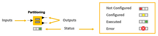
In Figure 1.5, under each node, you will see a status light: red, yellow, or green:
Figure 1.5 – Node structure and status lights
When a new node is created, the status light is usually red, which means that the node's settings still need to be configured for the node to be able to execute its task.
To configure a node, right-click it and select Configure or just double-click it. Then, adjust the necessary settings in the node's dialog. When the dialog is closed by pressing the OK button, the node is configured, and the status light changes to yellow; this means that the node is ready to be executed. Right-clicking on the node again shows an enabled Execute option; pressing it will execute the node.
The ports on the left are input ports, where the data from the outport of the predecessor node is fed into the node. Ports on the right are outgoing ports. The result of the node's operation on the data is provided by the output port of the successor nodes. When you hover over the port, a tooltip will provide information about the output dimension of the node.
Important note
Only ports of the same type can be connected!
Data ports (black triangles) are the most common type of node ports and transfer flat data tables from node to node. Database ports (brown squares) transfer SQL queries from node to node. Many more node ports exist and transfer different objects from one node to the next.
After successful execution, the status light of the node turns green, indicating that the processed data is now available on the outports. The result(s) can be inspected by exploring the outport view(s): the last entries in the context menu open them.
With that, we have completed our quick tour of the workbench in KNIME Analytics Platform.
Now, let's take a look at where we can find starting examples and help.
Useful Links and Materials
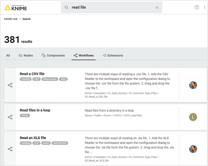
At this point, we have already looked at the KNIME Hub already. The KNIME Hub (https://hub.knime.com/) is a very useful public repository for applications, extensions, examples, and tutorials provided by the KNIME community. Here, you can share your workflows and download workflows that have been created by other KNIME users. Just type in some keywords and you will get a list of related workflows, components, extensions, and more. For example, just type in read file and you will get a list of example workflows illustrating how to read CSV files, .table files, Excel files, and so on. (Figure 1.6):
Figure 1.6 – Resulting list of workflows from searching for "read file" on the KNIME Hub
All workflows described in this book are also available on the KNIME Hub for you: https://hub.knime.com/kathrin/spaces/Codeless%20Deep%20Learning%20with%20KNIME/latest/.
Once you've isolated the workflow you are interested in, click on it to open its page, and then download it or open it in KNIME Analytics Platform to customize it to your own needs.
On the other hand, to share your work on the KNIME Hub, just copy your workflows from your local workspace into the My-KNIME-Hub/Public folder in the KNIME Explorer panel within the KNIME workbench. It will be automatically available to all members of the KNIME community.
The KNIME community is also very active, with tips and tricks available on the KNIME Forum (https://forum.knime.com/). Here, you can ask questions or search for answers.
Finally, contributions from the community are available as posts on the KNIME Blog (https://www.knime.com/blog), as books via KNIME Press (https://www.knime.com/knimepressE TV () channel on YouTube.
The two books KNIME Beginner's Luck and KNIME Advanced Luck provide tutorials for those users who are starting out in data science with KNIME Analytics Platform.
Now, let's build our first workflow, shall we?
Build and Execute Your First Workflow
In this section, we'll build our first, simple, small workflow. We'll start with something basic: reading data from an ASCII file, performing some filtering, and displaying the results in a bar chart.
In KNIME Explorer, do the following:
- Create a new empty folder by doing the following:
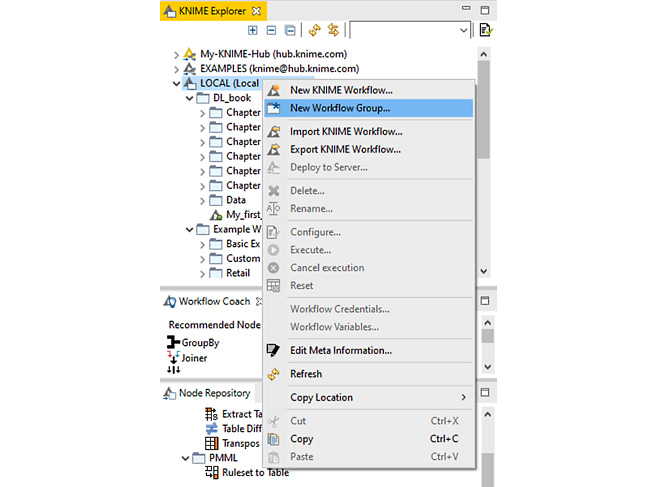
a) Right-click LOCAL (or anywhere you want your folder to be).
b) Select New Workflow Group... (as shown in Figure 1.7), and, in the window that opens, name it Chapter 1.
- Click Finish. You should then see a new folder with that name in the KNIME Explorer panel.
Important note
Folders in KNIME Explorer are called Workflow Groups.
Similarly, you can create a new workflow, as follows:
- Create a new workflow by doing the following:
a) Right-click the Chapter 1 folder (or anywhere you want your workflow to be).
b) Select New KNIME Workflow (as shown in Figure 1.7) and, in the window that opens, name it My_first_workflow.
- Click Finish. You should then see a new workflow with that name in the KNIME Explorer panel.
After clicking Finish, the Workflow Editor will open the canvas for the empty workflow.
Tip
By default, the canvas for a new workflow opens with the grid on; to turn it off, click the Open the settings dialog for the workflow editor button (the button before the last one) in the toolbar. This button opens a window where you can customize the workflow's appearance (for example, allowing curved connections) and perform editing (turn the grid on/off).
Figure 1.7 shows the New Workflow Group... option in the KNIME Explorer's context menu. It allows you to create a new, empty folder:
Figure 1.7 – Context menu for creating a new folder and a new workflow in KNIME Explorer
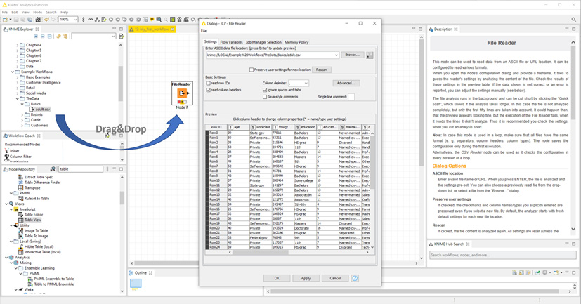
The first thing we need to do in our workflow is read an ASCII file with the data. Let's read the adult.csv file that comes with the installation of KNIME Analytics Platform. This can be found under Example Workflows/The Data/Basics. adult.csv is a US Census public file that describes 30K people by age, gender, origin, and professional and private life.
Let's create the node so that we can read the adult.csv ASCII file:
a) In the Node Repository, search for the File Reader node (it is actually located in the IO/Read category).
b) Drag and drop the File Reader node onto the Workflow Editor panel.
c) Alternatively, just double-click the File Reader node in the Node Repository; this will automatically create it in the Workflow Editor panel.
In Figure 1.8, see the File Reader node located in the Node Repository:
Figure 1.8 – The File Reader node under IO/Read in the Node Repository
Now, let's configure the node so that it reads the adult.csv file. Double-click the newly created File Reader node in the Workflow Editor and manually configure it with the file path to the adult.csv file. Alternatively, just drag and drop the adult.csv file from the KNIME Explorer panel (or from anywhere on your machine) onto the Workflow Editor window. You can see this action in Figure 1.9:
Figure 1.9 – Dragging and dropping the adult.csv file onto the Workflow Editor panel.
This automatically generates a File Reader node that contains most of the correct configuration settings for reading the file.
Tip
The Advanced button in the File Reader configuration window leads you to additional advanced settings: reading files with special characters, such as quotes; allowing lines with different lengths; using different encodings; and so on.
To execute this node, just right-click it and from the context menu, select Execute; alternatively, click on the Execute buttons (single and double white arrows on a green background) that are available in the toolbar.
To inspect the output data table that's produced by this node's execution, right-click on the node and select the last option available in the context menu. This opens the data table that appears as a result of reading the adult.csv file. You will notice columns such as Age, Workclass, and so on.
Important note
Data in KNIME Analytics Platform is organized into tables. Each cell is uniquely identified via the column header and the row ID. Therefore, column headers and row IDs need to have unique values.
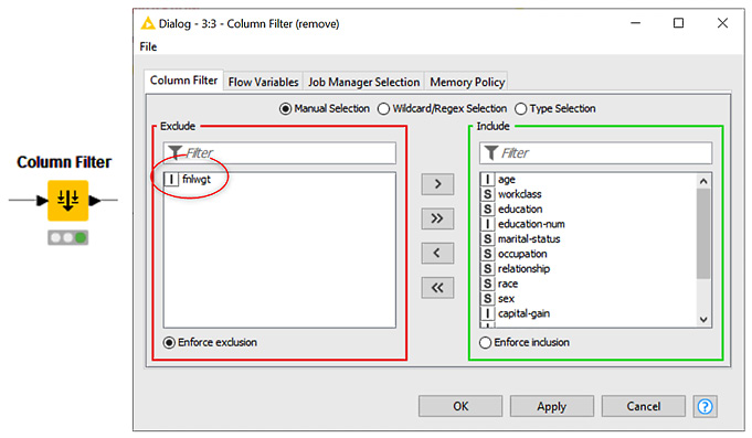
fnlwgt is one column for which we were never sure of what it meant. So, let's remove it from further analysis by using the Column Filter node.
To do this, search for Column Filter in the search box above the Node Repository, then drag and drop it onto the Workflow Editor and connect the output of the File Reader node to the input of the Column Filter node. Alternatively, we can select the File Reader node in the Workflow Editor panel and then double-click the Column Filter node in the Node Repository. This automatically creates a node and its connections in the Workflow Editor.
The Column Filter node and its configuration window are shown in Figure 1.10:
Figure 1.10 – Configuring the Column Filter node to remove the column named fnlwgt from the input data table
Again, double-click or right-click the node and then select Configure to configure it. This configuration window contains three options that can be selected via three radio buttons: Manual Selection, Wildcard/Regex Selection, and Type Selection. Let's take a look at these in more detail:
- Manual Selection offers an Include/Exclude framework so that you can manually transfer columns from the Include set into the Exclude set and vice versa.
- Wildcard/Regex Selection extracts the columns you wish to keep, based on a wildcard (using * as the wildcard) or regex expression.
- Type Selection keeps the columns based on the data types they carry.
Since this is our first workflow, we'll go for the easiest approach; that is, Manual Selection. Go to the Manual Selection tab and transfer the fnlwgt column to the Exclude set via the buttons in-between the two frames (these can be seen in Figure 1.10).
After executing the Column Filter node, if we inspect the output data table (right-click and select the last option in the context menu), we'll see a table that doesn't contain the fnlwgt column.
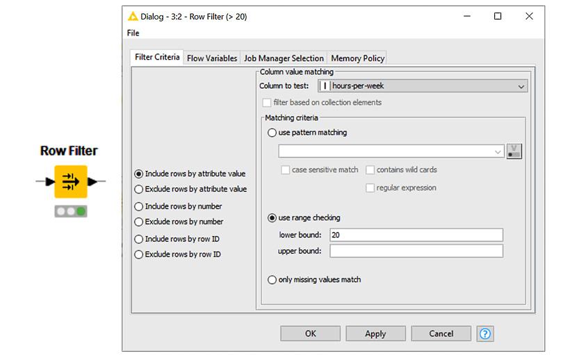
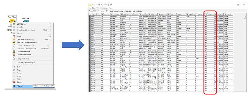
Now, let's extract all the records of people who work more than 20 hours/week. hours-per-week is the column that contains the data of interest.
For this, we need to create a Row Filter node and implement the required condition:
IF hours-per-week > 20 THEN Keep data row.
Again, let's locate the Row Filter node in the Node Repository panel, drag and drop it (or double-click it) into the Workflow Editor, connect the output port of the Column Filter node to its input port, and open its configuration window.
In the configuration window of the Row Filter node (Figure 1.11), we'll find three default filtering criteria: use pattern matching, use range checking, and only missing values match. Let's take a look at what they do:
- use pattern matching matches the given pattern to the content of the selected column in the Column to test field and keeps the matching rows.
- use range checking keeps only those data rows whose value in the Column to test columns falls between the lower bound and upper bound values.
- only missing values match only keeps the data rows where a missing value is present in the selected column.
The default behavior is to include the matching data rows in the output data table. However, this can be changed by enabling Exclude rows by attribute value via the radio buttons on the left-hand side of the configuration window.
Alternative filtering criteria can be done by row number or by row ID. This can also be enabled via the radio buttons on the left-hand side of the configuration window:
Figure 1.11 – Configuring the Row Filter node to keep only rows with hours-per-week > 20 in the input data table
After execution, upon opening the output data table (Figure 1.12), no data rows with hours-per-week < 20 should be present:
Figure 1.12 – Right-clicking a successfully executed node and selecting the last option shows the data table that was produced by the node
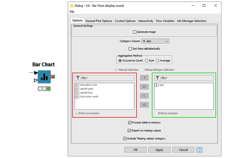
Now, let's look at some very basic visualization. Let's visualize the number of men versus women in this dataset, which contains people who work more than 20 hours/week:
Figure 1.13 – The Bar Chart node and its configuration window
To do this, locate the Bar Chart node in the Node Repository, create an instance in the workflow, connect it to receive input from the Row Filter node, and open its configuration window (Figure 1.13). Here, there are four tabs we can use for configuration purposes. Options covers all data settings, General Plot Options covers all plot settings, Control Options covers all control options, and Interactivity covers all subscription events when it comes to interacting with other plots, views, and charts when they've been assembled to create a component. Again, since this is just a beginner's workflow, we'll adopt all the default settings and just set the following:
- From the Options tab, set Category Column to
sex, ensuring it appears on the x axis. Then, select Occurrence Count in order to count the number of rows by sex.
- From the General Plot Options tab, set a title, a subtitle, and the axis labels.
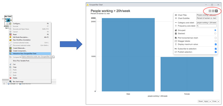
This node does not produce data, but rather a view of the bar chart. So, to inspect the results produced by this node after its execution, right-click it and select the central option; that is, Interactive View: Group Bar Chart (Figure 1.14):
Figure 1.14 – Right-clicking a successfully executed visualization node and selecting the Interactive View: Grouped Bar Chart option to see the chart/plot that has been produced
Notice the three buttons in the top-right corner of the view on the right of Figure 1.14. These three buttons enable zooming, toggling to full screen, and node settings, respectively. From the view itself, you can explore how the chart would look if different settings were to be selected, such as a different category column or a different title.
Important note
Most data visualization nodes produce a view and not a data table. To see the respective view, right-click the successfully executed node and select the Interactive View: … option.
The second lower input port of the Bar Chart node is optional (a white triangle) and is used to read a color map so that you can color the bars in the bar chart.
Important note
Note that a number of different data visualization nodes are available in the Node Repository: JavaScript, Local(Swing), Plotly, and so on. JavaScript and Plotly nodes offer the highest level of interactivity and the most polished graphics. We used the Bar Chart node from the JavaScript category in the Node Repository panel here.
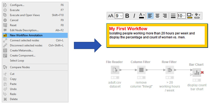
Now, we'll add a few comments to document the workflow. You can add comments at the node level or at the general workflow level.
Each node in the workflow is created with a default label of Node xx under it. Upon double-clicking it, the node label editor appears. This allows you to customize the text, the font, the color, the background, and other similar properties of the node (Figure 1.15). We need to write a little comment under each node to make it clear what tasks they are implementing:
Figure 1.15 – Editor for customizing the labels under each node
You can also write annotations at the workflow level. Just right-click anywhere in the Workflow Editor and select New Workflow Annotation. A yellow frame will appear in editing mode. Here, you can add text and customize it, as well as its frame. To close the annotation editor, just click anywhere else in the Workflow Editor. To reopen the annotation editor, double-click in the top-left corner of the annotation (Figure 1.16):
Figure 1.16 – Creating and editing workflow annotations
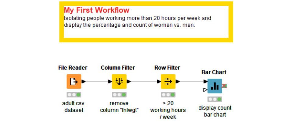
Congratulations! You have just built your first workflow with KNIME Analytics Platform. It should look something like the one in Figure 1.17:
Figure 1.17 – My_first_Workflow
That was a quick introduction to how to use KNIME Analytics Platform.
Now, let's make sure we have KNIME Deep Learning – Keras Integration installed and functioning.


 Free Chapter