
Selecting an analysis approach
By now, we have met the different families of time series-related datasets, and we have listed key potential challenges you may encounter when processing them. In this section, we will describe the different approaches we can take to analyze time series data.
Using raw time series data
Of course, the first and main way to perform time series analysis is to use the raw time sequences themselves, without any drastic transformation. The main benefit of this approach is the limited amount of preprocessing work you have to perform on your time series datasets before starting your actual analysis.
What can we do with these raw time series? We can leverage Amazon SageMaker and leverage the following built-in algorithms:
- Random Cut Forest: This algorithm is a robust cousin from the scikit-learn Isolation Forest algorithm and can compute an anomaly score for each of your data points. It considers each time series as a univariate one and cannot learn any relationship or global behavior from multiple or multivariate time series.
- DeepAR: This probabilistic forecasting algorithm is a great fit if you have hundreds of different time series that you can leverage to predict their future values. Not only does this algorithm provide you with point prediction (several single values over a certain forecast horizon), but it can also predict different quantiles, making it easier to answer questions such as: Given a confidence level of 80% (for instance), what boundary values will my time series take in the near future?
In addition to these built-in algorithms, you can of course bring your favorite packages to Amazon SageMaker to perform various tasks such as forecasting (by bringing in Prophet and NeuralProphet libraries) or change-point detection (with the ruptures Python package, for instance).
The following three AWS services we dedicate a part to in this book also assume that you will provide raw time series datasets as inputs:
- Amazon Forecast: To perform time series forecasting
- Amazon Lookout for Equipment: To deliver anomalous event forewarning usable to improve predictive maintenance practices
- Amazon Lookout for Metrics: To detect anomalies and help in root-cause analysis (RCA)
Other open source packages and AWS services can process transformed time series datasets. Let's now have a look at the different transformations you can apply to your time series.
Summarizing time series into tabular datasets
The first class of transformation you can apply to a time series dataset is to compact it by replacing each time series with some metrics that characterize it. You can do this manually by taking the mean and median of your time series or computing standard deviation. The key objective in this approach is to simplify the analysis of a time series by transforming a series of data points into one or several metrics. Once summarized, your insights can be used to support your EDA or build classification pipelines when new incoming time series sequences are available.
You can perform this summarization manually if you know which features you would like to engineer, or you can leverage Python packages such as the following:
tsfresh: (http://tsfresh.com)hctsa: (https://github.com/benfulcher/hctsa)featuretools: (https://www.featuretools.com)Cesium: (http://cesium-ml.org)FATS: (http://isadoranun.github.io/tsfeat)
These libraries can take multiple time series as input and compute hundreds, if not thousands, of features for each of them. Once you have a traditional tabular dataset, you can apply the usual ML techniques to perform dimension reduction, uncover feature importance, or run classification and clustering techniques.
By using Amazon SageMaker, you can access well-known algorithms that have been adapted to benefit from the scalability offered by the cloud. In some cases, they have been rewritten from scratch to enable linear scalability that makes them practical on huge datasets! Here are some of them:
- Principal Component Analysis (PCA): This algorithm can be used to perform dimensionality reductions on the obtained dataset (https://docs.aws.amazon.com/sagemaker/latest/dg/pca.html).
- K-Means: This is an unsupervised algorithm where each row will correspond to a single time series and each computed attribute will be used to compute a similarity between the time series (https://docs.aws.amazon.com/sagemaker/latest/dg/k-means.html).
- K-Nearest Neighbors (KNN): This is another algorithm that benefits from a scalable implementation. Once your time series has been transformed into a tabular dataset, you can frame your problem either as a classification or a regression problem and leverage KNN (https://docs.aws.amazon.com/sagemaker/latest/dg/k-nearest-neighbors.html).
- XGBoost: This is the Swiss Army knife of many data scientists and is a well-known algorithm to perform supervised classification and regression on tabular datasets (https://docs.aws.amazon.com/sagemaker/latest/dg/xgboost.html).
You can also leverage Amazon SageMaker and bring your custom preprocessing and modeling approaches if the built-in algorithms do not fit your purpose. Interesting approaches could be more generalizable dimension reduction techniques (such as Uniform Manifold Approximation and Projection (UMAP) or t-distributed stochastic neighbor embedding (t-SNE) and other clustering techniques such as Hierarchical Density-Based Spatial Clustering of Applications with Noise (HDBSCAN)). Once you have a tabular dataset, you can also apply and neural network-based approaches for both classification and regression.
Using imaging techniques
A time series can also be transformed into an image: this allows you to leverage the very rich field of computer vision approaches and architectures. You can leverage the pyts Python package to apply the transformation described in this chapter (https://pyts.readthedocs.io) and, more particularly, the pyts.image submodule.
Once your time series is transformed into an image, you can leverage many techniques to learn about it, such as the following:
- Use convolutional neural networks (CNN) architectures to learn valuable features and build such custom models on Amazon SageMaker or use its built-in image classification algorithm.
- Leverage Amazon Rekognition Custom Labels to rapidly build models that can rapidly classify different behaviors that would be highlighted by the image transformation process.
- Use Amazon Lookout for Vision to perform anomaly detection and classify which images are representative of an underlying issue captured in the time series.
Let's now have a look at the different transformations we can apply to our time series and what they can let you capture about their underlying dynamics. We will deep dive into the following:
- Recurrence plots
- Gramian angular fields
- Markov transition fields (MTF)
- Network graphs
Recurrence plots
A recurrence is a time at which a time series returns back to a value it has visited before. A recurrence plot illustrates the collection of pairs of timestamps at which the time series is at the same place—that is, the same value. Each point can take a binary value of 0 or 1. A recurrence plot helps in understanding the dynamics of a time series and such recurrence is closely related to dynamic non-linear systems. An example of recurrence plots being used can be seen here:
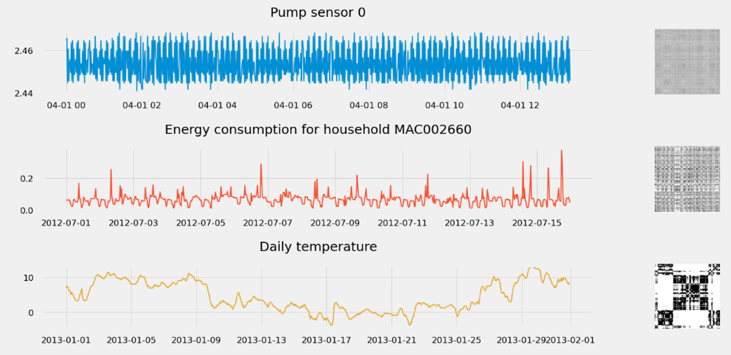
Figure 1.19 – Spotting time series dynamics with recurrence plots
A recurrence plot can be extended to multivariate datasets by taking the Hadamard product of each plot (matrix multiplication term by term).
Gramian angular fields
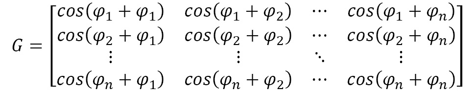
This representation is built upon the Gram matrix of an encoded time series. The detailed process would need you to scale your time series, convert it to polar coordinates (to keep the temporal dependency), and then you would compute the Gram matrix of the different time intervals.
Each cell of a Gram matrix is the pairwise dot-products of every pair of values in the encoded time series. In the following example, these are the different values of the scaled time series T:

In this case, the same time series encoded in polar coordinates will take each value and compute its angular cosine, as follows:

Then, the Gram matrix is computed as follows:
Let's plot the Gramian angular fields of the same three time series as before, as follows:

Figure 1.20 – Capturing period with Gramian angular fields
Compared to the previous representation (the recurrence plot), the Gramian angular fields are less prone to generate white noise for heavily period signals (such as the pump signal below). Moreover, each point takes a real value and is not limited to 0 and 1 (hence the colored pictures instead of the grayscale ones that recurrence plots can produce).
MTF
MTF is a visualization technique to highlight the behavior of time series. To build an MTF, you can use the pyts.image module. Under the hood, this is the transformation that is applied to your time series:
- Discretization of the time series along with the different values it can take.
- Build a Markov transition matrix.
- Compute the transition probabilities from one timestamp to all the others.
- Reorganize the transition probabilities into an MTF.
- Compute an aggregated MTF.
The following screenshot shows the MTF of the same three time series as before:
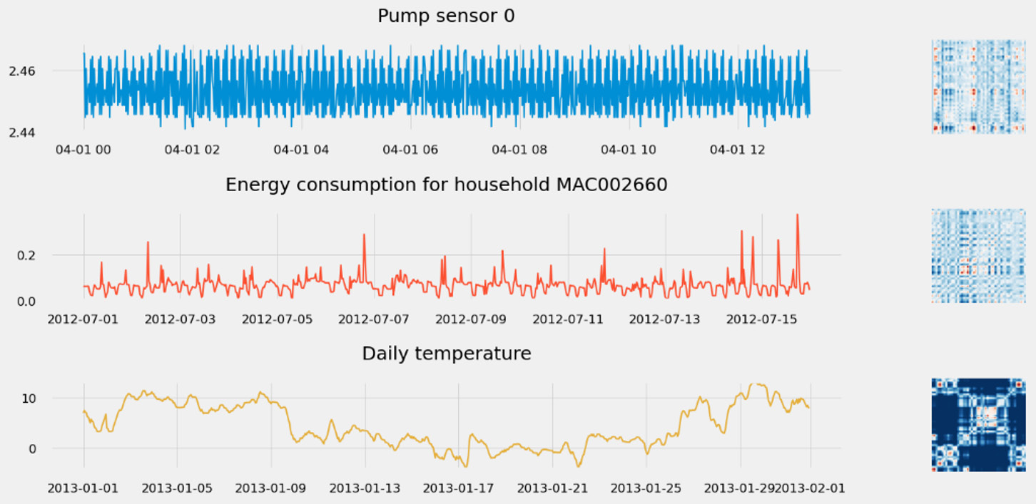
Figure 1.21 – Uncovering time series behavior with MTF
If you're interested in what insights this representation can bring you, feel free to dive deeper into it by walking through this GitHub repository: https://github.com/michaelhoarau/mtf-deep-dive. You can also read about this in detail in the following article: https://towardsdatascience.com/advanced-visualization-techniques-for-time series-analysis-14eeb17ec4b0
Modularity network graphs
From an MTF (see the previous section), we can generate a graph G = (V, E): we have a direct mapping between vertex V and the time index i. From there, there are two possible encodings of interest: flow encoding or modularity encoding. These are described in more detail here:
We map the flow of time to the vertex, using a color gradient from T0 to TN to color each node of the network graph.
We use the MTF weight to color the edges between the vertices.
- Modularity encoding: Modularity is an important pattern in network analysis to identify specific local structures. This is the encoding that I find most useful in time series analysis.
We map the module label (with the community ID) to each vertex with a specific color attached to each community.
We map the size of the vertices to a clustering coefficient.
We map the edge color to the module label of the target vertex.
To build a network graph from the MTF, you can use the tsia Python package. You can check the deep dive available as a Jupyter notebook in this GitHub repository: https://github.com/michaelhoarau/mtf-deep-dive.
A network graph is built from an MTF following this process:
- We compute the MTF for the time series.
- We build a network graph by taking this time series as an entry.
- We compute the partitions and modularity and encode these pieces of information into a network graph representation.
Once again, let's take the three time series previously processed and build their associated network graphs, as follows:

Figure 1.22 – Using network graphs to understand the structure of the time series
There are many features you can engineer once you have a network graph. You can use these features to build a numerical representation of the time series (an embedding). The characteristics you can derive from a network graph include the following:
- Diameter
- Average degree and average weighted degree
- Density
- Average path length
- Average clustering coefficient
- Modularity
- Number of partitions
All these parameters can be derived thanks to the networkx and python-louvain modules.
Symbolic transformations
Time series can also be discretized into sequences of text: this is a symbolic approach as we transform the original real values into symbolic strings. Once your time series are successfully represented into such a sequence of symbols (which can act as an embedding of your sequence), you can leverage many techniques to extract insights from them, including the following:
- You can use embedding for indexing use cases: given the embedding of a query time series, you can measure some distance to the collection of embeddings present in a database and return the closest matching one.
- Symbolic approaches transform real-value sequences of data into discrete data, which opens up the field of possible techniques—for instance, using suffix trees and Markov chains to detect novel or anomalous behavior, making it a relevant technique for anomaly detection use cases.
- Transformers and self-attention have triggered tremendous progress in natural language processing (NLP). As time series and natural languages are sometimes considered close due to their sequential nature, we are seeing a more and more mature implementation of the transformer architecture for time series classification and forecasting.
You can leverage the pyts Python package to apply the transformation described in this chapter (https://pyts.readthedocs.io) and Amazon SageMaker to bring the architecture described previously as custom models. Let's now have a look at the different symbolic transformations we can apply to our time series. In this section, we will deep dive into the following:
- Bag-of-words representations (BOW)
- Bag of symbolic Fourier approximations (BOSS)
- Word extraction for time series classification (WEASEL)
BOW representations (BOW and SAX-VSM)
The BOW approach applies a sliding window over a time series and can transform each subsequence into a word using symbolic aggregate approximation (SAX). SAX reduces a time series into a string of arbitrary lengths. It's a two-step process that starts with a dimensionality reduction via piecewise aggregate approximation (PAA) and then a discretization of the obtained simplified time series into SAX symbols. You can leverage the pyts.bag_of_words.BagOfWords module to build the following representation:

Figure 1.23 – Example of SAX to transform a time series
The BOW approach can be modified to leverage term frequency-inverse document frequency (TF-IDF) statistics. TF-IDF is a statistic that reflects how important a given word is in a corpus. SAX-VSM (SAX in vector space model) uses this statistic to link it to the number of times a symbol appears in a time series. You can leverage the pyts.classification.SAXVSM module to build this representation.
Bag of SFA Symbols (BOSS and BOSS VS)
The BOSS representation uses the structure-based representation of the BOW method but replaces PAA/SAX with a symbolic Fourier approximation (SFA). It is also possible to build upon the BOSS model and combine it with the TF-IDF model. As in the case of SAX-VSM, BOSS VS uses this statistic to link it to the number of times a symbol appears in a time series. You can leverage the pyts.classification.BOSSVS module to build this representation.
Word extraction for time series classification (WEASEL and WEASEL-MUSE)
The WEASEL approach builds upon the same kind of bag-of-pattern models as BOW and BOSS described just before. More precisely, it uses SFA (like the BOSS method). The windowing step is more flexible as it extracts them at multiple lengths (to account for patterns with different lengths) and also considers their local order instead of considering each window independently (by assembling bigrams, successive words, as features).
WEASEL generates richer feature sets than the other methods, which can lead to reduced signal-to-noise and high-loss information. To mitigate this, WEASEL starts by applying Fourier transforms on each window and uses an analysis of variance (ANOVA) f-test and information gain binning to choose the most discriminate Fourier coefficients. At the end of the representation generation pipeline, WEASEL also applies a Chi-Squared test to filter out less relevant words generated by the bag-of-patterns process.
You can leverage the pyts.transformation.WEASEL module to build this representation. Let's build the symbolic representations of the different time series of the heartbeats time series. We will keep the same color code (red for ischemia and blue for normal). The output can be seen here:

Figure 1.24 – WEASEL symbolic representation of heartbeats
The WEASEL representation is suited to univariate time series but can be extended to multivariate ones by using the WEASEL+MUSE algorithm (MUSE stands for Multivariate Unsupervised Symbols and dErivatives). You can leverage the pyts.multivariate.transformation.WEASELMUSE module to build this representation.
This section comes now to an end, and you should now have a hint on how rich time series analysis methodologies can be. With that in mind, we will now see how we can apply this fresh knowledge to solve different time series-based use cases.