Book Image

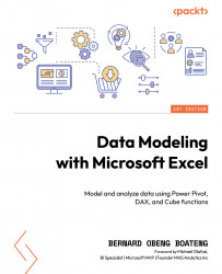
Data Modeling with Microsoft Excel

By : Bernard Obeng Boateng
5 (1)
Book Image

Data Modeling with Microsoft Excel

5 (1)
By: Bernard Obeng Boateng

Overview of this book

Microsoft Excel's BI solutions have evolved, offering users more flexibility and control over analyzing data directly in Excel. Features like PivotTables, Data Model, Power Query, and Power Pivot empower Excel users to efficiently get, transform, model, aggregate, and visualize data. Data Modeling with Microsoft Excel offers a practical way to demystify the use and application of these tools using real-world examples and simple illustrations. This book will introduce you to the world of data modeling in Excel, as well as definitions and best practices in data structuring for both normalized and denormalized data. The next set of chapters will take you through the useful features of Data Model and Power Pivot, helping you get to grips with the types of schemas (snowflake and star) and create relationships within multiple tables. You’ll also understand how to create powerful and flexible measures using DAX and Cube functions. By the end of this book, you’ll be able to apply the acquired knowledge in real-world scenarios and build an interactive dashboard that will help you make important decisions.
Table of Contents (16 chapters)
1
Part 1: Overview and Introduction to Data Modeling in Microsoft Excel
6
Part 2: Creating Insightful Calculations from your Data Model using DAX and Cube Functions
9
Part 3: Putting it all together with a Dashboard

What are dashboards?

A dashboard is a visual representation of data that is designed to provide an overview of key performance indicators (KPIs) and other important information. Dashboards can be used to present data in a variety of formats, including charts, graphs, and tables. They are typically used to communicate insights from data to stakeholders, such as managers and executives, in an easy-to-understand format.

Dashboards in Excel are dynamic visual interfaces that consolidate and display key information in a concise and visually appealing manner. By leveraging Excel’s extensive data manipulation capabilities and charting features, we can create interactive dashboards that enable the exploration and analysis of complex datasets. The primary objective of a dashboard is to provide a comprehensive overview of key metrics, trends, and patterns, enabling users to make informed decisions quickly. The following is a sample Personal Finance Dashboard to help a user compare...