
Creating a histogram of a time series
This is another bonus section, where we will illustrate how to create a histogram of a time series to get a better overview of its values.
A histogram, which looks a lot like a bar chart, defines buckets (bins) and counts the number of values that fall into each bin. Strictly speaking, a histogram allows you to understand your data by creating a plot of the distribution of values. You can see the maximum and the minimum values, as well as find out data patterns, just by looking at a histogram.
The Python code for histogram.py is as follows:
#!/usr/bin/env python3
import sys
import pandas as pd
import matplotlib.pyplot as plt
import numpy as np
import math
import os
if len(sys.argv) != 2:
     print("TS1")
     sys.exit()
TS1 = sys.argv[1]
ts1Temp = pd.read_csv(TS1, compression='gzip')
ta = ts1Temp.to_numpy()
ta = ta.reshape(len(ta))
min = np.min(ta)
max = np.max(ta)
plt.style.use('Solarize_Light2')
bins = np.linspace(min, max, 2 * abs(math.floor(max) + 1))
plt.hist([ta], bins, label=[os.path.basename(TS1)])
plt.legend(loc='upper right')
plt.show()
The third argument of the np.linespace() function helps us define the number of bins the histogram has. The first parameter is the minimum value, and the second parameter is the maximum value of the presented samples. This script does not save its output in a file but, instead, opens a window on your GUI to display the output. The plt.hist() function creates the histogram, whereas the plt.legend() function puts the legend in the output.
A sample output of histogram.py can be seen in Figure 2.5:
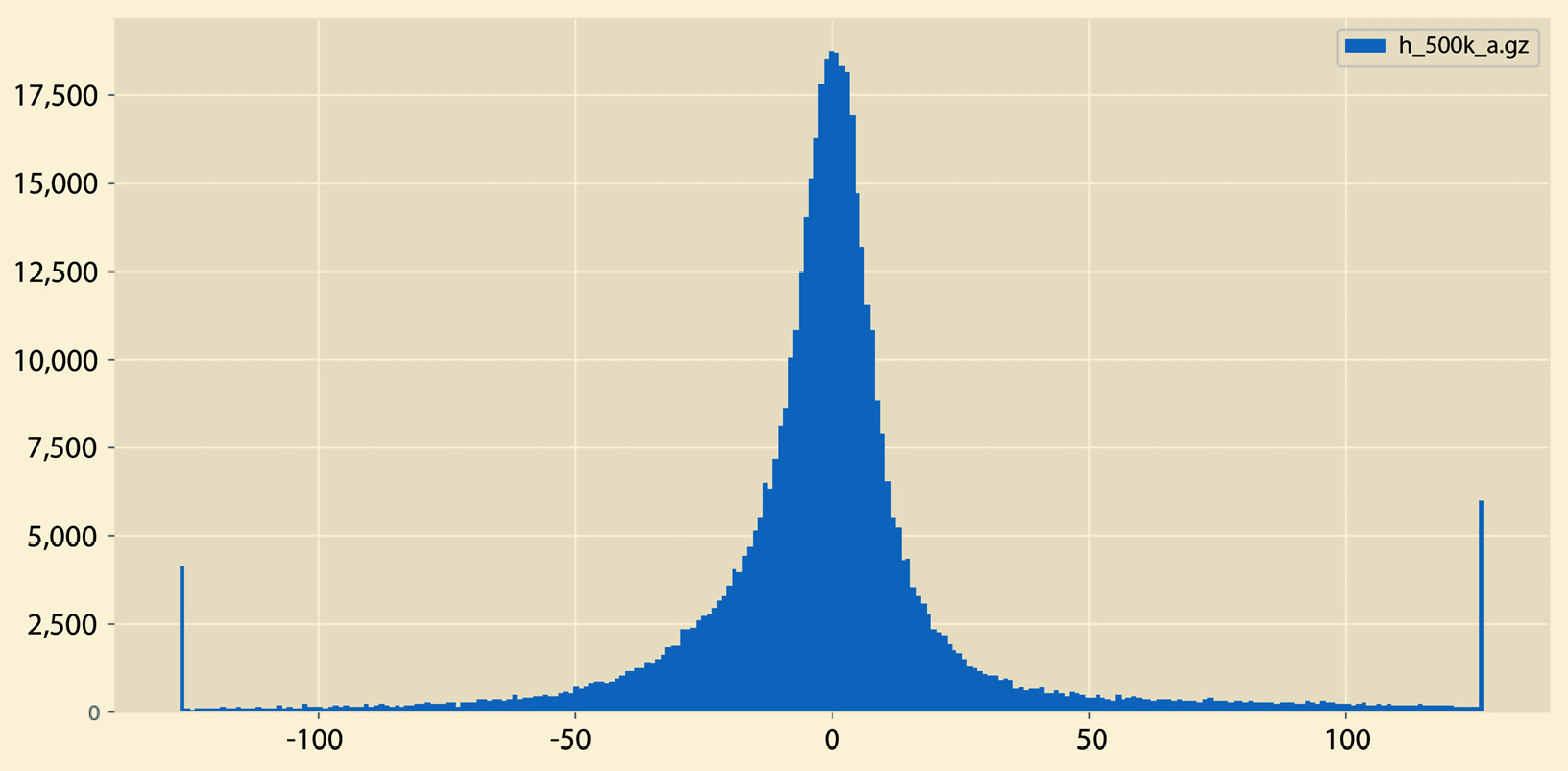
Figure 2.5 – A sample histogram
A different sample output from histogram.py can be seen in Figure 2.6:
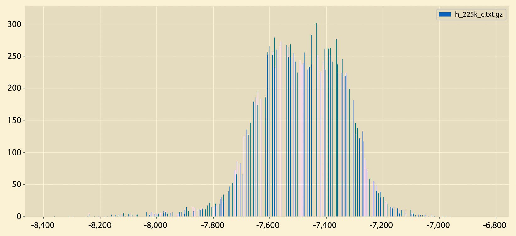
Figure 2.6 – A sample histogram
So, what is the difference between the histograms in Figure 2.5 and Figure 2.6? There exist many differences, including the fact that the histogram in Figure 2.5 does not have empty bins and it contains both negative and positive values. On the other hand, the histogram in Figure 2.6 contains negative values only that are far away from 0.
Now that we know about histograms, let us learn about another interesting statistical quantity – percentiles.