
UI design basics
In developing M5Stack Core applications, the UI aids in the operation of the device. The M5Stack Core’s LCD easily lays out graphics that convey information from electronic sensors attached to the programmable controller. The M5Stack Core LCD can also provide the status as output devices like an electromechanical relay. In this section, you will learn about effective visual effect approaches for UIs. You will learn about UI design basics that make your applications appealing and easy to use. Before you start designing your UI, the dimensions of the M5Stack Core are needed.
The M5Stack Core’s LCD dimensions are 320 x 230 pixels. Therefore, you have a total of 73,600 pixels available to create a variety of unique UIs:
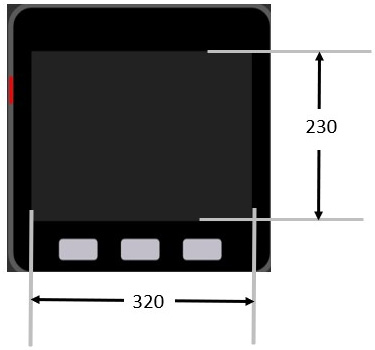
Figure 1.27 – M5Stack Core dimensions
The pixels are electronic dots arranged using a Cartesian coordinate system. When placing the images or controls, their locations can be managed using the Cartesian coordinate system. You can move the image quite easily using the UiFlow programming tool. The UiFlow programming tool has a design layout area that allows a preview of the images and controls placed on the LCD. The following example illustrates the x and y coordinates of 58 and 45 for the location of the square on the LCD:
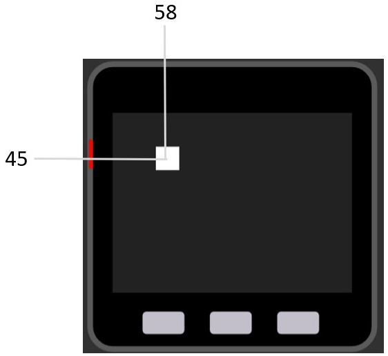
Figure 1.28 – Placement of an object on the UiFlow design layout area
The x-data point is 58 and the y-data point is 45. You can place the objects by dragging them to the specified location or entering them manually as follows:
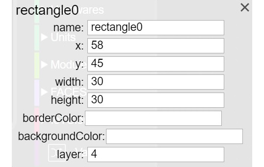
Figure 1.29 – Manual placement of a square on the UiFlow design layout area
You can obtain the properties box by clicking on the square. Once the properties box is visible on the UiFlow design layout area, x and y location data points may be entered as shown in the following figure:
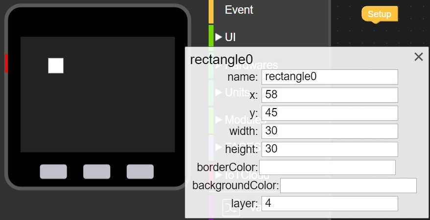
Figure 1.30 – Entering x and y data points into the properties box
The square can be precisely located on the LCD by entering the value incrementally in the properties box. As you enter the value, the square will move accordingly based on the coordinate position. You can use this approach to lay out your UI design on the M5Stack Core’s LCD. To make your UI effective, there are some basic design elements you need to consider.
Input controls
Input controls such as buttons, text fields, checkboxes, radio buttons, drop-down lists, list boxes, toggles, and date fields, allow the user to interact with your M5Stack Core device easily. You should size the input controls to be visible and for ease of use. Overlayed objects should not be placed on the input controls. Such information will make the input controls difficult to use.
Design considerations
When you lay out a UI design for an M5Stack Core device application, three factors should be considered: development, visibility, and acceptance. Let’s look at them in detail:
- Development factors: These help improve the visual communications of the UI design by providing tool kits, component libraries, and rapid prototyping support. The M5Stack Core’s main development factor is the availability of the UiFlow Blockly and Arduino code libraries. An example of a development factor is the Wi-Fi network UiFlow Blockly library shown in the following screenshot:
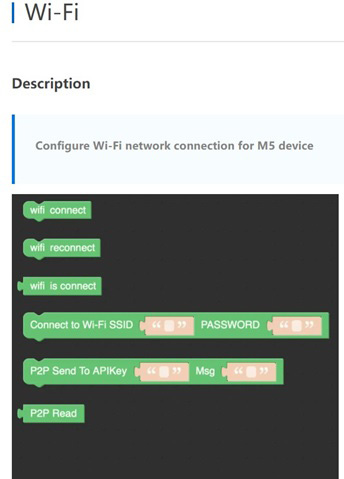
Figure 1.31 – Wi-Fi Blockly code library example of development factors
- Visibility factors: These allow multiple representations that aid the user to interact and engage with a UI design based on styles of learning and comprehension. Engagement, as it relates to the visual appeal of a UI design, provides education or is a productive tool and aligns with the learning aspect of the multiple representations concept. Examples of multiple representations include graphs, symbols, shapes, pictures, and sounds. The M5Stack Core includes a variety of shapes that will allow you to provide multiple representations for user interaction and engagement.
- Acceptance factors: These align with the documentation and training of the UI design-based product. For example, the M5Stack Core has been used in a variety of K-12 education classrooms based on the ease with which learners can create engaging and interactive devices. Figure 1.32 illustrates an acceptance factor using multiple representations for learner engagement and device interaction:

Figure 1.32 – M5Stack Core UI shapes for multiple representation
A final important note in designing and developing M5Stack Core UIs is simplicity. Simplicity is the design consideration consisting of using the important UI elements for communicating features and functions of your M5Stack Core device. The UI you design should be simple, eliminating unnecessary input control elements. The labeling of the multiple representations you use should be clear in language and messaging. The following screenshot illustrates clarity, thus eliminating unnecessary input control elements:
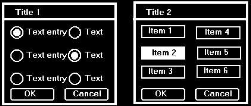
Figure 1.33 – (Left) complicated UI versus (right) simpler UI design
You now understand UI design basics that will aid in developing easy-to-use M5Stack Core applications. In the next section, we will present an overview of the UiFlow software.