
One of the darker corners of the flat UI paradigm is the look of clickable elements, like that of buttons; there is no universally accepted way of styling them.
For example, the Modern UI style (previously called Metro, as seen in Windows 8) is very radical, with clickable elements that look mostly like flat-colored rectangles with little or no distinctive graphical features. Other vendors, such as Apple, use vibrant gradients; there is a trend of also adding rounded corners, especially in web design since CSS3 provides a special-case syntax for just that. Subtle shadows, while considered heresy by some, aren't unheard of either.
Kivy is flexible in this regard. The framework does not impose any restrictions on visuals and provides a number of useful features to implement any design you like. One of the utilities that we will discuss next is 9-patch image scaling, which is used to style buttons and similar widgets that may have borders.
The motivation for a good scaling algorithm is simple: it's almost impossible to provide pixel-perfect graphics for every button, especially for the problematic ones that contain (varying amounts of) text. Scaling images uniformly is simple to implement but yields results that are mediocre at best, partly because of the aspect ratio distortion.
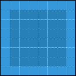
Non-uniform 9-patch scaling, on the other hand, produces uncompromising quality. The idea is to split the image into static and scalable parts. The following image is a hypothetical scalable button. The middle part (shown in yellow) is the working area, and everything else is a border:
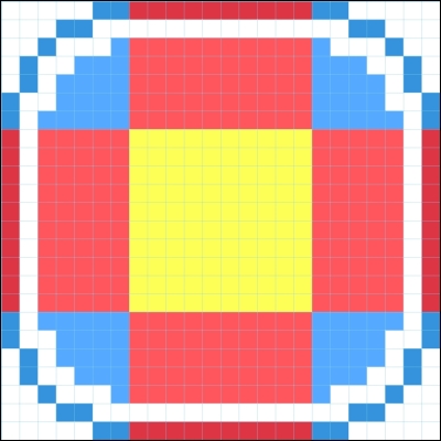
The red zones can be stretched in one dimension, while the blue zones (corners) are always left intact. This is evident from the following screenshot:
Corners, shown in blue, are fully static and may contain virtually anything. Borders, shown in red, are scalable in one dimension (top and bottom sides can be stretched horizontally, and left and right sides can be stretched vertically). The only part of the image that will be uniformly resized is the inner rectangle, the working area, shown in yellow; it is therefore common to paint it with a flat color. It will also contain text that's assigned to the button, if any.
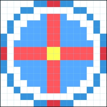
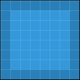
For this tutorial, we will use a simple flat button with a 1-pixel border. We can reuse this texture for all buttons or choose a different one, for example, for the Reset button. A button texture for the normal state with flat color and 1-pixel border is shown as follows:
The corresponding texture for the pressed state—an inversion of the preceding image—is shown as follows:
Now, to apply the 9-patch magic, we need to tell Kivy the size of borders that have limited scalability, as discussed previously (the image will be scaled uniformly by default). Let's revisit the clock.kv file and add the following properties:
<RobotoButton@Button>:
    background_normal: 'button_normal.png'
    background_down: 'button_down.png'
    border: (2, 2, 2, 2)
The border property values are ordered just like in CSS: top, right, bottom, and left (that is, clockwise starting from the top). Unlike CSS, we can't supply just one value for all sides; at least in the current Kivy version (1.8), the notation border: 2 results in error.
Tip
Probably the shortest way of setting all the borders to the same value is the Python syntax border: [2] * 4, which means take a list with a single element, 2, and repeat it four times.
Also note that while the visible border is just one pixel wide, we're assigning the border property of customized buttons to 2. This is due to the texture-stretching behavior of the renderer: if pixel colors from both sides of the "cut line" don't match, the result will be a gradient, and we want solid color.
In the class rules overview, we mentioned that the property declared on an instance of a widget takes precedence over the class rule's property with the same name. This can be used to selectively override background_*, border or any other attribute, for example, assigning another texture while reusing the border width definition:
RobotoButton:
    text: 'Reset'
    background_normal: 'red_button_normal.png'
    background_down: 'red_button_down.png'
Now our buttons are stylized, but they still don't do anything. The next step towards our goal is making the stopwatch work.