-
Book Overview & Buying

-
Table Of Contents

SwiftUI Cookbook
By :

SwiftUI Cookbook
By:
Overview of this book
 Free Chapter
 Sign In
Start Free Trial

 Free Chapter
SwiftUI scroll views are used to easily create scrolling containers. They automatically size themselves to the area where they are placed. Scroll views are vertical by default and can be made to scroll horizontally or vertically by passing in the .horizontal() or .vertical() modifiers as the first parameter to the scroll view.
Let's start by creating a SwiftUI project called ScrollViewApp.
Optional: Download the San Francisco (SF) Symbols app here: https://developer.apple.com/sf-symbols/.
SF Symbols is a set of over 2,400 symbols provided by Apple. They follow Apple's San Francisco system font and automatically ensure optical vertical alignment for different sizes and weights.
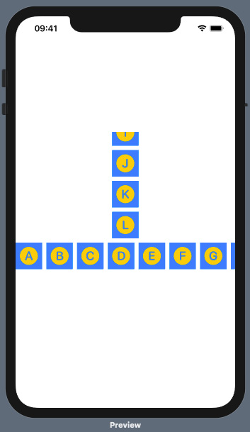
We will add two scroll views to a VStack component: one horizontal and one vertical. Each scroll view will contain SF symbols for the letters A–L:
ContentView struct declaration and its body, create an array of SF symbol names called imageNames. Add the strings for SF symbols A–L:let imageNames = [ "a.circle.fill", "b.circle.fill", "c.circle.fill", "d.circle.fill", "e.circle.fill", "f.circle.fill", "g.circle.fill", "h.circle.fill", "i.circle.fill", "j.circle.fill", "k.circle.fill", "l.circle.fill", ]
VStack component and scroll views to the app: var body: some View {
VStack{
ScrollView {
ForEach(self.imageNames, id: \.self) { name in
Image(systemName: name)
.font(.largeTitle)
.foregroundColor(Color. yellow)
.frame(width: 50, height: 50)
.background(Color.blue)
}
}
.frame(width:50, height:200)
ScrollView(.horizontal, showsIndicators: false) {
HStack{
ForEach(self.imageNames, id: \.self) { name in
Image(systemName: name)
.font(.largeTitle)
.foregroundColor(Color. yellow)
.frame(width: 50, height: 50)
.background(Color.blue)
}
}
}
}
}The result is a view with a vertical and horizontal scroll view:

Figure 2.1 – App with horizontal and vertical scroll views
VStack allows us to display multiple scroll views within the ContentView struct's body.
By default, scroll views display items vertically. The first ScrollView component in VStack displays items in a vertical way, even though no axis was specified.
Within the first ScrollView component, a ForEach loop is used to iterate over a static array and display the contents. In this case, the ForEach loop takes two parameters: the array we are iterating over and an identifier, id: \.self, used to distinguish between the items being displayed. The id parameter would not be required if the collection used conformed to the Identifiable protocol.
Two parameters are passed to the second ScrollView component: the axis and showIndicators (ScrollView(.horizontal, showsIndicators: false). The .horizontal axis parameter causes content to be horizontal, and showIndictors:false prevents the scrollbar indicator from appearing in the view.
Refer to the Apple ScrollView documentation at https://developer.apple.com/documentation/swiftui/scrollview.
