
Presenting the user with a choice from a list of available values is a common scenario for web-based applications. The HTML markup language includes a number of form elements that can be used to provide users with a list of options from which a selection can be made. Choosing the right HTML element or set of elements for a particular form depends on a number of criteria and is a common stumbling block for developers who are new to HTML. Fortunately, the standard set of JSF HTML components greatly simplifies the correct use of HTML selection elements. In later chapters, we will discover how other JSF component libraries introduce a rich and innovative set of user interface controls that can significantly extend the capabilities of HTML as a GUI toolkit.
Before we discuss JSF HTML selection components, let's consider the HTML elements that they represent. The HTML markup language includes a limited set of selection components such as checkboxes, radio buttons, and select menus. Both checkboxes and radio buttons are represented by the<input> element with different type attributes. A checkbox is rendered using the<input> element with the type attribute set to "checkbox", while a radio button is rendered using the<input> element with the type attribute set to "radio".
Both checkboxes and radio buttons can be grouped together to present the user with a range of inclusive or exclusive options. The HTML 4.01 specification explains that checkboxes are grouped together by users to represent several mutually inclusive options, while radio buttons are grouped together to represent mutually exclusive options.
Note
For more details, refer W3C to Forms in the W3C HTML 4.01 Specification: 13 July 2009http://www.w3.org/TR/html401/interact/forms.html.
Checkboxes can also be rendered individually, representing a Boolean choice of true or false. A radio button should not be rendered individually because to the user that represents a mutually exclusive choice from a set of only one possible option! In addition, once the user selects a radio button it can only be deselected by choosing another radio button in the set, or by using JavaScript to override the default behavior of this control.
The standard JSF HTML component library includes several components for rendering radio buttons and checkboxes in our JSF pages. Depending on our needs, we might use the<h:selectBooleanCheckbox> tag, the<h:selectManyCheckbox> tag, or the<h:selectOneRadio> tag.
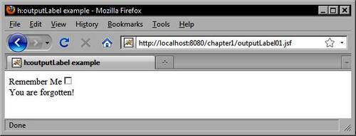
The<h:selectBooleanCheckbox> tag renders a single checkbox and is useful for presenting a Boolean option, such as a "remember me" checkbox in a login dialog. The<h:selectManyCheckbox> tag renders a set of checkboxes that can be used to display multiple of Boolean options to the user, for example, a list of interests for a newsletter subscription form. The<h:selectOneRadio> tag renders a set of radio buttons that can be used to present a set of mutually exclusive options such as a level of satisfaction on a scale from "very unsatisfied" to "very satisfied" in a customer feedback survey.
Recall from the<h:outputLabel> example that a label references another component's ID attribute in the label's for attribute. One of the benefits of the correct use of this component is that for certain components, browsers will recognize the label as an extension of the component itself and will allow users to click the label to toggle the component state. In this example, we use JavaScript to submit the form when the user clicks the checkbox.
<h:outputLabel value="Remember Me" for="remember" />
<h:selectBooleanCheckbox id="remember" value="#{backingBean.rememberMe}" onclick="submit()" />
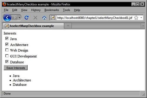
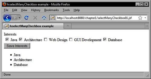
This example demonstrates how to use the<h:selectManyCheckbox> tag. Notice that the options are defined using nested<f:selectItem> tags. The itemLabel attribute is what is displayed to the user, while the itemValue attribute is what is submitted to the server when the form is posted.
<h:selectManyCheckbox id="interests" value="#{customerBean.interests}" layout="lineDirection">
<f:selectItem itemLabel="Java" itemValue="Java" />
<f:selectItem itemLabel="Architecture" itemValue="Architecture" />
<f:selectItem itemLabel="Web Design" itemValue="Web Design" />
<f:selectItem itemLabel="GUI Development" itemValue="GUI Development" />
<f:selectItem itemLabel="Database" itemValue="Database" />
</h:selectManyCheckbox>
The same example can be rewritten to display the options horizontally instead of vertically by setting the layout attribute of the<h:selectManyCheckox> tag to pageDirection as follows:
<h:selectManyCheckbox id="interests" value="#{customerBean.interests}" layout="pageDirection">
<f:selectItem itemLabel="Java" itemValue="Java" />
<f:selectItem itemLabel="Architecture" itemValue="Architecture" />
<f:selectItem itemLabel="Web Design" itemValue="Web Design" />
<f:selectItem itemLabel="GUI Development" itemValue="GUI Development" />
<f:selectItem itemLabel="Database" itemValue="Database" />
</h:selectManyCheckbox>
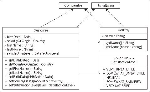
The following example for the<h:selectOneRadio> tag is interesting because it demonstrates a useful technique. The<h:selectOneRadio> tag renders a set of radio buttons in the view. These radio buttons represent mutually exclusive options within a set of predefined values. The Java enum type is a good choice for a data type here because it also represents a set of predefined values. JSF also includes a built-in converter class that specifically handles Java enum types. Therefore, we can define our enum as follows:
public enum SatisfactionLevel {
VERY_UNSATISFIED, SOMEWHAT_UNSATISFIED, NEUTRAL, SOMEWHAT_SATISFIED, VERY_SATISFIED
}
Next, in our Customer class we define a new property of type SatisfactionLevel.
public class Customer implements Comparable<Customer>, Serializable {
...
private SatisfactionLevel satisfactionLevel;
...
}
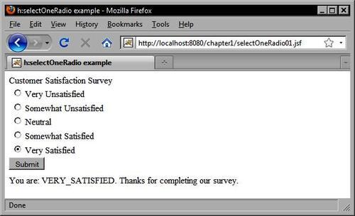
In our JSF page, we can now declare an<h:selectOneRadio> tag that is bound to this property. When the user submits the form, the selected value will be converted automatically to one of our enumerated values and stored in our model class.
<h:selectOneRadio id="survey" value="#{customerBean.customer.satisfactionLevel}" layout="pageDirection">
<f:selectItem itemLabel="Very Unsatisfied" itemValue="VERY_UNSATISFIED" />
<f:selectItem itemLabel="Somewhat Unsatisfied" itemValue="SOMEWHAT_UNSATISFIED" />
<f:selectItem itemLabel="Neutral" itemValue="NEUTRAL" />
<f:selectItem itemLabel="Somewhat Satisfied" itemValue="SOMEWHAT_SATISFIED" />
<f:selectItem itemLabel="Very Satisfied" itemValue="VERY_SATISFIED" />
</h:selectOneRadio>
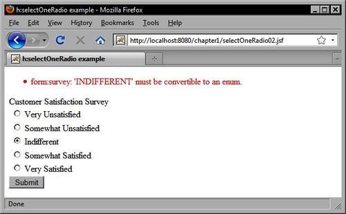
As we used a typesafe enum as our data type, only the values we defined in our Java code are acceptable. If we entered a new option value for the<h:selectOneRadio> tag, a conversion error would result when the form is submitted.
<h:selectOneRadio id="survey" value="#{customerBean.customer.satisfactionLevel}" layout="pageDirection">
<f:selectItem itemLabel="Very Unsatisfied" itemValue="VERY_UNSATISFIED" />
<f:selectItem itemLabel="Somewhat Unsatisfied" itemValue="SOMEWHAT_UNSATISFIED" /> <f:selectItem itemLabel="Indifferent" itemValue="INDIFFERENT" /> <f:selectItem itemLabel="Somewhat Satisfied" itemValue="SOMEWHAT_SATISFIED" />
<f:selectItem itemLabel="Very Satisfied" itemValue="VERY_SATISFIED" /> </h:selectOneRadio>
In addition to checkboxes and radio buttons, the HTML markup language includes another important selection control: the<select> element. The<select> element is useful because it can produce a number of different selection menus. Depending on the values of the multiple and size attributes, this element might display the following:
A single selection menu with only one item visible
A single selection menu with multiple items visible
A multiple selection menu with only one item visible
A multiple selection menu with many items visible
The menu items contained by the<select> element are specified by child<option> elements. The<option> element can have a selected state, and can declare a label and a value. The label attribute or the body of the<option> element is what is displayed to the user, while the value attribute is what is sent to the server during form submission. Multiple options can be grouped together using the<optgroup> element. The value of the<optgroup> element's label attribute is displayed as a header above the indented list of options. Grouping options together is an easy way to enhance the readability and usability of<select> elements in your forms.
JSF includes a number of components that represent the different states of the<select> element. The<h:selectOneMenu> tag renders the HtmlSelectOneMenu component as a single selection menu that displays only one item at a time. The<h:selectManyMenu> tag renders the HtmlSelectManyMenu component as a multiple selection menu that displays only one item at a time. The<h:selectOneListbox> tag renders the HtmlSelectOneListbox component as a single selection menu that displays multiple items at a time. The<h:selectManyListbox> tag renders the HtmlSelectManyListbox component as a multiple selection menu that displays multiple items at a time.
When would we use the<h:selectOneMenu> and<h:selectManyMenu> tags? The<h:selectOneMenu> tag is a good choice for a selection situation where the user may only choose one item from a long list of items, such as his or her country of origin. The<h:selectManyMenu> tag is intended for situations where it is preferable to display only one item at a time in the selection component, but where the user is allowed to make more than one selection.
Both of these menu components have an inherent size of one, meaning they will only display one item at a time. Unfortunately, the<h:selectManyMenu> tag produces a control that is not rendered consistently across browsers. In Internet Explorer, the component is rendered with a scrollbar allowing the user to scroll through the items in the list. In Firefox, however, the control is rendered without scrollbars, making it impossible for the user to make a selection. Therefore, it is not recommended to use the<h:selectManyMenu> tag at this time.
When should we use the<h:selectOneListbox> and<h:selectManyListbox> tags? If the user is only allowed to select one item and the list of options is greater than two but is still relatively short, then it may be preferable to use the<h:selectOneListbox> tag and to set the size attribute to the number of items in the list to ensure they will all be displayed without scrolling.
For example, if we were asking the user how they discovered our website, and the available options were "Television, Radio, Internet Search, Word of Mouth, Other", then displaying these options in a fully expanded single selection menu would actually increase the efficiency of our user interface by saving the user from having to click twice to make a selection (once to scroll, and once to select an option).
Choosing between the<h:selectOneListbox> and<h:selectManyListbox> tag is more straightforward than choosing between menu and list box components. It comes down to whether our application allows the user to select multiple options, or whether they must select only one option for a particular field. In the previous example, users may be allowed to select more than one source of information, in which case replacing the single selection component with its multiple selection variant is the obvious choice.
On the other hand, the decision to use the menu or list box selection components is a little more involved and ultimately depends on how well these components "fit" into our user interface as a whole. If there are several selection menus on the same screen, and all but one have long lists of items and are therefore rendered using the<h:selectOneMenu> tag, then it might look awkward to have a single<h:selectOneListbox> tag on the page. In this case, we may have to trade the user interface efficiency for consistency and use the<h:selectOneMenu> tag to render a component that makes our UI more aesthetically pleasing to user.
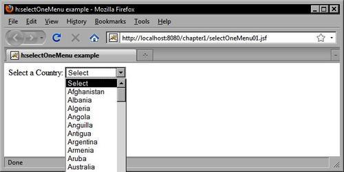
This example shows how to use the<h:selectOneMenu> tag to display a list of Country objects in the form. It obtains the country list from the backing bean and renders a blank item to prompt the user to make a selection. A custom converter is also registered on the HtmlSelectOneMenu component. The JSF framework calls our converter twice: once to convert each Country object to a string when the view is rendered, and once to convert the selected string back to a Country object when the form is submitted.
The following UML class diagram shows the design of our model classes:
In this example, we rely on a custom JSF converter to convert Country objects to String objects and vice versa. In later chapters, we will see that many popular JSF component libraries include reusable converters that can eliminate the need for us to write our own. When the view is rendered, our Country objects are rendered as strings in an HTML<select> element.
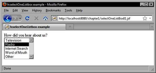
In this example, we use the<h:selectOneListbox> tag to render a single-selection list of items to the user.
<h:selectOneListbox id="option" value="#{customerBean.informationSource}"> <f:selectItem itemLabel="Television" itemValue="Television" />
<f:selectItem itemLabel="Radio" itemValue="Radio" />
<f:selectItem itemLabel="Internet Search" itemValue="Internet Search" />
<f:selectItem itemLabel="Word of Mouth" itemValue="Word of Mouth" />
<f:selectItem itemLabel="Other" itemValue="Other" />
</h:selectOneListbox>
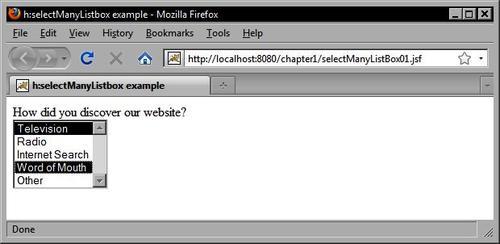
We can render the same set of options in a multiple selection mode using the<h:selectManyListbox> tag.
<h:selectManyListbox id="option" value="#{customerBean.informationSources}">
<f:selectItem itemLabel="Television" itemValue="Television" />
<f:selectItem itemLabel="Radio" itemValue="Radio" />
<f:selectItem itemLabel="Internet Search" itemValue="Internet Search" />
<f:selectItem itemLabel="Word of Mouth" itemValue="Word of Mouth" />
<f:selectItem itemLabel="Other" itemValue="Other" />
</h:selectManyListbox>