


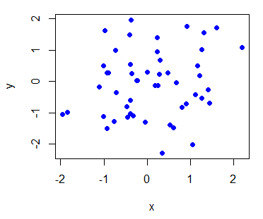
We can make a simple plot using the plot() function of R. Now we will simulate 50 values from a normal distribution using rnorm() and assign these to x and similarly generate and assign 50 normally distributed values to y. We can plot these values in the following way:
x = rnorm(50)
y = rnorm(50)
# pch = 19 stands for filled dot
plot(x, y, pch = 19, col = 'blue')
This gives us the following scatterplot with blue-colored filled dots as symbols for each data point:
We can also generate a line plot type of graph by using type = "l" inside plot().
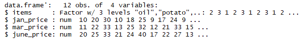
Now we will briefly look at a very strong graphical library called ggplot2 developed by Hadley Wickham. Remember, the all_prices data frame? If you don't, let's have another look at that:
str(all_prices)
We see that it has 12 rows and four columns, it has three numeric variables and one factor variable:
We first need to install and then load the ggplot2 package:
install.packages("ggplot2")
library(ggplot2)
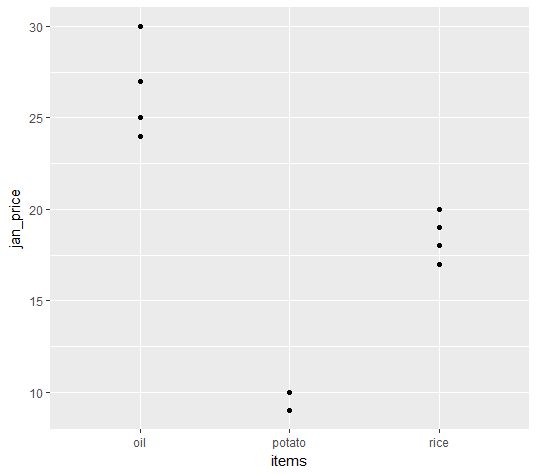
Now we need to define the data frame we want to use inside the ggplot() command, and inside this command, after the data frame name, we need to write aes(), which stands for aesthetics. Inside this aes(), we define the x axis variable and the y axis variable. So, if we want to plot the prices of different items in January against these items, we can do the following:
 ggplot(all_prices, aes(x = items, y = jan_price)) +
 geom_point()
Now we see the plot as follows:
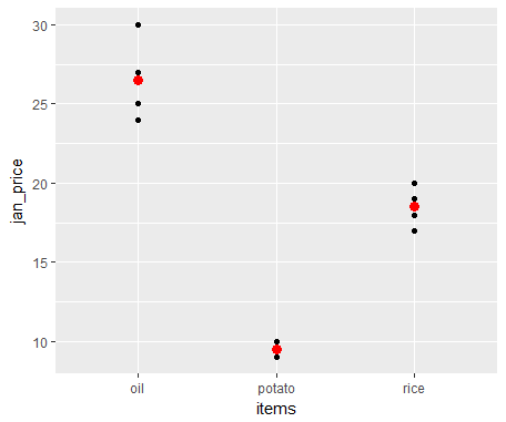
We can also compute and mark the mean price in January of these different items over all the years under consideration using stat = "summary" and fun.y = "mean". We will just need to add another layer, geom_point(), and mention these arguments inside this:
ggplot(all_prices, aes(x = items, y = jan_price)) +
 geom_point() +
 geom_point(stat = "summary", fun.y = "mean", colour = "red", size = 3)
The following screenshot shows that along with data points, the mean values for each item are marked as red:
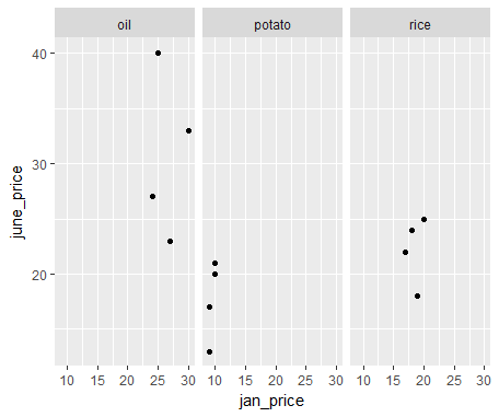
We can also plot the price of January against the price of June and make separate plots for each of the items using facet_grid(. ~ items):
ggplot(all_prices, aes(x = jan_price, y = june_price)) +
 geom_point() +
 facet_grid(. ~ items)
As a result, we see a scatterplot for three different items as follows:
We can also add a linear model fit using a stat_smooth() layer:
ggplot(all_prices, aes(x = jan_price, y = june_price)) +
 geom_point() +
 facet_grid(. ~ items) +
 # se = TRUE inside stat_smooth() shows confidence interval
 stat_smooth(method = "lm", se = TRUE, col = "red")
The preceding code gives a linear model fit and a 95% confidence interval along with the scatterplot:
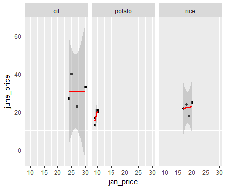
We get this weird-looking confidence interval for the oil price and the rice price, as there are very few points available.
We can do so many more things, and we have so many other things to cover in this book that we will not be covering any more plotting functionalities here. But we will explain many other aspects of plotting as and when appropriate when dealing with spatial data in upcoming chapters. I have also listed books to refer to for a deeper understanding of R in the Further reading section.


