Book Image

Practical Responsive Typography

By : Calonaci
Book Image

Practical Responsive Typography

By: Calonaci

Overview of this book

Typography is an essential part of any website’s design. It can help you stand out from the crowd, communicate with clarity, and cultivate a distinctive identity. Practical Responsive Typography demonstrates how to use typography to greatest effect. With this book you won't underestimate it's importance - you'll be in complete control over this crucial component of web design. From scaling and optimizing screen spaces to using a range of different web fonts, you'll quickly get up to speed with the practical considerations behind successful typography. But more than the fundamentals, you'll also find out how to go further by customizing typography designs to suit your identity.
Table of Contents (12 chapters)
11
Index

A Sass powered one page website


Let's start with our first, chapter-length project: imagine you are a designer, let's make a responsive one page website with Sass, showcasing your works.

First we'll create our project folder – and HTML page, of course naming it as standard, index.html – and the Sass file for our CSS, style.scss.

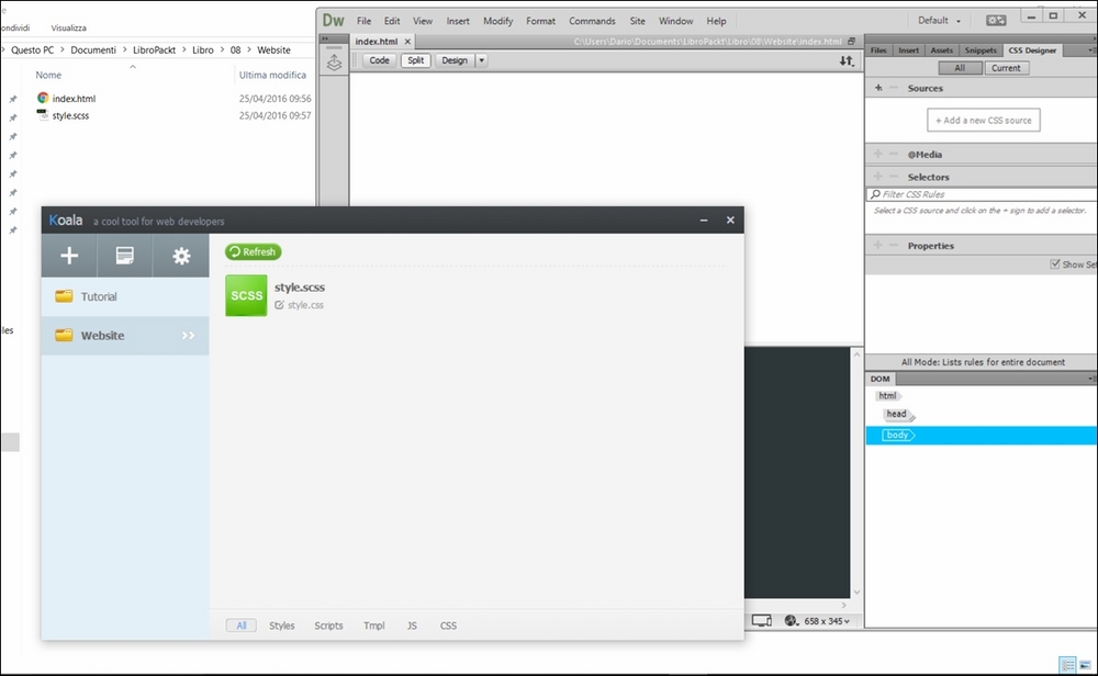
The following image show the structure of our project in its early minutes, using Koala and any of the developing software you use for your HTML and CSS (in this case Adobe Dreamweaver):
Let's start with our first step in responsive design, the meta tag in our index.html document:

<!DOCTYPE html>
<html>
  <head>
    <title>My Portfolio</title>
    <meta name="viewport" content="width=device-width, initial-scale=1">
    <!--[if IE]>
      <script src="http://html5shiv.googlecode.com/svn/trunk/html5.js">
      </script>
    <![endif]-->
  </head>
  <body>
  </body>
</html>

Of course, we...