Book Image

Designing Next Generation Web Projects with CSS3

By : Sandro Paganotti
Book Image

Designing Next Generation Web Projects with CSS3

By: Sandro Paganotti

Overview of this book

CSS3 unveils new possibilities for frontend web developers: things that would require JavaScript, such as animation and form validation, or even third party plugins, such as 3D transformations, are now accessible using this technology."Designing Next Generation Web Projects with CSS3" contains ten web projects fully developed using cutting edge CSS3 techniques. It also covers time saving implementation tips and tricks as well as fallback, polyfills, and graceful degradation approaches.This book draws a path through CSS3; it starts with projects using well supported features across web browsers and then it moves to more sophisticated techniques such as multi polyfill implementation and creating a zooming user interface with SVG and CSS. React to HTML5 form validation, target CSS rules to specific devices, trigger animations and behavior in response to user interaction, gain confidence with helpful tools like SASS, learn how to deal with old browsers and more."Designing Next Generation Web Projects with CSS3" is a helpful collection of techniques and good practices designed to help the implementation of CSS3 properties and features.
Table of Contents (17 chapters)
Designing Next Generation Web Projects with CSS3
Credits
About the Author
About the Reviewers
www.PacktPub.com
Preface
Index

Basic styling


What we need to do is center the form, give the right size to the texts, choose a background, and adjust the displacement of labels and fields.

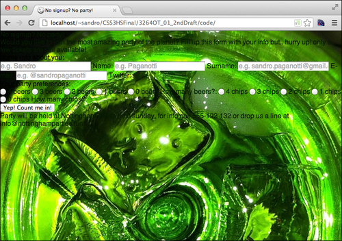
Let's start with the background. What we want to achieve is to place an image as big as possible to fit the page while keeping its proportions. This simple task in the "CSS2 era" would involve some use of JavaScript, such as the well-known Redux jQuery plugin (http://bavotasan.com/2011/full-sizebackground-image-jquery-plugin/). With CSS3 it's just a matter of a few statements:

html{
  height: 100%;
  background: black;
  background-image: url('../img/background.jpg');
  background-repeat: no-repeat;
  background-size: cover;
  background-position: top left;
  font-family: sans-serif;
  color: #051a00;
}

What does the trick here is the background-size property, which accepts the following values:

  • length: Using this value, we can express the size of the background using any units of measurement, for example background-size: 10px 10px;.

  • percentage: Using this value, we can specify a background size that varies with the size of the element, for example background-size: 10% 10%;.

  • cover: This value scales the image (without stretching it) to cover the whole area of the element. This means that part of the image may not be visible because it could get bigger than the container.

  • contain: This value scales the image (without stretching it) to the maximum size available while keeping the whole image within the container. This, obviously, could leave some area of the element uncovered.

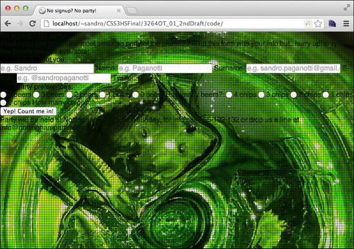
So, by using cover, we ensure that the whole page will be covered by our image, but we can do more! If we run all that we've done up to here in a browser, we will see that the pixels of our background image become visible if we enlarge the window too much. To avoid this, what we can do is to use another background image on top of this one. We can use small black dots to hide the pixels of the underlying image and achieve a better result.

The good news is that we can do this without using another element, as CSS3 allows more than one background on the same element. We can use commas (,) to separate the backgrounds, keeping in mind that what we declare first will lay over the others. So, let's change the preceding code a bit:

html{
  height: 100%;
  background: black;
  background-image: 
    url('../img/dots.png'), 
    url('../img/background.jpg');
  background-repeat: repeat, no-repeat;
  background-size: auto, cover;
  background-position: center center, top left;
  font-family: sans-serif;
  color: #051a00;
}

Also, all the other background-related properties act in the same way. If we omit one of the values, the previous one is used, so writing background-repeat: repeat is the same as writing background-repeat: repeat, repeat if two background images are declared.

Defining properties

Let's move on and define the rest of the required properties to complete the first phase of the project:

/* the main container */
article{
  width: 600px;
  margin: 0 auto;
  background: #6cbf00;
  border: 10px solid white;
  margin-top: 80px;
  position: relative;
  padding: 30px;
  border-radius: 20px;
}
/* move the title over the main container */
article h1{
  width: 600px;
  text-align: center;
  position: absolute;
  top: -62px;
/* using the custom font family provided by google */
  font-family: 'Port Lligat Sans', cursive;
  color: white;
  font-size: 60px;
  text-transform: uppercase;
}

/* the small text paragraphs */
article p, 
article > footer{
  padding-bottom: 1em;
  line-height: 1.4em;
}

/* the fieldsets' legends */
article legend{
  font-family: 'Port Lligat Sans', cursive;
  display: block;
  color: white;
  font-size: 25px;
  padding-bottom: 10px;
}

.label{
  display: block;
  float: left;
  clear: left;
}

/* positioning the submit button */
input[type=submit]{
  display:block;
  width: 200px;
  margin: 20px auto;
}

/* align texts input on the right */
input[type=text], input[type=email]{
  float: right;
  clear: right;
  width: 350px;
  border: none;
  padding-left: 5px;
}
input[type=text], 
input[type=email], 
.label{
  margin: 2px 0px 2px 20px;
  line-height: 30px;
  height: 30px;
}

span + input[type=radio], legend + input[type=radio]{
  clear: right
}

/* size of the small labels linked to each radio */
.preferences label.chips,
.preferences label.beers{
  width: 60px;
  background-image: none;
}

input[type="radio"]{
  padding-right: 4px;
}

input[type="radio"], 
.preferences label{
  float: right;
  line-height: 30px;
  height: 30px;
}

There are just a few things to underline here. First of all, by using some floats, we've moved all the fields to the right and the labels to the left. Next, we've defined some distance between the elements. Maybe the most cryptic statement is the following one:

span + input[type=radio], legend + input[type=radio]{
  clear: right
}

Due to the floating that we just talked about, the first element of each group of radio buttons became the rightmost. So, we identify this element by using the selector1 + selector2 selector, which indicates that the specified elements must be siblings. This is called an adjacent sibling selector, and selects all the elements matching the selector2 selector that directly follows an element matching the selector1 selector. Finally, using clear:right we simply state that there must be no other floating elements to the right of these radio buttons.

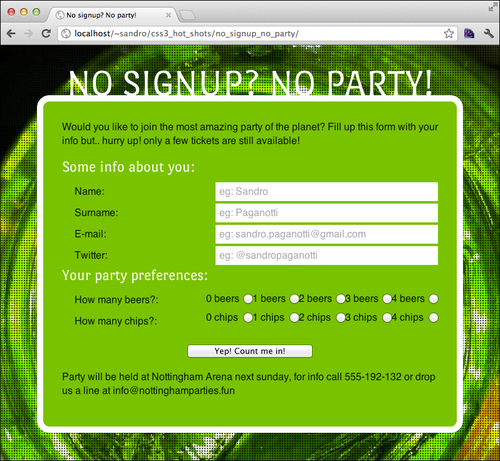
Let's reload the project in the browser to appreciate the result of our work: