
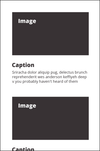
Before we jump into the code, let's take a look at some wireframes. The following screenshot shows how our screen should look on a small screen:
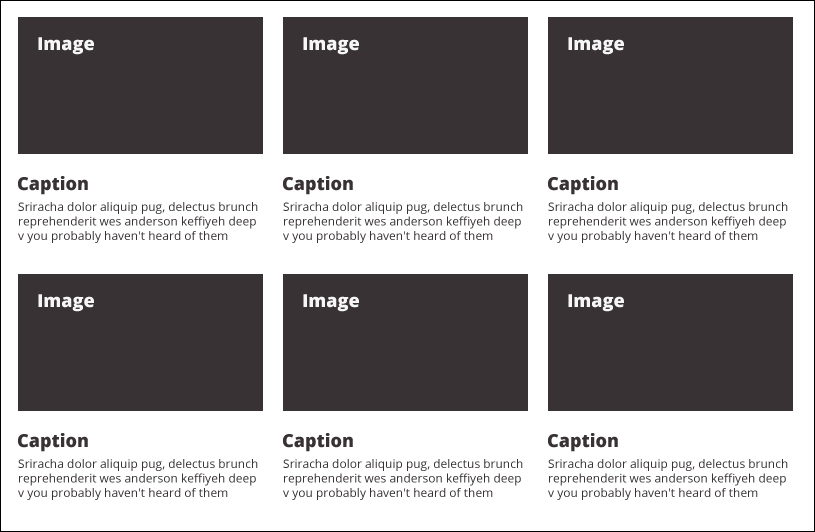
As the browser gets wider, we'd like those images to get bigger and change the layout from stacking to tiling for better use of the screen space. The following screenshot is the basic layout of a screen over 992 px wide:
There are a lot of visual breakpoints between the two that I have created above that 320 and Up facilitates. The only thing to keep in mind with 320 and Up is how to keep the rest of your page consistent with it. As we go along here, let's analyze what the layout is doing and get the rest of our page to play nice with it by either using styles that already exist in 320 and Up or creating our own.
The way I would create a Gallery page for myself is with some kind of hero at the top of the page, but not a slideshow. I feel it's important to orient users with a simple, bold statement at the top of most pages for...