Book Image

Mobile First Design with HTML5 and CSS3

By : Jason Gonzales
Book Image

Mobile First Design with HTML5 and CSS3

By: Jason Gonzales

Overview of this book

<p>The mobile first design philosophy aims to develop websites that will be lean and fast on small screens without sacrificing a tablet or desktop experience. Using HTML5, CSS3, and simple, standardized modern web tools you can make one site to rule them all.</p> <p>Mobile First Design with HTML5 and CSS3 will teach you the tools you need to make a modern, standards-based web page that displays beautifully on nearly any web browser—essential knowledge for anyone who makes websites!</p> <p>In this book, you will learn how to set up a project from scratch and quickly get up and running with a full portfolio website that will form the base for making almost any kind of web page. Learn to develop web pages that fit the web conventions we all have to conform to. You will learn how to make responsive image slideshows; image galleries with detail pages; and bold, eye-catching banners and forms. Best of all, you will learn how to make these things fast without compromising quality.</p> <p>This book will walk you through the process step by step with all the code required, as well as the thinking that goes behind planning a mobile first responsive website.</p>
Table of Contents (14 chapters)

The slim hero


Now, we need a hero at the top of this page, but we don't want to distract too much from the gallery tiles. So, we don't want a big, splashy image. Instead we want some bold content that quickly sums up what is happening on the page and meets the following requirements (that I also mentioned previously); Assume that the visitor may have landed on this page without ever seeing the rest of the site while not insulting the intelligence of a person who has already been browsing the site.

What you actually say is up to you, of course. The real objective is to understand the strategy of the content and how it relates to our layout.

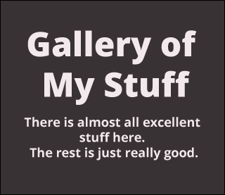
Here is a mock-up of what we are shooting for in a 320 px-wide device:

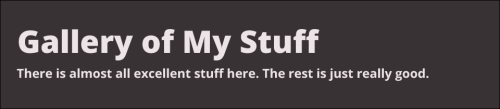
Here is how it should look on a desktop browser:

The major differences between the two mockups are as follows:

  • The 320 px layout will need smaller font sizes than the wider layout

  • The 320 px layout has the text aligned to the center whereas the wider layout has the text aligned left

This isn...