
Axure has a thriving user community, and the sharing of know-how is quite wonderful. For this book, we approached a number of experienced Axure users and asked them to submit a tutorial that could be of use to the readers. These tutorials are quite descriptive, but they do assume familiarity with Axure and an ability to fill in possible gaps in the descriptions. Each of the RP files are available on AxShare for download and review, and like other tutorials in the book, we recommend you follow by constructing them yourself.
Tutorial level: Intermediate/advanced
Shira Luk-Zilberman is currently a user experience designer at Sizmek, a leading campaign management platform. She previously worked at Netcraft, one of Israel's top UX consulting agencies. She completed her BSc and MSc in Computer Science, and she was on the path towards a career in software engineering before she realized that UX is far more interesting.
Shira brings her analytical and technical skills to the design process, and she specializes in creating usable solutions for complex domains. She is always excited to explore Axure's most advanced capabilities (and hacks) to achieve a truly realistic experience. She is an active user of the online Axure forums, and she is one of the admins of Israel's Axure community on Facebook, where she answers (and asks) questions daily.
When she is not building prototypes, she is busy mothering little baby Noga, who occupies most of her waking (and also most of her sleeping) hours. Her LinkedIn profile is il.linkedin.com/in/shiraluk/.
In this tutorial, I would like to share with you some construction ideas for simulating the familiar search field using a new repeater widget of Axure 7. The interface comprises a search box and drop-down list of items. As the user types a search query, the values in the list change dynamically and display relevant suggestions according to the text entered.
Some familiar interfaces that use this pattern include Google (Image 1, A), Facebook (B), and LinkedIn (C), as shown in the following screenshot:
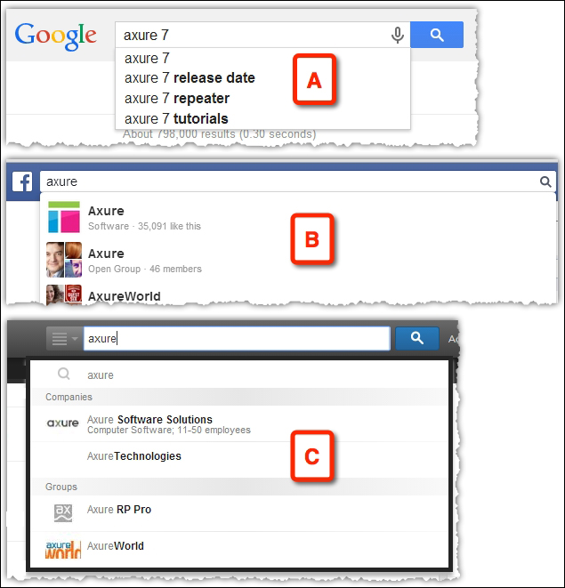
Image 1
We will cover the following topics in this tutorial:
A simple implementation of type-ahead, similar to Google's search
Adding images and summary text, as used by Facebook's search
Adding category fields to simulate LinkedIn's example
In the previous versions of Axure, the simulation required use of a dynamic panel with several states that match only a single query string. Applying changes to the design was a tedious task.
The repeater widget allows us to create a generic, easy-to-maintain interface that works for any search query. Now that's powerful!
In addition to simulating the behavior of a type-ahead search, this section also covers handling the widget's borders and dealing with a use case where there is no text in the search field.
Start by creating a sandbox file and drag over a repeater widget to the default Home page. Label the repeater widget RPTR_SearchOptions.
Perform the following steps to configure the repeater:
Double-click on the widget.
In the new tab, (RPTR_SearchOptions) Home (Image 2, A), that opens, rename the first column in the Repeater Dataset tab (B) to
Search_Option(C) and insert as many permutations as you can of search suggestions (D).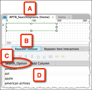
Image 2
While still on the (RPTR_SearchOptions) Home tab (Image 3, A), rename the default repeater item shape (B) to
LBL_SearchOption(C).In the repeater pane below, switch to the Repeater Item Interactions tab (D), and double-click on the OnItemLoad interaction (E).
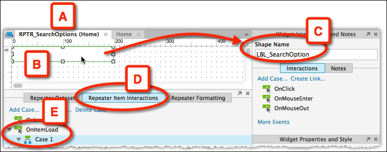
Image 3
In the Case Editor window (Image 4, A) that opens next, select the Set Text action (B) and click on the fx button (C) to set the values that will be displayed in the repeater.
In the Edit Text window (D) that opens, click on the Insert Variable or Function... link (E), and from the Repeater/Dataset category, select Item.Search_Option (F). This is where naming the item, an earlier step, helps.
Back in the Case Editor window, the configured action is displayed in the Organize actions as well as in the Configure actions columns (G).
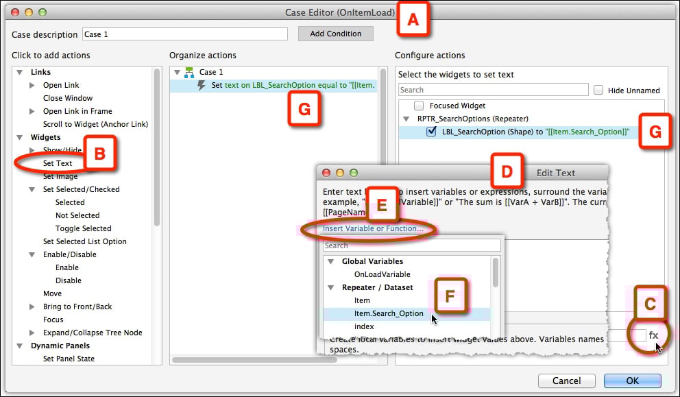
Image 4
When switching to the Home page tab (Image 5, A), the values entered in the dataset are visible (B). This preview helps with formatting, which is done back in the RPTR_SearchOptions tab (C) where you can apply formatting to the repeater item (D) such as, Right Alignment (E), and Left Padding (G).
View the results back in the Home tab (G) and tweak the repeater (H), as needed.
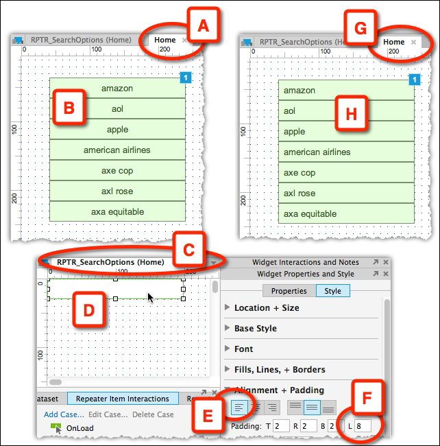
Image 5
With the repeater widget in place, we continue with the construction by associating an input search field to the suggestions drop-down list.
While still on the Home page (Image 6, A) tab, add a Text Field widget (B) that will serve as the search box. Name it TXT_Search (C). We will use the OnTextChange (D) event to dynamically change the displayed repeater values according to the current content of the search box. Double-click on it to open the Case Editor window.
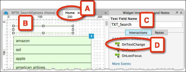
Image 6
A brief explanation before we continue with the step-by-step description: we will use the Add Filter action of the repeater so that every time the user changes the text in the search box, a new filter is applied to the repeater. The new filter uses the text in the search box for its input.
The tricky part is to filter only the search options that contain the search text. The Add Filter action works with a Boolean (true/false) expression that is applied to each item of the repeater. The items that evaluate to true are filtered and made visible. The items that evaluate to false are not visible. The goal is to build an expression that will only be "true" for items that contain the text in the search box.
In plain English, we are telling Axure: as the user types in the search field, look for a match in the list of search options we created in the repeater; if there is a match, show it.
The following is the step-by-step process:
In the Case Editor window (Image 7, A), select the Add Filter action (B) from the Repeaters category (C).
We want to filter the list of items in the repeater based on live input to the search box. Click on the fx button (D) to open the Edit Value window, as shown in the following screenshot:

Image 7
First, we select the repeater column we want to filer. In our case, it is the Search_Option column we created in the repeater dataset in an earlier step.
In the Edit Value window (Image 8, A), click on the Insert Variable or Function link (B), and from the Repeater / Dataset group, select Item. Search_Option (C).
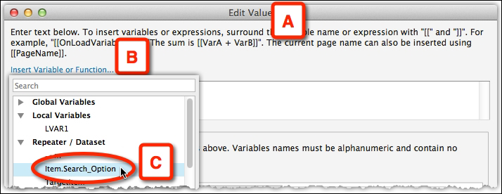
Image 8
[[Item.Search_Option]] will be pasted into the field. Place the mouse pointer in between n and ]], and move to the next step.
Next, still in the Edit Value window (Image 9, A), click on the Insert Variable or Function... link (B) again.
From the String category (C), select indexOf('searchValue') (D) as shown in the following screenshot:
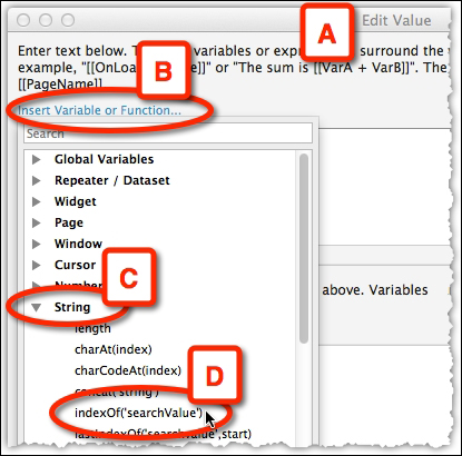
Image 9
The method indexOf returns the position of the first occurrence of the input value in a string, and in the next step, you will see how it is relevant to us.
Continue in the Edit Value dialog (Image 10, A), and click on the Add Local Variable link (B) to create a local variable of type text on widget (D) named LVAR1 (C), which will reference the text in the textbox TXT_Search (E).
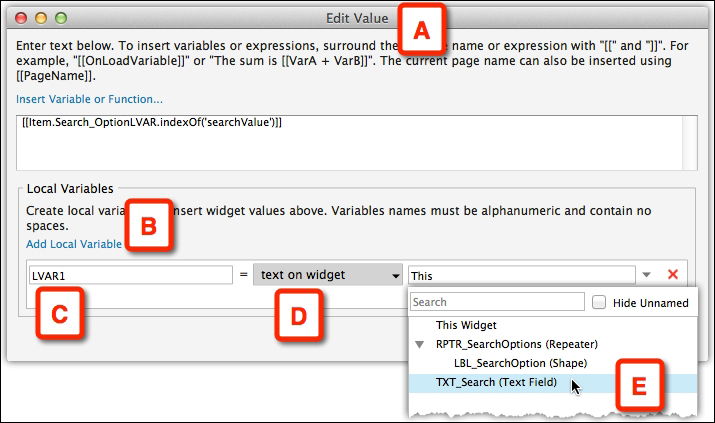
Image 10
Remember that we are using the string method indexOf(), which returns the position of the first occurrence of the input value in a string. In other words, if the expression [[item.Search_Option.indexOf(LVAR1)]] is larger than or equal to 0, there is some occurrence of LVAR1 within item.Search_Option. Otherwise, if the expression returns -1, there is no occurrence.
In the formula [[Item.Search_OptionLVAR.indexOf('searchValue')]], substitute searchValue with LVAR1, and evaluate it to be equal to or greater than 0. The final query string should be as follows:
[[item.Search_Option.indexOf(LVAR1) >= 0]]
Note
This query string is case sensitive. To make it case insensitive, add the string method toLowerCase(), which converts a string to lowercase letters, as follows:
[[item.Search_Option.toLowerCase().indexOf(LVAR1.toLowerCase( )) >= 0]]
Preview the Home page in the browser (Image 11, A). As you type into the search field (B), the letters in the string that make up the word Axure and the type-ahead options in the list (C) refresh instantly, as shown in the following screenshot:
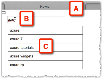
Image 11
We now have a search box that dynamically filters the search options according to the entered text. Yay!
Now, we want to achieve a Google-style pane with only an outline border. Here is the trick to do that.
Change the shape of the repeater item (Image 12, A) to a bottom border shape (B), and place it in location Left: 0, Top: -1 (C).
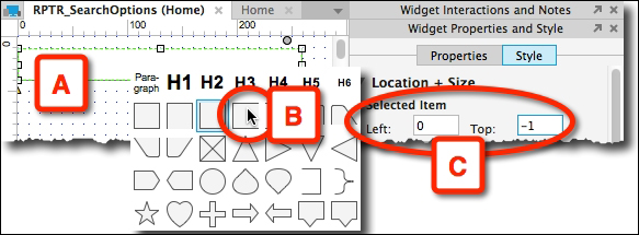
Image 12
Now, when the repeater is rendered, each item will hide the bottom border of the item before it, and the result will be a list with no horizontal borders, except for the last element (Image 13, A).
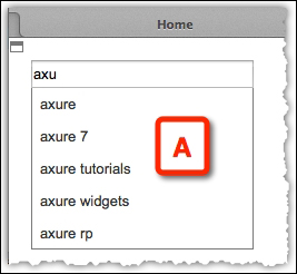
Image 13
We still need to account for the missing top border of the first element. Add a horizontal line named HL_TopBorder (Image 14, A) to the repeater item, and set it to Hidden (B).
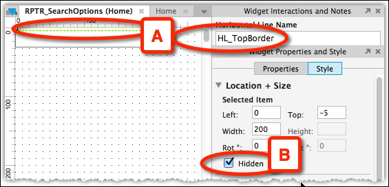
Image 14
The line will be visible only for the first rendered element. Here's how:
In the RPTR_SearchOptions tab (Image 15, A), we add a case to the OnItemLoad event (B).
Double-click on it to open the Case Editor window (C), and click on the Add Condition button (D).

Image 15
We can figure out when the first element is rendered by using the built-in isFirst function. We do this by adding a condition to the OnItemLoad event, which evaluates to true for the first element the repeater is rendered on.
In the Condition Builder window (Image 16, A), set the first drop-down list to value (B), and click on the fx button on the next field (C) to launch the Edit Text window (D).
There, click on the Insert Variable or Function... link (E), and from the Repeater / Dataset group (F), select IsFirst (G).

Image 16
Complete the condition to read as: if "[[Item.isFirst]]" equals "true" (Image 17, A) as shown in the following screenshot:
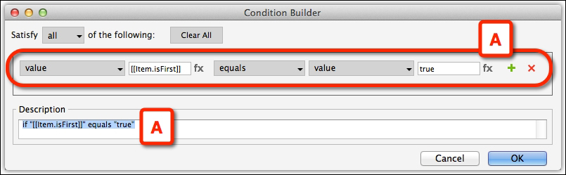
Image 17
Close the Condition Builder window.
Back in the Case Editor window (Image 18, A), use the Show action (B) to control the visibility of HL_TopBorder (C).
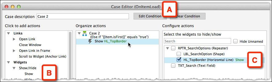
Image 18
Close the Case Editor window.
So, now we have two cases associated with the OnItemLoad event (Image 19, A). Remember that the cases are not associated with each other. The first controls the items that display in the list, the other deals with the display of the top line. Use the Toggle IF/ELSE IF option (B) to make the two IF conditions, instead of the default IF-ELSE.
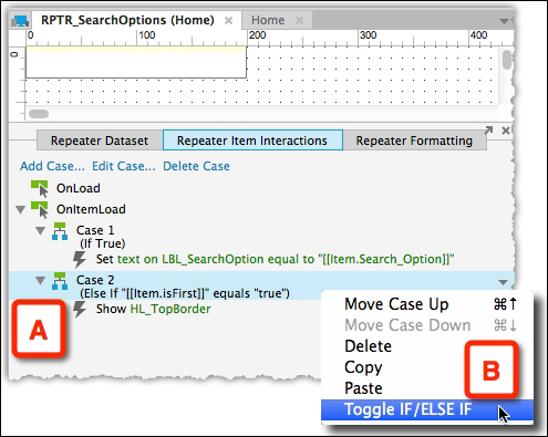
Image 19
The two cases should look as shown in the following screenshot (Image 20):
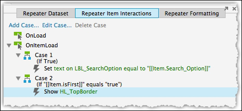
Image 20
Preview the Home page in the browser and voila – the top border is rendered only for the first element (Image 21, A).
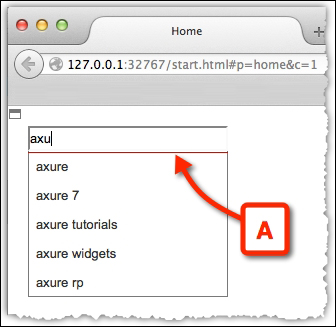
Image 21
The following are the final refinements to complete the Google-like interaction:
First, hide the repeater widget (Image 22, A), as suggestions will not be visible until the user starts typing.
Then, we need to make sure that the repeater is not shown when the search box is empty. Add a condition to the OnTextChange event that hides the repeater if the text is empty (B), and add another condition that displays it when it is not empty (C).
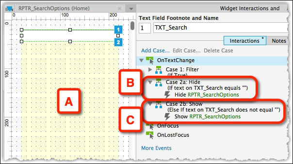
Image 22
With that, we are done! We have successfully simulated a Google-like type-ahead search interface. In the next part, we will see how we can convert this interface to resemble the Facebook interface.
The behavior of Facebook's type-ahead search pattern is similar to Google's, but it has a richer interface. Facebook's type-ahead drop-down list includes an image (Image 23, A), a title (B), and a summary line (C), as shown in the following screenshot:
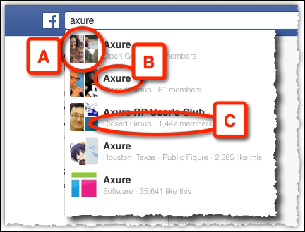
Image 23
It is fairly easy to tweak our Google example to the Facebook one. This is one of the major strengths of the repeater widget. Once you have an infrastructure of working patterns, it is easy to apply the changes:
Start by duplicating the Home page. Rename the Home page
Google Type Aheadand the new pageFacebook Type Ahead.On the repeater item page's RPTR_SearchOptions tab (Image 24, A), update the Repeater Dataset tab (B).
Update the Search_Option column (C) with the company names.
Add a column named Summary_Line (D), which contains a short summary of the item.

Image 24
Now, update the repeater to match the Facebook item layout with the following two label widgets:
Search Options (Image 25, A), named LBL_Name
Summary Line (B), named LBL_SummaryLine
Also, add an Image widget (C) and name it
Item_Image.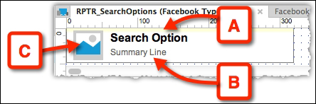
Image 25
Also, remember to adjust the width of the top horizontal rule, if needed.
In the Repeater Item Interactions tab (Image 26, A) associate the newly created labels, LBL_Name and LBL_SummaryLine, with the matching repeater item columns (B).
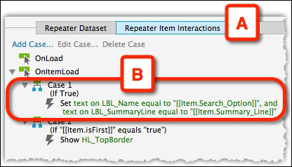
Image 26
Preview the page on the browser (Image 27). Tweaking the Google pattern to fit a Facebook type pattern required only a little effort, which involved updating the dataset and item layout.
Image 27
Now let's take our tutorial to the next level and see how to create the LinkedIn interface.
The LinkedIn type-ahead search is a bit more complicated to simulate, as it contains two types of items: a category item (Image 28, A) and a result item (B). To simplify this, we will ignore the first item in the LinkedIn panel (C). This item is actually a link to the LinkedIn search result page, and it can be incorporated into the repeater in a technique that is similar to the one shown in the following screenshot:
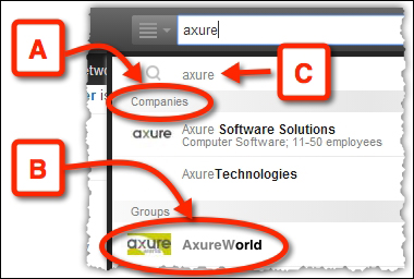
Image 28
Perform the following steps to update the data:
Start by duplicating the Facebook Type Ahead page and rename it
LinkedIn Type Ahead.Tweak the Repeater Dataset tab (Image 29, A) by adding a column to the repeater named Item_Type (B). This column will later help you differentiate between a category item and a result item.

Image 29
Next, slightly tweak the design to resemble the LinkedIn pattern (Image 30) as shown in the following screenshot:
Image 30
The following screenshot (Image 31) shows you the interim result:
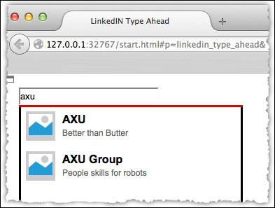
Image 31
Now, there are two problems to deal with regarding the category items' companies and groups:
They still look like a result item
They'll get filtered out when performing a search
We will deal with the latter problem first, because it's easier.
To ensure that category items do not get filtered out, we add another condition to the query string associated with the OnTextChange event of the search field itself, which we created back in the Google example. We use the logical operator OR (which looks like two vertical lines, ||), which combines two expressions with an OR operator between them.
We used the following string for the Google and Facebook examples:
[[item.Search_Option.toLowerCase().indexOf(LVAR1.toLowerCase( )) >= 0]]
The following string is the additional expression that we want to evaluate:
item.Item_Type=='category'
The condition checks whether the item.Item_Type property is equal to the category. This condition will always be true for category fields, and as we are using an OR operator, the entire expression will always be true for category fields. This ensures that they will always be shown when filtering.
So the new query string should look like the following:
[[item.Search_Option.toLowerCase().indexOf(LVAR1.toLowerCase( )) >= 0 || item.Item_Type=='category']]
Now the results will always contain the Companies and Groups categories (Image 32, A) regardless of the search query. This, of course, means that these categories will appear whether the results in these categories (B) match the query or not.
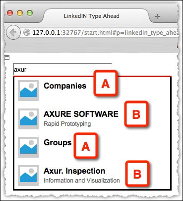
Image 32
Now, this is where it gets even trickier; we need to change the design for the Companies and Groups items, so they will look like a header for the category:
Convert the repeater item widget into a dynamic panel (Image 33, A) and name it
DP_List_Items(B).The dynamic panel should have two states (C):
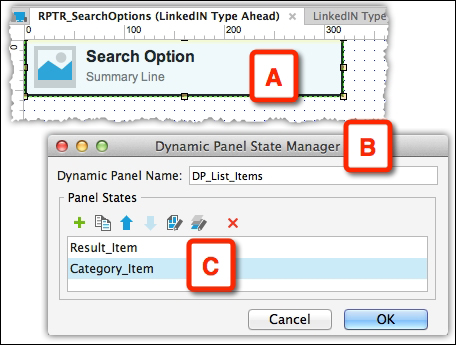
Image 33
Note that the horizontal line, HL_TopBorder, should stay outside of the dynamic panel and retain the visibility behavior that we created earlier.
Next is the design of the Category_Item state. As we duplicated the state from the original state, delete the image and the two labels, create a new label widget for the category name, and label it
LBL_Category-Nameas shown in the following screenshot (Image 34):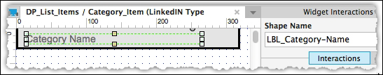
Image 34
Also, change the background color to gray and adjust the height of the rectangle. In the Repeater Item Interactions tab (Image 35, A), update the OnItemLoad actions (B) of the repeater. Associate LBL_Category-Name with the Search_Option column of the dataset (C).
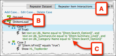
Image 35
Next, we will add a case to the OnItemLoad event, which will switch the state of the dynamic panel for all the categories.
To this case (the third case for this event), we add a condition that changes the state of the dynamic panel for all the category items.
In the Condition Builder window, select a value (Image 36, A) for the first drop-down list in the condition row. Click on the fx button (B) to launch the Edit Text window (C). There, click on the Insert Variable or Function... link (D), and from the Repeater / Dataset group (E), select item.Item_Type (F).
Close the Edit Text window and set the third drop-down list to equals (G), the fourth drop-down list to value (H), and type category (I) in the last field.
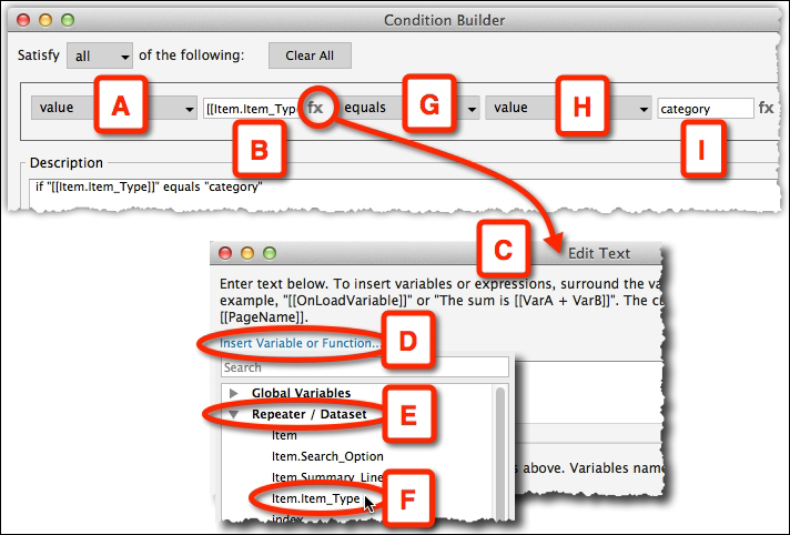
Image 36
Close the Condition Builder window and set an action to set the dynamic panel, DP_List_Items, to Category_Item (Image 37, A).

Image 37
Remember to toggle the case from Else If to If.
When viewing the resulting page, the category rows start to resemble the LinkedIn style. We encounter a new challenge now, which is the gap that comes after each category item (Image 38, A).
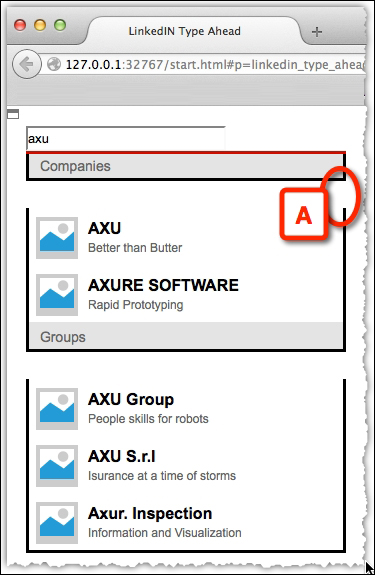
Image 38
This happens because the Result_Item rows are 60 pixels high and the Category_Item rows are 30 pixels high. The repeater doesn't know this because the panel state is changed dynamically. It allocates 60 pixels for each item regardless of the state of the dynamic panel.
Hopefully, this problem will be addressed in the newer versions of Axure. Until then, we use another trick.
What we now have is a 30 pixels gap that needs to be closed. Basically, what we do is push each item up so that it will close the gap. This is a bit tricky because items in the first Companies category need to be moved by -30 pixels, and items in the Groups category need to be moved by -60 pixels, as they have to close both the gaps. When we add a third category later, the items there would need to close three gaps and move by -90 pixels. So, the trick is to figure out the number of pixels by which we need to move each item.
We do this by adding a new global variable named ItemOffset. This variable will store the current offset and will decrease by 30 pixels each time we meet a new category.
The following screenshot (Image 39) shows us the cases applied to the OnItemLoad event:
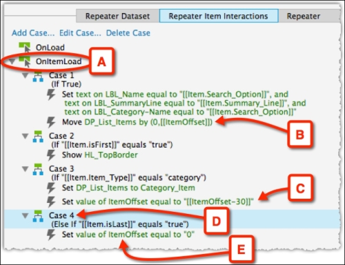
Image 39
Let's review what happens in the OnItemLoad event (Image 39, A):
The first item we meet when the repeater is rendered is the first category item, Companies.
The first case is triggered and Companies is moved by 0 pixels—since we are not looking to really move the widget, just to trigger an action (B).
As this is an item of the category type, the third case is executed and the ItemOffset variable is updated to 0-30 which is -30 (C).
The next items will be shifted by -30 pixels.
Once we meet the second category, the third case is executed again and ItemOffset is updated to -60.
Now the next items are shifted by -60 pixels. Mission accomplished!
When the last item is rendered, the ItemOffest global variable is reset to 0.
The following screenshot (Image 40) shows us the final result:
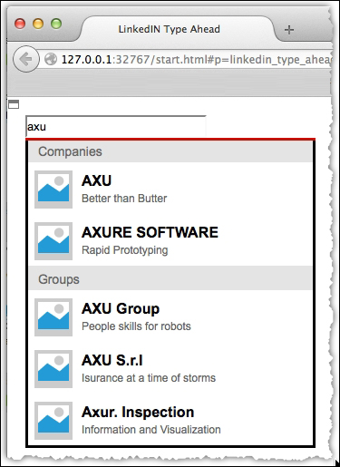
Image 40
To add an additional category to this example, all we need to do is add a few more category items and result items to the repeater dataset, and that's it!
This was an opportunity to demonstrate the repeater's powerful abilities to create a robust, generic interface that can be easily scaled with new data and/or a new design. Like many powerful features, mastering the repeater widget requires an investment of your time. However, once you do master it, you can achieve a realistic, high-fidelity interface on Axure like never before.
Tutorial level: Intermediate/advanced
Svetlin Denkov is a UX Prototyper at GN ReSound in Chicago, where he builds highly interactive prototypes for mobile and tablet devices using different technologies. He has a masters degree in Human-Computer Interaction from DePaul University. Svetlin is also a leader at the Chicago chapter of IxDA, which introduces technology events to the local UX community on a monthly basis.
He has used Axure for several years now as his favorite prototyping tool and regularly contributes to the Chicago Axure Users Meetup. In his spare time, as a "Sifu" user, Svetlin helps others on the Axure forums under the name light_forger. You can also follow him on Twitter at @svetlindenkov, where he posts about UX, prototyping, and technology.
When he is not prototyping, Svetlin seeks creative inspiration for new ideas over a strong cup of oolong tea, unless he is mountain biking, which he enjoys immensely!
Denkov is a User Experience Designer who seeks productive workflows to create Responsive Web Designs (RWD). He was excited to learn about the inclusion of an Adaptive Views feature in Axure 7 Beta. Adopting the software during its Beta phase enabled him to test Mobile-First RWDs for iOS-specific breakpoints. Breakpoints identify device segmentations based on the resolution's width or height.
The electronic magazine UXmatters, accessible at http://www.uxmatters.com, inspired him to work on his early tests; therefore, he created a two-page RWD design for a UXmatters mobile site with a Home page linking to an Article page. He is not associated with the magazine in any way, but he enjoys their content and built the mobile site as an exercise. He shared many of his findings from these tests with other UXers at Axure Meetups in Chicago and Orlando.
However, an unexpected problem emerged during these presentations. To trigger designs at different breakpoints (Image 41, A and C) on the desktop, the browser (and therefore, the viewport) had to be resized by dragging the bottom-right window corner (Image 41, B). However, this confused the participating UX designers and other design professionals. Many asked for an explanation of what exactly was being done on the screen; they wanted to know what role the resizing of the browser played in the demonstration.
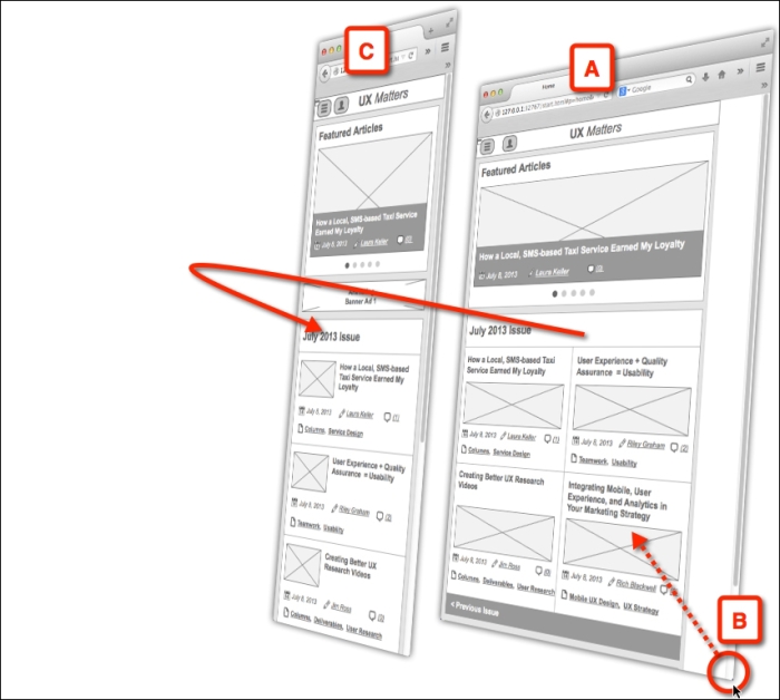
Image 41
Based on comments he received, it was obvious that the current approach to demonstrate RWDs communicated designs ineffectively, because the audience was distracted by the presentation method. The resizing of the browser and the consequent screen lag introduced an unfamiliar situation that confused the participants.
This can be very disruptive, especially when a user experience designer is making a presentation to stakeholders during design reviews; it sets up a scenario that can compromise a project's momentum and ultimately its timeline. A new approach to demonstrate RWD was needed.
Luckily, there is a relatively easy-to-implement solution that can be adopted by UX designers. Before diving into the explanation, we need to take note that several assumptions were made while designing this solution.
The breakpoints have been identified ahead of time. In this tutorial, I am using an iPhone 5S in portrait and landscape modes (Image 42, A and B), as shown in the following screenshot:
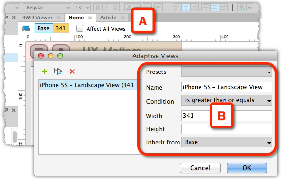
Image 42
The iPhone 5C has an identical retina resolution of 1136 pixels by 640 pixels. For more information on the mobile project setup, refer to the tutorials on iPhone at http://www.Axure.com. The initial RWD prototype is organized in discrete pages for Home (Image 42, A) and Article (B):
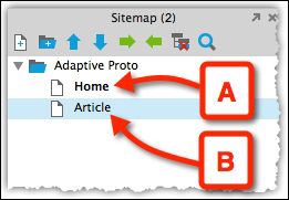
Image 43
Call to Action (CTA) allows for navigation between pages. For example, on the Home page, clicking on the article's title (Image 44, A) leads to an action (B) that opens the Article page, as shown in the following screenshot:
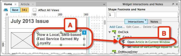
Image 44
The solution includes a new page, RWD Viewer (Image 45, A), with a two-state dynamic panel (C), and controls for alternating between the states. Each state holds an iFrame that has been sized to match the appropriate breakpoint (D). A global variable keeps track of the current page that is being viewed, and its value is passed on, changing the dynamic panel to a different state, switching between breakpoints using the top-button navigation (B), as shown in the following screenshot:
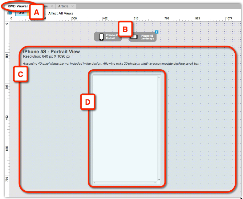
Image 45
The following are the steps to set up the view:
Create a new RWD Viewer page as the container for the viewer (Image 46, A), as shown in the following screenshot:

Image 46
Create two buttons that include a description of the breakpoint and a visual of its orientation. (Image 47, A and B). You can also opt for a much simpler treatment. The styling is up to you!
Group the buttons using the Selection Group pop up (C) in a group called buttons.
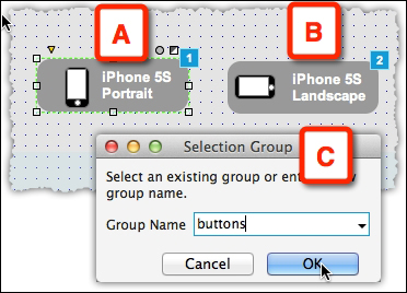
Image 47
Create a two-state dynamic panel and label it
dp_Viewer(Image 48, A). Name each of the states to reflect the appropriate breakpoint, for example,s1_iPhone5SPortrait(B) ands2_iPhone5SLandscape(C).
Image 48
Size the dynamic panel so it accommodates all the content. Adjust its height and width to be, at the very least, the height and width of the largest content across all views.
Next, in each state of the dynamic panel, create an iFrame sized to its breakpoint:
A 340 pixels by 548 pixels iFrame for portrait, which you label if_iPhone5SPortrait (Image 49, A) and 588 pixels by 320 pixels iFrame for landscape, which you label if_iPhone5SLandscape.
20 pixels are added to the width to accommodate the scroll bar so that it is shown in Firefox. If you're giving a demo in Chrome or Safari, the scroll bar is only 2 pixels wide. Additionally, 20 pixels are removed from the top to accommodate iPhone's status bar. For more information on handling the status bar in iOS 7, refer to the Axure Mobile forum at http://forum.Axure.com.
The following screenshot (Image 49) illustrates the vertical state (A) and the Location + Size panel (B):
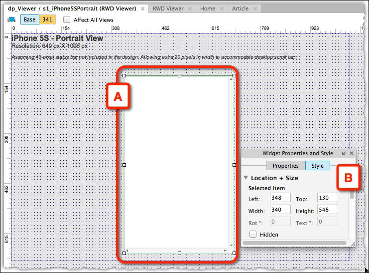
Image 49
The following screenshot (Image 50) illustrates the horizontal state (A) and the Location + Size panel (B):
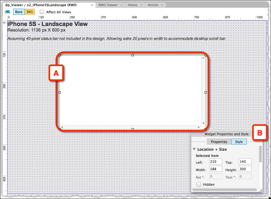
Image 50
Next, we will configure the iFrame. Set Home as the default target page for both the iFrames (Image 51, A). For a seamless experience, enable scrolling for both iFrames by selecting the Show as Needed option (B), as shown in the following screenshot:
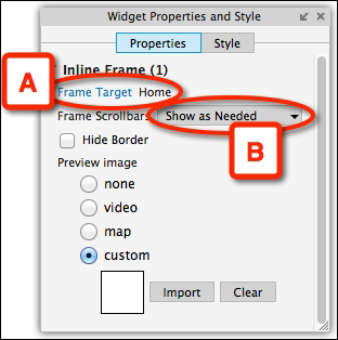
Image 51
The next section details wiring interactions to the wireframes:
To pass context from one iFrame to another, a global variable must be used to store the currently opened Axure page as a text string. Create a global variable and name it
gVarCurrPage. SetHomeas the variable's default value.Clicking on the article's link in the Home page (Image 12, A) sets the value of the global variable to Article (B) as shown in the following screenshot:
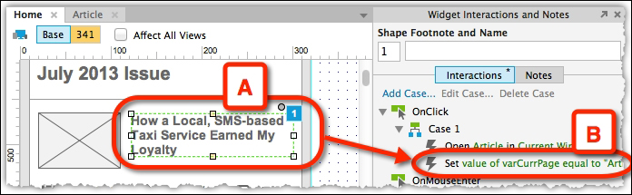
Image 52
Similarly, in the Article page, gVarCurrPage will be set to Home if the user clicks on the relevant navigation there. Essentially, for every CTA that triggers a page change, the value of the global variable has to be updated.
Lastly, for the two buttons we created in step 2.1 Setting Up the View, the actions must be updated for every button.
Click on the first button to set the dp_Viewer to s1_iPhone5SPortrait state.
Add conditional statements to check the value of gVarCurrPage and open the appropriate page in the iFrame; for example, if the value is Article, open the Article page in if_iPhone5SPortrait.
The same applies for the second button, except this time dp_Viewer is set to s2_iPhone5SLandscape.
You must do this for every button depending on the number of breakpoints you have included in your design.
Preview or generate the prototype in the browser to check the interaction and layout. Possible tweaks include toggling the iFrame borders and changing the captions above each layout option. Switching breakpoints via buttons (Image 53, A and B) is now elegant and seamless and resizing the browser window is no longer required. Presenting layouts in meetings has now been transformed to a polished experience.
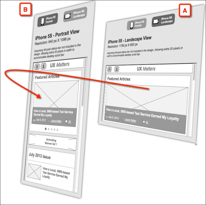
Image 53
While this organizational approach significantly improves the RWD presentation, it is not without limitations. The following is a list of the possible limitations:
The RWD viewer assumes that all screens map across all breakpoints. If you have breakpoints for which some of the screens are combined/removed, this has to be reflected by updating the values in the conditional statements assigned to the buttons.
Using nested dynamic panels to organize your screen content may break the RWD viewer. This is true when you try to pass context between iFrames because there is a single container page. Therefore, instead of checking for the page name, you must check for the state of the parent dynamic panel (the content container). Not only will you have to change the state of this panel, but you will also have to adjust the states of any other existing panels, for example, headers, footers, and so on. You can see how this easy task becomes quite a daunting task.
The newly introduced OnAdaptiveViewChange event may help in handling custom interactions in dynamic panels (and possibly content, although Axure at this point does not provide actions for "Place in View" and "Unplace from View" of widgets), but this does not eliminate the need to use the resizing metaphor for triggering views.
An inherent limitation of using a page-based design is that the content does not load immediately when opened in an iFrame. Each page loads separately, introducing a lag in updating the iFrame. This can be solved by using a transitional loading screen, which displays the content as the screen loads, but this is outside the scope of the tutorial.
With the Axure's 7.0 update and its cloud storage service AxureShare (http://share.Axure.com), it appears that the pages' speed for loading content has significantly improved, but this speed will vary depending on the amount and type of content (for example, rich visual assets versus vector Axure widgets) you have per page.
Despite the limitations, using this approach will benefit the communication of RWD by:
Helping project members and stakeholders understand design views across devices
Facilitating a discussion of the design during reviews
Ensuring close team collaboration for iterating the design
Separating the content from the viewer, which will allow prototype demos on a mobile device or on a desktop
In addition to the time and effort spent in creating the RWD design, a User Experience designer must put in more effort and work harder to adopt this presentation strategy; he/she must build the viewer before the design is ready for demonstration. For multiple projects that target the same number and type of platforms, building the viewer can be done once and consequently tweaked from one project to another.
Furthermore, just like any change management exercise, prototypers must be careful to reflect updates in page names and the overall flow of the prototype in order not to break the iFrame content loading.
Lastly, this technique may not be applicable to all types of project work. More specifically, maintaining deep, highly interactive prototypes using this approach may prove challenging. Ideally, the technique should be applied for click-through experiences. Regardless of the scope and goals of your projects, I hope what I presented here will be useful to many of you who engage in creating RWDs!
Tutorial level: Intermediate/advanced
Ritch is the CEO of Ax-Stream—the approved Axure RP training and support partners for Europe. He has worked in UX, UCD, and Usability since 1995 and has particular expertise in designing and usability testing of early conceptual prototypes (using Axure). Ritch has published numerous refereed papers in this field and was on the editorial board of the Encyclopedia of Human-Computer Interaction, published in the year 2007. He is a member of as well as a guest speaker for the User Experience Professionals Association (UXPA).
He has been using Axure, in lead UX roles, on multimillion dollar projects since 2008 and focuses on: highly complex Axure prototyping, developing intelligent widget libraries and strategic work around integrating Axure into UCD and Agile methods. He contributed a tutorial to the book Axure RP 6 Prototyping Essentials, Ezra Schwartz, Packt Publishing; he is "Sifu" on the Axure forum, owns the Axure RP Pro LinkedIn group, and is a regular panel speaker at AxureWorld.
He holds a PhD in Human-Computer Interaction (HCI) from Loughborough University's Human Sciences and Advanced Technology (HUSAT) research center and has delivered lectures at the masters level across five countries on UXD, UCD, Usability, IT Strategy, Business Analysis, and IT development methodology.
In the training courses we conduct at Ax-Stream, our delegates often ask if it is possible to reuse cases across different events and widgets. The more technical of them frame this question, "Is it possible to define a library of subroutines in Axure that can be reused?"
This requirement can usefully be explained by considering the following screenshot (Image 54), where we have prototyped a very simple usability questionnaire using Axure 7:
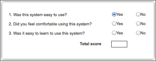
Image 54
There are three questions and a pair of radio buttons for answering each question. As the questions are answered by clicking on the radio buttons, we want the total score to be updated whereby one point is scored for each Yes answer. So, if the user answers Yes to all three questions, the total score is 3, and if the user answers No to all three questions, the total score is 0.
To prototype this in Axure 7, perform the following steps:
Create a page titled
questionnaire(Image 54, A).Add Label widgets for questions (B) and their corresponding pairs of Yes and No radio buttons (C).
Add a Rectangle widget to display the total score (D).
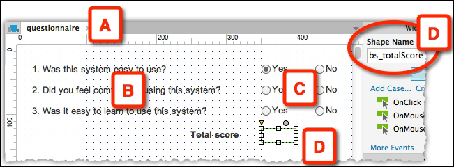
Image 55
Label all of the radio buttons and the total rectangle shape.
Assign each pair of radio buttons (Image 56, A) to a radio group (B), which will take care of the exclusivity of each answer.
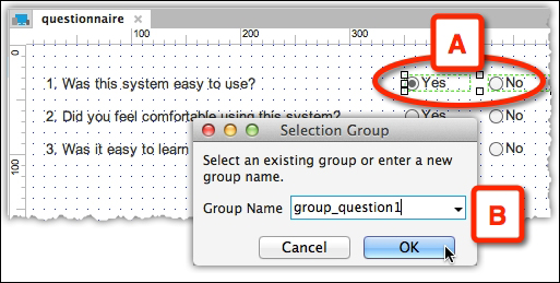
Image 56
Add a case to the OnClick event of the first radio button (Image 57, A) named setTotalScore (B). It calculates the total score based on the status of the radio buttons.
This is done with three local variables: LVar_question1, LVar_question2, and LVar_question3, which are mapped to the is selected of status of the three Yes radio buttons (C). When in the selected state, the value of their local variable will be
1. The three values are added and placed in a global variable called gVar_totalScore.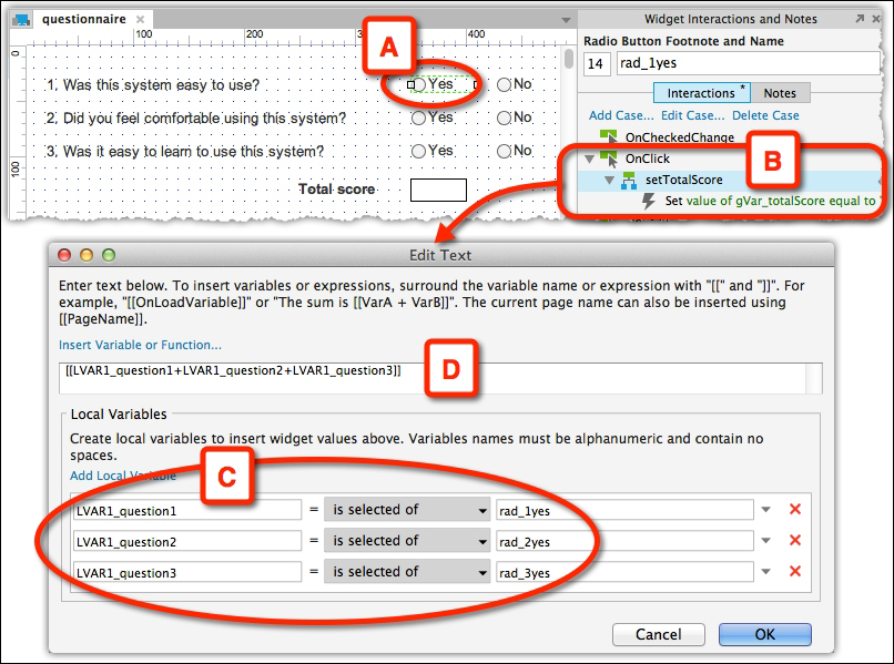
Image 57
For the same radio button (Image 58, A), add an action (C) to the setTotalScore case (B) that uses the Set Text action.
Place the value of the gVar_totalScore variable in the bs_totalScore (D) Rectangle widget.
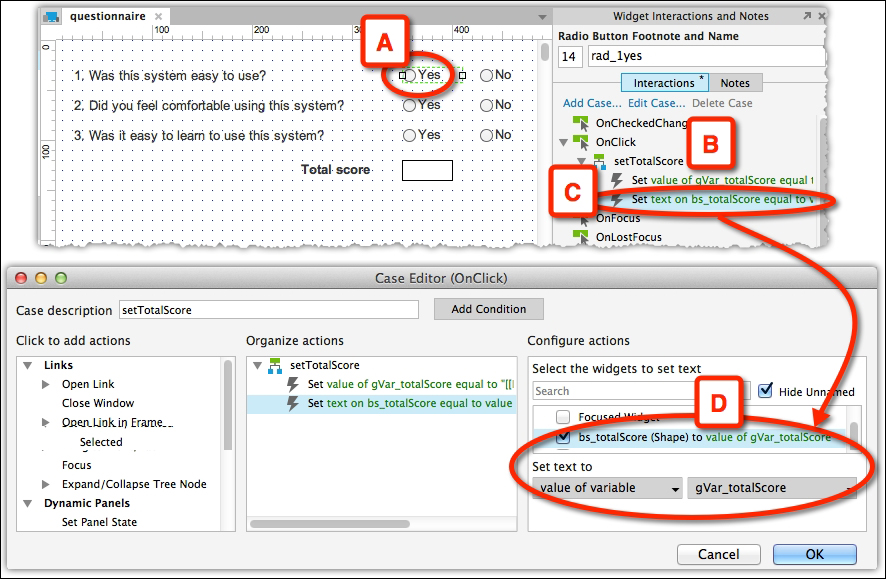
Image 58
Copy this case onto all the radio buttons so that the total score will be updated when the user clicks on any of the radio buttons.
This example will work just fine, but the architecture of this Axure prototype has a significant problem that can cost us a lot of time later on! The problem comes when we want to add additional questions and an associated pair of radio buttons.
In addition to adding cases to the new radio buttons, we also need to update every case on each of the existing six radio buttons so that the total score is now calculated on the basis of all questions. This can be quite a lengthy and tedious task, and in real prototyping scenarios, we may have to update lots of cases this way! Remember, a key feature of prototyping is speed!
When there are many actions and conditions to be updated within each case, we can save some time by updating just one case, deleting any old cases, then copying and pasting the updated case as required. However, this is still quite lengthy and tedious. Its repetitive nature also means that it is error prone; for example, it is easy to forget to update one or more widgets if we are editing lots of them. In turn, bugs introduced by such errors can be quite difficult to track down, as we may be convinced that all the widgets have been correctly updated.
Fortunately, there is a great solution to this problem. The approach involves a small dynamic panel, which has one empty state. This panel responds to an event triggered by the radio buttons, executing a case that contains all of the necessary actions to calculate and set the total score. The same cases that were present on each radio button in the previous version of our prototype are now concentrated at a single place.
Start by duplicating the questionnaire page to questionnaire2 (Image 59, A). Add a fourth question (B). Due to the duplication, there is a bit of work—tweaking the widgets and the calculations that are based on the local variables. Try to do this yourself before looking at the file for answers. Add a small dynamic panel to the right of the bs_totalScore widget (Image 59, C) and label it calculator. There is nothing you need to do with its states.
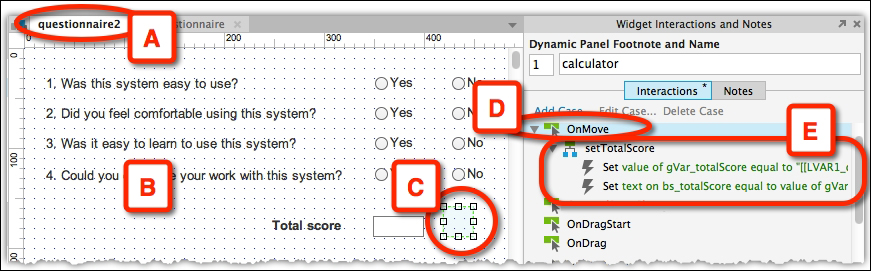
Image 59
Copy the setTotalScore action from any of the radio buttons in the questionnaire page and paste it to an OnMove event of the calculator dynamic panel. For the rad1_yes radio button (Image 60, A), create a Move calculator by (0,0) (B) case for an OnClick event.
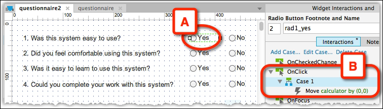
Image 60
This panel is obviously not intended to move. Rather, the action triggers the panel's OnMove event, which, in turn, performs the cases and sets the total score. Paste this action to all radio buttons.
This architecture means that if we add one more question, we simply have to update one case on the OnMove event of the dynamic panel and copy and paste some cases onto the new radio buttons—we do not have to update any of the cases on the exiting radio buttons!
Of course, the time-saving and error-prevention benefits of this architecture increase along with the number of times similar cases would otherwise need to be replicated across the prototype, but the architecture has another, less obvious, but key advantage! Keeping track of what interactions each widget/event is performing in a prototype can ultimately become the limiting factor in how complex an Axure prototype an individual can produce. This architecture, whereby we keep more complex cases in one place or modularize the interactive aspects of the prototype, makes the process of managing complex interactivity easier and more scalable; thus, this increases the potential complexity of the prototype.
The ultimate progression of this architecture is to set global variables prior to triggering a dynamic panel's OnMove event such that the panel then uses the value in the variables to determine (through the use of conditions) which case(s) to execute, and how this execution should be performed, in particular contexts. Indeed, some Axure experts, including myself, have pushed this architecture to the point whereby for very complex prototyping, we manage most, or even all, of the interactivity using a single control panel and a suitable set of variables to manage the behavior of this panel. In my experience, this makes it easier to keep the interaction model in mind and identify/correct any bugs. Indeed, an example of this can be found in the widget called menuPanDragSwipeRepeaterItems in Ax-Stream's Drag, Swipes and Spins widget library (which is available for free download at www.ax-stream.com).
The use of such architectures can be extended in Axure prototyping, whereby we set up a bunch of such control dynamic panels on a page that act like a subroutine library we can simply call upon from any widget or event to execute the cases we need.
Of course, as with all Axure functionality, we can place these control panels into masters if we want to reuse them across pages. Similarly, we can place them within custom widgets so that (complex) cases can be reused across different projects via widget libraries. I also hope that such libraries will eventually be produced for distribution across the Axure community. This will ensure the Axure prototyping speed can be increased in general—just as code subroutines and objects that solve common programing problems are freely available to developers (for a wide variety of development environments).
Clearly, these more sophisticated progressions will be best suited to those with a more technical background, who are capable of complex Axure prototyping. However, the basic technique of using the OnMove event on a dynamic panel to reduce redundancy in a prototype's interaction model is not particularly difficult to understand at its most basic level, and I hope it will be useful to the wider Axure community.
Tutorial level: Beginner to advanced
Inconsistencies of interactive components and UI elements in software products are a nightmare. Not only are they confusing to end users and developers, but they also drive up the development costs, since they are extremely hard to manage and difficult to update. The end goal always should be to bundle up all the functionalities your app needs with as few UI components as possible.
Marc has created a new interactive toolkit in Axure (http://wearebridge.co/ux-tools) to help UX, IX, and visual designers build better, more consistent prototypes faster. It consists of UI elements, page modules, and page templates. You can now easily build wireframes and flows or start your own library with some of the stencils he has provided. Libraries can be used not only to verify design assumptions on a component-by-component basis, but also to define and document design decisions. Libraries constructed in Axure can be easily shared, tested, and kept up to date.
This section will briefly walk you through the process of creating and adding a new page module to the library of interactive components. A page module consists of multiple UI elements and can initiate several view changes inside its own property. Dynamic modules are becoming increasingly important with the growing popularity of single-page applications.
Let's assume that you already set the stage for your library and used the widget, interaction, and page style panes to define a consistent form language for your components (colors, shapes, proportions, fonts, margin, padding, and so on). We can jump straight to the design of a new module. We are also clear about the context, function, and form of the new module.
The way I always approach the next stage is to look at best practices on the web or on mobile and search to find out if there are already established design patterns out there that I can adopt. Especially, when you design components for closed platforms, such as the iOS and Android, or XBOX, you want to make sure you "stick to existing frameworks" (Roman Nurik, Android Design team). This is basically your first, free usability test; if you see it in action on a major site or app, it probably has been tested already with users. You can also quickly google usability and performance tests and get answers on more specific questions around touch events, gestures, form creation, naming conventions, icons, legibility, and so on. The web is full of knowledge.
Feeling a bit more fancy and ready to raise the design bar? Check out the Web and you can draw some inspiration from www.pattrns.com, www.littlebigdetails.com, www.behance.com, www.cssdesignawards.com, and so on. There are some really interesting design visions out there that might add just the pixel piece you needed. After all, design is about imagination and experimentation, not just designing by numbers.
So finally, you think you are on a good path and maybe have even discovered two solutions along your design journey. Now, let's quickly talk to a front-end developer and see if there are some issues around performance. He should also give you a rough estimate for coding. Connect the dots: the goal of this first step is to come up with the most elegant solution to solve your design problem.
You are equipped with a clear idea, notes, and raw sketches and can go back to Axure to craft the new page module. I hope you made use of the built-in Axure widget library and created a new library. If not, do so; it's much easier to manage, share, and distribute your components later on.
Ok, let's start clicking. First thing, look at the existing UI elements you already crafted and see what you can reuse. Remember the overarching design mantra for interaction designers: build more with less, more efficiently. Think as a front-end developer and what code she or he can reuse to achieve a specific outcome quickly. Look at what is on your website or your app already and what combination of existing elements might do the job as well.
Take the following page module for example (Image 61). It is a Welcome Module for first-time users. It elegantly wraps multiple functionalities into a dynamic widget and was built quickly by merging a few basic UI elements: an accordion, form fields, a button, the carousel, and the modal window itself. These basic elements might be already in your library, so you just need to stitch them together, which is easy since you built them based on a grid and global style attributes. The solution and adaptive view for small screen devices can be just the accordion itself—the grid shows us where the breakpoints are and how it can fit on a vertical view of a smartphone.
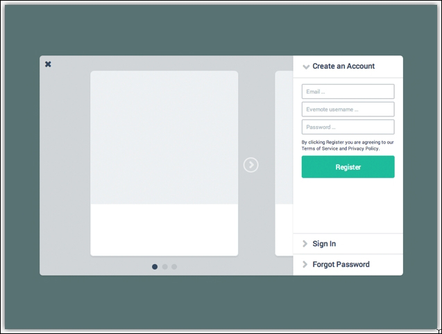
Image 61
The functionality for the individual components (the accordion, form fields, button, view controller, and so on) has been established earlier and should be available to you right away.
Tip
You can use widget interactions and page interactions once you've created a master out of a single component. Page interactions are good for initializing onPageLoad events, such as setting a specific state for a dynamic widget. Be sure to name each and every component or group module. It will be easier for you to add interactions and reference the right widgets.
While building components, make sure you understand the context in which other designers, researchers, content strategists, or copywriters are going to use the library you created later. When you look at the previous example, I didn't define every single element, nor did I add all the content for the different states and views. I left it open and just provided the functional framework my colleagues can take and continue working on effectively. We will discuss one such case as an example: a UX researcher wants to test different images and alternative messaging on a welcome flow. You want to make it easy for him/her to change the content and quickly build several test cases. You might also have the chance to build products for different markets, and a library is an awesome tool to test localization. Give it a try: change English to the German or Russian version and see how the proportions of your components hold up. It is a good thing that you defined some global style attributes using the widget pane from Axure. Now, you can easily change the font size of all your green buttons in the UI library. Maybe the executive producer did not like the green color of the buttons either? If so, change it back to grey with a click of a button.
Think you are finished? Do the clean up: describe it, name it, and stitch it to an existing folder so people can find it easily later. I use categories that are more generic such as UI elements, page modules, and page components. Maybe it makes more sense to tie the components to your developer's naming conventions and how they refer to UI modules in the code. I also had good experiences with actual themes such as maps, forum, e-commerce, and so on. See what works best within your context.
This is the beauty of Axure. Now that you've actually created your new module in a real prototyping tool, you can take it for a test ride. Go ahead, open a new document and drag your new module from the widget library onto your page. I often use the public folder of Dropbox, so I can share a link with the stakeholders too. Preview it in a browser and click on all the interactive components, change the views, and so on. Don't miss the opportunity to look it up on a tablet and/or small screen device, if you happen to optimize the view port in Publish / Generate HTML Files. You especially want to check where the copy breaks, readability, positioning, the timing for transitioning, and so on. Are you missing some interactions? While dragging your element from the library to your screen, Axure might have lost a reference to a specific widget. Go back to the interaction widget and see if there is an undefined piece of code. The goal of this state is to make it work rock solid so that it can be tested with real users, if needed.
You have discovered some usability flaws or performance issues and might also have looked at some testing results from your UX researchers. It's time to implement the changes and put the official stamp on it: Version 1.0 of the software will change on a relatively frequent basis, so make sure to keep track of the changes. I usually add a change log page to each library. You can also use the Note widget from Axure to keep track of changes. With this, you keep the users of your library informed about the changes you made. Now, you might not be the only one working on this library, so it's good practice on how to log your work.
Here we go—you've added another page module with several UI elements to your widget library. Maybe you should inform your colleagues about it and introduce the new design snippet with a friendly "Welcome XYZ to the family" e-mail. I hope you crafted an e-mail template already. Get ready and start your own UI kit or even lay out an interactive style guide with Axure.