Book Image

Mastering Responsive Web Design

By : Ricardo Zea
Book Image

Mastering Responsive Web Design

By: Ricardo Zea

Overview of this book

Building powerful and accessible websites and apps using HTML5 and CSS3 is a must if we want to create memorable experiences for our users. In the ever-changing world of web design and development, being proficient in responsive web design is no longer an option: it is mandatory. Each chapter will take you one step closer to becoming an expert in RWD. Right from the start your skills will be pushed as we introduce you to the power of Sass, the CSS preprocessor, to increase the speed of writing repetitive CSS tasks. We’ll then use simple but meaningful HTML examples, and add ARIA roles to increase accessibility. We’ll also cover when desktop-first or mobile-first approaches are ideal, and strategies to implement a mobile-first approach in your HTML builds. After this we will learn how to use an easily scalable CSS grid or, if you prefer, how to use Flexbox instead. We also cover how to implement images and video in both responsive and responsible ways. Finally, we build a solid and elegant typographic scale, and make sure your messages and communications display correctly with responsive emails.
Table of Contents (16 chapters)
Mastering Responsive Web Design
Credits
About the Author
Acknowledgment
About the Reviewers
www.PacktPub.com
Preface
Index

The posture patterns and the touch zones


No matter how usable the sizes of our touch targets are, if they are not placed in the right location, all our efforts are pretty much worthless.

We can't talk about small UIs and large fingers without mentioning the extensive work of Luke Wroblewski in his article Responsive Navigation: Optimizing for Touch Across Devices (http://www.lukew.com/ff/entry.asp?1649).

The posture patterns

In his article, Luke talks about the patterns of posture most users have when holding their smartphones, tablets, and touch-enabled laptops:

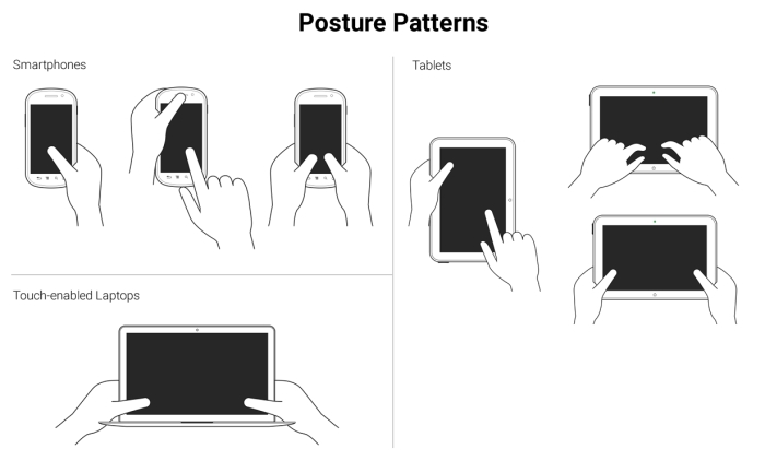
These patterns allow us to define the best way to lay out our content in order to be easily usable and accessible.

Understanding the posture patterns of our users will allow us to understand when our targets can be the right size or even a bit smaller if there isn't enough screen real estate, or a bit larger if precision is needed, since it's different when someone uses their thumbs as opposed to their index fingers.

The touch zones

Luke...