
So, let's have a look at the content we want on this page and how to strategize the layouts for different devices.
The main things, I think, most people want to see in a portfolio of any kind are a few key images and some lengthier, detailed text describing images.
Here is the layout we will need for mobile screens:
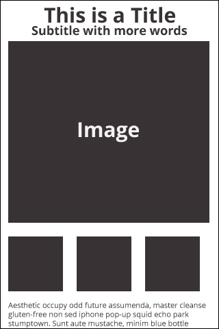
The smaller squares, shown in the screenshot, will be the thumbnails that users can touch or click on to show the larger image above the smaller images on the page. The first thumbnail will be the default image that will be displayed when the Gallery page loads. We will also highlight the thumbnail that is currently active, with a border. In order to do this, we will need to make both full-sized and thumbnail-sized images of all the images. The description for each image will be below the thumbnails (and that's completely appropriate in my book). If your images are compelling enough, people will scroll down to read it.
Now, let's look at the opposite end of the...