
When developing apps for Android, you never have to start completely from scratch, as the Android platform does a really good job of supplying a wide range of prebuilt UI components that you can simply drop into your UI.
This means that the same UI elements crop up time and again in all sorts of Android apps. So, it's well worth spending some time seeing what we can learn from other Android applications—particularly apps that do UI well.
In this section, we'll analyze the Google+ app, which comes preinstalled on many Android devices, and is also available to download for free from Google Play. We'll work our way through all the core UI components that Google uses in this app and look at what makes them so effective.
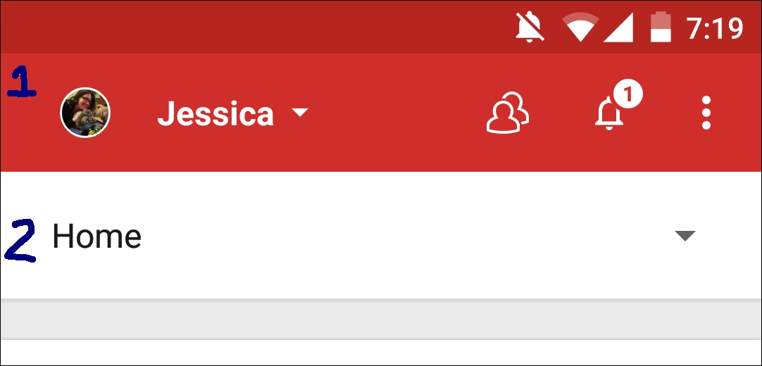
The action bar runs along the top of the screen and typically contains action and navigation elements:
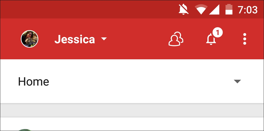
Google+'s action bar contains three important UI elements that you'll typically want to include in your own Android UIs.
Action bars tend to persist throughout an app, which makes them perfect for providing your users with a consistent, easily accessible way of navigating your UI.
Navigational controls can either be straightforward, such as the standard Back button, or they can be more complicated, such as view-switching controls.
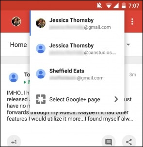
The main Google+ action bar contains a navigational control that gives users the ability to switch between their Google+ accounts, which is handy for anyone who has multiple accounts, such as a work Google+ account and a personal account.
The action bar is also ideal for providing easy access to your app's most important actions, based on the user's current context. The actions that appear in the action bar are known as action buttons.
In the following screenshot, the Google+ action bar contains two action buttons:
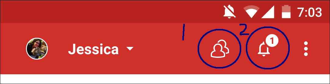
You'll typically represent an action button with an icon and/or text. Android provides a range of ready-made action buttons that you should use wherever possible, as they ensure that the average user will be familiar with at least some of the action buttons that you use in your UI.
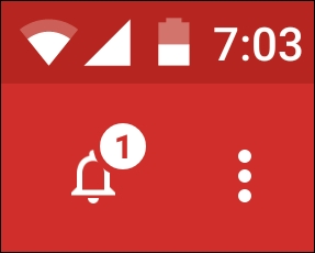
Depending on the app and the available screen space, it's possible that all your action buttons won't always fit into the action bar. If this is the case, the Android system will automatically move some of these action buttons into the action overflow, which is the dotted icon that appears in the upper-right corner throughout the Google+ app:
How many action buttons wind up hidden in the action overflow depends on the user's screen. At the extreme ends of the scale, a tablet held in the landscape mode will have much more space available for the action bar, compared to a smartphone held in portrait mode.
When designing your action bar, make sure you place the most important action buttons toward the left of the screen, so they're less likely to wind up in the action overflow. Actions that your users are less likely to need can be placed toward the end of the action bar where they have a greater risk of winding up in the action overflow.
Although the action overflow does help to reduce action bar clutter, in some scenarios, you may want to display a large number of actions without risking any of them ending up in the action overflow on smaller screens. If this is the case, you may want to use a split action bar:
In the previous screenshot, the Google+ app uses a split action bar to reduce action bar clutter without relegating any actions to the action overflow. A split action bar is also useful to prevent the action overflow from growing out of control and becoming unmanageable.
The main Google+ screen is the home screen, which happens to contain a special kind of action button that was introduced as part of Google's Material Design overhaul.
This is known as a floating action button (FAB), and it's displayed prominently in the bottom-right corner of the Google+ home page:
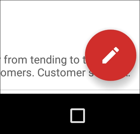
As the name suggests, FABs are circular buttons that float above the main user interface. These floating buttons give you a handy way of highlighting the primary action within the current context.
Google+ uses its prominent floating action button as a way of encouraging the user to join in the conversation by writing a status update.
Menus are one of the main ways of navigating an app, and they are an essential component of most Android UIs.
Menus present the user with a list of options, which are usually represented by a single word or one line of text at the most:
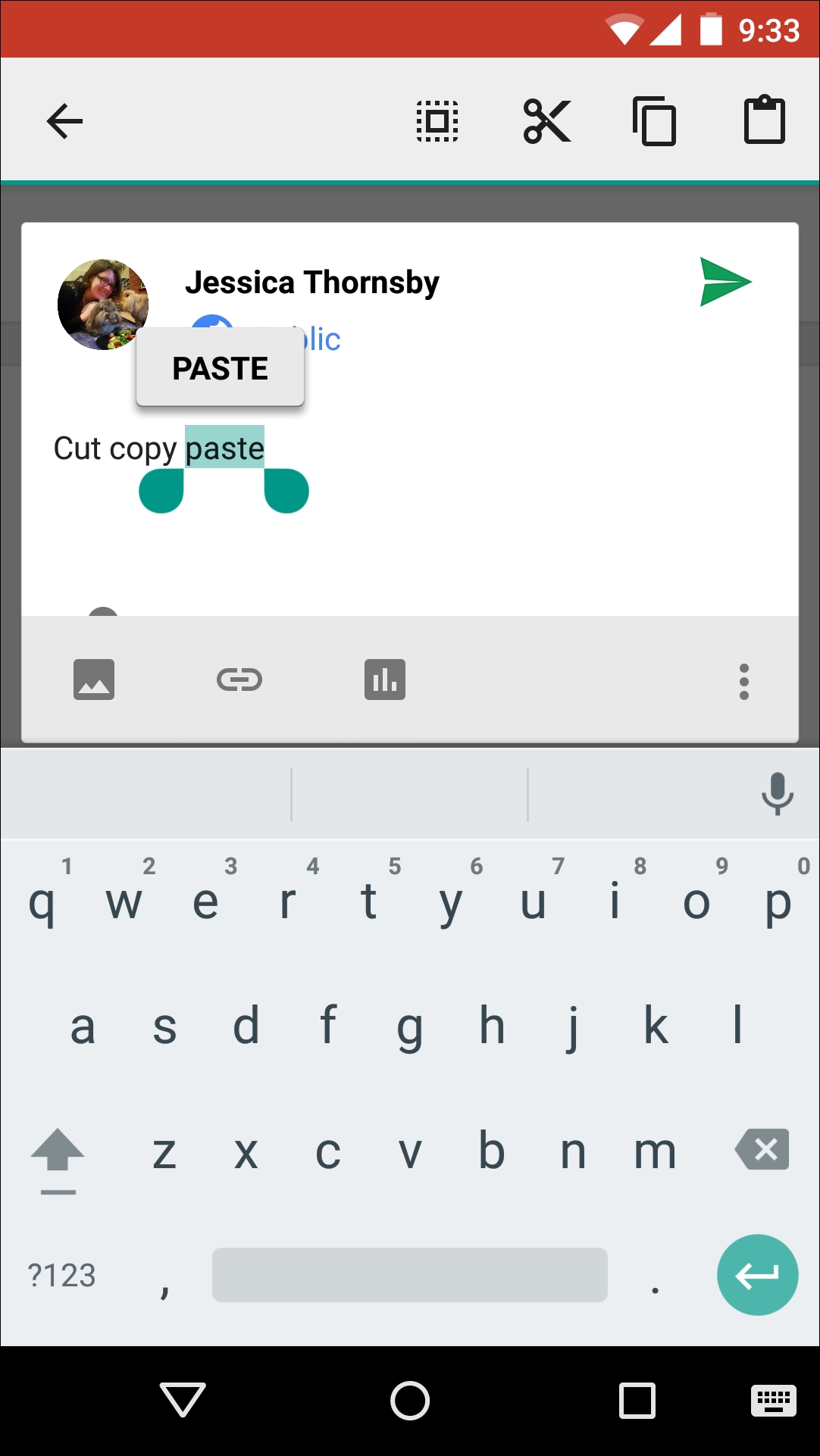
Google+ features lots of different menus, but the one that deserves a special mention is the context menu.
Context menus are special because they dynamically update to include the actions that are relevant to the selected content only. Context menus appear when you long press an onscreen element. The context menu you've probably encountered the most often is the Select All/Cut/Copy/Paste menu, which appears when you long press some text:
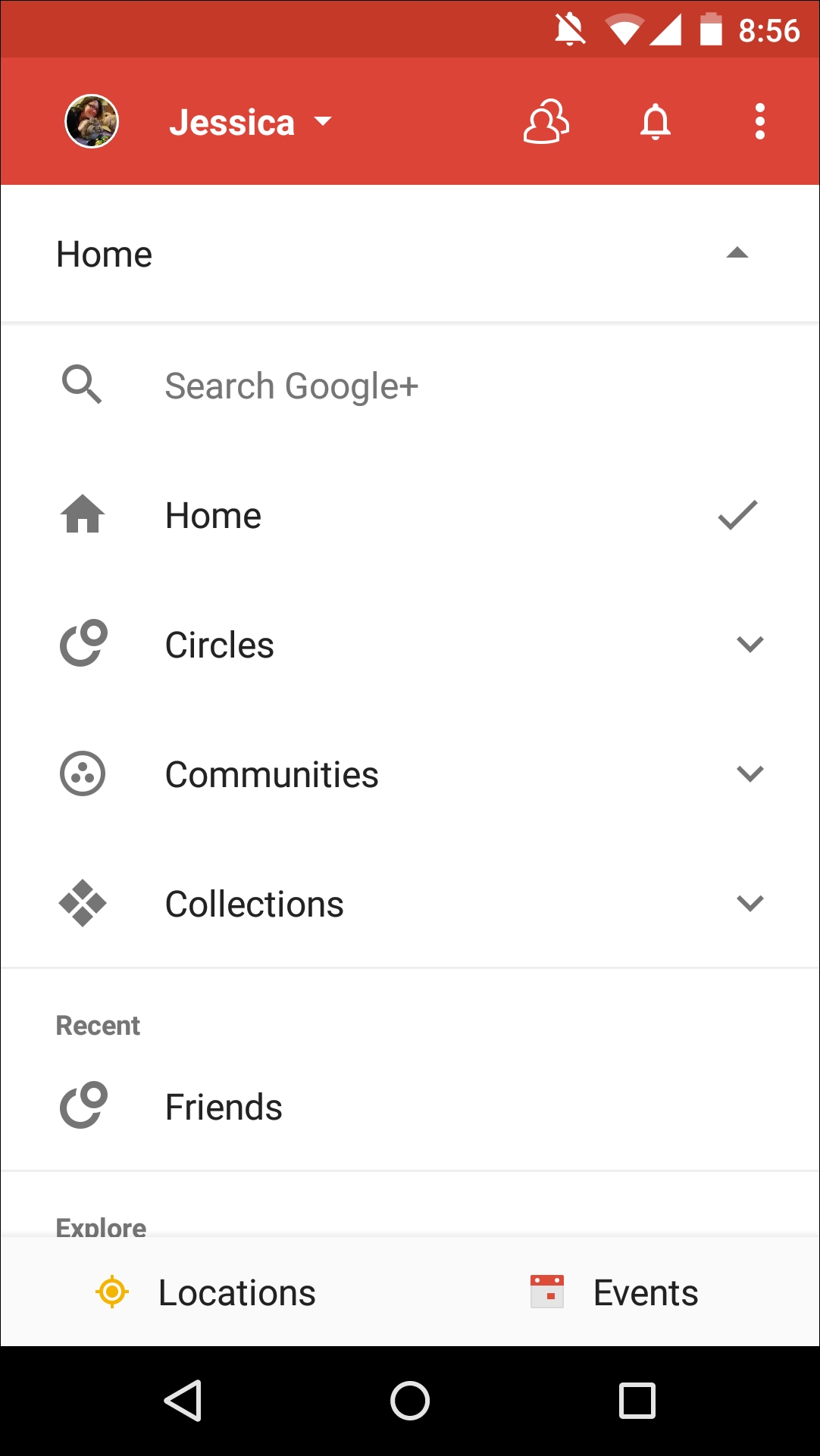
Settings is a mainstay of many Android applications as it gives users a way to tweak an app's behavior to better suit them. If users can modify your app in any way, you'll need to provide them with some form of settings screen.
The main challenge when creating a settings screen is ensuring your users will be able to understand all the available options and their current values at a glance. This means designing your settings in such a way that each screen only ever contains a manageable number of options (usually less than 10).
If you have lots of options you want to include in your app's settings, resist the temptation to display them as one long list. Instead, divide them into groups of related options. Then you can either display your settings as a single screen formatted as multiple lists of related items, or you can take a leaf out of Google+'s book and move each group of related options to its own page.
If you opt for the latter, your main settings screen can then serve as an index, linking the user to each subpage, which is exactly the approach Google+ takes with its main Settings screen:
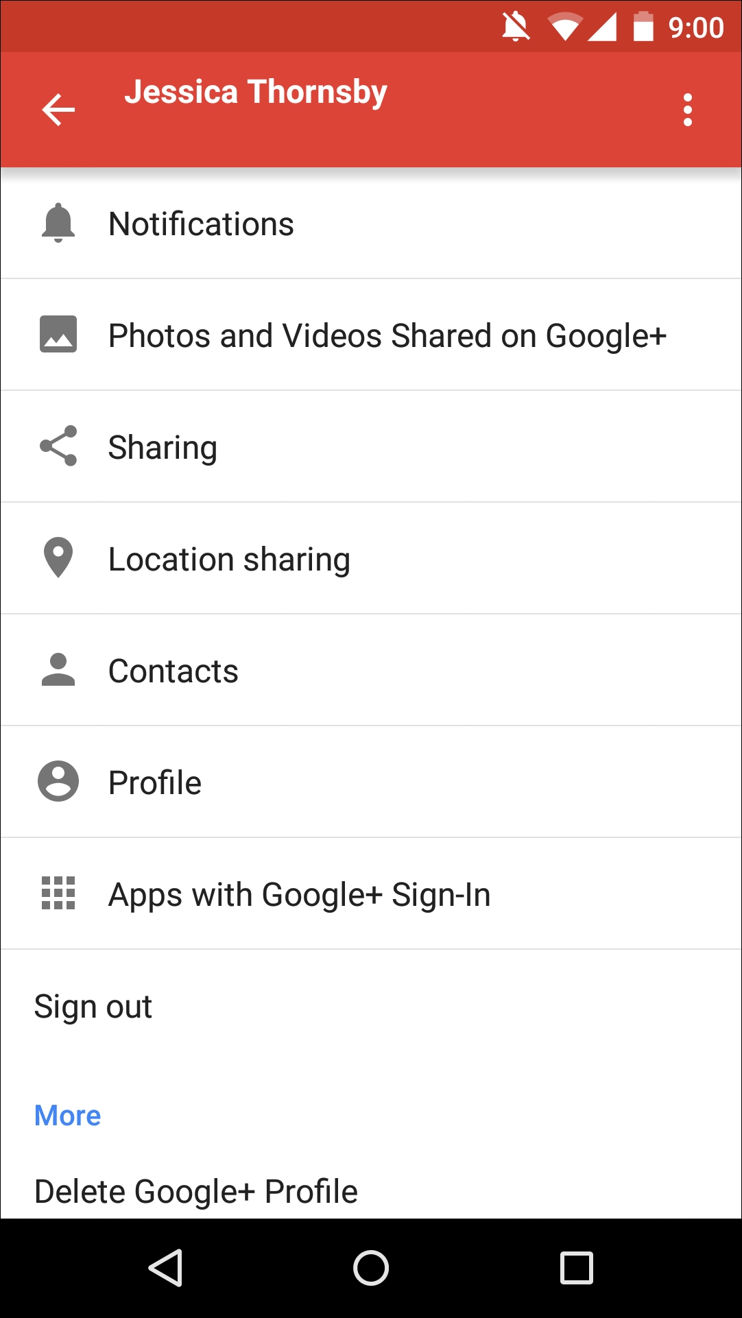
For ease of use, you should prioritize your settings so the options users are most likely to need are always within easy reach at the top of the settings screen.
This can also be seen in Google+'s settings where obscure options, such as Delete Google+ Profile, are confined to the very bottom of the settings screen.
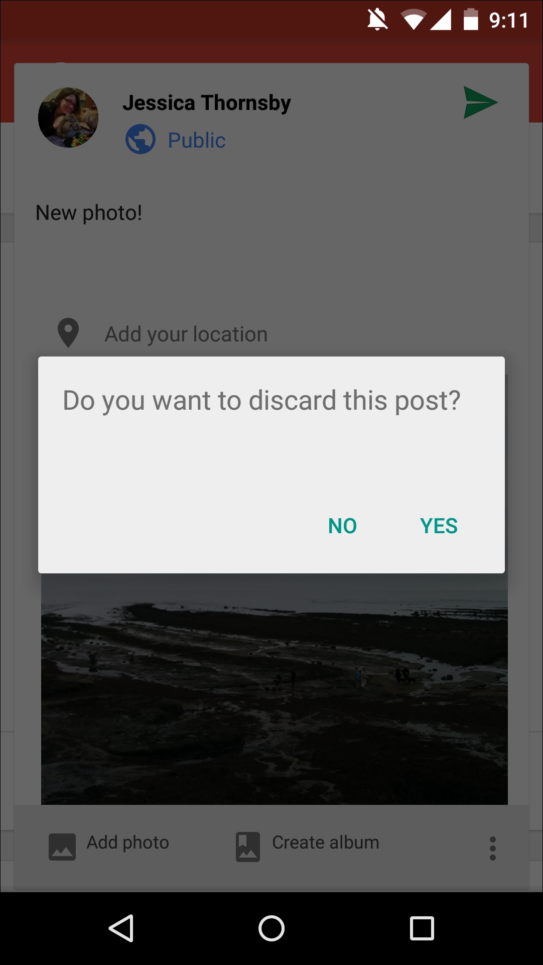
From time to time, you may need to really grab the user's attention, and the UI elements that can help you with this are dialogues.
A dialogue is a small window that can contain text and buttons and is typically used for one of the following purposes:
Giving the user some important information, such as terms and conditions, or a disclaimer they need to read before they can progress to the next task
Requesting additional information, for example, a dialogue that prompts users to enter their password
Asking users to make a decision; for example, if you draft a Google+ update and then try to navigate away without posting that update, Google+ uses a dialogue box to check whether you really do want to discard your post
A toast is a small popup that provides the user with simple feedback.
Unlike dialogues, the app underneath the toast remains active the entire time the toast is visible. Opt for a toast rather than a dialogue when you want to convey a short and simple message to the user, and crucially, you don't require any user input—toasts don't support any kind of user input.
In Google+, you'll occasionally see a toast when new posts are available to view on the home screen. This toast will prompt you to swipe the screen to see updates.
Android users typically expect to be able to search all the data that's included in your app, so most UIs include some form of search functionality.
The good news is that the Android platform has a ready-made search framework that you can implement in your UI. Using this standard search framework isn't just easier for you, it's also easier for your users, as most Android users will immediately know how to interact with Android's standard search functionality, since they'll have encountered the underlying framework many times before (even if they weren't aware of it):
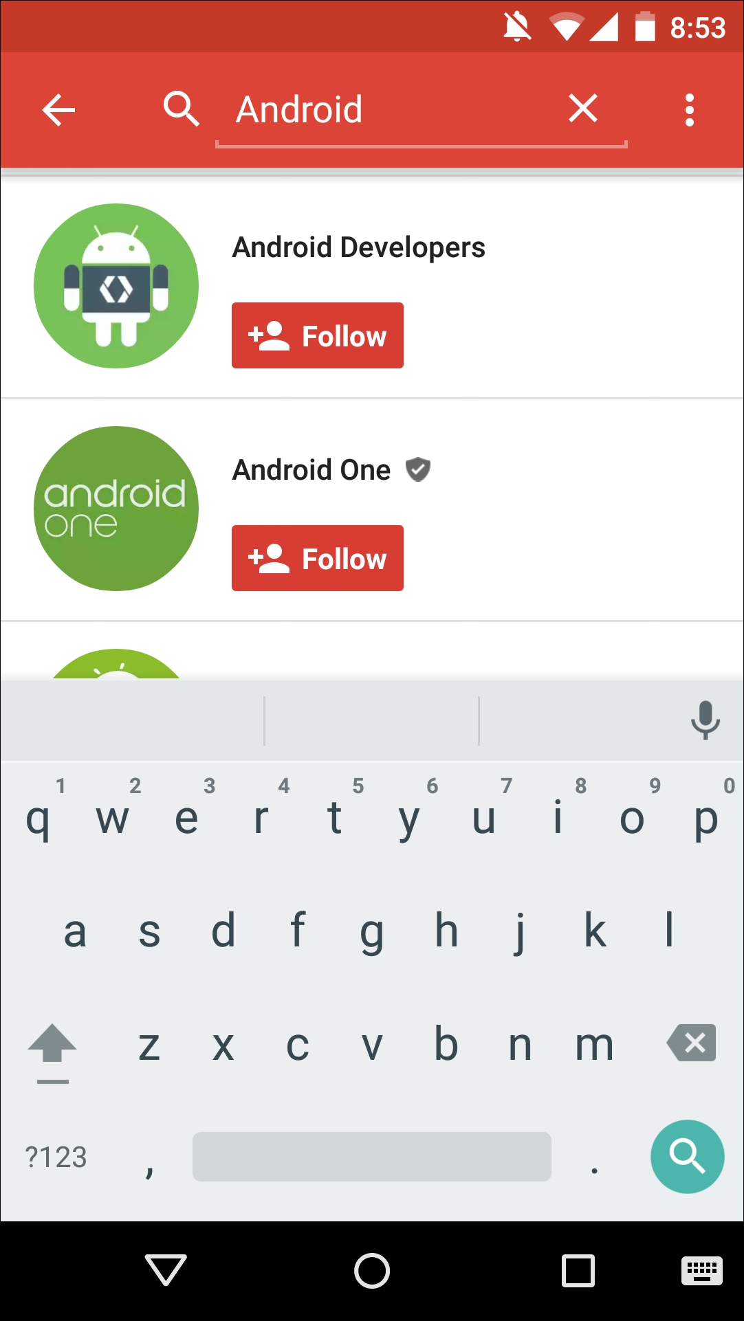
You can use Android's standard search framework to implement searching in one of the following ways:
A search dialogue: This dialogue is hidden by default. When activated by the user, it appears as a floating search box at the top of the current activity. The search dialogue component is controlled by the Android system.
A search widget: This is an instance of
SearchViewthat you can place anywhere in your app's UI. If you do decide to use the search widget, you'll need to do some additional work to get the Android system to handle search events that occur via this widget.
Input controls are a variety of components provided by the Android platform that the user can interact with. Boot up any Android app on your device, and chances are it'll contain some form of input control—whether it's a button, a checkbox, a text field, or something else.
Since your average Android user will have encountered these standard input controls many times before, including them in your UI guarantees that the majority of users will immediately know how to interact with at least some of your app's core UI elements.
We've looked at lots of different UI elements you can find in the Google+ app, but what ties all these elements together and ensures your UI feels consistent?
The answer is styles and themes.
While Android does give you the power to customize the look and feel of every part of every screen of your UI, you'll have to balance this against providing a consistent UI experience for your users. Themes and styles are powerful tools that can help you provide this app-wide consistency.
Styles and themes allow you to define a group of attributes once and then use them throughout your app. So, you could create a style that specifies that text should be blue with the monospace typeface, and then you can apply this style across your entire application. Instantly, all your text will have the same formatting.
Styles and themes can be simple, such as our text example, or you can create long lists of attributes that dictate how every element of your UI should look and feel, from the shade of the action bar, to the background image and the amount of padding used throughout your layout.
Although they're often talked about together, there is a one crucial difference between styles and themes:
Style: This is a collection of properties that you can apply to an entire activity or application, or to an individual view
Theme: This is a style that you can apply to an entire activity or application, but not to an individual view
The Android platform provides plenty of predefined themes and styles that you can use in your Android apps (including some crucial Material themes), or you can create your own.
Although you can create themes and styles completely from scratch, you'll usually want to take Android's ready-made themes and styles as your starting point, and then define any properties that you want to add, change, or remove. This is called inheritance, and it's one of the quickest and easiest ways of creating a UI that feels familiar and professionally designed but is still subtly unique to your app.