

This may seem like an obvious question. After all, we interact with UIs every day, whether it's on our computer, mobiles, tablets, or other electronic devices. But sometimes, the simplest questions are the hardest to answer.
The technical definition of a user interface is the junction between a user and an app or a computer program. A user interface is everything the user can see and interact with, and unless you're developing a very special (or very unusual) kind of Android app, then every app you develop will have some form of user interface.
When it comes to creating your app's UI, the Android platform gives you the freedom to bring your vision to life. Just flick through a few of the apps installed on your Android device, and chances are that you'll encounter UIs that look very different from one another.
Although these UIs may look different on the surface, they do share lots of common elements, whether they're the layouts working quietly behind the scenes, or visible elements such as buttons, menus, and action bars.
Here are a few UIs from different Android apps. Although they each have their own look and feel, they also have a lot of UI elements in common:
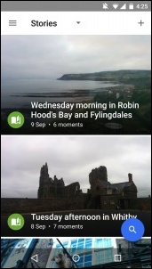
Google Photos isn't just a gallery, it also gives snap-happy Android users new ways to enjoy their media by organizing photos and videos based on factors such as location, date, and subject matter. Since the Photos app wants to encourage you to spend time exploring and enjoying its photo and video content, it's no surprise that the most prominent UI element is the floating Search button in the bottom-right corner, which allows users to search their media based on factors such as location and subject.
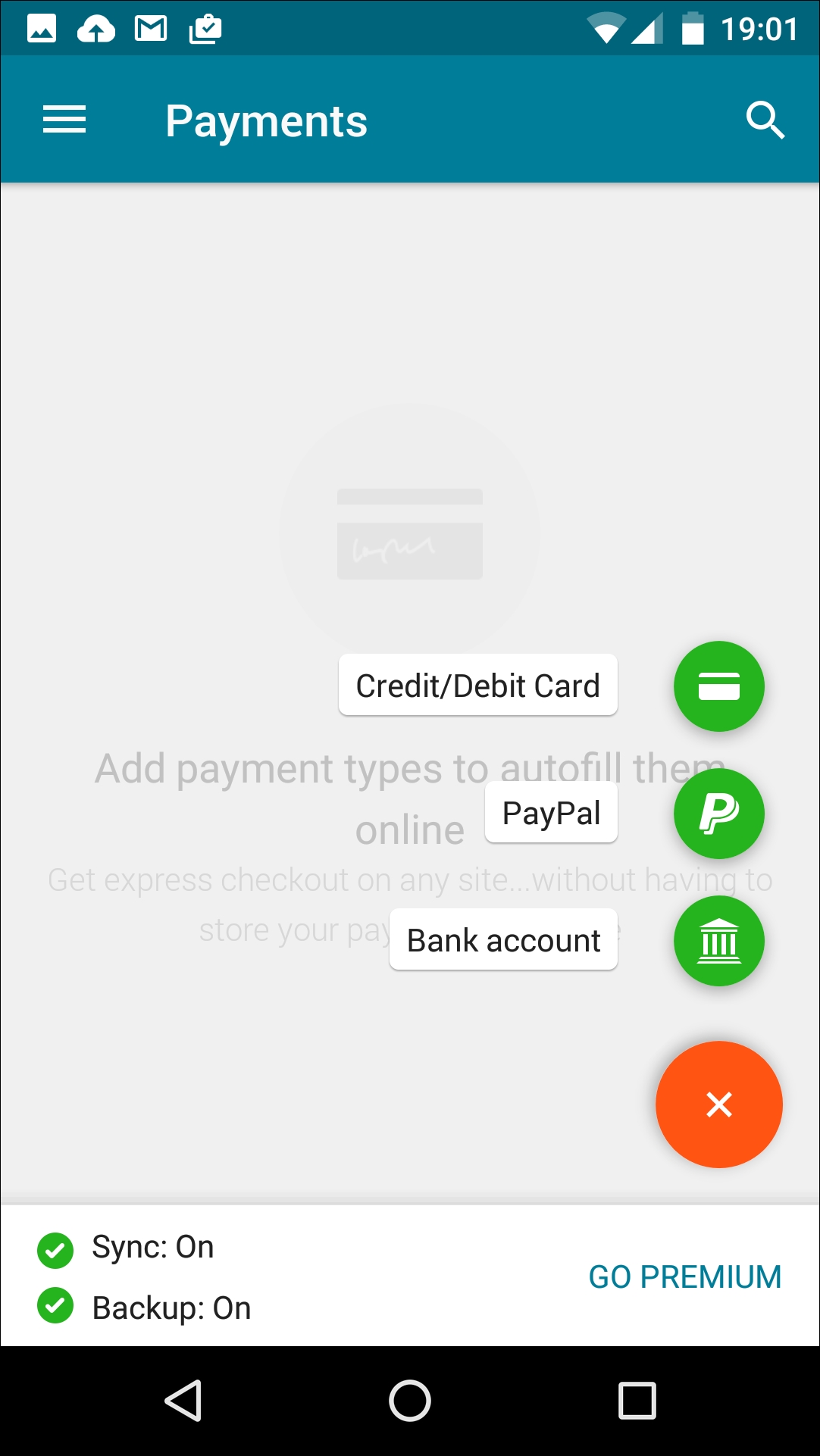
Announced at the 2014 Google I/O conference, and later making an appearance in Android 5.0, Material Design is a new design language that provides a more consistent user experience across Google products-including Android. Taking its cues from paper and ink, Material Design uses shadows, edges, dimensions, and the concept of sheets of material to create a striking, minimal experience.
Many apps now implement Material Design. This helps to provide a more seamless UI experience, even when the user is switching between apps created by entirely different developers. The previous screen shows the Dashlane password manager app, which has a Material Design theme.
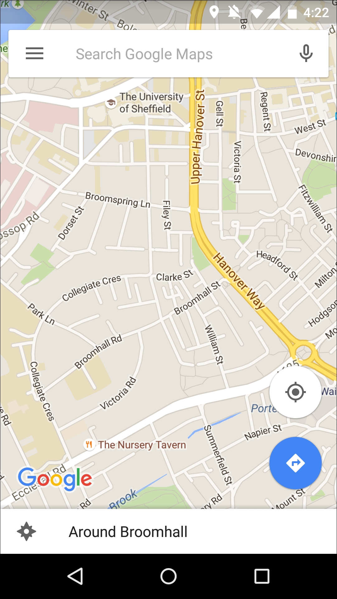
The UI elements you'll find in the Maps app are carefully designed to stay out of the way, so the main body of content (that is, the map part of Maps) is clearly visible and uninterrupted. This is a good example of a UI that strikes a tricky balance between being unobtrusive, while also ensuring all the UI elements you could possibly need are always within easy reach. Another example of this kind of UI is the YouTube app.