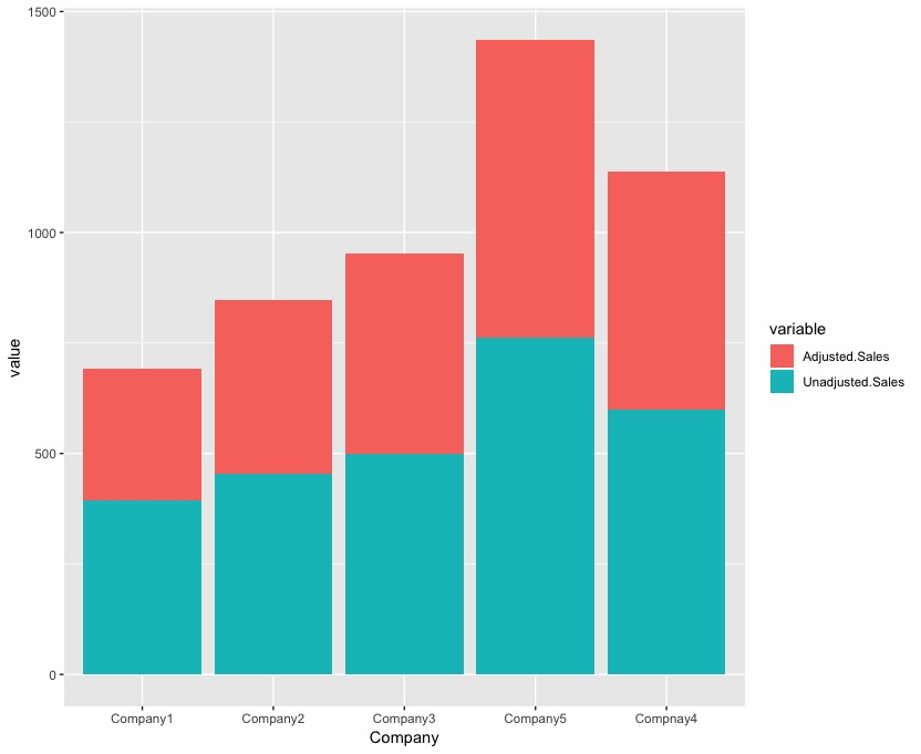
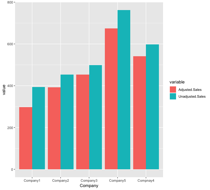
The ggplot2 package has become the dominant R package for creating serious plots, mainly due to its beautiful aesthetics. The ggplot package allows the user to define the plots in a sequential (or additive) way, and this great syntax has contributed to its enormous success. As you would expect, this package can handle a wide variety of plots.
-
Book Overview & Buying
-
Table Of Contents

R Statistics Cookbook
By :
R Statistics Cookbook
By:
Overview of this book
R is a popular programming language for developing statistical software. This book will be a useful guide to solving common and not-so-common challenges in statistics. With this book, you'll be equipped to confidently perform essential statistical procedures across your organization with the help of cutting-edge statistical tools.
You'll start by implementing data modeling, data analysis, and machine learning to solve real-world problems. You'll then understand how to work with nonparametric methods, mixed effects models, and hidden Markov models. This book contains recipes that will guide you in performing univariate and multivariate hypothesis tests, several regression techniques, and using robust techniques to minimize the impact of outliers in data.You'll also learn how to use the caret package for performing machine learning in R. Furthermore, this book will help you understand how to interpret charts and plots to get insights for better decision making.
By the end of this book, you will be able to apply your skills to statistical computations using R 3.5. You will also become well-versed with a wide array of statistical techniques in R that are extensively used in the data science industry.
Table of Contents (12 chapters)
Preface
 Free Chapter
Getting Started with R and Statistics
Univariate and Multivariate Tests for Equality of Means
Linear Regression
Bayesian Regression
Nonparametric Methods
Robust Methods
Time Series Analysis
Mixed Effects Models
Predictive Models Using the Caret Package
Bayesian Networks and Hidden Markov Models
Other Books You May Enjoy