Dive into R with this data science guide on machine learning (ML). Machine Learning with R, Fourth Edition, takes you through classification methods like nearest neighbor and Naive Bayes and regression modeling, from simple linear to logistic.
Dive into practical deep learning with neural networks and support vector machines and unearth valuable insights from complex data sets with market basket analysis. Learn how to unlock hidden patterns within your data using k-means clustering.
With three new chapters on data, you’ll hone your skills in advanced data preparation, mastering feature engineering, and tackling challenging data scenarios. This book helps you conquer high-dimensionality, sparsity, and imbalanced data with confidence. Navigate the complexities of big data with ease, harnessing the power of parallel computing and leveraging GPU resources for faster insights.
Elevate your understanding of model performance evaluation, moving beyond accuracy metrics. With a new chapter on building better learners, you’ll pick up techniques that top teams use to improve model performance with ensemble methods and innovative model stacking and blending techniques.
Machine Learning with R, Fourth Edition, equips you with the tools and knowledge to tackle even the most formidable data challenges. Unlock the full potential of machine learning and become a true master of the craft.
After collecting data and loading it into R data structures, the next step in the machine learning process involves examining the data in detail. It is during this step that you will begin to explore the data’s features and examples and realize the peculiarities that make your data unique. The better you understand your data, the better you will be able to match a machine learning model to your learning problem.
The best way to learn the process of data exploration is by example. In this section, we will explore the usedcars.csv dataset, which contains actual data about used cars advertised for sale on a popular US website in the year 2012.
The usedcars.csv dataset is available for download on the Packt Publishing support page for this book. If you are following along with the examples, be sure that this file has been downloaded and saved to your R working directory.
Since the dataset is stored in CSV form, we can use the read.csv() function to load the data into an R data frame:
> usedcars <- read.csv("usedcars.csv")
Using the usedcars data frame, we will now assume the role of a data scientist who has the task of understanding the used car data. Although data exploration is a fluid process, the steps can be imagined as a sort of investigation in which questions about the data are answered. The exact questions may vary across projects, but the types of questions are always similar.
You should be able to adapt the basic steps of this investigation to any dataset you like, whether large or small.
Figure 2.3: “Do pricing algorithms get a test drive?” (image created by Midjourney AI with the prompt of “cute cartoon robot buying a used car”)
Exploring the structure of data
The first questions to ask in an investigation of a new dataset should be about how the dataset is organized. If you are fortunate, your source will provide a data dictionary, a document that describes the dataset’s features. In our case, the used car data does not come with this documentation, so we’ll need to create our own.
The str() function provides a method for displaying the structure of R objects, such as data frames, vectors, or lists. It can be used to create the basic outline for our data dictionary:
> str(usedcars)
'data.frame':	150 obs. of  6 variables:
 $ year        : int  2011 2011 2011 2011 ...
 $ model       : chr  "SEL" "SEL" "SEL" "SEL" ...
 $ price       : int  21992 20995 19995 17809 ...
 $ mileage     : int  7413 10926 7351 11613 ...
 $ color       : chr  "Yellow" "Gray" "Silver" "Gray" ...
 $ transmission: chr  "AUTO" "AUTO" "AUTO" "AUTO" ...
For such a simple command, we learn a wealth of information about the dataset. The statement 150 obs informs us that the data includes 150 observations, which is just another way of saying that the dataset contains 150 rows or examples. The number of observations is often simply abbreviated as n.
Since we know that the data describes used cars, we can now presume that we have examples of n = 150 automobiles for sale.
The 6 variables statement refers to the six features that were recorded in the data. The term variable is borrowed from the field of statistics, and simply means a mathematical object that can take various values—like the x and y variables you might solve for in an algebraic equation. These features, or variables, are listed by name on separate lines. Looking at the line for the feature called color, we note some additional details:
$ color : chr "Yellow" "Gray" "Silver" "Gray" ...
After the variable’s name, the chr label tells us that the feature is the character type. In this dataset, three of the variables are character while three are noted as int, which refers to the integer type. Although the usedcars dataset includes only character and integer features, you are also likely to encounter num, or numeric type, when using non-integer data. Any factors would be listed as the factor type. Following each variable’s type, R presents a sequence of the first few feature values. The values "Yellow" "Gray" "Silver" "Gray" are the first four values of the color feature.
Applying a bit of subject-area knowledge to the feature names and values allows us to make some assumptions about what the features represent. year could refer to the year the vehicle was manufactured, or it could specify the year the advertisement was posted. We’ll have to investigate this feature later in more detail, since the four example values (2011 2011 2011 2011) could be used to argue for either possibility. The model, price, mileage, color, and transmission most likely refer to the characteristics of the car for sale.
Although our data appears to have been given meaningful names, this is not always the case. Sometimes datasets have features with nonsensical names or codes, like V1. In these cases, it may be necessary to do additional sleuthing to determine what a feature represents. Still, even with helpful feature names, it is always prudent to be skeptical about the provided labels. Let’s investigate further.
Exploring numeric features
To investigate the numeric features in the used car data, we will employ a common set of measurements for describing values known as summary statistics. The summary() function displays several common summary statistics. Let’s look at a single feature, year:
> summary(usedcars$year)
   Min. 1st Qu.  Median    Mean  3rd Qu.   Max.
   2000    2008    2009    2009    2010    2012
Ignoring the meaning of the values for now, the fact that we see numbers such as 2000, 2008, and 2009 leads us to believe that year indicates the year of manufacture rather than the year the advertisement was posted, since we know the vehicle listings were obtained in 2012.
By supplying a vector of column names, we can also use the summary() function to obtain summary statistics for several numeric columns at the same time:
> summary(usedcars[c("price", "mileage")])
     price          mileage
 Min.   : 3800   Min.   :  4867
 1st Qu.:10995   1st Qu.: 27200
 Median :13592   Median : 36385
 Mean   :12962   Mean   : 44261
 3rd Qu.:14904   3rd Qu.: 55124
 Max.   :21992   Max.   :151479
The six summary statistics provided by the summary() function are simple, yet powerful tools for investigating data. They can be divided into two types: measures of center and measures of spread.
Measuring the central tendency – mean and median
Measures of central tendency are a class of statistics used to identify a value that falls in the middle of a set of data. You are most likely already familiar with one common measure of center: the average. In common use, when something is deemed average, it falls somewhere between the extreme ends of the scale. An average student might have marks falling in the middle of their classmates’. An average weight is neither unusually light nor heavy. In general, an average item is typical and not too unlike the others in its group. You might think of it as an exemplar by which all the others are judged.
In statistics, the average is also known as the mean, which is a measurement defined as the sum of all values divided by the number of values. For example, to calculate the mean income in a group of three people with incomes of $36,000, $44,000, and $56,000, we could type:
> (36000 + 44000 + 56000) / 3
[1] 45333.33
R also provides a mean() function, which calculates the mean for a vector of numbers:
> mean(c(36000, 44000, 56000))
[1] 45333.33
The mean income of this group of people is about $45,333. Conceptually, this can be imagined as the income each person would have if the total income was divided equally across every person.
Recall that the preceding summary() output listed mean values for price and mileage. These values suggest that the typical used car in this dataset was listed at a price of $12,962 and had an odometer reading of 44,261. What does this tell us about our data? We can note that because the average price is relatively low, we might expect that the dataset contains economy-class cars. Of course, the data could also include late-model luxury cars with high mileage, but the relatively low mean mileage statistic doesn’t provide evidence to support this hypothesis. On the other hand, it doesn’t provide evidence to ignore the possibility either. We’ll need to keep this in mind as we examine the data further.
Although the mean is by far the most cited statistic for measuring the center of a dataset, it is not always the most appropriate one. Another commonly used measure of central tendency is the median, which is the value that occurs at the midpoint of an ordered list of values. As with the mean, R provides a median() function, which we can apply to our salary data as shown in the following example:
> median(c(36000, 44000, 56000))
[1] 44000
So, because the middle value is 44000, the median income is $44,000.
If a dataset has an even number of values, there is no middle value. In this case, the median is commonly calculated as the average of the two values at the center of the ordered list. For example, the median of the values 1, 2, 3, and 4 is 2.5.
At first glance, it seems like the median and mean are very similar measures. Certainly, the mean value of $45,333 and the median value of $44,000 are not very far apart. Why have two measures of central tendency? The reason relates to the fact that the mean and median are affected differently by values falling at the far ends of the range. In particular, the mean is highly sensitive to outliers, or values that are atypically high or low relative to the majority of data. A more nuanced take on outliers will be presented in Chapter 11, Being Successful with Machine Learning, but for now, we can consider them extreme values that tend to shift the mean higher or lower relative to the median, because the median is largely insensitive to the outlying values.
Recall again the reported median values in the summary() output for the used car dataset. Although the mean and median for price are similar (differing by approximately five percent), there is a much larger difference between the mean and median for mileage. For mileage, the mean of 44,261 is more than 20 percent larger than the median of 36,385. Since the mean is more sensitive to extreme values than the median, the fact that the mean is much higher than the median might lead us to suspect that there are some used cars with extremely high mileage values relative to the others in the dataset. To investigate this further, we’ll need to add additional summary statistics to our analysis.
Measuring spread – quartiles and the five-number summary
The mean and median provide ways to quickly summarize values, but these measures of center tell us little about whether there is diversity in the measurements. To measure the diversity, we need to employ another type of summary statistics concerned with the spread of the data, or how tightly or loosely the values are spaced. Knowing about the spread provides a sense of the data’s highs and lows, and whether most values are like or unlike the mean and median.
The five-number summary is a set of five statistics that roughly depict the spread of a feature’s values. All five statistics are included in the summary() function output. Written in order, they are:
Minimum (Min.)
First quartile, or Q1 (1st Qu.)
Median, or Q2 (Median)
Third quartile, or Q3 (3rd Qu.)
Maximum (Max.)
As you would expect, the minimum and maximum are the most extreme feature values, indicating the smallest and largest values respectively. R provides the min() and max() functions to calculate these for a vector.
The span between the minimum and maximum value is known as the range. In R, the range() function returns both the minimum and maximum value:
> range(usedcars$price)
[1] 3800 21992
Combining range() with the difference function diff() allows you to compute the range statistic with a single line of code:
> diff(range(usedcars$price))
[1] 18192
One quarter of the dataset’s values fall below the first quartile (Q1), and another quarter is above the third quartile (Q3). Along with the median, which is the midpoint of the data values, the quartiles divide a dataset into four portions, each containing 25 percent of the values.
Quartiles are a special case of a type of statistic called quantiles, which are numbers that divide data into equally sized quantities. In addition to quartiles, commonly used quantiles include tertiles (three parts), quintiles (five parts), deciles (10 parts), and percentiles (100 parts). Percentiles are often used to describe the ranking of a value; for instance, a student whose test score was ranked at the 99th percentile performed better than or equal to 99 percent of the other test takers.
The middle 50 percent of data, found between the first and third quartiles, is of particular interest because it is a simple measure of spread. The difference between Q1 and Q3 is known as the interquartile range (IQR), and can be calculated with the IQR() function:
> IQR(usedcars$price)
[1] 3909.5
We could have also calculated this value by hand from the summary() output for the usedcars$price vector by computing 14904 – 10995 = 3909. The small difference between our calculation and the IQR() output is due to the fact that R automatically rounds the summary() output.
The quantile() function provides a versatile tool for identifying quantiles for a set of values. By default, quantile() returns the five-number summary. Applying the function to the usedcars$price vector results in the same summary statistics as before:
When computing quantiles, there are many methods for handling ties among sets of values with no single middle value. The quantile() function allows you to specify among nine different tie-breaking algorithms by specifying the type parameter. If your project requires a precisely defined quantile, it is important to read the function documentation using the ?quantile command.
By supplying an additional probs parameter for a vector denoting cut points, we can obtain arbitrary quantiles, such as the 1st and 99th percentiles:
> quantile(usedcars$price, probs = c(0.01, 0.99))
      1%      99%
 5428.69 20505.00
The sequence function seq() generates vectors of evenly spaced values. This makes it easy to obtain other slices of data, such as the quintiles (five groups) shown in the following command:
> quantile(usedcars$price, seq(from = 0, to = 1, by = 0.20))
Equipped with an understanding of the five-number summary, we can re-examine the used car summary() output. For price, the minimum was $3,800 and the maximum was $21,992. Interestingly, the difference between the minimum and Q1 is about $7,000, as is the difference between Q3 and the maximum; yet, the difference from Q1 to the median to Q3 is roughly $2,000. This suggests that the lower and upper 25 percent of values are more widely dispersed than the middle 50 percent of values, which seem to be more tightly grouped around the center. We also see a similar trend with mileage. As you will learn later in this chapter, this pattern of spread is common enough that it has been called a “normal” distribution of data.
The spread of mileage also exhibits another interesting property—the difference between Q3 and the maximum is far greater than that between the minimum and Q1. In other words, the larger values are far more spread out than the smaller values. This finding helps explain why the mean value is much greater than the median. Because the mean is sensitive to extreme values, it is pulled higher, while the median stays in relatively the same place. This is an important property, which becomes more apparent when the data is presented visually.
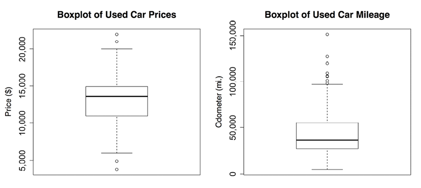
Visualizing numeric features – boxplots
Visualizing numeric features can help diagnose data problems that might negatively affect machine learning model performance. A common visualization of the five-number summary is a boxplot, also known as a box-and-whisker plot. The boxplot displays the center and spread of a numeric variable in a format that allows you to quickly obtain a sense of its range and skew or compare it to other features.
Let’s look at a boxplot for the used car price and mileage data. To obtain a boxplot for a numeric vector, we will use the boxplot() function. We will also specify a pair of extra parameters, main and ylab, to add a title to the figure and label the y axis (the vertical axis), respectively. The commands to create the price and mileage boxplots are:
> boxplot(usedcars$price, main = "Boxplot of Used Car Prices",
          ylab = "Price ($)")
> boxplot(usedcars$mileage, main = "Boxplot of Used Car Mileage",
          ylab = "Odometer (mi.)")
R will produce figures as follows:
Figure 2.4: Boxplots of used car price and mileage data
A boxplot depicts the five-number summary using horizontal lines and dots. The horizontal lines forming the box in the middle of each figure represent Q1, Q2 (the median), and Q3 when reading the plot from bottom to top. The median is denoted by the dark line, which lines up with $13,592 on the vertical axis for price and 36,385 mi. on the vertical axis for mileage.
In simple boxplots, such as those in the preceding diagram, the box width is arbitrary and does not illustrate any characteristic of the data. For more sophisticated analyses, it is possible to use the shape and size of the boxes to facilitate comparisons of the data across several groups. To learn more about such features, begin by examining the notch and varwidth options in the R boxplot() documentation by typing the ?boxplot command.
The minimum and maximum values can be illustrated using whiskers that extend below and above the box; however, a widely used convention only allows the whiskers to extend to a minimum or maximum of 1.5 times the IQR below Q1 or above Q3. Any values that fall beyond this threshold are considered outliers and are denoted as circles or dots. For example, recall that the IQR for price was 3,909 with Q1 of 10,995 and Q3 of 14,904. An outlier is therefore any value that is less than 10995 - 1.5 * 3909 = 5131.5 or greater than 14904 + 1.5 * 3909 = 20767.5.
The price boxplot shows two outliers on both the high and low ends. On the mileage boxplot, there are no outliers on the low end and thus the bottom whisker extends to the minimum value of 4,867. On the high end, we see several outliers beyond the 100,000-mile mark. These outliers are responsible for our earlier finding, which noted that the mean value was much greater than the median.
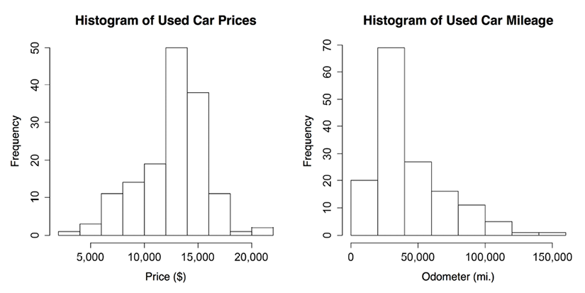
Visualizing numeric features – histograms
A histogram is another way to visualize the spread of a numeric feature. It is like a boxplot in that it divides the feature values into a predefined number of portions or bins, which act as containers for values. Their similarities end there, however. Where a boxplot creates four portions containing the same number of values but varying in range, a histogram uses a larger number of portions of identical range and allows the bins to contain different numbers of values.
We can create a histogram for the used car price and mileage data using the hist() function. As we did with the boxplot, we will specify a title for the figure using the main parameter and label the x axis with the xlab parameter. The commands to create the histograms are:
> hist(usedcars$price, main = "Histogram of Used Car Prices",
       xlab = "Price ($)")
> hist(usedcars$mileage, main = "Histogram of Used Car Mileage",
       xlab = "Odometer (mi.)")
This produces the following diagrams:
Figure 2.5: Histograms of used car price and mileage data
The histogram is composed of a series of bars with heights indicating the count, or frequency, of values falling within each of the equal-width bins partitioning the values. The vertical lines that separate the bars, as labeled on the horizontal axis, indicate the start and end points of the range of values falling within the bin.
You may have noticed that the preceding histograms have differing numbers of bins. This is because the hist() function attempts to identify the optimal number of bins for the feature’s range. If you’d like to override this default, use the breaks parameter. Supplying an integer such as breaks = 10 creates exactly 10 bins of equal width, while supplying a vector such as c(5000, 10000, 15000, 20000) creates bins that break at the specified values.
On the price histogram, each of the 10 bars spans an interval of $2,000, beginning at $2,000 and ending at $22,000. The tallest bar in the center of the figure covers the range from $12,000 to $14,000 and has a frequency of 50. Since we know our data includes 150 cars, we know that one-third of all the cars are priced from $12,000 to $14,000. Nearly 90 cars—more than half—are priced from $12,000 to $16,000.
The mileage histogram includes eight bars representing bins of 20,000 miles each, beginning at 0 and ending at 160,000 miles. Unlike the price histogram, the tallest bar is not in the center of the data, but on the left-hand side of the diagram. The 70 cars contained in this bin have odometer readings from 20,000 to 40,000 miles.
You might also notice that the shape of the two histograms is somewhat different. It seems that the used car prices tend to be evenly divided on both sides of the middle, while the car mileages stretch further to the right.
This characteristic is known as skew, or more specifically right skew, because the values on the high end (right side) are far more spread out than the values on the low end (left side). As shown in the following diagram, histograms of skewed data look stretched on one of the sides:
Figure 2.6: Three skew patterns visualized with idealized histograms
The ability to quickly diagnose such patterns in our data is one of the strengths of the histogram as a data exploration tool. This will become even more important as we start examining other patterns of spread in numeric data.
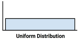
Understanding numeric data – uniform and normal distributions
Histograms, boxplots, and statistics describing the center and spread provide ways to examine the distribution of a feature’s values. A variable’s distribution describes how likely a value is to fall within various ranges.
If all values are equally likely to occur—say, for instance, in a dataset recording the values rolled on a fair six-sided die—the distribution is said to be uniform. A uniform distribution is easy to detect with a histogram because the bars are approximately the same height. The histogram may look something like the following diagram:
Figure 2.7: A uniform distribution visualized with an idealized histogram
It’s important to note that not all random events are uniform. For instance, rolling a weighted six-sided trick die would result in some numbers coming up more often than others. While each roll of the die results in a randomly selected number, they are not equally likely.
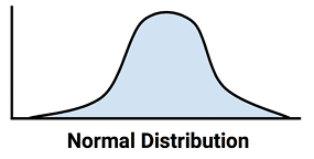
The used car price and mileage data are also clearly not uniform, since some values are seemingly far more likely to occur than others. In fact, on the price histogram, it seems that values become less likely to occur as they are further away from both sides of the center bar, which results in a bell-shaped distribution of data. This characteristic is so common in real-world data that it is the hallmark of the so-called normal distribution. The stereotypical bell-shaped curve of the normal distribution is shown in the following diagram:
Figure 2.8: A normal distribution visualized with an idealized histogram
Although there are numerous types of non-normal distributions, many real-world phenomena generate data that can be described by the normal distribution. Therefore, the normal distribution’s properties have been studied in detail.
Measuring spread – variance and standard deviation
Distributions allow us to characterize a large number of values using a smaller number of parameters. The normal distribution, which describes many types of real-world data, can be defined with just two: center and spread. The center of the normal distribution is defined by its mean value, which we have used before. The spread is measured by a statistic called the standard deviation.
To calculate the standard deviation, we must first obtain the variance, which is defined as the average of the squared differences between each value and the mean value. In mathematical notation, the variance of a set of n values in a set named x is defined by the following formula:
In this formula, the Greek letter mu (written as ) denotes the mean of the values, and the variance itself is denoted by the Greek letter sigma squared (written as ).
The standard deviation is the square root of the variance, and is denoted by sigma (written as ) as shown in the following formula:
In R, the var() and sd() functions save us the trouble of calculating the variance and standard deviation by hand. For example, computing the variance and standard deviation of the price and mileage vectors, we find:
> var(usedcars$price)
[1] 9749892
> sd(usedcars$price)
[1] 3122.482
> var(usedcars$mileage)
[1] 728033954
> sd(usedcars$mileage)
[1] 26982.1
When interpreting the variance, larger numbers indicate that the data is spread more widely around the mean. The standard deviation indicates, on average, how much each value differs from the mean.
If you compute these statistics by hand using the formulas in the preceding diagrams, you will obtain a slightly different result than the built-in R functions. This is because the preceding formulas use the population variance (which divides by n), while R uses the sample variance (which divides by n - 1). Except for very small datasets, the distinction is minor.
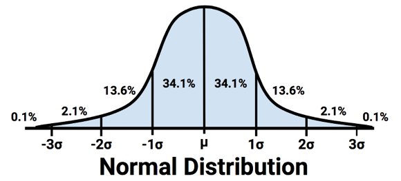
The standard deviation can be used to quickly estimate how extreme a given value is under the assumption that it came from a normal distribution. The 68–95–99.7 rule states that 68 percent of values in a normal distribution fall within one standard deviation of the mean, while 95 percent and 99.7 percent of values fall within two and three standard deviations, respectively. This is illustrated in the following diagram:
Figure 2.9: The percent of values within one, two, and three standard deviations of a normal distribution’s mean
Applying this information to the used car data, we know that the mean and standard deviation of price were $12,962 and $3,122 respectively. Therefore, by assuming that the prices are normally distributed, approximately 68 percent of cars in our data were advertised at prices between $12,962 - $3,122 = $9,840 and $12,962 + $3,122 = $16,804.
Although, strictly speaking, the 68–95–99.7 rule only applies to normal distributions, the basic principle applies to almost any data; values more than three standard deviations away from the mean tend to be exceedingly rare events.
Exploring categorical features
If you recall, the used car dataset contains three categorical features: model, color, and transmission. Additionally, although year is stored as a numeric vector, each year can be imagined as a category applying to multiple cars. We might therefore consider treating it as categorical as well.
In contrast to numeric data, categorical data is typically examined using tables rather than summary statistics. A table that presents a single categorical feature is known as a one-way table. The table() function can be used to generate one-way tables for the used car data:
 Black   Blue   Gold   Gray  Green    Red Silver  White Yellow
    35     17      1     16      5     25     32     16      3
The table() output lists the categories of the nominal variable and a count of the number of values falling into each category. Since we know there are 150 used cars in the dataset, we can determine that roughly one-third of all the cars were manufactured in 2010, given that 49/150 = 0.327.
R can also perform the calculation of table proportions directly, by using the prop.table() command on a table produced by the table() function:
The results of prop.table() can be combined with other R functions to transform the output. Suppose we would like to display the results in percentages with a single decimal place. We can do this by multiplying the proportions by 100, then using the round() function while specifying digits = 1, as shown in the following example:
Black   Blue   Gold   Gray  Green    Red Silver  White Yellow
 23.3   11.3    0.7   10.7    3.3   16.7   21.3   10.7    2.0
Although this includes the same information as the default prop.table() output, the changes make it easier to read. The results show that black is the most common color, with nearly a quarter (23.3 percent) of all advertised cars. Silver is a close second with 21.3 percent, and red is third with 16.7 percent.
Measuring the central tendency – the mode
In statistics terminology, the mode of a feature is the value occurring most often. Like the mean and median, the mode is another measure of central tendency. It is typically used for categorical data, since the mean and median are not defined for nominal variables.
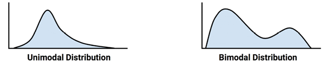
For example, in the used car data, the mode of year is 2010, while the modes for the model and color variables are SE and Black, respectively. A variable may have more than one mode; a variable with a single mode is unimodal, while a variable with two modes is bimodal. Data with multiple modes is more generally called multimodal.
Although you might suspect that you could use the mode() function, R uses this to obtain the type of variable (as in numeric, list, and so on) rather than the statistical mode. Instead, to find the statistical mode, simply look at the table() output for the category with the greatest number of values.
The mode or modes are used in a qualitative sense to gain an understanding of important values. Even so, it would be dangerous to place too much emphasis on the mode since the most common value is not necessarily a majority. For instance, although black was the single most common car color, it was only about a quarter of all advertised cars.
It is best to think about the modes in relation to the other categories. Is there one category that dominates all others, or are there several? Thinking about modes this way may help to generate testable hypotheses by raising questions about what makes certain values more common than others. If black and silver are common used car colors, we might believe that the data represents luxury cars, which tend to be sold in more conservative colors. Alternatively, these colors could indicate economy cars, which are sold with fewer color options. We will keep these questions in mind as we continue to examine this data.
Thinking about the modes as common values allows us to apply the concept of the statistical mode to numeric data. Strictly speaking, it would be unlikely to have a mode for a continuous variable, since no two values are likely to repeat. However, if we think about modes as the highest bars on a histogram, we can discuss the modes of variables such as price and mileage. It can be helpful to consider the mode when exploring numeric data, particularly to examine whether the data is multimodal.
Figure 2.10: Hypothetical distributions of numeric data with one and two modes
Exploring relationships between features
So far, we have examined variables one at a time, calculating only univariate statistics. During our investigation, we raised questions that we were unable to answer before:
Does the price and mileage data imply that we are examining only economy-class cars, or are there luxury cars with high mileage?
Do relationships between model and color provide insight into the types of cars we are examining?
These types of questions can be addressed by looking at bivariate relationships, which consider the relationship between two variables. Relationships of more than two variables are called multivariate relationships. Let’s begin with the bivariate case.
Visualizing relationships – scatterplots
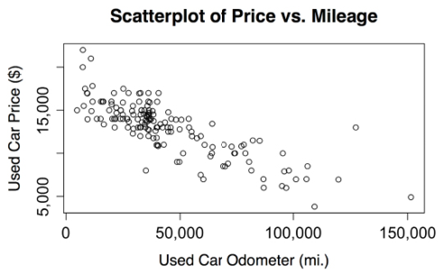
A scatterplot is a diagram that visualizes a bivariate relationship between numeric features. It is a two-dimensional figure in which dots are drawn on a coordinate plane using the values of one feature to provide the horizontal x coordinates, and the values of another feature to provide the vertical y coordinates. Patterns in the placement of dots reveal underlying associations between the two features.
To answer our question about the relationship between price and mileage, we will examine a scatterplot. We’ll use the plot() function, along with the main, xlab, and ylab parameters used previously to label the diagram.
To use plot(), we need to specify x and y vectors containing the values used to position the dots on the figure. Although the conclusions would be the same regardless of the variable used to supply the x and y coordinates, convention dictates that the y variable is the one that is presumed to depend on the other (and is therefore known as the dependent variable). Since a seller cannot modify a car’s odometer reading, mileage is unlikely to be dependent on the car’s price. Instead, our hypothesis is that a car’s price depends on the odometer mileage. Therefore, we will select price as the dependent y variable.
The full command to create our scatterplot is:
> plot(x = usedcars$mileage, y = usedcars$price,
       main = "Scatterplot of Price vs. Mileage",
       xlab = "Used Car Odometer (mi.)",
       ylab = "Used Car Price ($)")
This produces the following scatterplot:
Figure 2.11: The relationship between used car price and mileage
Using the scatterplot, we notice a clear relationship between the price of a used car and the odometer reading. To read the plot, examine how the values of the y axis variable change as the values on the x axis increase. In this case, car prices tend to be lower as the mileage increases. If you have ever sold or shopped for a used car, this is not a profound insight.
Perhaps a more interesting finding is the fact that there are very few cars that have both high price and high mileage, aside from a lone outlier at about 125,000 miles and $14,000. The absence of more points like this provides evidence to support the conclusion that our dataset is unlikely to include any high-mileage luxury cars. All the most expensive cars in the data, particularly those above $17,500, seem to have extraordinarily low mileage, which implies that we could be looking at a single type of car that retails for a price of around $20,000 when new.
The relationship we’ve observed between car prices and mileage is known as a negative association because it forms a pattern of dots in a line sloping downward. A positive association would appear to form a line sloping upward. A flat line, or a seemingly random scattering of dots, is evidence that the two variables are not associated at all. The strength of a linear association between two variables is measured by a statistic known as correlation. Correlations are discussed in detail in Chapter 6, Forecasting Numeric Data – Regression Methods, which covers methods for modeling linear relationships.
Keep in mind that not all associations form straight lines. Sometimes the dots form a U shape or V shape, while sometimes the pattern seems to be weaker or stronger for increasing values of the x or y variable. Such patterns imply that the relationship between the two variables is not linear, and thus correlation would be a poor measure of their association.
To examine a relationship between two nominal variables, a two-way cross-tabulation is used (also known as a crosstab or contingency table). A cross-tabulation is like a scatterplot in that it allows you to examine how the values of one variable vary by the values of another. The format is a table in which the rows are the levels of one variable, while the columns are the levels of another. Counts in each of the table’s cells indicate the number of values falling into the row and column combination.
To answer our earlier question about whether there is a relationship between model and color, we will examine a crosstab. There are several functions to produce two-way tables in R, including table(), which we used before for one-way tables. The CrossTable() function in the gmodels package by Gregory R. Warnes is perhaps the most user-friendly, as it presents the row, column, and margin percentages in a single table, saving us the trouble of computing them ourselves. To install the gmodels package if you haven’t already done so using the instructions in the prior chapter, use the following command:
> install.packages("gmodels")
After the package installs, type library(gmodels) to load the package. Although you only need to install the package once, you will need to load the package with the library() command during each R session in which you plan to use the CrossTable() function.
Before proceeding with our analysis, let’s simplify our project by reducing the number of levels in the color variable. This variable has nine levels, but we don’t really need this much detail. What we are truly interested in is whether the car’s color is conservative. Toward this end, we’ll divide the nine colors into two groups—the first group will include the conservative colors black, gray, silver, and white; the second group will include blue, gold, green, red, and yellow. We’ll create a logical vector indicating whether the car’s color is conservative by our definition. The following returns TRUE if the car is one of the four conservative colors, and FALSE otherwise:
You may have noticed a new command here. The %in% operator returns TRUE or FALSE for each value in the vector on the left-hand side of the operator, indicating whether the value is found in the vector on the right-hand side. In simple terms, you can translate this line as “is the used car color in the set of black, gray, silver, and white?”
Examining the table() output for our newly created variable, we see that about two-thirds of the cars have conservative colors while one-third do not:
> table(usedcars$conservative)
FALSE  TRUE
   51    99
Now, let’s look at a cross-tabulation to see how the proportion of conservatively colored cars varies by model. Since we’re assuming that the model of car dictates the choice of color, we’ll treat the conservative color indicator as the dependent (y) variable. The CrossTable() command is therefore:
> CrossTable(x = usedcars$model, y = usedcars$conservative)
The CrossTable() output is dense with numbers, but the legend at the top (labeled Cell Contents) indicates how to interpret each value. The table rows indicate the three models of used cars: SE, SEL, and SES (plus an additional row for the total across all models). The columns indicate whether the car’s color is conservative (plus a column totaling across both types of color).
The first value in each cell indicates the number of cars with that combination of model and color. The proportions indicate each cell’s contribution to the chi-square statistic, the row total, the column total, and the table’s overall total.
What we are most interested in is the proportion of conservative cars for each model. The row proportions tell us that 0.654 (65 percent) of SE cars are colored conservatively, in comparison to 0.696 (70 percent) of SEL cars, and 0.653 (65 percent) of SES. These differences are relatively small, which suggests that there are no substantial differences in the types of colors chosen for each model of car.
The chi-square values refer to the cell’s contribution in the Pearson’s chi-squared test for independence between two variables. Although a complete discussion of the statistics behind this test is highly technical, the test measures how likely it is that the difference in cell counts in the table is due to chance alone, which can help us confirm our hypothesis that the differences by group are not substantial. Beginning by adding the cell contributions for the six cells in the table, we find 0.009 + 0.004 + 0.086 + 0.044 + 0.007 + 0.004 = 0.154. This is the chi-squared test statistic.
To calculate the probability that this statistic is observed under the hypothesis that there is no association between the variables, we pass the test statistic to the pchisq() function as follows:
> pchisq(0.154, df = 2, lower.tail = FALSE)
[1] 0.9258899
The df parameter refers to the degrees of freedom, which is a component of the statistical test related to the number of rows and columns in the table; again, ignoring what it means, it can be computed as (rows - 1) * (columns - 1), or 1 for a 2x2 table and 2 for the 3x2 table used here. Setting lower.tail = FALSE requests the right-tailed probability of about 0.926, which can be understood intuitively as the probability of obtaining a test statistic of at least 0.154 or greater due to chance alone.
If the probability of the chi-squared test is very low—perhaps below ten, five, or even one percent—it provides strong evidence that the two variables are associated, because the observed association in the table is unlikely to have happened by chance. In our case, the probability is much closer to 100 percent than to 10 percent, so it is unlikely we are observing an association between model and color for cars in this dataset.
Rather than computing this by hand, you can also obtain the chi-squared test results by adding an additional parameter specifying chisq = TRUE when calling the CrossTable() function. For example:
> CrossTable(x = usedcars$model, y = usedcars$conservative,
               chisq = TRUE)
Pearson's Chi-squared test
------------------------------------------------------------
Chi^2 =  0.1539564     d.f. =  2     p =  0.92591
Note that, aside from slight differences due to rounding, this produces the same chi-squared test statistic and probability as was computed by hand.
The chi-squared test performed here is one of many types of formal hypothesis testing that can be performed using traditional statistics. If you’ve ever heard the phrase “statistically significant,” it means a statistical test like chi-squared (or one of many others) was performed, and it reached a “significant” level—typically, a probability less than five percent. Although hypothesis testing is somewhat beyond the scope of this book, it will be encountered again briefly in Chapter 6, Forecasting Numeric Data – Regression Methods.
Read this chapter and the full book FREE of cost - No Credit card required!
Plus access over 9,000 other expert tech books and videos just by signing up - No commitment!
CONTINUE READING
83
Tech Concepts
36
Programming languages
73
Tech Tools
Unlimited access to the largest independent learning library in tech of over 8,000 expert-authored tech books and videos.
Innovative learning tools, including AI book assistants, code context explainers, and text-to-speech.
50+ new titles added per month and exclusive early access to books as they are being written.


 Free Chapter


 ) denotes the mean of the values, and the variance itself is denoted by the Greek letter sigma squared (written as
  ).
). ) as shown in the following formula: