
Working with the asset catalog for Dark Mode
Since the ability to add colors to the asset catalog became available back in Xcode 9, there is now even more reason to take full advantage of one of Xcode's prized assets.
In this section, we'll look at how we can use the asset catalog not only to create our custom colors but also to create our own adaptive colors and images, allowing us to harness the power of Xcode when developing dynamic appearance applications.
Using custom adaptive colors
Sticking with our current project, head on over to the file inspector, and highlight the Assets.xcassets folder. With the following layout visible, click on the + button highlighted in the following screenshot and select New Color Set from the list of options:
Figure 2.19 – Creating a color set
Add in another three color sets and name them the following:
brandLabelbrandSecondaryLabelbrandTertiaryLabel
Highlight brandLabel, and then highlight the option in the central asset preview window. Notice the list of attribute options now made available to us in the Attributes Inspector pane:
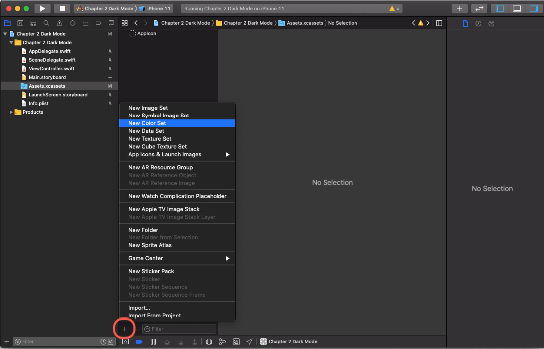
Figure 2.20 – Adding a color set
As you can see, we can now define the brandLabel color that we want to use. But first, let's make it adaptive. In the Attributes Inspector pane, change Appearance from None to Any, Light, Dark.
You'll have noticed on the dropdown that there was another option of Any, Dark, so let's go through what this means:
- None: This is a default color and won't be adaptive to your selected appearance.
- Any, Dark: In this scenario, Any will support legacy versions of your app, along with any other variations that aren't dark (so light, basically). Dark will be dark…
- Any, Light, Dark: Same as the preceding but will allow you to specifically select a value for legacy and light (along with dark).
So, with that covered, let's add some colors. Now, as mentioned before, this is where you can be really specific with your color choices, either by personal preference or brand guidelines you have to follow. For me, I'm just going to click Show Color Picker and pick my favorite colors:
- Tangerine for Any (Legacy) and light
- A more subtle Cantaloupe for dark:
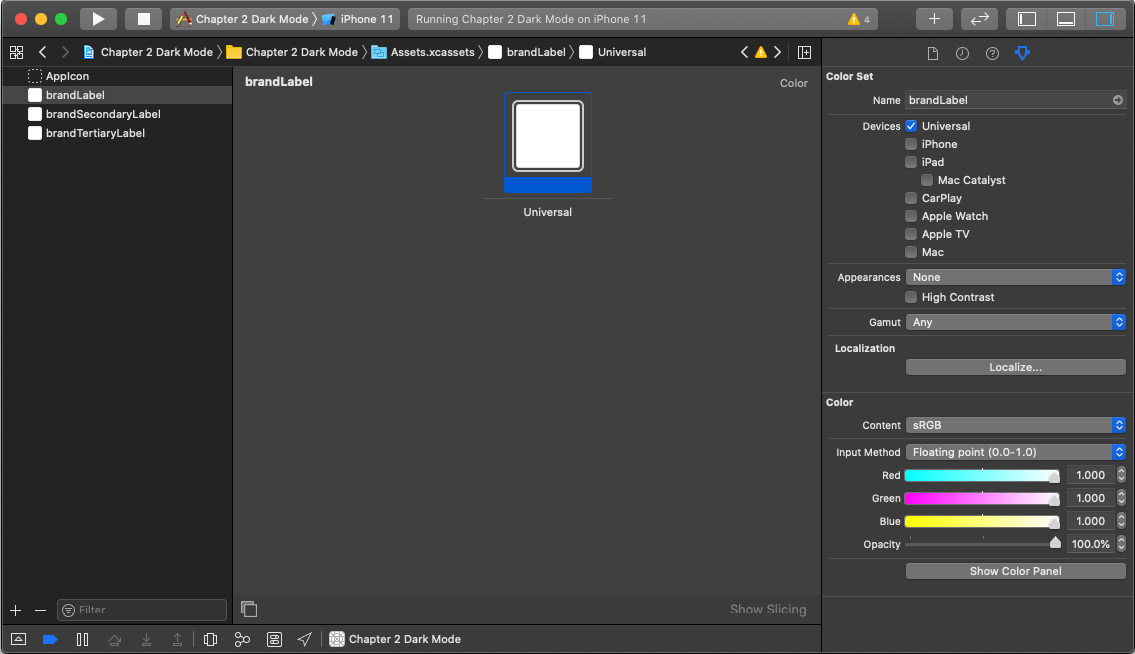
Figure 2.21 – Choosing a color
Do the same for brandSecondaryLabel and brandTertiaryLabel, remembering to slightly alter the colors based on the semantic purpose you intend to use them for.
Once you've done that, head back on over to Interface Builder and highlight primaryLabel, then bring open the options of colors from Attributes Inspector. You should see the following:
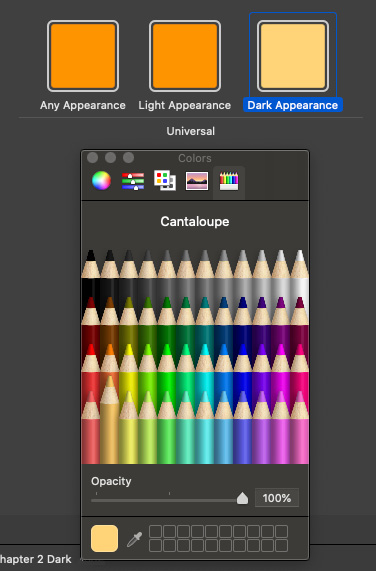
Figure 2.22 – Default label color
All the color sets you created in the asset catalog are available to use right there in Interface Builder. Go ahead and add them in for each label and see how they look by switching appearance in Interface Builder:
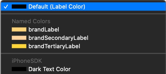
Figure 2.23 – Color set, light mode versus dark mode
With that done, you've created your very own adaptive, semantic and dynamic colors for your app – all within the power of Xcode.
If you wanted to use the colors programmatically, you can do that by simply referring to the asset name in a couple of different ways.
First is a direct reference to the name of the assets:
primaryLabel.textColor = UIColor(named: "brandLabel")
Alternatively, you can select the asset directly from the media library by pressing Shift + CMD + M and selecting show color palette from the icon options and selecting the color you want.
This will insert the color from the assets catalog as a swatch, directly inside your code:

Figure 2.24 – Assigning a color set programmatically
Or another option, if you really wanted to keep your code clean, would be to create an extension of UIColor allowing you to define your own property:
extension UIColor {
    static var brandLabel: UIColor {
        return UIColor(named: "brandLabel") ?? UIColor.label
    }
}
This can now be used just like this:
primaryLabel.textColor = UIColor.brandLabel
This is a nice, clean, and manageable way to look after your custom color sets programmatically, but this really is a personal preference, and each to their own. If you're working with a large alternative color guideline, making the change to a primary color in one extension will roll the change out to your entire app without the worry of missing a label or two.
Next, let's take a look at the same approach but for images.
Using custom adaptive images
We've learned a lot about how the asset catalog works with adaptive images from the previous section, Custom adaptive colors, and luckily, we can take full advantage of that in creating adaptive images for our project.
In the same way that we created a new color set, let's follow these steps:
- Head on back over to Assets.xcassets.
- Create a new image set:

Figure 2.25 – New image set
- Name your new image header, highlight it, and change the appearance in the Attributes Inspector window to Any, Dark. You should now see the following:

Figure 2.26 – Add new image set
When adding an image to the image catalog, you'll be given the option for adding 1x, 2x, or 3x images – these are different image scales you can set for various screen sizes. For further information, see the following from Apple's documentation.
For this example, we are going to add in two different images to the 2x option: one for Any and the other for Dark. You can grab the images I've used from the sample project found in GitHub or choose your own – it's up to you. From the Finder, simply drag and drop the images into the 2x placeholder inside Xcode. You should see the following once done:

Figure 2.27 – New image set variants
Now, head back on over to your storyboard and add in a UIImageView to your project. Add this to the top of ViewController to act as a header.
Once in place, head on over to the Attributes Inspector pane and select the dropdown for the Image option – there, you should see your newly created asset, header:
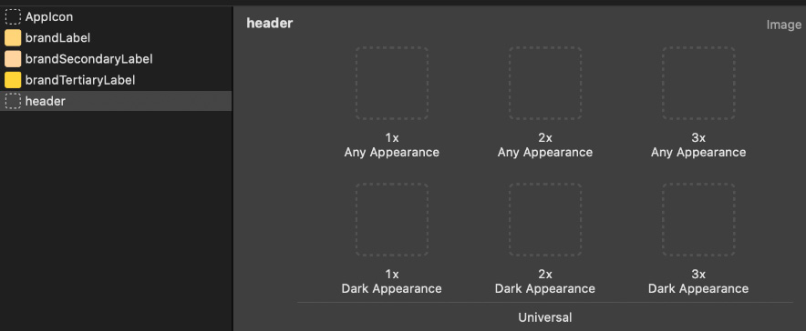
Figure 2.28 – Setting header from the image set
Select this and take a look (depending on the size of the image you chose, you may need to set Content Mode to Aspect Fill – these options can also be found in Attributes Inspector).
Run the simulator and have a look at everything you've achieved so far in this chapter, remembering to switch from light to dark appearance by using the environment override in Xcode… looks pretty good, right?
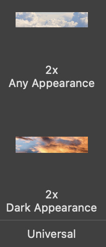
Figure 2.29 – Header light mode versus dark mode
Just like we did with color sets, we can of course handle this programmatically, should we wish. Let's add another extension to our app to handle this for us:
extension UIImage {
    static var header: UIImage {
        return UIImage(named: "header") ?? UIImage()
    }
}
We can again use this in just the same way as before:
headerImageView.image = UIImage.header
We do this by assigning our header image directly onto our UIImageView.
In this section, we harnessed the power of the asset catalog to allow us to create custom adaptive and dynamic colors and images for our app. In the next section, we'll take a look at how best to update a legacy app to support dark mode with everything we've learned so far, and also how best to identify the little things we can do to futureproof our apps for various appearances.