
In this chapter, you will start learning some new Bootstrap elements and components. By doing this, you will first understand the concepts of the Bootstrap grid system and move on to some basic components. Now, we are going to start the development of a responsive sample landing page. First, we will use the base theme of the framework, and in future, we will apply our own style.
The main structure of this chapter is as follows:
- The Bootstrap grid system
- Typography
- Tables
- Buttons
The basis of the Bootstrap framework relies in its grid system. Bootstrap offers components that allow us to structure a website in a responsive grid layout.
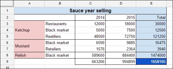
To exemplify this, imagine an electronic square sheet table that can be divided into many rows and columns, as shown in the following screenshot. In the table, you can create as many lines as you want while merging cells. But what would happen if you wanted to change the layout of a single row? That could be painful.
The Bootstrap grid system works in a different way. By letting you define a set of rows, each one having a set of independent columns, it allows you to build a solid grid system for your web page. Also, each column can have different sizes to perfectly fit your template.
This not being enough, the Bootstrap grid system adapts for every viewport and resolution, which we call responsiveness.
To start learning about the grid system, we will introduce it using the example of a landing page. As you will see, Bootstrap will allow us to create a complete scaffolding that will automatically adjust the content for any viewport.
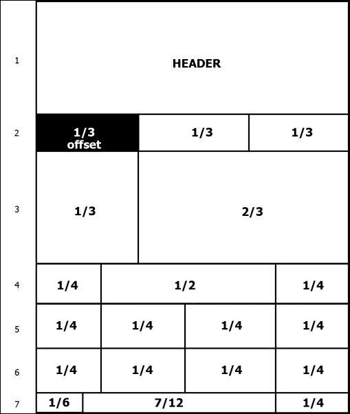
For our landing page, we will use the grid presented in the following image. As you can see, it is represented by seven rows, each containing a different number of columns. In this first example, we will use a nonmobile viewport, which we will discuss in the next chapter.
To start that, let's use our default layout presented in Chapter 1, Getting Started. Add inside the div.container tag another div with the .row class:
<!DOCTYPE html>
<html>
  <head>
    <meta charset="utf-8">
    <meta http-equiv="X-UA-Compatible" content="IE=edge">
    <meta name="viewport" content="width=device-width, initial-scale=1">
    <title>Landing page</title>

    <link rel="stylesheet" href="css/bootstrap.css">

    <!--[if lt IE 9]>
      <script src="https://oss.maxcdn.com/html5shiv/3.7.2/html5shiv.min.js">
</script>
      <script src="https://oss.maxcdn.com/respond/1.4.2/respond.min.js">
</script>
    <![endif]-->
  </head>
  <body>
    <div class="container">
      <div class="row"></div>
    </div>

    <script src="js/jquery-1.11.3.js"></script>
    <script src="js/bootstrap.js"></script>
  </body>
</html>
The hierarchy for the grid system always follows the sequence of a container that wraps rows and multiple columns. Keep in mind to always use this sequence to get a proper output.
Now that we have our .container with the first .row, let's create our first column. Every row is subdivided into 12 parts, so you can have up to 12 columns in a single row.
To identify a column, we must follow the template of .col-*-*. The first asterisk means the viewport for the column, and the other one means the size of the column. We will explain more about that, but to create our first column, we create a column identified by .col-md-12 inside our row:
<div class="container">
  <div class="row">
    <header class="col-md-12">
      HEADER
    </header>
  </div>
</div>
In this column, the md in.col-md-12 means that for the viewport medium (which means the md identifier), the column must have a 12-column width. In other words, the column fills the entire width of this row. This column will fill the complete width because it is our header, and as we can see in the previous image, this row is composed of just a single row.
So, to create a column in the Bootstrap grid system, you must follow the recipe of .col-*-* for every column. While you can set an integer from 1 to 12 for the width, for the viewport, you must set the correct class prefix. In this table, you can see the breakdown of class prefix usage and on which resolution it can be used:
|
Extra small devices (phones < 544 px / 34 em) |
Small devices (tablets ≥ 544 px / 34 em and < 768 px / 48 em) |
Medium devices (desktops ≥ 768 px /48 em and < 900 px / 62 em) |
Large devices (desktops ≥ 900 px / 62 em and < 1,200 px 75 em) |
Extra large devices (desktops ≥ 1,200 px / 75 em) | |
|---|---|---|---|---|---|
|
Grid behavior |
Horizontal lines at all times |
Collapse at start and fit the column grid | |||
|
Container's fixed width |
Auto |
|
|
|
|
|
Class prefix |
|
|
|
|
|
|
Number of columns |
12 | ||||
|
Column fixed width |
Auto |
|
|
|
|
Our second row is divided into three equal-sized columns, and the first one is an offset column, or in other words, an empty column that will be filled by a left margin. Therefore, the second row will be like this:
<div class="row">
  <div class="col-md-offset-4 col-md-4">1/3</div>
  <div class="col-md-4">1/3</div>
</div>
As you can see, by adding the .col-md-offset-4 class, we create a margin to the left four, sized in just this .row. By having each row independent of the others, we can properly customize the layout to appear just as it is supposed to be.
Now we will advance to the third row in our scaffolding. If you've got the spirit, you should have no problems with this row. For training, try doing it by yourself and check the solution in the book afterwards! I am sure you can handle it.
So, this row is composed of two columns. The first column must fill 4 out of the 12 parts of the row and the other column will fill the rest. The row in the HTML should look like this:
<div class="row">
  <div class="col-md-4"></div>
  <div class="col-md-8"></div>
</div>
About the fourth row—it is composed of a quarter divisor, followed by a half divisor, followed by a last quarter divisor. Using this in base 12, we will have the following grid in the row:
<div class="row">
  <div class="col-md-3">1/4</div>
  <div class="col-md-6">1/2</div>
  <div class="col-md-3">1/4</div>
</div>
In the fifth and sixth rows, we will show how you can create a row using two options. In the fifth row, we will create just as we are doing in the other rows, while in the sixth row, we will use the concept of nesting rows.
So, in the fifth row, create it just as you were doing before; create a row with four equally sized rows, which means that each column will have the .col-md-3 class:
<div class="row">
  <div class="col-md-3">1/4</div>
  <div class="col-md-3">1/4</div>
  <div class="col-md-3">1/4</div>
  <div class="col-md-3">1/4</div>
</div>
For the sixth row, we will use nesting rows. So, let's create the first .row, having three columns:
<div class="row">
  <div class="col-md-3">1/4</div>
  <div class="col-md-6"></div>
  <div class="col-md-3">1/4</div>
</div>
As you can see, the first and the last column use the same class of columns in row five—the .col-md-3 class—while the middle column is double the size, with the .col-md-6 class.
Let's nest another .row inside the middle column. When you create a new nested row, the columns inside of it are refreshed and you have another set of 12-sized columns to put inside it. So, inside this new row, create two columns with the .col-md-6 class to generate two columns representing a fourth of the row:
<div class="row">
  <div class="col-md-3">1/4</div>
  <div class="col-md-6">
    <div class="row">
      <div class="col-md-6">1/4</div>
      <div class="col-md-6">1/4</div>
    </div>
  </div>
  <div class="col-md-3">1/4</div>
</div>
The concept of nesting rows is pretty complex, since you can infinitely subdivide a row, although it is great to create small grid components inside your page that can be used in other locations.
To create the last row, we need to create the .col-md-2 column, followed by .col-md-7 and .col-md-3. So, just create a row using the <footer> tag with those columns. The complete scaffolding will be this:
<!DOCTYPE html>
<html>
  <head>
    <meta charset="utf-8">
    <meta http-equiv="X-UA-Compatible" content="IE=edge">
    <meta name="viewport" content="width=device-width, initial-scale=1">
    <title>Landing page</title>
    <link rel="stylesheet" href="css/bootstrap.css">
    <!--[if lt IE 9]>
      <script src="https://oss.maxcdn.com/html5shiv/3.7.2/html5shiv.min.js">
</script>
      <script src="https://oss.maxcdn.com/respond/1.4.2/respond.min.js">
</script>
    <![endif]-->
  </head>
  <body>
    <div class="container">
      <!-- row 1 -->
      <div class="row">
        <header class="col-md-12">
          HEADER
        </header>
      </div>

      <!-- row 2 -->
      <div class="row">
        <div class="col-md-offset-4 col-md-4">1/3</div>
        <div class="col-md-4">1/3</div>
      </div>

      <!-- row 3 -->
      <div class="row">
        <div class="col-md-4"></div>
        <div class="col-md-8"></div>
      </div>

      <!-- row 4 -->
      <div class="row">
        <div class="col-md-3">1/4</div>
        <div class="col-md-6">1/2</div>
        <div class="col-md-3">1/4</div>
      </div>

      <!-- row 5 -->
      <div class="row">
        <div class="col-md-3">1/4</div>
        <div class="col-md-3">1/4</div>
        <div class="col-md-3">1/4</div>
        <div class="col-md-3">1/4</div>
      </div>

      <!-- row 6 – nesting rows -->
      <div class="row">
        <div class="col-md-3">1/4</div>
        <div class="col-md-6">
          <div class="row">
            <div class="col-md-6">1/4</div>
            <div class="col-md-6">1/4</div>
          </div>
        </div>
        <div class="col-md-3">1/4</div>
      </div>

      <!-- row 7 -->
      <footer class="row">
        <div class="col-md-2">1/2</div>
        <div class="col-md-7">7/12</div>
        <div class="col-md-3">1/4</div>
      </footer>
    </div>

    <script src="js/jquery-1.11.3.js"></script>
    <script src="js/bootstrap.js"></script>
  </body>
</html>
Setting things up
To start that, let's use our default layout presented in Chapter 1, Getting Started. Add inside the div.container tag another div with the .row class:
<!DOCTYPE html>
<html>
  <head>
    <meta charset="utf-8">
    <meta http-equiv="X-UA-Compatible" content="IE=edge">
    <meta name="viewport" content="width=device-width, initial-scale=1">
    <title>Landing page</title>

    <link rel="stylesheet" href="css/bootstrap.css">

    <!--[if lt IE 9]>
      <script src="https://oss.maxcdn.com/html5shiv/3.7.2/html5shiv.min.js">
</script>
      <script src="https://oss.maxcdn.com/respond/1.4.2/respond.min.js">
</script>
    <![endif]-->
  </head>
  <body>
    <div class="container">
      <div class="row"></div>
    </div>

    <script src="js/jquery-1.11.3.js"></script>
    <script src="js/bootstrap.js"></script>
  </body>
</html>
The hierarchy for the grid system always follows the sequence of a container that wraps rows and multiple columns. Keep in mind to always use this sequence to get a proper output.
Now that we have our .container with the first .row, let's create our first column. Every row is subdivided into 12 parts, so you can have up to 12 columns in a single row.
To identify a column, we must follow the template of .col-*-*. The first asterisk means the viewport for the column, and the other one means the size of the column. We will explain more about that, but to create our first column, we create a column identified by .col-md-12 inside our row:
<div class="container">
  <div class="row">
    <header class="col-md-12">
      HEADER
    </header>
  </div>
</div>
In this column, the md in.col-md-12 means that for the viewport medium (which means the md identifier), the column must have a 12-column width. In other words, the column fills the entire width of this row. This column will fill the complete width because it is our header, and as we can see in the previous image, this row is composed of just a single row.
So, to create a column in the Bootstrap grid system, you must follow the recipe of .col-*-* for every column. While you can set an integer from 1 to 12 for the width, for the viewport, you must set the correct class prefix. In this table, you can see the breakdown of class prefix usage and on which resolution it can be used:
|
Extra small devices (phones < 544 px / 34 em) |
Small devices (tablets ≥ 544 px / 34 em and < 768 px / 48 em) |
Medium devices (desktops ≥ 768 px /48 em and < 900 px / 62 em) |
Large devices (desktops ≥ 900 px / 62 em and < 1,200 px 75 em) |
Extra large devices (desktops ≥ 1,200 px / 75 em) | |
|---|---|---|---|---|---|
|
Grid behavior |
Horizontal lines at all times |
Collapse at start and fit the column grid | |||
|
Container's fixed width |
Auto |
|
|
|
|
|
Class prefix |
|
|
|
|
|
|
Number of columns |
12 | ||||
|
Column fixed width |
Auto |
|
|
|
|
Our second row is divided into three equal-sized columns, and the first one is an offset column, or in other words, an empty column that will be filled by a left margin. Therefore, the second row will be like this:
<div class="row">
  <div class="col-md-offset-4 col-md-4">1/3</div>
  <div class="col-md-4">1/3</div>
</div>
As you can see, by adding the .col-md-offset-4 class, we create a margin to the left four, sized in just this .row. By having each row independent of the others, we can properly customize the layout to appear just as it is supposed to be.
Now we will advance to the third row in our scaffolding. If you've got the spirit, you should have no problems with this row. For training, try doing it by yourself and check the solution in the book afterwards! I am sure you can handle it.
So, this row is composed of two columns. The first column must fill 4 out of the 12 parts of the row and the other column will fill the rest. The row in the HTML should look like this:
<div class="row">
  <div class="col-md-4"></div>
  <div class="col-md-8"></div>
</div>
About the fourth row—it is composed of a quarter divisor, followed by a half divisor, followed by a last quarter divisor. Using this in base 12, we will have the following grid in the row:
<div class="row">
  <div class="col-md-3">1/4</div>
  <div class="col-md-6">1/2</div>
  <div class="col-md-3">1/4</div>
</div>
In the fifth and sixth rows, we will show how you can create a row using two options. In the fifth row, we will create just as we are doing in the other rows, while in the sixth row, we will use the concept of nesting rows.
So, in the fifth row, create it just as you were doing before; create a row with four equally sized rows, which means that each column will have the .col-md-3 class:
<div class="row">
  <div class="col-md-3">1/4</div>
  <div class="col-md-3">1/4</div>
  <div class="col-md-3">1/4</div>
  <div class="col-md-3">1/4</div>
</div>
For the sixth row, we will use nesting rows. So, let's create the first .row, having three columns:
<div class="row">
  <div class="col-md-3">1/4</div>
  <div class="col-md-6"></div>
  <div class="col-md-3">1/4</div>
</div>
As you can see, the first and the last column use the same class of columns in row five—the .col-md-3 class—while the middle column is double the size, with the .col-md-6 class.
Let's nest another .row inside the middle column. When you create a new nested row, the columns inside of it are refreshed and you have another set of 12-sized columns to put inside it. So, inside this new row, create two columns with the .col-md-6 class to generate two columns representing a fourth of the row:
<div class="row">
  <div class="col-md-3">1/4</div>
  <div class="col-md-6">
    <div class="row">
      <div class="col-md-6">1/4</div>
      <div class="col-md-6">1/4</div>
    </div>
  </div>
  <div class="col-md-3">1/4</div>
</div>
The concept of nesting rows is pretty complex, since you can infinitely subdivide a row, although it is great to create small grid components inside your page that can be used in other locations.
To create the last row, we need to create the .col-md-2 column, followed by .col-md-7 and .col-md-3. So, just create a row using the <footer> tag with those columns. The complete scaffolding will be this:
<!DOCTYPE html>
<html>
  <head>
    <meta charset="utf-8">
    <meta http-equiv="X-UA-Compatible" content="IE=edge">
    <meta name="viewport" content="width=device-width, initial-scale=1">
    <title>Landing page</title>
    <link rel="stylesheet" href="css/bootstrap.css">
    <!--[if lt IE 9]>
      <script src="https://oss.maxcdn.com/html5shiv/3.7.2/html5shiv.min.js">
</script>
      <script src="https://oss.maxcdn.com/respond/1.4.2/respond.min.js">
</script>
    <![endif]-->
  </head>
  <body>
    <div class="container">
      <!-- row 1 -->
      <div class="row">
        <header class="col-md-12">
          HEADER
        </header>
      </div>

      <!-- row 2 -->
      <div class="row">
        <div class="col-md-offset-4 col-md-4">1/3</div>
        <div class="col-md-4">1/3</div>
      </div>

      <!-- row 3 -->
      <div class="row">
        <div class="col-md-4"></div>
        <div class="col-md-8"></div>
      </div>

      <!-- row 4 -->
      <div class="row">
        <div class="col-md-3">1/4</div>
        <div class="col-md-6">1/2</div>
        <div class="col-md-3">1/4</div>
      </div>

      <!-- row 5 -->
      <div class="row">
        <div class="col-md-3">1/4</div>
        <div class="col-md-3">1/4</div>
        <div class="col-md-3">1/4</div>
        <div class="col-md-3">1/4</div>
      </div>

      <!-- row 6 – nesting rows -->
      <div class="row">
        <div class="col-md-3">1/4</div>
        <div class="col-md-6">
          <div class="row">
            <div class="col-md-6">1/4</div>
            <div class="col-md-6">1/4</div>
          </div>
        </div>
        <div class="col-md-3">1/4</div>
      </div>

      <!-- row 7 -->
      <footer class="row">
        <div class="col-md-2">1/2</div>
        <div class="col-md-7">7/12</div>
        <div class="col-md-3">1/4</div>
      </footer>
    </div>

    <script src="js/jquery-1.11.3.js"></script>
    <script src="js/bootstrap.js"></script>
  </body>
</html>
Offset columns
Our second row is divided into three equal-sized columns, and the first one is an offset column, or in other words, an empty column that will be filled by a left margin. Therefore, the second row will be like this:
<div class="row">
  <div class="col-md-offset-4 col-md-4">1/3</div>
  <div class="col-md-4">1/3</div>
</div>
As you can see, by adding the .col-md-offset-4 class, we create a margin to the left four, sized in just this .row. By having each row independent of the others, we can properly customize the layout to appear just as it is supposed to be.
Now we will advance to the third row in our scaffolding. If you've got the spirit, you should have no problems with this row. For training, try doing it by yourself and check the solution in the book afterwards! I am sure you can handle it.
So, this row is composed of two columns. The first column must fill 4 out of the 12 parts of the row and the other column will fill the rest. The row in the HTML should look like this:
<div class="row">
  <div class="col-md-4"></div>
  <div class="col-md-8"></div>
</div>
About the fourth row—it is composed of a quarter divisor, followed by a half divisor, followed by a last quarter divisor. Using this in base 12, we will have the following grid in the row:
<div class="row">
  <div class="col-md-3">1/4</div>
  <div class="col-md-6">1/2</div>
  <div class="col-md-3">1/4</div>
</div>
In the fifth and sixth rows, we will show how you can create a row using two options. In the fifth row, we will create just as we are doing in the other rows, while in the sixth row, we will use the concept of nesting rows.
So, in the fifth row, create it just as you were doing before; create a row with four equally sized rows, which means that each column will have the .col-md-3 class:
<div class="row">
  <div class="col-md-3">1/4</div>
  <div class="col-md-3">1/4</div>
  <div class="col-md-3">1/4</div>
  <div class="col-md-3">1/4</div>
</div>
For the sixth row, we will use nesting rows. So, let's create the first .row, having three columns:
<div class="row">
  <div class="col-md-3">1/4</div>
  <div class="col-md-6"></div>
  <div class="col-md-3">1/4</div>
</div>
As you can see, the first and the last column use the same class of columns in row five—the .col-md-3 class—while the middle column is double the size, with the .col-md-6 class.
Let's nest another .row inside the middle column. When you create a new nested row, the columns inside of it are refreshed and you have another set of 12-sized columns to put inside it. So, inside this new row, create two columns with the .col-md-6 class to generate two columns representing a fourth of the row:
<div class="row">
  <div class="col-md-3">1/4</div>
  <div class="col-md-6">
    <div class="row">
      <div class="col-md-6">1/4</div>
      <div class="col-md-6">1/4</div>
    </div>
  </div>
  <div class="col-md-3">1/4</div>
</div>
The concept of nesting rows is pretty complex, since you can infinitely subdivide a row, although it is great to create small grid components inside your page that can be used in other locations.
To create the last row, we need to create the .col-md-2 column, followed by .col-md-7 and .col-md-3. So, just create a row using the <footer> tag with those columns. The complete scaffolding will be this:
<!DOCTYPE html>
<html>
  <head>
    <meta charset="utf-8">
    <meta http-equiv="X-UA-Compatible" content="IE=edge">
    <meta name="viewport" content="width=device-width, initial-scale=1">
    <title>Landing page</title>
    <link rel="stylesheet" href="css/bootstrap.css">
    <!--[if lt IE 9]>
      <script src="https://oss.maxcdn.com/html5shiv/3.7.2/html5shiv.min.js">
</script>
      <script src="https://oss.maxcdn.com/respond/1.4.2/respond.min.js">
</script>
    <![endif]-->
  </head>
  <body>
    <div class="container">
      <!-- row 1 -->
      <div class="row">
        <header class="col-md-12">
          HEADER
        </header>
      </div>

      <!-- row 2 -->
      <div class="row">
        <div class="col-md-offset-4 col-md-4">1/3</div>
        <div class="col-md-4">1/3</div>
      </div>

      <!-- row 3 -->
      <div class="row">
        <div class="col-md-4"></div>
        <div class="col-md-8"></div>
      </div>

      <!-- row 4 -->
      <div class="row">
        <div class="col-md-3">1/4</div>
        <div class="col-md-6">1/2</div>
        <div class="col-md-3">1/4</div>
      </div>

      <!-- row 5 -->
      <div class="row">
        <div class="col-md-3">1/4</div>
        <div class="col-md-3">1/4</div>
        <div class="col-md-3">1/4</div>
        <div class="col-md-3">1/4</div>
      </div>

      <!-- row 6 – nesting rows -->
      <div class="row">
        <div class="col-md-3">1/4</div>
        <div class="col-md-6">
          <div class="row">
            <div class="col-md-6">1/4</div>
            <div class="col-md-6">1/4</div>
          </div>
        </div>
        <div class="col-md-3">1/4</div>
      </div>

      <!-- row 7 -->
      <footer class="row">
        <div class="col-md-2">1/2</div>
        <div class="col-md-7">7/12</div>
        <div class="col-md-3">1/4</div>
      </footer>
    </div>

    <script src="js/jquery-1.11.3.js"></script>
    <script src="js/bootstrap.js"></script>
  </body>
</html>
Completing the grid rows
Now we will advance to the third row in our scaffolding. If you've got the spirit, you should have no problems with this row. For training, try doing it by yourself and check the solution in the book afterwards! I am sure you can handle it.
So, this row is composed of two columns. The first column must fill 4 out of the 12 parts of the row and the other column will fill the rest. The row in the HTML should look like this:
<div class="row">
  <div class="col-md-4"></div>
  <div class="col-md-8"></div>
</div>
About the fourth row—it is composed of a quarter divisor, followed by a half divisor, followed by a last quarter divisor. Using this in base 12, we will have the following grid in the row:
<div class="row">
  <div class="col-md-3">1/4</div>
  <div class="col-md-6">1/2</div>
  <div class="col-md-3">1/4</div>
</div>
In the fifth and sixth rows, we will show how you can create a row using two options. In the fifth row, we will create just as we are doing in the other rows, while in the sixth row, we will use the concept of nesting rows.
So, in the fifth row, create it just as you were doing before; create a row with four equally sized rows, which means that each column will have the .col-md-3 class:
<div class="row">
  <div class="col-md-3">1/4</div>
  <div class="col-md-3">1/4</div>
  <div class="col-md-3">1/4</div>
  <div class="col-md-3">1/4</div>
</div>
For the sixth row, we will use nesting rows. So, let's create the first .row, having three columns:
<div class="row">
  <div class="col-md-3">1/4</div>
  <div class="col-md-6"></div>
  <div class="col-md-3">1/4</div>
</div>
As you can see, the first and the last column use the same class of columns in row five—the .col-md-3 class—while the middle column is double the size, with the .col-md-6 class.
Let's nest another .row inside the middle column. When you create a new nested row, the columns inside of it are refreshed and you have another set of 12-sized columns to put inside it. So, inside this new row, create two columns with the .col-md-6 class to generate two columns representing a fourth of the row:
<div class="row">
  <div class="col-md-3">1/4</div>
  <div class="col-md-6">
    <div class="row">
      <div class="col-md-6">1/4</div>
      <div class="col-md-6">1/4</div>
    </div>
  </div>
  <div class="col-md-3">1/4</div>
</div>
The concept of nesting rows is pretty complex, since you can infinitely subdivide a row, although it is great to create small grid components inside your page that can be used in other locations.
To create the last row, we need to create the .col-md-2 column, followed by .col-md-7 and .col-md-3. So, just create a row using the <footer> tag with those columns. The complete scaffolding will be this:
<!DOCTYPE html>
<html>
  <head>
    <meta charset="utf-8">
    <meta http-equiv="X-UA-Compatible" content="IE=edge">
    <meta name="viewport" content="width=device-width, initial-scale=1">
    <title>Landing page</title>
    <link rel="stylesheet" href="css/bootstrap.css">
    <!--[if lt IE 9]>
      <script src="https://oss.maxcdn.com/html5shiv/3.7.2/html5shiv.min.js">
</script>
      <script src="https://oss.maxcdn.com/respond/1.4.2/respond.min.js">
</script>
    <![endif]-->
  </head>
  <body>
    <div class="container">
      <!-- row 1 -->
      <div class="row">
        <header class="col-md-12">
          HEADER
        </header>
      </div>

      <!-- row 2 -->
      <div class="row">
        <div class="col-md-offset-4 col-md-4">1/3</div>
        <div class="col-md-4">1/3</div>
      </div>

      <!-- row 3 -->
      <div class="row">
        <div class="col-md-4"></div>
        <div class="col-md-8"></div>
      </div>

      <!-- row 4 -->
      <div class="row">
        <div class="col-md-3">1/4</div>
        <div class="col-md-6">1/2</div>
        <div class="col-md-3">1/4</div>
      </div>

      <!-- row 5 -->
      <div class="row">
        <div class="col-md-3">1/4</div>
        <div class="col-md-3">1/4</div>
        <div class="col-md-3">1/4</div>
        <div class="col-md-3">1/4</div>
      </div>

      <!-- row 6 – nesting rows -->
      <div class="row">
        <div class="col-md-3">1/4</div>
        <div class="col-md-6">
          <div class="row">
            <div class="col-md-6">1/4</div>
            <div class="col-md-6">1/4</div>
          </div>
        </div>
        <div class="col-md-3">1/4</div>
      </div>

      <!-- row 7 -->
      <footer class="row">
        <div class="col-md-2">1/2</div>
        <div class="col-md-7">7/12</div>
        <div class="col-md-3">1/4</div>
      </footer>
    </div>

    <script src="js/jquery-1.11.3.js"></script>
    <script src="js/bootstrap.js"></script>
  </body>
</html>
Nesting rows
In the fifth and sixth rows, we will show how you can create a row using two options. In the fifth row, we will create just as we are doing in the other rows, while in the sixth row, we will use the concept of nesting rows.
So, in the fifth row, create it just as you were doing before; create a row with four equally sized rows, which means that each column will have the .col-md-3 class:
<div class="row">
  <div class="col-md-3">1/4</div>
  <div class="col-md-3">1/4</div>
  <div class="col-md-3">1/4</div>
  <div class="col-md-3">1/4</div>
</div>
For the sixth row, we will use nesting rows. So, let's create the first .row, having three columns:
<div class="row">
  <div class="col-md-3">1/4</div>
  <div class="col-md-6"></div>
  <div class="col-md-3">1/4</div>
</div>
As you can see, the first and the last column use the same class of columns in row five—the .col-md-3 class—while the middle column is double the size, with the .col-md-6 class.
Let's nest another .row inside the middle column. When you create a new nested row, the columns inside of it are refreshed and you have another set of 12-sized columns to put inside it. So, inside this new row, create two columns with the .col-md-6 class to generate two columns representing a fourth of the row:
<div class="row">
  <div class="col-md-3">1/4</div>
  <div class="col-md-6">
    <div class="row">
      <div class="col-md-6">1/4</div>
      <div class="col-md-6">1/4</div>
    </div>
  </div>
  <div class="col-md-3">1/4</div>
</div>
The concept of nesting rows is pretty complex, since you can infinitely subdivide a row, although it is great to create small grid components inside your page that can be used in other locations.
To create the last row, we need to create the .col-md-2 column, followed by .col-md-7 and .col-md-3. So, just create a row using the <footer> tag with those columns. The complete scaffolding will be this:
<!DOCTYPE html>
<html>
  <head>
    <meta charset="utf-8">
    <meta http-equiv="X-UA-Compatible" content="IE=edge">
    <meta name="viewport" content="width=device-width, initial-scale=1">
    <title>Landing page</title>
    <link rel="stylesheet" href="css/bootstrap.css">
    <!--[if lt IE 9]>
      <script src="https://oss.maxcdn.com/html5shiv/3.7.2/html5shiv.min.js">
</script>
      <script src="https://oss.maxcdn.com/respond/1.4.2/respond.min.js">
</script>
    <![endif]-->
  </head>
  <body>
    <div class="container">
      <!-- row 1 -->
      <div class="row">
        <header class="col-md-12">
          HEADER
        </header>
      </div>

      <!-- row 2 -->
      <div class="row">
        <div class="col-md-offset-4 col-md-4">1/3</div>
        <div class="col-md-4">1/3</div>
      </div>

      <!-- row 3 -->
      <div class="row">
        <div class="col-md-4"></div>
        <div class="col-md-8"></div>
      </div>

      <!-- row 4 -->
      <div class="row">
        <div class="col-md-3">1/4</div>
        <div class="col-md-6">1/2</div>
        <div class="col-md-3">1/4</div>
      </div>

      <!-- row 5 -->
      <div class="row">
        <div class="col-md-3">1/4</div>
        <div class="col-md-3">1/4</div>
        <div class="col-md-3">1/4</div>
        <div class="col-md-3">1/4</div>
      </div>

      <!-- row 6 – nesting rows -->
      <div class="row">
        <div class="col-md-3">1/4</div>
        <div class="col-md-6">
          <div class="row">
            <div class="col-md-6">1/4</div>
            <div class="col-md-6">1/4</div>
          </div>
        </div>
        <div class="col-md-3">1/4</div>
      </div>

      <!-- row 7 -->
      <footer class="row">
        <div class="col-md-2">1/2</div>
        <div class="col-md-7">7/12</div>
        <div class="col-md-3">1/4</div>
      </footer>
    </div>

    <script src="js/jquery-1.11.3.js"></script>
    <script src="js/bootstrap.js"></script>
  </body>
</html>
Finishing the grid
To create the last row, we need to create the .col-md-2 column, followed by .col-md-7 and .col-md-3. So, just create a row using the <footer> tag with those columns. The complete scaffolding will be this:
<!DOCTYPE html>
<html>
  <head>
    <meta charset="utf-8">
    <meta http-equiv="X-UA-Compatible" content="IE=edge">
    <meta name="viewport" content="width=device-width, initial-scale=1">
    <title>Landing page</title>
    <link rel="stylesheet" href="css/bootstrap.css">
    <!--[if lt IE 9]>
      <script src="https://oss.maxcdn.com/html5shiv/3.7.2/html5shiv.min.js">
</script>
      <script src="https://oss.maxcdn.com/respond/1.4.2/respond.min.js">
</script>
    <![endif]-->
  </head>
  <body>
    <div class="container">
      <!-- row 1 -->
      <div class="row">
        <header class="col-md-12">
          HEADER
        </header>
      </div>

      <!-- row 2 -->
      <div class="row">
        <div class="col-md-offset-4 col-md-4">1/3</div>
        <div class="col-md-4">1/3</div>
      </div>

      <!-- row 3 -->
      <div class="row">
        <div class="col-md-4"></div>
        <div class="col-md-8"></div>
      </div>

      <!-- row 4 -->
      <div class="row">
        <div class="col-md-3">1/4</div>
        <div class="col-md-6">1/2</div>
        <div class="col-md-3">1/4</div>
      </div>

      <!-- row 5 -->
      <div class="row">
        <div class="col-md-3">1/4</div>
        <div class="col-md-3">1/4</div>
        <div class="col-md-3">1/4</div>
        <div class="col-md-3">1/4</div>
      </div>

      <!-- row 6 – nesting rows -->
      <div class="row">
        <div class="col-md-3">1/4</div>
        <div class="col-md-6">
          <div class="row">
            <div class="col-md-6">1/4</div>
            <div class="col-md-6">1/4</div>
          </div>
        </div>
        <div class="col-md-3">1/4</div>
      </div>

      <!-- row 7 -->
      <footer class="row">
        <div class="col-md-2">1/2</div>
        <div class="col-md-7">7/12</div>
        <div class="col-md-3">1/4</div>
      </footer>
    </div>

    <script src="js/jquery-1.11.3.js"></script>
    <script src="js/bootstrap.js"></script>
  </body>
</html>You can easily switch the actual example grid with a fluid full-width layout. To do so, replace the farthest .container with .container-fluid:
<div class="container-fluid">
  …
</div>
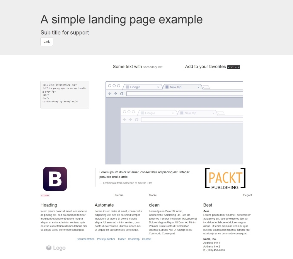
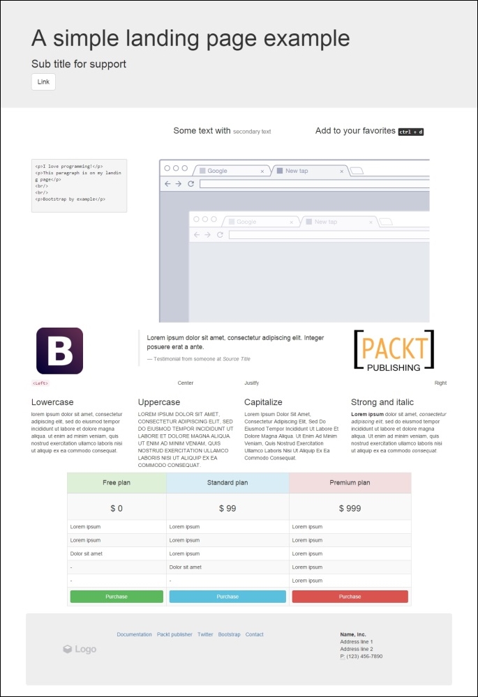
Now, we will start using some of the CSS provided for Bootstrap to make our components responsive and more elegant. Our main goal is to make our grid page like what is shown in this screenshot:
Let's break down each row and learn about typography and some other components. We will do this without using a single custom line of CSS!
Getting started with the first row, you may see that this row has a gray background, which is not present in the rest of the layout. To create this, we must make a change in our grid by creating a new .container for this row. So, create another .container and place it inside the first row:
<div class="container">
  <!-- row 1 -->
  <div class="row">
    <header class="col-md-12">
    </header>
  </div>
</div>
<div class="container">
  <!—- the others rows (2 to 7) -->
</div>
Now, to make the gray area, we will use a class in Bootstrap called .jumbotron. The jumbotron is a flexible Bootstrap component that can extend to the entire viewport to showcase some content, in this case the header. So, wrap the container inside a div.jumbotron:
<div class="jumbotron">
  <div class="container">
    <!-- row 1 -->
    <div class="row">
      <header class="col-md-12">
      </header>
    </div>
  </div>
</div>
Inside the header, as we can see in the layout, we must create a title, a subtitle, and a button. For the title, let's use the <h1> and <h2> heading elements. For the button, let's create a link with the .btn, .btn-default, and .btn-lg classes. We will mention more about these components in the next subsections:
<div class="jumbotron">
  <div class="container">
    <!-- row 1 -->
    <div class="row">
      <header class="col-md-12">
        <h1>A simple landing page example</h1>
        <h2>Sub title for support</h2>
        <a class="btn btn-default btn-lg" href="#" role="button">
          Link
        </a>
      </header>
    </div>
  </div>
</div>Bootstrap provides styled headings from h1 to h6. You should always use them in order of importance, from <h1> to <h6> (the least important).
Tip
Do you know why headings are important?
Heading are very important for Search Engine Optimization (SEO). They suggest for search engines what is important in your page context. You must keep the hierarchy for page coherence, and do not skip any tag (that is, jump from heading 3 to heading 5). Otherwise, the structure will be broken and not relevant for SEO.
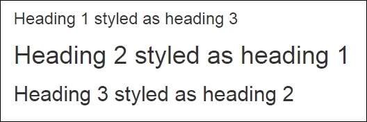
The heading has classes for identifying its style. So, if your most important phrase is not the biggest one at times, you can swap the sizes by adding heading classes, just as in the following example:
<h1 class="h3">Heading 1 styled as heading 3</h1>
<h2 class="h1">Heading 2 styled as heading 1</h2>
<h3 class="h2">Heading 3 styled as heading 2</h3>
The other element of the first row is a button! We can apply button classes for hyperlinks, button elements, and inputs. To make one of these elements a button, just add the .btn class followed by the kind of button, in this case the kind .btn-default, which is a blue button. The next table shows every possibility of color classes for a button:
|
Button class |
Output |
|---|---|
|
|
 |
|
|
 |
|
|
 |
|
|
 |
|
|
 |
|
|
 |
|
|
 |
We have also added the .btn-lg class in the first row button. This class will increase the size of the button. Bootstrap also provides some other button size classes, such as .btn-sm for small buttons and .btn-xs for even smaller ones.
You can also make a button span the full width of the parent element with the .btn-block class, changing the display of the button to block.
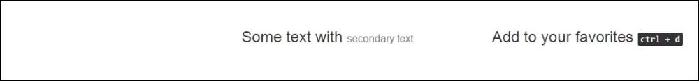
With regards to the second row, we have a row that contains a heading and complementary small text after that.
To add lighter and secondary text to the heading, we can add a <small> tag or any other tag with the .small class inside the heading. The HTML for the first column in the second row should be like the following:
<div class="row">
  <div class="col-md-offset-4 col-md-4">
    <h3>
      Some text with <small>secondary text</small>
    </h3>
  </div>
  <div class="col-md-4">
    <h3>
      Add to your favorites
      <small>
        <kbd><kbd>ctrl</kbd> + <kbd>d</kbd></kbd>
      </small>
    </h3>
  </div>
</div>
Note that inside the small tag, we have added a <kbd> tag, which is an HTML element that creates a user-like input keyboard. Refresh the web browser and you will see this row as shown here:
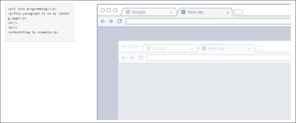
For the third row, we have a code snippet and an image. To create a code snippet, use the <pre> tag for multiple lines of code. The <pre> tag is present in HTML for creating preformatted text, such as a code snippet. You have the option of adding the .pre-scrollable class, which will add a scrollbar if the code snippet reaches the maximum height of 350 px (or 21.8 em).
For this row, in the right column, we have an image. For that, just create an <img> tag and add the .img-responsive class, which will make the images automatically responsive-friendly to the viewport. The HTML for the third row is as follows:
<div class="row">
<div class="col-md-3">
<pre><p>I love programming!</p>
<p>This paragraph is on my landing page</p>
<br/>
<br/>
<p>Bootstrap by example</p>
</pre>
</div>
<div class="col-md-9">
<img src="imgs/center.png" class="img-responsive">
</div>
</div>Refresh your browser and you will see the result of this row as shown in the following screenshot:
In the fourth row, we have images in both the left and right columns and a testimonial in the middle. Bootstrap provides a typographic theme for doing block quotes, so just create a <blockquote> tag. Inside it, create a <footer> tag to identify the source, and wrap the name in a <cite> tag, like this:
<div class="row">
  <div class="col-md-3">
    <img src="imgs/bs.png" class="img-responsive">
  </div>
  <div class="col-md-6">
    <blockquote>
      <p>Lorem ipsum dolor sit amet, consectetur adipiscing elit. Integer posuere erat a ante.</p>
      <footer>Testimonial from someone at <cite title="Source Title">Source Title</cite></footer>
    </blockquote>
  </div>
  <div class="col-md-3">
    <img src="imgs/packt.png" class="img-responsive">
  </div>
</div>
Moving on, we must advance to the fifth row. This row is here just to show the different ways in which we can apply typography and coding elements tags using Bootstrap. Let's go through each one to describe its usage.
In the first column, we have a piece of inline code. To do that, wrap the snippet in a <code> tag. From the first to the fourth column of this row, we are presenting the alignment classes. Using these, you can easily realign text content in a paragraph tag. The code for the row is as follows:
<div class="row">
<div class="col-md-3">
<p class="text-left"><code><Left></code></p>
</div>
<div class="col-md-3">
<p class="text-center">Center</p>
</div>
<div class="col-md-3">
<p class="text-justify">Justify</p>
</div>
<div class="col-md-3">
<p class="text-right">Right</p>
</div>
</div>Just use the right classes for a proper alignment. The result in the browser should look like this:

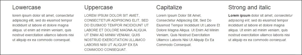
The sixth row is composed of four equally divided columns, but in this case, we are using the nesting rows option. On the first three columns, we added Bootstrap text transformation classes to make the text lowercase, uppercase, and capitalized, respectively. The code for this row should be like the following:
<div class="row">
  <div class="col-md-3">
    <h3>Lowercase</h3>
    <p class="text-lowercase">
      Lorem ipsum dolor ... consequat.
    </p>
  </div>
  <div class="col-md-6">
    <div class="row">
      <div class="col-md-6">
        <h3>Uppercase</h3>
        <p class="text-uppercase">
          Lorem ipsum dolor ... consequat.
        </p>
      </div>
      <div class="col-md-6">
        <h3>Capitalize</h3>
        <p class="text-capitalize">
          Lorem ipsum dolor ... consequat.
        </p>
      </div>
    </div>
  </div>
  <div class="col-md-3">
    <h3>Strong and italic</h3>
    <p>
      <strong>Lorem ipsum</strong> dolor ... <em>consequat</em>.
    </p>
  </div>
</div>
Pay attention to the last column, where we are using the <strong> tags to make the text bold and the <em> tag to make the text italic. Refresh your web browser and see the result, like this:
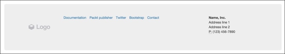
Finally, we are going through the footer, which is the last row. If you take a look at the full layout image (the one presented at the beginning of this section), you will notice that it is composed of three columns. The first column contains a logo image, the middle one contains an inline list, and the last one has the company's contact address.
For the first column, we should just create an <img> tag with the .img-responsive class. For the second column, the inline list, we must create a <ul> tag. By default, every <li> inside a <ul> has the bullets on the left-hand side. To remove them, apply the .unstyled Bootstrap class. Also, a <ul> will create the <li> elements as a block. In our case, we want the <li> to appear side by side, so we use the .list-inline Bootstrap class to create this effect.
To present contact information in the last column, we will use the <address> tag. Bootstrap offers a CSS theme for this tag; you just need to keep the formatting along with the <br> tags, as shown in this code:
<footer class="row jumbotron">
  <div class="col-md-2">
    <img src="imgs/logo.png" class="img-responsive">
  </div>
  <div class="col-md-7">
    <ul class="list-inline list-unstyled">
      <li><a href="#">Documentation</a></li>
      <li><a href="#">Packt publisher</a></li>
      <li><a href="#">Twitter</a></li>
      <li><a href="#">Bootstrap</a></li>
      <li><a href="#">Contact</a></li>
    </ul>
  </div>
  <div class="col-md-3">
    <address>
      <strong>Name, Inc.</strong><br>
      Address line 1<br>
      Address line 2<br>
      <abbr title="Phone">P:</abbr> (123) 456-7890
    </address>
  </div>
</footer>
Pay attention to the <footer> tag. We added the .jumbotron class to make it rounded and give it a gray background. The following screenshot presents to us the result of the footer:
There are headings everywhere
Bootstrap provides styled headings from h1 to h6. You should always use them in order of importance, from <h1> to <h6> (the least important).
Tip
Do you know why headings are important?
Heading are very important for Search Engine Optimization (SEO). They suggest for search engines what is important in your page context. You must keep the hierarchy for page coherence, and do not skip any tag (that is, jump from heading 3 to heading 5). Otherwise, the structure will be broken and not relevant for SEO.
The heading has classes for identifying its style. So, if your most important phrase is not the biggest one at times, you can swap the sizes by adding heading classes, just as in the following example:
<h1 class="h3">Heading 1 styled as heading 3</h1>
<h2 class="h1">Heading 2 styled as heading 1</h2>
<h3 class="h2">Heading 3 styled as heading 2</h3>
The other element of the first row is a button! We can apply button classes for hyperlinks, button elements, and inputs. To make one of these elements a button, just add the .btn class followed by the kind of button, in this case the kind .btn-default, which is a blue button. The next table shows every possibility of color classes for a button:
|
Button class |
Output |
|---|---|
|
|
|
|
|
|
|
|
|
|
|
|
|
|
|
|
|
|
|
|
|
We have also added the .btn-lg class in the first row button. This class will increase the size of the button. Bootstrap also provides some other button size classes, such as .btn-sm for small buttons and .btn-xs for even smaller ones.
You can also make a button span the full width of the parent element with the .btn-block class, changing the display of the button to block.
With regards to the second row, we have a row that contains a heading and complementary small text after that.
To add lighter and secondary text to the heading, we can add a <small> tag or any other tag with the .small class inside the heading. The HTML for the first column in the second row should be like the following:
<div class="row">
  <div class="col-md-offset-4 col-md-4">
    <h3>
      Some text with <small>secondary text</small>
    </h3>
  </div>
  <div class="col-md-4">
    <h3>
      Add to your favorites
      <small>
        <kbd><kbd>ctrl</kbd> + <kbd>d</kbd></kbd>
      </small>
    </h3>
  </div>
</div>
Note that inside the small tag, we have added a <kbd> tag, which is an HTML element that creates a user-like input keyboard. Refresh the web browser and you will see this row as shown here:
For the third row, we have a code snippet and an image. To create a code snippet, use the <pre> tag for multiple lines of code. The <pre> tag is present in HTML for creating preformatted text, such as a code snippet. You have the option of adding the .pre-scrollable class, which will add a scrollbar if the code snippet reaches the maximum height of 350 px (or 21.8 em).
For this row, in the right column, we have an image. For that, just create an <img> tag and add the .img-responsive class, which will make the images automatically responsive-friendly to the viewport. The HTML for the third row is as follows:
<div class="row">
<div class="col-md-3">
<pre><p>I love programming!</p>
<p>This paragraph is on my landing page</p>
<br/>
<br/>
<p>Bootstrap by example</p>
</pre>
</div>
<div class="col-md-9">
<img src="imgs/center.png" class="img-responsive">
</div>
</div>Refresh your browser and you will see the result of this row as shown in the following screenshot:
In the fourth row, we have images in both the left and right columns and a testimonial in the middle. Bootstrap provides a typographic theme for doing block quotes, so just create a <blockquote> tag. Inside it, create a <footer> tag to identify the source, and wrap the name in a <cite> tag, like this:
<div class="row">
  <div class="col-md-3">
    <img src="imgs/bs.png" class="img-responsive">
  </div>
  <div class="col-md-6">
    <blockquote>
      <p>Lorem ipsum dolor sit amet, consectetur adipiscing elit. Integer posuere erat a ante.</p>
      <footer>Testimonial from someone at <cite title="Source Title">Source Title</cite></footer>
    </blockquote>
  </div>
  <div class="col-md-3">
    <img src="imgs/packt.png" class="img-responsive">
  </div>
</div>
Moving on, we must advance to the fifth row. This row is here just to show the different ways in which we can apply typography and coding elements tags using Bootstrap. Let's go through each one to describe its usage.
In the first column, we have a piece of inline code. To do that, wrap the snippet in a <code> tag. From the first to the fourth column of this row, we are presenting the alignment classes. Using these, you can easily realign text content in a paragraph tag. The code for the row is as follows:
<div class="row">
<div class="col-md-3">
<p class="text-left"><code><Left></code></p>
</div>
<div class="col-md-3">
<p class="text-center">Center</p>
</div>
<div class="col-md-3">
<p class="text-justify">Justify</p>
</div>
<div class="col-md-3">
<p class="text-right">Right</p>
</div>
</div>Just use the right classes for a proper alignment. The result in the browser should look like this:
The sixth row is composed of four equally divided columns, but in this case, we are using the nesting rows option. On the first three columns, we added Bootstrap text transformation classes to make the text lowercase, uppercase, and capitalized, respectively. The code for this row should be like the following:
<div class="row">
  <div class="col-md-3">
    <h3>Lowercase</h3>
    <p class="text-lowercase">
      Lorem ipsum dolor ... consequat.
    </p>
  </div>
  <div class="col-md-6">
    <div class="row">
      <div class="col-md-6">
        <h3>Uppercase</h3>
        <p class="text-uppercase">
          Lorem ipsum dolor ... consequat.
        </p>
      </div>
      <div class="col-md-6">
        <h3>Capitalize</h3>
        <p class="text-capitalize">
          Lorem ipsum dolor ... consequat.
        </p>
      </div>
    </div>
  </div>
  <div class="col-md-3">
    <h3>Strong and italic</h3>
    <p>
      <strong>Lorem ipsum</strong> dolor ... <em>consequat</em>.
    </p>
  </div>
</div>
Pay attention to the last column, where we are using the <strong> tags to make the text bold and the <em> tag to make the text italic. Refresh your web browser and see the result, like this:
Finally, we are going through the footer, which is the last row. If you take a look at the full layout image (the one presented at the beginning of this section), you will notice that it is composed of three columns. The first column contains a logo image, the middle one contains an inline list, and the last one has the company's contact address.
For the first column, we should just create an <img> tag with the .img-responsive class. For the second column, the inline list, we must create a <ul> tag. By default, every <li> inside a <ul> has the bullets on the left-hand side. To remove them, apply the .unstyled Bootstrap class. Also, a <ul> will create the <li> elements as a block. In our case, we want the <li> to appear side by side, so we use the .list-inline Bootstrap class to create this effect.
To present contact information in the last column, we will use the <address> tag. Bootstrap offers a CSS theme for this tag; you just need to keep the formatting along with the <br> tags, as shown in this code:
<footer class="row jumbotron">
  <div class="col-md-2">
    <img src="imgs/logo.png" class="img-responsive">
  </div>
  <div class="col-md-7">
    <ul class="list-inline list-unstyled">
      <li><a href="#">Documentation</a></li>
      <li><a href="#">Packt publisher</a></li>
      <li><a href="#">Twitter</a></li>
      <li><a href="#">Bootstrap</a></li>
      <li><a href="#">Contact</a></li>
    </ul>
  </div>
  <div class="col-md-3">
    <address>
      <strong>Name, Inc.</strong><br>
      Address line 1<br>
      Address line 2<br>
      <abbr title="Phone">P:</abbr> (123) 456-7890
    </address>
  </div>
</footer>
Pay attention to the <footer> tag. We added the .jumbotron class to make it rounded and give it a gray background. The following screenshot presents to us the result of the footer:
Playing with buttons
The other element of the first row is a button! We can apply button classes for hyperlinks, button elements, and inputs. To make one of these elements a button, just add the .btn class followed by the kind of button, in this case the kind .btn-default, which is a blue button. The next table shows every possibility of color classes for a button:
|
Button class |
Output |
|---|---|
|
|
|
|
|
|
|
|
|
|
|
|
|
|
|
|
|
|
|
|
|
We have also added the .btn-lg class in the first row button. This class will increase the size of the button. Bootstrap also provides some other button size classes, such as .btn-sm for small buttons and .btn-xs for even smaller ones.
You can also make a button span the full width of the parent element with the .btn-block class, changing the display of the button to block.
With regards to the second row, we have a row that contains a heading and complementary small text after that.
To add lighter and secondary text to the heading, we can add a <small> tag or any other tag with the .small class inside the heading. The HTML for the first column in the second row should be like the following:
<div class="row">
  <div class="col-md-offset-4 col-md-4">
    <h3>
      Some text with <small>secondary text</small>
    </h3>
  </div>
  <div class="col-md-4">
    <h3>
      Add to your favorites
      <small>
        <kbd><kbd>ctrl</kbd> + <kbd>d</kbd></kbd>
      </small>
    </h3>
  </div>
</div>
Note that inside the small tag, we have added a <kbd> tag, which is an HTML element that creates a user-like input keyboard. Refresh the web browser and you will see this row as shown here:
For the third row, we have a code snippet and an image. To create a code snippet, use the <pre> tag for multiple lines of code. The <pre> tag is present in HTML for creating preformatted text, such as a code snippet. You have the option of adding the .pre-scrollable class, which will add a scrollbar if the code snippet reaches the maximum height of 350 px (or 21.8 em).
For this row, in the right column, we have an image. For that, just create an <img> tag and add the .img-responsive class, which will make the images automatically responsive-friendly to the viewport. The HTML for the third row is as follows:
<div class="row">
<div class="col-md-3">
<pre><p>I love programming!</p>
<p>This paragraph is on my landing page</p>
<br/>
<br/>
<p>Bootstrap by example</p>
</pre>
</div>
<div class="col-md-9">
<img src="imgs/center.png" class="img-responsive">
</div>
</div>Refresh your browser and you will see the result of this row as shown in the following screenshot:
In the fourth row, we have images in both the left and right columns and a testimonial in the middle. Bootstrap provides a typographic theme for doing block quotes, so just create a <blockquote> tag. Inside it, create a <footer> tag to identify the source, and wrap the name in a <cite> tag, like this:
<div class="row">
  <div class="col-md-3">
    <img src="imgs/bs.png" class="img-responsive">
  </div>
  <div class="col-md-6">
    <blockquote>
      <p>Lorem ipsum dolor sit amet, consectetur adipiscing elit. Integer posuere erat a ante.</p>
      <footer>Testimonial from someone at <cite title="Source Title">Source Title</cite></footer>
    </blockquote>
  </div>
  <div class="col-md-3">
    <img src="imgs/packt.png" class="img-responsive">
  </div>
</div>
Moving on, we must advance to the fifth row. This row is here just to show the different ways in which we can apply typography and coding elements tags using Bootstrap. Let's go through each one to describe its usage.
In the first column, we have a piece of inline code. To do that, wrap the snippet in a <code> tag. From the first to the fourth column of this row, we are presenting the alignment classes. Using these, you can easily realign text content in a paragraph tag. The code for the row is as follows:
<div class="row">
<div class="col-md-3">
<p class="text-left"><code><Left></code></p>
</div>
<div class="col-md-3">
<p class="text-center">Center</p>
</div>
<div class="col-md-3">
<p class="text-justify">Justify</p>
</div>
<div class="col-md-3">
<p class="text-right">Right</p>
</div>
</div>Just use the right classes for a proper alignment. The result in the browser should look like this:
The sixth row is composed of four equally divided columns, but in this case, we are using the nesting rows option. On the first three columns, we added Bootstrap text transformation classes to make the text lowercase, uppercase, and capitalized, respectively. The code for this row should be like the following:
<div class="row">
  <div class="col-md-3">
    <h3>Lowercase</h3>
    <p class="text-lowercase">
      Lorem ipsum dolor ... consequat.
    </p>
  </div>
  <div class="col-md-6">
    <div class="row">
      <div class="col-md-6">
        <h3>Uppercase</h3>
        <p class="text-uppercase">
          Lorem ipsum dolor ... consequat.
        </p>
      </div>
      <div class="col-md-6">
        <h3>Capitalize</h3>
        <p class="text-capitalize">
          Lorem ipsum dolor ... consequat.
        </p>
      </div>
    </div>
  </div>
  <div class="col-md-3">
    <h3>Strong and italic</h3>
    <p>
      <strong>Lorem ipsum</strong> dolor ... <em>consequat</em>.
    </p>
  </div>
</div>
Pay attention to the last column, where we are using the <strong> tags to make the text bold and the <em> tag to make the text italic. Refresh your web browser and see the result, like this:
Finally, we are going through the footer, which is the last row. If you take a look at the full layout image (the one presented at the beginning of this section), you will notice that it is composed of three columns. The first column contains a logo image, the middle one contains an inline list, and the last one has the company's contact address.
For the first column, we should just create an <img> tag with the .img-responsive class. For the second column, the inline list, we must create a <ul> tag. By default, every <li> inside a <ul> has the bullets on the left-hand side. To remove them, apply the .unstyled Bootstrap class. Also, a <ul> will create the <li> elements as a block. In our case, we want the <li> to appear side by side, so we use the .list-inline Bootstrap class to create this effect.
To present contact information in the last column, we will use the <address> tag. Bootstrap offers a CSS theme for this tag; you just need to keep the formatting along with the <br> tags, as shown in this code:
<footer class="row jumbotron">
  <div class="col-md-2">
    <img src="imgs/logo.png" class="img-responsive">
  </div>
  <div class="col-md-7">
    <ul class="list-inline list-unstyled">
      <li><a href="#">Documentation</a></li>
      <li><a href="#">Packt publisher</a></li>
      <li><a href="#">Twitter</a></li>
      <li><a href="#">Bootstrap</a></li>
      <li><a href="#">Contact</a></li>
    </ul>
  </div>
  <div class="col-md-3">
    <address>
      <strong>Name, Inc.</strong><br>
      Address line 1<br>
      Address line 2<br>
      <abbr title="Phone">P:</abbr> (123) 456-7890
    </address>
  </div>
</footer>
Pay attention to the <footer> tag. We added the .jumbotron class to make it rounded and give it a gray background. The following screenshot presents to us the result of the footer:
More typography and code tags
With regards to the second row, we have a row that contains a heading and complementary small text after that.
To add lighter and secondary text to the heading, we can add a <small> tag or any other tag with the .small class inside the heading. The HTML for the first column in the second row should be like the following:
<div class="row">
  <div class="col-md-offset-4 col-md-4">
    <h3>
      Some text with <small>secondary text</small>
    </h3>
  </div>
  <div class="col-md-4">
    <h3>
      Add to your favorites
      <small>
        <kbd><kbd>ctrl</kbd> + <kbd>d</kbd></kbd>
      </small>
    </h3>
  </div>
</div>
Note that inside the small tag, we have added a <kbd> tag, which is an HTML element that creates a user-like input keyboard. Refresh the web browser and you will see this row as shown here:
For the third row, we have a code snippet and an image. To create a code snippet, use the <pre> tag for multiple lines of code. The <pre> tag is present in HTML for creating preformatted text, such as a code snippet. You have the option of adding the .pre-scrollable class, which will add a scrollbar if the code snippet reaches the maximum height of 350 px (or 21.8 em).
For this row, in the right column, we have an image. For that, just create an <img> tag and add the .img-responsive class, which will make the images automatically responsive-friendly to the viewport. The HTML for the third row is as follows:
<div class="row">
<div class="col-md-3">
<pre><p>I love programming!</p>
<p>This paragraph is on my landing page</p>
<br/>
<br/>
<p>Bootstrap by example</p>
</pre>
</div>
<div class="col-md-9">
<img src="imgs/center.png" class="img-responsive">
</div>
</div>Refresh your browser and you will see the result of this row as shown in the following screenshot:
In the fourth row, we have images in both the left and right columns and a testimonial in the middle. Bootstrap provides a typographic theme for doing block quotes, so just create a <blockquote> tag. Inside it, create a <footer> tag to identify the source, and wrap the name in a <cite> tag, like this:
<div class="row">
  <div class="col-md-3">
    <img src="imgs/bs.png" class="img-responsive">
  </div>
  <div class="col-md-6">
    <blockquote>
      <p>Lorem ipsum dolor sit amet, consectetur adipiscing elit. Integer posuere erat a ante.</p>
      <footer>Testimonial from someone at <cite title="Source Title">Source Title</cite></footer>
    </blockquote>
  </div>
  <div class="col-md-3">
    <img src="imgs/packt.png" class="img-responsive">
  </div>
</div>
Moving on, we must advance to the fifth row. This row is here just to show the different ways in which we can apply typography and coding elements tags using Bootstrap. Let's go through each one to describe its usage.
In the first column, we have a piece of inline code. To do that, wrap the snippet in a <code> tag. From the first to the fourth column of this row, we are presenting the alignment classes. Using these, you can easily realign text content in a paragraph tag. The code for the row is as follows:
<div class="row">
<div class="col-md-3">
<p class="text-left"><code><Left></code></p>
</div>
<div class="col-md-3">
<p class="text-center">Center</p>
</div>
<div class="col-md-3">
<p class="text-justify">Justify</p>
</div>
<div class="col-md-3">
<p class="text-right">Right</p>
</div>
</div>Just use the right classes for a proper alignment. The result in the browser should look like this:
The sixth row is composed of four equally divided columns, but in this case, we are using the nesting rows option. On the first three columns, we added Bootstrap text transformation classes to make the text lowercase, uppercase, and capitalized, respectively. The code for this row should be like the following:
<div class="row">
  <div class="col-md-3">
    <h3>Lowercase</h3>
    <p class="text-lowercase">
      Lorem ipsum dolor ... consequat.
    </p>
  </div>
  <div class="col-md-6">
    <div class="row">
      <div class="col-md-6">
        <h3>Uppercase</h3>
        <p class="text-uppercase">
          Lorem ipsum dolor ... consequat.
        </p>
      </div>
      <div class="col-md-6">
        <h3>Capitalize</h3>
        <p class="text-capitalize">
          Lorem ipsum dolor ... consequat.
        </p>
      </div>
    </div>
  </div>
  <div class="col-md-3">
    <h3>Strong and italic</h3>
    <p>
      <strong>Lorem ipsum</strong> dolor ... <em>consequat</em>.
    </p>
  </div>
</div>
Pay attention to the last column, where we are using the <strong> tags to make the text bold and the <em> tag to make the text italic. Refresh your web browser and see the result, like this:
Finally, we are going through the footer, which is the last row. If you take a look at the full layout image (the one presented at the beginning of this section), you will notice that it is composed of three columns. The first column contains a logo image, the middle one contains an inline list, and the last one has the company's contact address.
For the first column, we should just create an <img> tag with the .img-responsive class. For the second column, the inline list, we must create a <ul> tag. By default, every <li> inside a <ul> has the bullets on the left-hand side. To remove them, apply the .unstyled Bootstrap class. Also, a <ul> will create the <li> elements as a block. In our case, we want the <li> to appear side by side, so we use the .list-inline Bootstrap class to create this effect.
To present contact information in the last column, we will use the <address> tag. Bootstrap offers a CSS theme for this tag; you just need to keep the formatting along with the <br> tags, as shown in this code:
<footer class="row jumbotron">
  <div class="col-md-2">
    <img src="imgs/logo.png" class="img-responsive">
  </div>
  <div class="col-md-7">
    <ul class="list-inline list-unstyled">
      <li><a href="#">Documentation</a></li>
      <li><a href="#">Packt publisher</a></li>
      <li><a href="#">Twitter</a></li>
      <li><a href="#">Bootstrap</a></li>
      <li><a href="#">Contact</a></li>
    </ul>
  </div>
  <div class="col-md-3">
    <address>
      <strong>Name, Inc.</strong><br>
      Address line 1<br>
      Address line 2<br>
      <abbr title="Phone">P:</abbr> (123) 456-7890
    </address>
  </div>
</footer>
Pay attention to the <footer> tag. We added the .jumbotron class to make it rounded and give it a gray background. The following screenshot presents to us the result of the footer:
The Bootstrap framework offers a wide variety for table customization. To present them, we will create a new row before the <footer> and a price table for our landing page, like this:
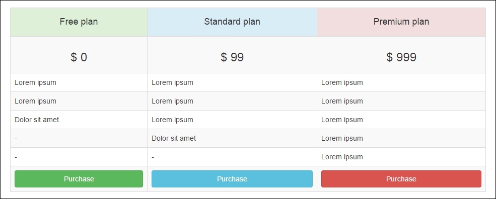
To do this, we must create a regular table with the <table>, <thead>, <tbody>, <tr>, <th>, and <td> tags. The table will have three columns and eight rows. Therefore, the HTML code should be like this:
<div class="row">
  <div class="col-md-10 col-md-offset-1">
    <table>
      <thead>
        <tr>
          <th>
            <h4>Free plan</h4>
          </th>
          <th>
            <h4>Standard plan</h4>
          </th>
          <th>
            <h4>Premium plan</h4>
          </th>
        </tr>
      </thead>
      <tbody>
        <tr>
          <td>
            <h3>$ 0</h3>
          </td>
          <td>
            <h3>$ 99</h3>
          </td>
          <td>
            <h3>$ 999</h3>
          </td>
        </tr>
        <tr>
          <td>Lorem ipsum</td>
          <td>Lorem ipsum</td>
          <td>Lorem ipsum</td>
        </tr>
        <tr>
          <td>Lorem ipsum</td>
          <td>Lorem ipsum</td>
          <td>Lorem ipsum</td>
        </tr>
        <tr>
          <td>Dolor sit amet</td>
          <td>Lorem ipsum</td>
          <td>Lorem ipsum</td>
        </tr>
        <tr>
          <td>-</td>
          <td>Dolor sit amet</td>
          <td>Lorem ipsum</td>
        </tr>
        <tr>
          <td>-</td>
          <td>-</td>
          <td>Lorem ipsum</td>
        </tr>
        <tr>
          <td><a href="#">Purchase</a></td>
          <td><a href="#">Purchase</a></td>
          <td><a href="#">Purchase</a></td>
        </tr>
      </tbody>
    </table>
  </div>
</div>
Right now, we have no secrets in our table. Let's start using CSS Bootstrap styles! First of all, add the .table class to the <table> tag (duh!). This seems redundant, but it's an option of the framework used to make it explicit.
Then, we will apply some specific styles. To make the rows striped, we add the .table-striped class to <table> as well. We want this table to have borders, so we add the .table-bordered class to make it like that. Last but not least, add the .table-hover class to enable hover state in the <tbody> rows.
Now we will move on to the <tr> tag inside <thead>. To make its background green, we add the .success class. Similar to buttons, every cell, row, or table in a <table> tag can receive color classes, officially called Bootstrap contextual classes.
Contextual classes follow the same colors meant for buttons. So, for the second column, we apply the .info class to get a cyan background color, and we use a .danger class to get a red background color in the last column.
Inside each <th> tag, we have an <h4> typography tag. If you take a look at the image showing how the table should look, you will notice that the heading texts are in the center. You may remember how to do that; just apply the .text-center class in the headings.
The themed <thead> tag will be like this:
<thead>
  <tr>
    <th class="success">
      <h4 class="text-center">Free plan</h4>
    </th>
    <th class="info">
      <h4 class="text-center">Standard plan</h4>
    </th>
    <th class="danger">
      <h4 class="text-center">Premium plan</h4>
    </th>
  </tr>
</thead>
Now we will move on to the first table row in <tbody>, which is the price row. We just need to center <h4> in the same way as we did in the <thead> row—by adding the .text-center class:
<h3 class="text-center">$ 0</h3>
The next five rows have no specific style, but the last one has buttons and some tricks!
Do you remember how to apply the color theme in the buttons? You just need to follow the <thead> column color style, prepending .btn-* in the Bootstrap contextual classes. For instance, the first one will have the .btn-success class to turn a green button.
Furthermore, the button must fill the full width of the cell. To make the button span the complete parent width, add the .btn-block class and the magic is completely done! The code for the last row is as follows:
<tr>
  <td><a href="#" class="btn btn-success btn-block">Purchase</a></td>
  <td><a href="#" class="btn btn-info btn-block">Purchase</a></td>
  <td><a href="#" class="btn btn-danger btn-block">Purchase</a></td>
</tr>
Styling the buttons
Do you remember how to apply the color theme in the buttons? You just need to follow the <thead> column color style, prepending .btn-* in the Bootstrap contextual classes. For instance, the first one will have the .btn-success class to turn a green button.
Furthermore, the button must fill the full width of the cell. To make the button span the complete parent width, add the .btn-block class and the magic is completely done! The code for the last row is as follows:
<tr>
  <td><a href="#" class="btn btn-success btn-block">Purchase</a></td>
  <td><a href="#" class="btn btn-info btn-block">Purchase</a></td>
  <td><a href="#" class="btn btn-danger btn-block">Purchase</a></td>
</tr>
Right now, we have finished the first version of our landing page! It should look like what is shown in the next screenshot. Note that we did it without a single line of custom CSS!:
This is the power of Bootstrap. Can you feel it? You can do beautiful things very quickly. Bootstrap is a must-have tool for prototyping!
Change the viewport of your page by resizing the window and you will see how nicely Bootstrap adapts to any resolution. You don't have to worry about it if you have done a great job at making the grid and placing the elements.
Before ending this chapter, we must get some things clear. Bootstrap offers some helper classes mixins and some vendor's mixins, which offer cross-browser compatibility support.
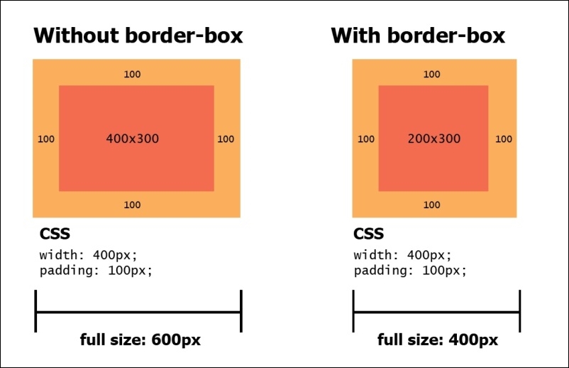
Bootstrap 3 started using box-sizing: border-box for all elements and pseudo-elements. With this enabled, the width and height properties start to include the padding and the border but not the margin.
With that, it is easier to set the right sizing for your elements. This is because any change that you make in the element, such as customizing the padding of a .row, will reflect the width and height of the whole element. The following figure shows you the differences of box-sizing.
Bootstrap offers quick classes to make an element float. Add the .pull-left or .pull-right class to make the elements float left or right, respectively. Keep in mind that both classes apply the !important modifier to avoid override issues:
<div class="pull-left"></div>
<div class="pull-right"></div>
Clearfix is a way of clearing the floating of an element related to its child element. The Bootstrap columns are all floated left, and the parent row has a clearfix. This makes every column appear right next to each other, and the row does not overlap with other rows. This figure exemplifies how clearfix works:
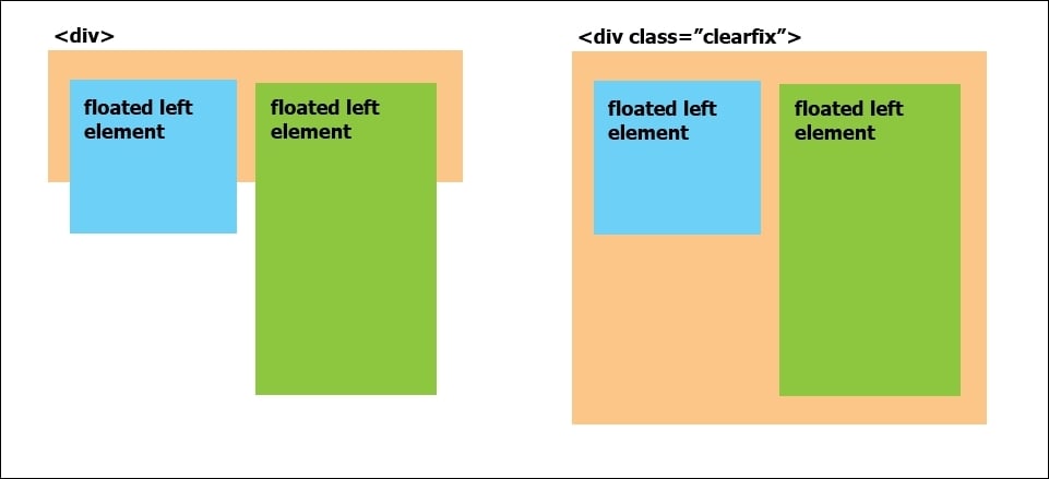
So, if you want to add the clearfix to a new element or pseudo-element, add the .clearfix class and you can get the hard work quickly done.
In the following table, the font sizes for default text and heading are presented. It describes the heading, font family, and line height. It is important to make it explicit for you to deeply understand the Bootstrap default configuration if you want a different customization.
|
CSS option |
Default value |
|---|---|
|
|
|
|
|
|
|
|
|
|
|
|
|
|
|
|
|
|
|
|
|
|
|
|
|
|
|
|
|
|
Box-sizing
Bootstrap 3 started using box-sizing: border-box for all elements and pseudo-elements. With this enabled, the width and height properties start to include the padding and the border but not the margin.
With that, it is easier to set the right sizing for your elements. This is because any change that you make in the element, such as customizing the padding of a .row, will reflect the width and height of the whole element. The following figure shows you the differences of box-sizing.
Bootstrap offers quick classes to make an element float. Add the .pull-left or .pull-right class to make the elements float left or right, respectively. Keep in mind that both classes apply the !important modifier to avoid override issues:
<div class="pull-left"></div>
<div class="pull-right"></div>
Clearfix is a way of clearing the floating of an element related to its child element. The Bootstrap columns are all floated left, and the parent row has a clearfix. This makes every column appear right next to each other, and the row does not overlap with other rows. This figure exemplifies how clearfix works:
So, if you want to add the clearfix to a new element or pseudo-element, add the .clearfix class and you can get the hard work quickly done.
In the following table, the font sizes for default text and heading are presented. It describes the heading, font family, and line height. It is important to make it explicit for you to deeply understand the Bootstrap default configuration if you want a different customization.
|
CSS option |
Default value |
|---|---|
|
|
|
|
|
|
|
|
|
|
|
|
|
|
|
|
|
|
|
|
|
|
|
|
|
|
|
|
|
|
Quick floats
Bootstrap offers quick classes to make an element float. Add the .pull-left or .pull-right class to make the elements float left or right, respectively. Keep in mind that both classes apply the !important modifier to avoid override issues:
<div class="pull-left"></div>
<div class="pull-right"></div>
Clearfix is a way of clearing the floating of an element related to its child element. The Bootstrap columns are all floated left, and the parent row has a clearfix. This makes every column appear right next to each other, and the row does not overlap with other rows. This figure exemplifies how clearfix works:
So, if you want to add the clearfix to a new element or pseudo-element, add the .clearfix class and you can get the hard work quickly done.
In the following table, the font sizes for default text and heading are presented. It describes the heading, font family, and line height. It is important to make it explicit for you to deeply understand the Bootstrap default configuration if you want a different customization.
|
CSS option |
Default value |
|---|---|
|
|
|
|
|
|
|
|
|
|
|
|
|
|
|
|
|
|
|
|
|
|
|
|
|
|
|
|
|
|
Clearfix
Clearfix is a way of clearing the floating of an element related to its child element. The Bootstrap columns are all floated left, and the parent row has a clearfix. This makes every column appear right next to each other, and the row does not overlap with other rows. This figure exemplifies how clearfix works:
So, if you want to add the clearfix to a new element or pseudo-element, add the .clearfix class and you can get the hard work quickly done.
In the following table, the font sizes for default text and heading are presented. It describes the heading, font family, and line height. It is important to make it explicit for you to deeply understand the Bootstrap default configuration if you want a different customization.
|
CSS option |
Default value |
|---|---|
|
|
|
|
|
|
|
|
|
|
|
|
|
|
|
|
|
|
|
|
|
|
|
|
|
|
|
|
|
|
Font definitions for typography
In the following table, the font sizes for default text and heading are presented. It describes the heading, font family, and line height. It is important to make it explicit for you to deeply understand the Bootstrap default configuration if you want a different customization.
|
CSS option |
Default value |
|---|---|
|
|
|
|
|
|
|
|
|
|
|
|
|
|
|
|
|
|
|
|
|
|
|
|
|
|
|
|
|
|
In this chapter, we started our example of creating a landing page. By now, we can create a beautiful page without a single line of CSS or JavaScript!
First, we were able to reveal the secrets behind Bootstrap's scaffolding and understand its proper usage. You learned how to set rows inside a container, columns inside rows, and settings classes for a specific viewport. We played some tricks on columns as well, making nested rows, offsetting columns, and using multiple containers.
The basis of scaffolding will be important throughout the book, and it is in fact the basis of the Bootstrap framework. The power to manipulate it is a key factor in understanding the framework. I advise you to try out some new combinations of rows in your landing page and see what happens. Further in this book, we will show you some other grid combinations and custom layouts.
Furthermore, we played with buttons, which is another key factor in Bootstrap. We presented some of the basis of button configurations and customizations. During the rest of this book, some more options will be presented in many different ways, but respecting the basis that you have just learned.
Tables are also a very common element in web pages, and Bootstrap offers a wide variety of customizations for them. We showed an example with all the main table features that you can for sure use in your daily tasks.
Finally, we saw some tricks of the framework. As I already said, you must understand the roots of Bootstrap to understand the magic. In an easy way, Bootstrap offers helpers to make our work as fast as it can get.
In the next chapter, we will dive into mobile-first development and different viewport configurations, making our landing page best fit for any device. We will also show a nice way to debug our page for any virtual devices.