
Among all kinds of web pages, the web application is the one with the fastest growth in usage. So, we will take a deep dive into this area by developing a really nice web application. Actually, Bootstrap was mainly designed for this type of application, since it was developed at first for the Twitter web application.
Therefore, in this chapter and in the next ones, we will take the reverse path. Instead of developing Bootstrap for Twitter, we will develop an app like Twitter with Bootstrap. With that, we will touch upon even more components and elements of Bootstrap, as follows:
- Web application definitions
- A fully customized navigation bar
- Cards
- Thumbnails
- Pagination
- Breadcrumbs
This chapter will be a bit more difficult, but I believe you are ready for this. So, can you build a web app?
Web applications came from the mix of an application and a browser, of course! Basically, a web application is a client application that runs on a web browser. Thus most of the processes are done on the client machine and the server is just responsible for the data processing.
This is interesting, since you can always deliver to the client the most updated version of the application, while the client does not need to upgrade the software. This leads to fast-paced and continuous development of the app.
Just as we always say when starting a new example, let's use the HTML boilerplate that we always use, keeping the same folder structure and so on:
<!DOCTYPE html>
<html>
  <head>
    <meta charset="utf-8">
    <meta http-equiv="X-UA-Compatible" content="IE=edge">
    <meta name="viewport" content="width=device-width, initial-scale=1">
    <title>Web App</title>

    <link rel="stylesheet" href="css/bootstrap.css">
    <link rel="stylesheet" href="css/base.css">

    <!--[if lt IE 9]>
      <script src="https://oss.maxcdn.com/html5shiv/3.7.2/html5shiv.min.js">
</script>
      <script src="https://oss.maxcdn.com/respond/1.4.2/respond.min.js">
</script>
    <![endif]-->
  </head>
  <body>
    <script src="js/jquery-1.11.3.js"></script>
    <script src="js/bootstrap.js"></script>
    <script src="js/main.js"></script>
  </body>
</html>First of all, we will add the navigation bar to our web application. Before the start of the <body> tag, add the navigation bar, just as we did in the last chapter:
<nav class="navbar navbar-default navbar-fixed-top">
  <div class="container">
    <div class="navbar-header">
      <a class="navbar-brand" href="webapp.html">
        <img src="imgs/logo.png" class="img-responsive">
      </a>
      <button type="button" class="navbar-toggle collapsed" data-toggle="collapse" data-target="#nav-menu" aria-expanded="false">
        <span class="sr-only">Toggle navigation</span>
        <span class="icon-bar"></span>
        <span class="icon-bar"></span>
        <span class="icon-bar"></span>
      </button>
      <!-- <a class="btn btn-primary navbar-btn pull-left" href="#" role="button">Sign up</a> -->
    </div>

    <div id="nav-menu" class="collapse navbar-collapse">
        <ul class="nav navbar-nav">
        </ul>
    </div>
  </div>
</nav>
First, we created a simple navigation bar with the collapse option, just as we did in the last chapter. The major difference this time is the addition of the image <img src="imgs/logo.png" class="img-responsive"> logo. The CSS for adjusting the logo is as follows:
.navbar-brand img {
  height: 100%
}
So, we need to create the items inside the list ul.nav.navbar-nav tag. Append the following code inside the list:
<ul class="nav navbar-nav">
  <li>
    <a href="#">
      Home
    </a>
  </li>
  <li>
    <a href="#">
      Notifications
    </a>
  </li>
  <li>
    <a href="#">
      Messages
    </a>
  </li>
</ul>
Therefore, we should add some icons to each menu. Do you remember how to do this? We need to use the Bootstrap Glyphicons. Add the icons, as highlighted in this HTML code:
<ul class="nav navbar-nav">
  <li>
    <a href="#">
      <span class="glyphicon glyphicon-home" aria-hidden="true"></span>
      Home
    </a>
  </li>
  <li>
    <a href="#">
      <span class="glyphicon glyphicon-bell" aria-hidden="true"></span>
      Notifications
    </a>
  </li>
  <li>
    <a href="#">
      <span class="glyphicon glyphicon-envelope" aria-hidden="true"></span>
      Messages
    </a>
  </li>
</ul>
The result right now should look like what is shown in the following screenshot:

In our navigation bar, we will add a search input. There are two tricks for this. The first is the input must be like an input group to have a magnifier icon on the right-hand-side part. The second is that the input must be aligned to the right and not to the left in the <nav>. In the HTML, let's create a form after ul.nav.navbar-nav:
<div id="nav-menu" class="collapse navbar-collapse">
    <ul class="nav navbar-nav">
      …
    </ul>

    <form id="search" role="search">
      <div class="input-group">
        <input type="text" class="form-control" placeholder="Search...">
        <span class="glyphicon glyphicon-search" aria-hidden="true"></span>
      </div>
    </form>
</div>
In the CSS, move the form to the right and add some padding:
nav form#search {
  float: right;
  padding: 0.5em;
}

nav form#search .glyphicon-search {
    z-index: 99;
    position: absolute;
    right: 0.7em;
    top: 50%;
    margin-top: -0.44em;
}

nav form#search .input-group .form-control {
    border-radius: 0.25em;
}
Refresh the web page and check out the input. It should appear as shown in this screenshot:

Our navigation bar is starting to appear like the navigation bar of a web application, but not close enough! Now, it's the turn of the menu options.
We will now do some crazy stuff: add a thumbnail together with a Bootstrap button dropdown. Just before form#search, add the button HTML:
<div id="nav-options" class="btn-group pull-right">
  <button type="button" class="btn btn-default dropdown-toggle thumbnail" data-toggle="dropdown" aria-haspopup="true" aria-expanded="false">
    <img src="imgs/jon.png">
  </button>
  <ul class="dropdown-menu">
    <li><a href="#">Profile</a></li>
    <li><a href="#">Setting</a></li>
    <li role="separator" class="divider"></li>
    <li><a href="#">Logout</a></li>
  </ul>
</div>
Basically, we used the template for a button dropdown (which you learned about in the previous chapter) and just removed the .caret component present on it. Instead of adding some text, we added an image, that is, the profile image. In .btn-group, we applied the helper class from Bootstrap, .pull-right. Since it was placed before the form, the button will appear after the form.
Then, it's time for the CSS. We need to resize the image and properly set the margins and paddings:
#nav-options {
  margin: 0.5em;
}

#nav-options button.thumbnail {
  margin: 0;
  padding: 0;
}

#nav-options img {
  max-height: 2.3em;
  border-radius: 0.3em;
}
The result of the addition of the button should be like what is shown in the following screenshot:
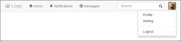
The last element present in the navigation bar is the Tweet button. To add it, we set following the HTML right before the button group option that we just added:
<button id="tweet" class="btn btn-default pull-right">
  <span class="glyphicon glyphicon-pencil" aria-hidden="true"></span>
  Tweet
</button>
For the CSS, we just need to add some margin:
#tweet {
  margin: 0.5em;
}
Finally, we have all the elements and components in our navigation bar, and it should look like this:

Now that we have our navigation bar done, it's time to customize the Bootstrap theme, add some tweaks, and fix viewport issues.
To be a little different, we will use a blue background color for our navigation bar. First, we need to add some simple CSS rules:
.navbar-default {
  background-color: #2F92CA;
}

.navbar-default .navbar-nav > li > a {
  color: #FFF;
}
Afterwards, let's add the active option to the list on the navigation. Add the .active class to the first element of the nav list (the Home one), presented in bold in the following code:
   <ul class="nav navbar-nav">
     <li class="active">
       <a href="#">
       <span class="glyphicon glyphicon-home" aria-hidden="true"></span>
        Home
       </a>
     </li>
     … <!--others li and the rest of the code -->
   </ul>
Then, go to the CSS and set the following:
.navbar-default {
  background-color: #2F92CA;
}

.navbar-default .navbar-nav > li > a {
  color: #FFF;
}

.navbar-default .navbar-nav > .active > a {
  background-color: transparent;
  color: #FFF;
  padding-bottom: 10px;
  border-bottom: 5px solid #FFF;
}
The result of this should be like the one presented in the following screenshot. You can see that Home is in the active state. To mark that, we've added a border below it for denotation:

If you hover over any element in the navigation list, you will see that it has the wrong color. We will use some style to fix that—by using CSS3 transitions! The complete CSS for the customization should be like the following:
.navbar-default {
  background-color: #2F92CA;
}

.navbar-default .navbar-nav > li > a,
.navbar-default .navbar-nav > li > a:hover {
  color: #FFF;
  -webkit-transition: all 150ms ease-in-out;
  -moz-transition: all 150ms ease-in-out;
  -ms-transition: all 150ms ease-in-out;
  -o-transition: all 150ms ease-in-out;
  transition: all 150ms ease-in-out;
}

.navbar-default .navbar-nav > .active > a {
  background-color: transparent;
  color: #FFF;
  padding-bottom: 0.62em;
  border-bottom: 0.45em solid #FFF;}

.navbar-default .navbar-nav > .active > a:hover,
.navbar-default .navbar-nav > li > a:hover {
  background-color: transparent;
  color: #F3F3F3;
  padding-bottom: 0.62em;
  border-bottom: 0.45em solid #F3F3F3;
}Here, we had to change the default colors from the default Bootstrap navigation list. Also, by adding the transitions, we got a nice effect; when the user hovers over the menu, a border appears at the bottom of the item list.
To finish the navigation bar, it would be nice to add some badges to the notifications item in the up list to show the number of new notifications, just as Twitter has on its website. For that, you will learn to use Bootstrap badges.
So, in the notifications item in the list, add the following highlighted HTML line:
<ul class="nav navbar-nav">
  <li class="active">
    <a href="#">
      <span class="glyphicon glyphicon-home" aria-hidden="true"></span>
      Home
    </a>
  </li>
  <li>
    <a href="#">
      <span class="badge">5</span>
      <span class="glyphicon glyphicon-bell" aria-hidden="true"></span>
      Notifications
    </a>
  </li>
  <li>
    <a href="#">
      <span class="glyphicon glyphicon-envelope" aria-hidden="true"></span>
      Messages
    </a>
  </li>
</ul>
For the CSS, set some positions, paddings, and borders:
.navbar-nav .badge {
  color: #2F92CA;
  background-color: #FFF;
  font-size: 0.7em;
  padding: 0.27rem 0.55rem 0.2rem 0.4rem;
  position: absolute;
  left: 0.37rem;
  top: 0.7rem;
  z-index: 99;
  border: 0.2rem solid #2F92CA;
}
Nicely done! Refresh the browser and you will see this pretty, beautiful badge:

We now have three issues with the navigation bar. Can you guess them?
They are the Tweet button at the small viewport, the collapsed navigation menu collapse, and the color of the collapse hamburger button.
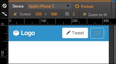
Well, first we will handle the easiest one—fix the Tweet button! For that, we will create another element to be placed at the left-hand side of the collapse button and just display it when they are in extra small resolution. First, add the .hidden-xs class to the current Tweet button:
<button id="tweet" class="btn btn-default pull-right hidden-xs">
  <span class="glyphicon glyphicon-pencil" aria-hidden="true"></span>
  Tweet
</button>
Secondly, at .navbar-header, after button.navbar-toggle, add the following highlighted button:
<div class="navbar-header">
  <a class="navbar-brand" href="webapp.html">
    <img src="imgs/logo.png" class="img-responsive">
  </a>

  <button type="button" class="navbar-toggle collapsed" data-toggle="collapse" data-target="#nav-menu" aria-expanded="false">
    <span class="sr-only">Toggle navigation</span>
    <span class="icon-bar"></span>
    <span class="icon-bar"></span>
    <span class="icon-bar"></span>
  </button>

  <button id="tweet" class="btn btn-default pull-right visible-xs-block">
    <span class="glyphicon glyphicon-pencil" aria-hidden="true"></span>
    Tweet
  </button>
</div>
So, what we did is hide the Tweet button for extra small devices and show a new one in a different element. Set a mobile viewport and you can see the button's position fixed, as follows:
Next, let's fix the color of the collapse hamburger button. Just apply the next CSS to change its color:
.navbar-header .navbar-toggle,
.navbar-default .navbar-toggle:focus {
background-color: #57A5D2;
}
.navbar-default .navbar-toggle:hover {
background-color: #3986B3;
}
.navbar-default .navbar-toggle .icon-bar {
background-color: #FFF;
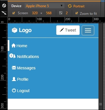
}Finally, let's customize the collapsed navigation bar using Bootstrap helpers. We add the .hidden-xs class to .nav-options and the .hidden-sm class to the form#search element, making them invisible for extra small and small devices respectively, just as we did to the Tweet button:
<div id="nav-options" class="btn-group pull-right hidden-xs">
  …
</div>

<form id="search" role="search" class="hidden-sm">
  …
</form>
Then, in the ul.nav.navbar-nav navigation list, create two items that will replace the ones hidden at the current viewport:
<ul class="nav navbar-nav">
  ...
  <!-- others elements list were hidden -->
  <li class="visible-xs-inline">
    <a href="#">
      <span class="glyphicon glyphicon-user" aria-hidden="true"></span>
      Profile
    </a>
  </li>
  <li class="visible-xs-inline">
    <a href="#">
      <span class="glyphicon glyphicon-off" aria-hidden="true"></span>
      Logout
    </a>
  </li>
</ul>
Thus we are making them visible for extra small resolution with the .visible.xs-inline class, as long they are from an inline list.
To wrap it up, let's remove the border in the active list item, since it does not seem nice at the bottom in the layout. Let's change it to a right border instead of bottom with the following CSS using a media query:
@media(max-width:34em){
  .navbar-default .navbar-nav > .active > a {
    border-bottom: none;
    border-left: 0.45em solid #FFF;
    padding-left: 0.5em;
  }
}
And we are done! Refresh the web page and see the final result of the navigation bar. It is awesome!
Adding the search input
In our navigation bar, we will add a search input. There are two tricks for this. The first is the input must be like an input group to have a magnifier icon on the right-hand-side part. The second is that the input must be aligned to the right and not to the left in the <nav>. In the HTML, let's create a form after ul.nav.navbar-nav:
<div id="nav-menu" class="collapse navbar-collapse">
    <ul class="nav navbar-nav">
      …
    </ul>

    <form id="search" role="search">
      <div class="input-group">
        <input type="text" class="form-control" placeholder="Search...">
        <span class="glyphicon glyphicon-search" aria-hidden="true"></span>
      </div>
    </form>
</div>
In the CSS, move the form to the right and add some padding:
nav form#search {
  float: right;
  padding: 0.5em;
}

nav form#search .glyphicon-search {
    z-index: 99;
    position: absolute;
    right: 0.7em;
    top: 50%;
    margin-top: -0.44em;
}

nav form#search .input-group .form-control {
    border-radius: 0.25em;
}
Refresh the web page and check out the input. It should appear as shown in this screenshot:
Our navigation bar is starting to appear like the navigation bar of a web application, but not close enough! Now, it's the turn of the menu options.
We will now do some crazy stuff: add a thumbnail together with a Bootstrap button dropdown. Just before form#search, add the button HTML:
<div id="nav-options" class="btn-group pull-right">
  <button type="button" class="btn btn-default dropdown-toggle thumbnail" data-toggle="dropdown" aria-haspopup="true" aria-expanded="false">
    <img src="imgs/jon.png">
  </button>
  <ul class="dropdown-menu">
    <li><a href="#">Profile</a></li>
    <li><a href="#">Setting</a></li>
    <li role="separator" class="divider"></li>
    <li><a href="#">Logout</a></li>
  </ul>
</div>
Basically, we used the template for a button dropdown (which you learned about in the previous chapter) and just removed the .caret component present on it. Instead of adding some text, we added an image, that is, the profile image. In .btn-group, we applied the helper class from Bootstrap, .pull-right. Since it was placed before the form, the button will appear after the form.
Then, it's time for the CSS. We need to resize the image and properly set the margins and paddings:
#nav-options {
  margin: 0.5em;
}

#nav-options button.thumbnail {
  margin: 0;
  padding: 0;
}

#nav-options img {
  max-height: 2.3em;
  border-radius: 0.3em;
}
The result of the addition of the button should be like what is shown in the following screenshot:
The last element present in the navigation bar is the Tweet button. To add it, we set following the HTML right before the button group option that we just added:
<button id="tweet" class="btn btn-default pull-right">
  <span class="glyphicon glyphicon-pencil" aria-hidden="true"></span>
  Tweet
</button>
For the CSS, we just need to add some margin:
#tweet {
  margin: 0.5em;
}
Finally, we have all the elements and components in our navigation bar, and it should look like this:
Now that we have our navigation bar done, it's time to customize the Bootstrap theme, add some tweaks, and fix viewport issues.
To be a little different, we will use a blue background color for our navigation bar. First, we need to add some simple CSS rules:
.navbar-default {
  background-color: #2F92CA;
}

.navbar-default .navbar-nav > li > a {
  color: #FFF;
}
Afterwards, let's add the active option to the list on the navigation. Add the .active class to the first element of the nav list (the Home one), presented in bold in the following code:
   <ul class="nav navbar-nav">
     <li class="active">
       <a href="#">
       <span class="glyphicon glyphicon-home" aria-hidden="true"></span>
        Home
       </a>
     </li>
     … <!--others li and the rest of the code -->
   </ul>
Then, go to the CSS and set the following:
.navbar-default {
  background-color: #2F92CA;
}

.navbar-default .navbar-nav > li > a {
  color: #FFF;
}

.navbar-default .navbar-nav > .active > a {
  background-color: transparent;
  color: #FFF;
  padding-bottom: 10px;
  border-bottom: 5px solid #FFF;
}
The result of this should be like the one presented in the following screenshot. You can see that Home is in the active state. To mark that, we've added a border below it for denotation:
If you hover over any element in the navigation list, you will see that it has the wrong color. We will use some style to fix that—by using CSS3 transitions! The complete CSS for the customization should be like the following:
.navbar-default {
  background-color: #2F92CA;
}

.navbar-default .navbar-nav > li > a,
.navbar-default .navbar-nav > li > a:hover {
  color: #FFF;
  -webkit-transition: all 150ms ease-in-out;
  -moz-transition: all 150ms ease-in-out;
  -ms-transition: all 150ms ease-in-out;
  -o-transition: all 150ms ease-in-out;
  transition: all 150ms ease-in-out;
}

.navbar-default .navbar-nav > .active > a {
  background-color: transparent;
  color: #FFF;
  padding-bottom: 0.62em;
  border-bottom: 0.45em solid #FFF;}

.navbar-default .navbar-nav > .active > a:hover,
.navbar-default .navbar-nav > li > a:hover {
  background-color: transparent;
  color: #F3F3F3;
  padding-bottom: 0.62em;
  border-bottom: 0.45em solid #F3F3F3;
}Here, we had to change the default colors from the default Bootstrap navigation list. Also, by adding the transitions, we got a nice effect; when the user hovers over the menu, a border appears at the bottom of the item list.
To finish the navigation bar, it would be nice to add some badges to the notifications item in the up list to show the number of new notifications, just as Twitter has on its website. For that, you will learn to use Bootstrap badges.
So, in the notifications item in the list, add the following highlighted HTML line:
<ul class="nav navbar-nav">
  <li class="active">
    <a href="#">
      <span class="glyphicon glyphicon-home" aria-hidden="true"></span>
      Home
    </a>
  </li>
  <li>
    <a href="#">
      <span class="badge">5</span>
      <span class="glyphicon glyphicon-bell" aria-hidden="true"></span>
      Notifications
    </a>
  </li>
  <li>
    <a href="#">
      <span class="glyphicon glyphicon-envelope" aria-hidden="true"></span>
      Messages
    </a>
  </li>
</ul>
For the CSS, set some positions, paddings, and borders:
.navbar-nav .badge {
  color: #2F92CA;
  background-color: #FFF;
  font-size: 0.7em;
  padding: 0.27rem 0.55rem 0.2rem 0.4rem;
  position: absolute;
  left: 0.37rem;
  top: 0.7rem;
  z-index: 99;
  border: 0.2rem solid #2F92CA;
}
Nicely done! Refresh the browser and you will see this pretty, beautiful badge:
We now have three issues with the navigation bar. Can you guess them?
They are the Tweet button at the small viewport, the collapsed navigation menu collapse, and the color of the collapse hamburger button.
Well, first we will handle the easiest one—fix the Tweet button! For that, we will create another element to be placed at the left-hand side of the collapse button and just display it when they are in extra small resolution. First, add the .hidden-xs class to the current Tweet button:
<button id="tweet" class="btn btn-default pull-right hidden-xs">
  <span class="glyphicon glyphicon-pencil" aria-hidden="true"></span>
  Tweet
</button>
Secondly, at .navbar-header, after button.navbar-toggle, add the following highlighted button:
<div class="navbar-header">
  <a class="navbar-brand" href="webapp.html">
    <img src="imgs/logo.png" class="img-responsive">
  </a>

  <button type="button" class="navbar-toggle collapsed" data-toggle="collapse" data-target="#nav-menu" aria-expanded="false">
    <span class="sr-only">Toggle navigation</span>
    <span class="icon-bar"></span>
    <span class="icon-bar"></span>
    <span class="icon-bar"></span>
  </button>

  <button id="tweet" class="btn btn-default pull-right visible-xs-block">
    <span class="glyphicon glyphicon-pencil" aria-hidden="true"></span>
    Tweet
  </button>
</div>
So, what we did is hide the Tweet button for extra small devices and show a new one in a different element. Set a mobile viewport and you can see the button's position fixed, as follows:
Next, let's fix the color of the collapse hamburger button. Just apply the next CSS to change its color:
.navbar-header .navbar-toggle,
.navbar-default .navbar-toggle:focus {
  background-color: #57A5D2;
}

.navbar-default .navbar-toggle:hover {
  background-color: #3986B3;
}

.navbar-default .navbar-toggle .icon-bar {
  background-color: #FFF;
}
Finally, let's customize the collapsed navigation bar using Bootstrap helpers. We add the .hidden-xs class to .nav-options and the .hidden-sm class to the form#search element, making them invisible for extra small and small devices respectively, just as we did to the Tweet button:
<div id="nav-options" class="btn-group pull-right hidden-xs">
  …
</div>

<form id="search" role="search" class="hidden-sm">
  …
</form>
Then, in the ul.nav.navbar-nav navigation list, create two items that will replace the ones hidden at the current viewport:
<ul class="nav navbar-nav">
  ...
  <!-- others elements list were hidden -->
  <li class="visible-xs-inline">
    <a href="#">
      <span class="glyphicon glyphicon-user" aria-hidden="true"></span>
      Profile
    </a>
  </li>
  <li class="visible-xs-inline">
    <a href="#">
      <span class="glyphicon glyphicon-off" aria-hidden="true"></span>
      Logout
    </a>
  </li>
</ul>
Thus we are making them visible for extra small resolution with the .visible.xs-inline class, as long they are from an inline list.
To wrap it up, let's remove the border in the active list item, since it does not seem nice at the bottom in the layout. Let's change it to a right border instead of bottom with the following CSS using a media query:
@media(max-width:34em){
  .navbar-default .navbar-nav > .active > a {
    border-bottom: none;
    border-left: 0.45em solid #FFF;
    padding-left: 0.5em;
  }
}
And we are done! Refresh the web page and see the final result of the navigation bar. It is awesome!
Time for the menu options!
Our navigation bar is starting to appear like the navigation bar of a web application, but not close enough! Now, it's the turn of the menu options.
We will now do some crazy stuff: add a thumbnail together with a Bootstrap button dropdown. Just before form#search, add the button HTML:
<div id="nav-options" class="btn-group pull-right">
  <button type="button" class="btn btn-default dropdown-toggle thumbnail" data-toggle="dropdown" aria-haspopup="true" aria-expanded="false">
    <img src="imgs/jon.png">
  </button>
  <ul class="dropdown-menu">
    <li><a href="#">Profile</a></li>
    <li><a href="#">Setting</a></li>
    <li role="separator" class="divider"></li>
    <li><a href="#">Logout</a></li>
  </ul>
</div>
Basically, we used the template for a button dropdown (which you learned about in the previous chapter) and just removed the .caret component present on it. Instead of adding some text, we added an image, that is, the profile image. In .btn-group, we applied the helper class from Bootstrap, .pull-right. Since it was placed before the form, the button will appear after the form.
Then, it's time for the CSS. We need to resize the image and properly set the margins and paddings:
#nav-options {
  margin: 0.5em;
}

#nav-options button.thumbnail {
  margin: 0;
  padding: 0;
}

#nav-options img {
  max-height: 2.3em;
  border-radius: 0.3em;
}
The result of the addition of the button should be like what is shown in the following screenshot:
The last element present in the navigation bar is the Tweet button. To add it, we set following the HTML right before the button group option that we just added:
<button id="tweet" class="btn btn-default pull-right">
  <span class="glyphicon glyphicon-pencil" aria-hidden="true"></span>
  Tweet
</button>
For the CSS, we just need to add some margin:
#tweet {
  margin: 0.5em;
}
Finally, we have all the elements and components in our navigation bar, and it should look like this:
Now that we have our navigation bar done, it's time to customize the Bootstrap theme, add some tweaks, and fix viewport issues.
To be a little different, we will use a blue background color for our navigation bar. First, we need to add some simple CSS rules:
.navbar-default {
  background-color: #2F92CA;
}

.navbar-default .navbar-nav > li > a {
  color: #FFF;
}
Afterwards, let's add the active option to the list on the navigation. Add the .active class to the first element of the nav list (the Home one), presented in bold in the following code:
   <ul class="nav navbar-nav">
     <li class="active">
       <a href="#">
       <span class="glyphicon glyphicon-home" aria-hidden="true"></span>
        Home
       </a>
     </li>
     … <!--others li and the rest of the code -->
   </ul>
Then, go to the CSS and set the following:
.navbar-default {
  background-color: #2F92CA;
}

.navbar-default .navbar-nav > li > a {
  color: #FFF;
}

.navbar-default .navbar-nav > .active > a {
  background-color: transparent;
  color: #FFF;
  padding-bottom: 10px;
  border-bottom: 5px solid #FFF;
}
The result of this should be like the one presented in the following screenshot. You can see that Home is in the active state. To mark that, we've added a border below it for denotation:
If you hover over any element in the navigation list, you will see that it has the wrong color. We will use some style to fix that—by using CSS3 transitions! The complete CSS for the customization should be like the following:
.navbar-default {
  background-color: #2F92CA;
}

.navbar-default .navbar-nav > li > a,
.navbar-default .navbar-nav > li > a:hover {
  color: #FFF;
  -webkit-transition: all 150ms ease-in-out;
  -moz-transition: all 150ms ease-in-out;
  -ms-transition: all 150ms ease-in-out;
  -o-transition: all 150ms ease-in-out;
  transition: all 150ms ease-in-out;
}

.navbar-default .navbar-nav > .active > a {
  background-color: transparent;
  color: #FFF;
  padding-bottom: 0.62em;
  border-bottom: 0.45em solid #FFF;}

.navbar-default .navbar-nav > .active > a:hover,
.navbar-default .navbar-nav > li > a:hover {
  background-color: transparent;
  color: #F3F3F3;
  padding-bottom: 0.62em;
  border-bottom: 0.45em solid #F3F3F3;
}Here, we had to change the default colors from the default Bootstrap navigation list. Also, by adding the transitions, we got a nice effect; when the user hovers over the menu, a border appears at the bottom of the item list.
To finish the navigation bar, it would be nice to add some badges to the notifications item in the up list to show the number of new notifications, just as Twitter has on its website. For that, you will learn to use Bootstrap badges.
So, in the notifications item in the list, add the following highlighted HTML line:
<ul class="nav navbar-nav">
  <li class="active">
    <a href="#">
      <span class="glyphicon glyphicon-home" aria-hidden="true"></span>
      Home
    </a>
  </li>
  <li>
    <a href="#">
      <span class="badge">5</span>
      <span class="glyphicon glyphicon-bell" aria-hidden="true"></span>
      Notifications
    </a>
  </li>
  <li>
    <a href="#">
      <span class="glyphicon glyphicon-envelope" aria-hidden="true"></span>
      Messages
    </a>
  </li>
</ul>
For the CSS, set some positions, paddings, and borders:
.navbar-nav .badge {
  color: #2F92CA;
  background-color: #FFF;
  font-size: 0.7em;
  padding: 0.27rem 0.55rem 0.2rem 0.4rem;
  position: absolute;
  left: 0.37rem;
  top: 0.7rem;
  z-index: 99;
  border: 0.2rem solid #2F92CA;
}
Nicely done! Refresh the browser and you will see this pretty, beautiful badge:
We now have three issues with the navigation bar. Can you guess them?
They are the Tweet button at the small viewport, the collapsed navigation menu collapse, and the color of the collapse hamburger button.
Well, first we will handle the easiest one—fix the Tweet button! For that, we will create another element to be placed at the left-hand side of the collapse button and just display it when they are in extra small resolution. First, add the .hidden-xs class to the current Tweet button:
<button id="tweet" class="btn btn-default pull-right hidden-xs">
  <span class="glyphicon glyphicon-pencil" aria-hidden="true"></span>
  Tweet
</button>
Secondly, at .navbar-header, after button.navbar-toggle, add the following highlighted button:
<div class="navbar-header">
  <a class="navbar-brand" href="webapp.html">
    <img src="imgs/logo.png" class="img-responsive">
  </a>

  <button type="button" class="navbar-toggle collapsed" data-toggle="collapse" data-target="#nav-menu" aria-expanded="false">
    <span class="sr-only">Toggle navigation</span>
    <span class="icon-bar"></span>
    <span class="icon-bar"></span>
    <span class="icon-bar"></span>
  </button>

  <button id="tweet" class="btn btn-default pull-right visible-xs-block">
    <span class="glyphicon glyphicon-pencil" aria-hidden="true"></span>
    Tweet
  </button>
</div>
So, what we did is hide the Tweet button for extra small devices and show a new one in a different element. Set a mobile viewport and you can see the button's position fixed, as follows:
Next, let's fix the color of the collapse hamburger button. Just apply the next CSS to change its color:
.navbar-header .navbar-toggle,
.navbar-default .navbar-toggle:focus {
  background-color: #57A5D2;
}

.navbar-default .navbar-toggle:hover {
  background-color: #3986B3;
}

.navbar-default .navbar-toggle .icon-bar {
  background-color: #FFF;
}
Finally, let's customize the collapsed navigation bar using Bootstrap helpers. We add the .hidden-xs class to .nav-options and the .hidden-sm class to the form#search element, making them invisible for extra small and small devices respectively, just as we did to the Tweet button:
<div id="nav-options" class="btn-group pull-right hidden-xs">
  …
</div>

<form id="search" role="search" class="hidden-sm">
  …
</form>
Then, in the ul.nav.navbar-nav navigation list, create two items that will replace the ones hidden at the current viewport:
<ul class="nav navbar-nav">
  ...
  <!-- others elements list were hidden -->
  <li class="visible-xs-inline">
    <a href="#">
      <span class="glyphicon glyphicon-user" aria-hidden="true"></span>
      Profile
    </a>
  </li>
  <li class="visible-xs-inline">
    <a href="#">
      <span class="glyphicon glyphicon-off" aria-hidden="true"></span>
      Logout
    </a>
  </li>
</ul>
Thus we are making them visible for extra small resolution with the .visible.xs-inline class, as long they are from an inline list.
To wrap it up, let's remove the border in the active list item, since it does not seem nice at the bottom in the layout. Let's change it to a right border instead of bottom with the following CSS using a media query:
@media(max-width:34em){
  .navbar-default .navbar-nav > .active > a {
    border-bottom: none;
    border-left: 0.45em solid #FFF;
    padding-left: 0.5em;
  }
}
And we are done! Refresh the web page and see the final result of the navigation bar. It is awesome!
The option at the thumbnail
We will now do some crazy stuff: add a thumbnail together with a Bootstrap button dropdown. Just before form#search, add the button HTML:
<div id="nav-options" class="btn-group pull-right">
  <button type="button" class="btn btn-default dropdown-toggle thumbnail" data-toggle="dropdown" aria-haspopup="true" aria-expanded="false">
    <img src="imgs/jon.png">
  </button>
  <ul class="dropdown-menu">
    <li><a href="#">Profile</a></li>
    <li><a href="#">Setting</a></li>
    <li role="separator" class="divider"></li>
    <li><a href="#">Logout</a></li>
  </ul>
</div>
Basically, we used the template for a button dropdown (which you learned about in the previous chapter) and just removed the .caret component present on it. Instead of adding some text, we added an image, that is, the profile image. In .btn-group, we applied the helper class from Bootstrap, .pull-right. Since it was placed before the form, the button will appear after the form.
Then, it's time for the CSS. We need to resize the image and properly set the margins and paddings:
#nav-options {
  margin: 0.5em;
}

#nav-options button.thumbnail {
  margin: 0;
  padding: 0;
}

#nav-options img {
  max-height: 2.3em;
  border-radius: 0.3em;
}
The result of the addition of the button should be like what is shown in the following screenshot:
The last element present in the navigation bar is the Tweet button. To add it, we set following the HTML right before the button group option that we just added:
<button id="tweet" class="btn btn-default pull-right">
  <span class="glyphicon glyphicon-pencil" aria-hidden="true"></span>
  Tweet
</button>
For the CSS, we just need to add some margin:
#tweet {
  margin: 0.5em;
}
Finally, we have all the elements and components in our navigation bar, and it should look like this:
Now that we have our navigation bar done, it's time to customize the Bootstrap theme, add some tweaks, and fix viewport issues.
To be a little different, we will use a blue background color for our navigation bar. First, we need to add some simple CSS rules:
.navbar-default {
  background-color: #2F92CA;
}

.navbar-default .navbar-nav > li > a {
  color: #FFF;
}
Afterwards, let's add the active option to the list on the navigation. Add the .active class to the first element of the nav list (the Home one), presented in bold in the following code:
   <ul class="nav navbar-nav">
     <li class="active">
       <a href="#">
       <span class="glyphicon glyphicon-home" aria-hidden="true"></span>
        Home
       </a>
     </li>
     … <!--others li and the rest of the code -->
   </ul>
Then, go to the CSS and set the following:
.navbar-default {
  background-color: #2F92CA;
}

.navbar-default .navbar-nav > li > a {
  color: #FFF;
}

.navbar-default .navbar-nav > .active > a {
  background-color: transparent;
  color: #FFF;
  padding-bottom: 10px;
  border-bottom: 5px solid #FFF;
}
The result of this should be like the one presented in the following screenshot. You can see that Home is in the active state. To mark that, we've added a border below it for denotation:
If you hover over any element in the navigation list, you will see that it has the wrong color. We will use some style to fix that—by using CSS3 transitions! The complete CSS for the customization should be like the following:
.navbar-default {
  background-color: #2F92CA;
}

.navbar-default .navbar-nav > li > a,
.navbar-default .navbar-nav > li > a:hover {
  color: #FFF;
  -webkit-transition: all 150ms ease-in-out;
  -moz-transition: all 150ms ease-in-out;
  -ms-transition: all 150ms ease-in-out;
  -o-transition: all 150ms ease-in-out;
  transition: all 150ms ease-in-out;
}

.navbar-default .navbar-nav > .active > a {
  background-color: transparent;
  color: #FFF;
  padding-bottom: 0.62em;
  border-bottom: 0.45em solid #FFF;}

.navbar-default .navbar-nav > .active > a:hover,
.navbar-default .navbar-nav > li > a:hover {
  background-color: transparent;
  color: #F3F3F3;
  padding-bottom: 0.62em;
  border-bottom: 0.45em solid #F3F3F3;
}Here, we had to change the default colors from the default Bootstrap navigation list. Also, by adding the transitions, we got a nice effect; when the user hovers over the menu, a border appears at the bottom of the item list.
To finish the navigation bar, it would be nice to add some badges to the notifications item in the up list to show the number of new notifications, just as Twitter has on its website. For that, you will learn to use Bootstrap badges.
So, in the notifications item in the list, add the following highlighted HTML line:
<ul class="nav navbar-nav">
  <li class="active">
    <a href="#">
      <span class="glyphicon glyphicon-home" aria-hidden="true"></span>
      Home
    </a>
  </li>
  <li>
    <a href="#">
      <span class="badge">5</span>
      <span class="glyphicon glyphicon-bell" aria-hidden="true"></span>
      Notifications
    </a>
  </li>
  <li>
    <a href="#">
      <span class="glyphicon glyphicon-envelope" aria-hidden="true"></span>
      Messages
    </a>
  </li>
</ul>
For the CSS, set some positions, paddings, and borders:
.navbar-nav .badge {
  color: #2F92CA;
  background-color: #FFF;
  font-size: 0.7em;
  padding: 0.27rem 0.55rem 0.2rem 0.4rem;
  position: absolute;
  left: 0.37rem;
  top: 0.7rem;
  z-index: 99;
  border: 0.2rem solid #2F92CA;
}
Nicely done! Refresh the browser and you will see this pretty, beautiful badge:
We now have three issues with the navigation bar. Can you guess them?
They are the Tweet button at the small viewport, the collapsed navigation menu collapse, and the color of the collapse hamburger button.
Well, first we will handle the easiest one—fix the Tweet button! For that, we will create another element to be placed at the left-hand side of the collapse button and just display it when they are in extra small resolution. First, add the .hidden-xs class to the current Tweet button:
<button id="tweet" class="btn btn-default pull-right hidden-xs">
  <span class="glyphicon glyphicon-pencil" aria-hidden="true"></span>
  Tweet
</button>
Secondly, at .navbar-header, after button.navbar-toggle, add the following highlighted button:
<div class="navbar-header">
  <a class="navbar-brand" href="webapp.html">
    <img src="imgs/logo.png" class="img-responsive">
  </a>

  <button type="button" class="navbar-toggle collapsed" data-toggle="collapse" data-target="#nav-menu" aria-expanded="false">
    <span class="sr-only">Toggle navigation</span>
    <span class="icon-bar"></span>
    <span class="icon-bar"></span>
    <span class="icon-bar"></span>
  </button>

  <button id="tweet" class="btn btn-default pull-right visible-xs-block">
    <span class="glyphicon glyphicon-pencil" aria-hidden="true"></span>
    Tweet
  </button>
</div>
So, what we did is hide the Tweet button for extra small devices and show a new one in a different element. Set a mobile viewport and you can see the button's position fixed, as follows:
Next, let's fix the color of the collapse hamburger button. Just apply the next CSS to change its color:
.navbar-header .navbar-toggle,
.navbar-default .navbar-toggle:focus {
  background-color: #57A5D2;
}

.navbar-default .navbar-toggle:hover {
  background-color: #3986B3;
}

.navbar-default .navbar-toggle .icon-bar {
  background-color: #FFF;
}
Finally, let's customize the collapsed navigation bar using Bootstrap helpers. We add the .hidden-xs class to .nav-options and the .hidden-sm class to the form#search element, making them invisible for extra small and small devices respectively, just as we did to the Tweet button:
<div id="nav-options" class="btn-group pull-right hidden-xs">
  …
</div>

<form id="search" role="search" class="hidden-sm">
  …
</form>
Then, in the ul.nav.navbar-nav navigation list, create two items that will replace the ones hidden at the current viewport:
<ul class="nav navbar-nav">
  ...
  <!-- others elements list were hidden -->
  <li class="visible-xs-inline">
    <a href="#">
      <span class="glyphicon glyphicon-user" aria-hidden="true"></span>
      Profile
    </a>
  </li>
  <li class="visible-xs-inline">
    <a href="#">
      <span class="glyphicon glyphicon-off" aria-hidden="true"></span>
      Logout
    </a>
  </li>
</ul>
Thus we are making them visible for extra small resolution with the .visible.xs-inline class, as long they are from an inline list.
To wrap it up, let's remove the border in the active list item, since it does not seem nice at the bottom in the layout. Let's change it to a right border instead of bottom with the following CSS using a media query:
@media(max-width:34em){
  .navbar-default .navbar-nav > .active > a {
    border-bottom: none;
    border-left: 0.45em solid #FFF;
    padding-left: 0.5em;
  }
}
And we are done! Refresh the web page and see the final result of the navigation bar. It is awesome!
Adding the Tweet button
The last element present in the navigation bar is the Tweet button. To add it, we set following the HTML right before the button group option that we just added:
<button id="tweet" class="btn btn-default pull-right">
  <span class="glyphicon glyphicon-pencil" aria-hidden="true"></span>
  Tweet
</button>
For the CSS, we just need to add some margin:
#tweet {
  margin: 0.5em;
}
Finally, we have all the elements and components in our navigation bar, and it should look like this:
Now that we have our navigation bar done, it's time to customize the Bootstrap theme, add some tweaks, and fix viewport issues.
To be a little different, we will use a blue background color for our navigation bar. First, we need to add some simple CSS rules:
.navbar-default {
  background-color: #2F92CA;
}

.navbar-default .navbar-nav > li > a {
  color: #FFF;
}
Afterwards, let's add the active option to the list on the navigation. Add the .active class to the first element of the nav list (the Home one), presented in bold in the following code:
   <ul class="nav navbar-nav">
     <li class="active">
       <a href="#">
       <span class="glyphicon glyphicon-home" aria-hidden="true"></span>
        Home
       </a>
     </li>
     … <!--others li and the rest of the code -->
   </ul>
Then, go to the CSS and set the following:
.navbar-default {
  background-color: #2F92CA;
}

.navbar-default .navbar-nav > li > a {
  color: #FFF;
}

.navbar-default .navbar-nav > .active > a {
  background-color: transparent;
  color: #FFF;
  padding-bottom: 10px;
  border-bottom: 5px solid #FFF;
}
The result of this should be like the one presented in the following screenshot. You can see that Home is in the active state. To mark that, we've added a border below it for denotation:
If you hover over any element in the navigation list, you will see that it has the wrong color. We will use some style to fix that—by using CSS3 transitions! The complete CSS for the customization should be like the following:
.navbar-default {
  background-color: #2F92CA;
}

.navbar-default .navbar-nav > li > a,
.navbar-default .navbar-nav > li > a:hover {
  color: #FFF;
  -webkit-transition: all 150ms ease-in-out;
  -moz-transition: all 150ms ease-in-out;
  -ms-transition: all 150ms ease-in-out;
  -o-transition: all 150ms ease-in-out;
  transition: all 150ms ease-in-out;
}

.navbar-default .navbar-nav > .active > a {
  background-color: transparent;
  color: #FFF;
  padding-bottom: 0.62em;
  border-bottom: 0.45em solid #FFF;}

.navbar-default .navbar-nav > .active > a:hover,
.navbar-default .navbar-nav > li > a:hover {
  background-color: transparent;
  color: #F3F3F3;
  padding-bottom: 0.62em;
  border-bottom: 0.45em solid #F3F3F3;
}Here, we had to change the default colors from the default Bootstrap navigation list. Also, by adding the transitions, we got a nice effect; when the user hovers over the menu, a border appears at the bottom of the item list.
To finish the navigation bar, it would be nice to add some badges to the notifications item in the up list to show the number of new notifications, just as Twitter has on its website. For that, you will learn to use Bootstrap badges.
So, in the notifications item in the list, add the following highlighted HTML line:
<ul class="nav navbar-nav">
  <li class="active">
    <a href="#">
      <span class="glyphicon glyphicon-home" aria-hidden="true"></span>
      Home
    </a>
  </li>
  <li>
    <a href="#">
      <span class="badge">5</span>
      <span class="glyphicon glyphicon-bell" aria-hidden="true"></span>
      Notifications
    </a>
  </li>
  <li>
    <a href="#">
      <span class="glyphicon glyphicon-envelope" aria-hidden="true"></span>
      Messages
    </a>
  </li>
</ul>
For the CSS, set some positions, paddings, and borders:
.navbar-nav .badge {
  color: #2F92CA;
  background-color: #FFF;
  font-size: 0.7em;
  padding: 0.27rem 0.55rem 0.2rem 0.4rem;
  position: absolute;
  left: 0.37rem;
  top: 0.7rem;
  z-index: 99;
  border: 0.2rem solid #2F92CA;
}
Nicely done! Refresh the browser and you will see this pretty, beautiful badge:
We now have three issues with the navigation bar. Can you guess them?
They are the Tweet button at the small viewport, the collapsed navigation menu collapse, and the color of the collapse hamburger button.
Well, first we will handle the easiest one—fix the Tweet button! For that, we will create another element to be placed at the left-hand side of the collapse button and just display it when they are in extra small resolution. First, add the .hidden-xs class to the current Tweet button:
<button id="tweet" class="btn btn-default pull-right hidden-xs">
  <span class="glyphicon glyphicon-pencil" aria-hidden="true"></span>
  Tweet
</button>
Secondly, at .navbar-header, after button.navbar-toggle, add the following highlighted button:
<div class="navbar-header">
  <a class="navbar-brand" href="webapp.html">
    <img src="imgs/logo.png" class="img-responsive">
  </a>

  <button type="button" class="navbar-toggle collapsed" data-toggle="collapse" data-target="#nav-menu" aria-expanded="false">
    <span class="sr-only">Toggle navigation</span>
    <span class="icon-bar"></span>
    <span class="icon-bar"></span>
    <span class="icon-bar"></span>
  </button>

  <button id="tweet" class="btn btn-default pull-right visible-xs-block">
    <span class="glyphicon glyphicon-pencil" aria-hidden="true"></span>
    Tweet
  </button>
</div>
So, what we did is hide the Tweet button for extra small devices and show a new one in a different element. Set a mobile viewport and you can see the button's position fixed, as follows:
Next, let's fix the color of the collapse hamburger button. Just apply the next CSS to change its color:
.navbar-header .navbar-toggle,
.navbar-default .navbar-toggle:focus {
  background-color: #57A5D2;
}

.navbar-default .navbar-toggle:hover {
  background-color: #3986B3;
}

.navbar-default .navbar-toggle .icon-bar {
  background-color: #FFF;
}
Finally, let's customize the collapsed navigation bar using Bootstrap helpers. We add the .hidden-xs class to .nav-options and the .hidden-sm class to the form#search element, making them invisible for extra small and small devices respectively, just as we did to the Tweet button:
<div id="nav-options" class="btn-group pull-right hidden-xs">
  …
</div>

<form id="search" role="search" class="hidden-sm">
  …
</form>
Then, in the ul.nav.navbar-nav navigation list, create two items that will replace the ones hidden at the current viewport:
<ul class="nav navbar-nav">
  ...
  <!-- others elements list were hidden -->
  <li class="visible-xs-inline">
    <a href="#">
      <span class="glyphicon glyphicon-user" aria-hidden="true"></span>
      Profile
    </a>
  </li>
  <li class="visible-xs-inline">
    <a href="#">
      <span class="glyphicon glyphicon-off" aria-hidden="true"></span>
      Logout
    </a>
  </li>
</ul>
Thus we are making them visible for extra small resolution with the .visible.xs-inline class, as long they are from an inline list.
To wrap it up, let's remove the border in the active list item, since it does not seem nice at the bottom in the layout. Let's change it to a right border instead of bottom with the following CSS using a media query:
@media(max-width:34em){
  .navbar-default .navbar-nav > .active > a {
    border-bottom: none;
    border-left: 0.45em solid #FFF;
    padding-left: 0.5em;
  }
}
And we are done! Refresh the web page and see the final result of the navigation bar. It is awesome!
Customizing the navigation bar
Now that we have our navigation bar done, it's time to customize the Bootstrap theme, add some tweaks, and fix viewport issues.
To be a little different, we will use a blue background color for our navigation bar. First, we need to add some simple CSS rules:
.navbar-default {
  background-color: #2F92CA;
}

.navbar-default .navbar-nav > li > a {
  color: #FFF;
}
Afterwards, let's add the active option to the list on the navigation. Add the .active class to the first element of the nav list (the Home one), presented in bold in the following code:
   <ul class="nav navbar-nav">
     <li class="active">
       <a href="#">
       <span class="glyphicon glyphicon-home" aria-hidden="true"></span>
        Home
       </a>
     </li>
     … <!--others li and the rest of the code -->
   </ul>
Then, go to the CSS and set the following:
.navbar-default {
  background-color: #2F92CA;
}

.navbar-default .navbar-nav > li > a {
  color: #FFF;
}

.navbar-default .navbar-nav > .active > a {
  background-color: transparent;
  color: #FFF;
  padding-bottom: 10px;
  border-bottom: 5px solid #FFF;
}
The result of this should be like the one presented in the following screenshot. You can see that Home is in the active state. To mark that, we've added a border below it for denotation:
If you hover over any element in the navigation list, you will see that it has the wrong color. We will use some style to fix that—by using CSS3 transitions! The complete CSS for the customization should be like the following:
.navbar-default {
  background-color: #2F92CA;
}

.navbar-default .navbar-nav > li > a,
.navbar-default .navbar-nav > li > a:hover {
  color: #FFF;
  -webkit-transition: all 150ms ease-in-out;
  -moz-transition: all 150ms ease-in-out;
  -ms-transition: all 150ms ease-in-out;
  -o-transition: all 150ms ease-in-out;
  transition: all 150ms ease-in-out;
}

.navbar-default .navbar-nav > .active > a {
  background-color: transparent;
  color: #FFF;
  padding-bottom: 0.62em;
  border-bottom: 0.45em solid #FFF;}

.navbar-default .navbar-nav > .active > a:hover,
.navbar-default .navbar-nav > li > a:hover {
  background-color: transparent;
  color: #F3F3F3;
  padding-bottom: 0.62em;
  border-bottom: 0.45em solid #F3F3F3;
}Here, we had to change the default colors from the default Bootstrap navigation list. Also, by adding the transitions, we got a nice effect; when the user hovers over the menu, a border appears at the bottom of the item list.
To finish the navigation bar, it would be nice to add some badges to the notifications item in the up list to show the number of new notifications, just as Twitter has on its website. For that, you will learn to use Bootstrap badges.
So, in the notifications item in the list, add the following highlighted HTML line:
<ul class="nav navbar-nav">
  <li class="active">
    <a href="#">
      <span class="glyphicon glyphicon-home" aria-hidden="true"></span>
      Home
    </a>
  </li>
  <li>
    <a href="#">
      <span class="badge">5</span>
      <span class="glyphicon glyphicon-bell" aria-hidden="true"></span>
      Notifications
    </a>
  </li>
  <li>
    <a href="#">
      <span class="glyphicon glyphicon-envelope" aria-hidden="true"></span>
      Messages
    </a>
  </li>
</ul>
For the CSS, set some positions, paddings, and borders:
.navbar-nav .badge {
  color: #2F92CA;
  background-color: #FFF;
  font-size: 0.7em;
  padding: 0.27rem 0.55rem 0.2rem 0.4rem;
  position: absolute;
  left: 0.37rem;
  top: 0.7rem;
  z-index: 99;
  border: 0.2rem solid #2F92CA;
}
Nicely done! Refresh the browser and you will see this pretty, beautiful badge:
We now have three issues with the navigation bar. Can you guess them?
They are the Tweet button at the small viewport, the collapsed navigation menu collapse, and the color of the collapse hamburger button.
Well, first we will handle the easiest one—fix the Tweet button! For that, we will create another element to be placed at the left-hand side of the collapse button and just display it when they are in extra small resolution. First, add the .hidden-xs class to the current Tweet button:
<button id="tweet" class="btn btn-default pull-right hidden-xs">
  <span class="glyphicon glyphicon-pencil" aria-hidden="true"></span>
  Tweet
</button>
Secondly, at .navbar-header, after button.navbar-toggle, add the following highlighted button:
<div class="navbar-header">
  <a class="navbar-brand" href="webapp.html">
    <img src="imgs/logo.png" class="img-responsive">
  </a>

  <button type="button" class="navbar-toggle collapsed" data-toggle="collapse" data-target="#nav-menu" aria-expanded="false">
    <span class="sr-only">Toggle navigation</span>
    <span class="icon-bar"></span>
    <span class="icon-bar"></span>
    <span class="icon-bar"></span>
  </button>

  <button id="tweet" class="btn btn-default pull-right visible-xs-block">
    <span class="glyphicon glyphicon-pencil" aria-hidden="true"></span>
    Tweet
  </button>
</div>
So, what we did is hide the Tweet button for extra small devices and show a new one in a different element. Set a mobile viewport and you can see the button's position fixed, as follows:
Next, let's fix the color of the collapse hamburger button. Just apply the next CSS to change its color:
.navbar-header .navbar-toggle,
.navbar-default .navbar-toggle:focus {
  background-color: #57A5D2;
}

.navbar-default .navbar-toggle:hover {
  background-color: #3986B3;
}

.navbar-default .navbar-toggle .icon-bar {
  background-color: #FFF;
}
Finally, let's customize the collapsed navigation bar using Bootstrap helpers. We add the .hidden-xs class to .nav-options and the .hidden-sm class to the form#search element, making them invisible for extra small and small devices respectively, just as we did to the Tweet button:
<div id="nav-options" class="btn-group pull-right hidden-xs">
  …
</div>

<form id="search" role="search" class="hidden-sm">
  …
</form>
Then, in the ul.nav.navbar-nav navigation list, create two items that will replace the ones hidden at the current viewport:
<ul class="nav navbar-nav">
  ...
  <!-- others elements list were hidden -->
  <li class="visible-xs-inline">
    <a href="#">
      <span class="glyphicon glyphicon-user" aria-hidden="true"></span>
      Profile
    </a>
  </li>
  <li class="visible-xs-inline">
    <a href="#">
      <span class="glyphicon glyphicon-off" aria-hidden="true"></span>
      Logout
    </a>
  </li>
</ul>
Thus we are making them visible for extra small resolution with the .visible.xs-inline class, as long they are from an inline list.
To wrap it up, let's remove the border in the active list item, since it does not seem nice at the bottom in the layout. Let's change it to a right border instead of bottom with the following CSS using a media query:
@media(max-width:34em){
  .navbar-default .navbar-nav > .active > a {
    border-bottom: none;
    border-left: 0.45em solid #FFF;
    padding-left: 0.5em;
  }
}
And we are done! Refresh the web page and see the final result of the navigation bar. It is awesome!
Setting up the custom theme
To be a little different, we will use a blue background color for our navigation bar. First, we need to add some simple CSS rules:
.navbar-default {
  background-color: #2F92CA;
}

.navbar-default .navbar-nav > li > a {
  color: #FFF;
}
Afterwards, let's add the active option to the list on the navigation. Add the .active class to the first element of the nav list (the Home one), presented in bold in the following code:
   <ul class="nav navbar-nav">
     <li class="active">
       <a href="#">
       <span class="glyphicon glyphicon-home" aria-hidden="true"></span>
        Home
       </a>
     </li>
     … <!--others li and the rest of the code -->
   </ul>
Then, go to the CSS and set the following:
.navbar-default {
  background-color: #2F92CA;
}

.navbar-default .navbar-nav > li > a {
  color: #FFF;
}

.navbar-default .navbar-nav > .active > a {
  background-color: transparent;
  color: #FFF;
  padding-bottom: 10px;
  border-bottom: 5px solid #FFF;
}
The result of this should be like the one presented in the following screenshot. You can see that Home is in the active state. To mark that, we've added a border below it for denotation:
If you hover over any element in the navigation list, you will see that it has the wrong color. We will use some style to fix that—by using CSS3 transitions! The complete CSS for the customization should be like the following:
.navbar-default {
  background-color: #2F92CA;
}

.navbar-default .navbar-nav > li > a,
.navbar-default .navbar-nav > li > a:hover {
  color: #FFF;
  -webkit-transition: all 150ms ease-in-out;
  -moz-transition: all 150ms ease-in-out;
  -ms-transition: all 150ms ease-in-out;
  -o-transition: all 150ms ease-in-out;
  transition: all 150ms ease-in-out;
}

.navbar-default .navbar-nav > .active > a {
  background-color: transparent;
  color: #FFF;
  padding-bottom: 0.62em;
  border-bottom: 0.45em solid #FFF;}

.navbar-default .navbar-nav > .active > a:hover,
.navbar-default .navbar-nav > li > a:hover {
  background-color: transparent;
  color: #F3F3F3;
  padding-bottom: 0.62em;
  border-bottom: 0.45em solid #F3F3F3;
}Here, we had to change the default colors from the default Bootstrap navigation list. Also, by adding the transitions, we got a nice effect; when the user hovers over the menu, a border appears at the bottom of the item list.
To finish the navigation bar, it would be nice to add some badges to the notifications item in the up list to show the number of new notifications, just as Twitter has on its website. For that, you will learn to use Bootstrap badges.
So, in the notifications item in the list, add the following highlighted HTML line:
<ul class="nav navbar-nav">
  <li class="active">
    <a href="#">
      <span class="glyphicon glyphicon-home" aria-hidden="true"></span>
      Home
    </a>
  </li>
  <li>
    <a href="#">
      <span class="badge">5</span>
      <span class="glyphicon glyphicon-bell" aria-hidden="true"></span>
      Notifications
    </a>
  </li>
  <li>
    <a href="#">
      <span class="glyphicon glyphicon-envelope" aria-hidden="true"></span>
      Messages
    </a>
  </li>
</ul>
For the CSS, set some positions, paddings, and borders:
.navbar-nav .badge {
  color: #2F92CA;
  background-color: #FFF;
  font-size: 0.7em;
  padding: 0.27rem 0.55rem 0.2rem 0.4rem;
  position: absolute;
  left: 0.37rem;
  top: 0.7rem;
  z-index: 99;
  border: 0.2rem solid #2F92CA;
}
Nicely done! Refresh the browser and you will see this pretty, beautiful badge:
We now have three issues with the navigation bar. Can you guess them?
They are the Tweet button at the small viewport, the collapsed navigation menu collapse, and the color of the collapse hamburger button.
Well, first we will handle the easiest one—fix the Tweet button! For that, we will create another element to be placed at the left-hand side of the collapse button and just display it when they are in extra small resolution. First, add the .hidden-xs class to the current Tweet button:
<button id="tweet" class="btn btn-default pull-right hidden-xs">
  <span class="glyphicon glyphicon-pencil" aria-hidden="true"></span>
  Tweet
</button>
Secondly, at .navbar-header, after button.navbar-toggle, add the following highlighted button:
<div class="navbar-header">
  <a class="navbar-brand" href="webapp.html">
    <img src="imgs/logo.png" class="img-responsive">
  </a>

  <button type="button" class="navbar-toggle collapsed" data-toggle="collapse" data-target="#nav-menu" aria-expanded="false">
    <span class="sr-only">Toggle navigation</span>
    <span class="icon-bar"></span>
    <span class="icon-bar"></span>
    <span class="icon-bar"></span>
  </button>

  <button id="tweet" class="btn btn-default pull-right visible-xs-block">
    <span class="glyphicon glyphicon-pencil" aria-hidden="true"></span>
    Tweet
  </button>
</div>
So, what we did is hide the Tweet button for extra small devices and show a new one in a different element. Set a mobile viewport and you can see the button's position fixed, as follows:
Next, let's fix the color of the collapse hamburger button. Just apply the next CSS to change its color:
.navbar-header .navbar-toggle,
.navbar-default .navbar-toggle:focus {
  background-color: #57A5D2;
}

.navbar-default .navbar-toggle:hover {
  background-color: #3986B3;
}

.navbar-default .navbar-toggle .icon-bar {
  background-color: #FFF;
}
Finally, let's customize the collapsed navigation bar using Bootstrap helpers. We add the .hidden-xs class to .nav-options and the .hidden-sm class to the form#search element, making them invisible for extra small and small devices respectively, just as we did to the Tweet button:
<div id="nav-options" class="btn-group pull-right hidden-xs">
  …
</div>

<form id="search" role="search" class="hidden-sm">
  …
</form>
Then, in the ul.nav.navbar-nav navigation list, create two items that will replace the ones hidden at the current viewport:
<ul class="nav navbar-nav">
  ...
  <!-- others elements list were hidden -->
  <li class="visible-xs-inline">
    <a href="#">
      <span class="glyphicon glyphicon-user" aria-hidden="true"></span>
      Profile
    </a>
  </li>
  <li class="visible-xs-inline">
    <a href="#">
      <span class="glyphicon glyphicon-off" aria-hidden="true"></span>
      Logout
    </a>
  </li>
</ul>
Thus we are making them visible for extra small resolution with the .visible.xs-inline class, as long they are from an inline list.
To wrap it up, let's remove the border in the active list item, since it does not seem nice at the bottom in the layout. Let's change it to a right border instead of bottom with the following CSS using a media query:
@media(max-width:34em){
  .navbar-default .navbar-nav > .active > a {
    border-bottom: none;
    border-left: 0.45em solid #FFF;
    padding-left: 0.5em;
  }
}
And we are done! Refresh the web page and see the final result of the navigation bar. It is awesome!
Fixing the list navigation bar pseudo-classes
If you hover over any element in the navigation list, you will see that it has the wrong color. We will use some style to fix that—by using CSS3 transitions! The complete CSS for the customization should be like the following:
.navbar-default {
  background-color: #2F92CA;
}

.navbar-default .navbar-nav > li > a,
.navbar-default .navbar-nav > li > a:hover {
  color: #FFF;
  -webkit-transition: all 150ms ease-in-out;
  -moz-transition: all 150ms ease-in-out;
  -ms-transition: all 150ms ease-in-out;
  -o-transition: all 150ms ease-in-out;
  transition: all 150ms ease-in-out;
}

.navbar-default .navbar-nav > .active > a {
  background-color: transparent;
  color: #FFF;
  padding-bottom: 0.62em;
  border-bottom: 0.45em solid #FFF;}

.navbar-default .navbar-nav > .active > a:hover,
.navbar-default .navbar-nav > li > a:hover {
  background-color: transparent;
  color: #F3F3F3;
  padding-bottom: 0.62em;
  border-bottom: 0.45em solid #F3F3F3;
}Here, we had to change the default colors from the default Bootstrap navigation list. Also, by adding the transitions, we got a nice effect; when the user hovers over the menu, a border appears at the bottom of the item list.
To finish the navigation bar, it would be nice to add some badges to the notifications item in the up list to show the number of new notifications, just as Twitter has on its website. For that, you will learn to use Bootstrap badges.
So, in the notifications item in the list, add the following highlighted HTML line:
<ul class="nav navbar-nav">
  <li class="active">
    <a href="#">
      <span class="glyphicon glyphicon-home" aria-hidden="true"></span>
      Home
    </a>
  </li>
  <li>
    <a href="#">
      <span class="badge">5</span>
      <span class="glyphicon glyphicon-bell" aria-hidden="true"></span>
      Notifications
    </a>
  </li>
  <li>
    <a href="#">
      <span class="glyphicon glyphicon-envelope" aria-hidden="true"></span>
      Messages
    </a>
  </li>
</ul>
For the CSS, set some positions, paddings, and borders:
.navbar-nav .badge {
  color: #2F92CA;
  background-color: #FFF;
  font-size: 0.7em;
  padding: 0.27rem 0.55rem 0.2rem 0.4rem;
  position: absolute;
  left: 0.37rem;
  top: 0.7rem;
  z-index: 99;
  border: 0.2rem solid #2F92CA;
}
Nicely done! Refresh the browser and you will see this pretty, beautiful badge:
We now have three issues with the navigation bar. Can you guess them?
They are the Tweet button at the small viewport, the collapsed navigation menu collapse, and the color of the collapse hamburger button.
Well, first we will handle the easiest one—fix the Tweet button! For that, we will create another element to be placed at the left-hand side of the collapse button and just display it when they are in extra small resolution. First, add the .hidden-xs class to the current Tweet button:
<button id="tweet" class="btn btn-default pull-right hidden-xs">
  <span class="glyphicon glyphicon-pencil" aria-hidden="true"></span>
  Tweet
</button>
Secondly, at .navbar-header, after button.navbar-toggle, add the following highlighted button:
<div class="navbar-header">
  <a class="navbar-brand" href="webapp.html">
    <img src="imgs/logo.png" class="img-responsive">
  </a>

  <button type="button" class="navbar-toggle collapsed" data-toggle="collapse" data-target="#nav-menu" aria-expanded="false">
    <span class="sr-only">Toggle navigation</span>
    <span class="icon-bar"></span>
    <span class="icon-bar"></span>
    <span class="icon-bar"></span>
  </button>

  <button id="tweet" class="btn btn-default pull-right visible-xs-block">
    <span class="glyphicon glyphicon-pencil" aria-hidden="true"></span>
    Tweet
  </button>
</div>
So, what we did is hide the Tweet button for extra small devices and show a new one in a different element. Set a mobile viewport and you can see the button's position fixed, as follows:
Next, let's fix the color of the collapse hamburger button. Just apply the next CSS to change its color:
.navbar-header .navbar-toggle,
.navbar-default .navbar-toggle:focus {
  background-color: #57A5D2;
}

.navbar-default .navbar-toggle:hover {
  background-color: #3986B3;
}

.navbar-default .navbar-toggle .icon-bar {
  background-color: #FFF;
}
Finally, let's customize the collapsed navigation bar using Bootstrap helpers. We add the .hidden-xs class to .nav-options and the .hidden-sm class to the form#search element, making them invisible for extra small and small devices respectively, just as we did to the Tweet button:
<div id="nav-options" class="btn-group pull-right hidden-xs">
  …
</div>

<form id="search" role="search" class="hidden-sm">
  …
</form>
Then, in the ul.nav.navbar-nav navigation list, create two items that will replace the ones hidden at the current viewport:
<ul class="nav navbar-nav">
  ...
  <!-- others elements list were hidden -->
  <li class="visible-xs-inline">
    <a href="#">
      <span class="glyphicon glyphicon-user" aria-hidden="true"></span>
      Profile
    </a>
  </li>
  <li class="visible-xs-inline">
    <a href="#">
      <span class="glyphicon glyphicon-off" aria-hidden="true"></span>
      Logout
    </a>
  </li>
</ul>
Thus we are making them visible for extra small resolution with the .visible.xs-inline class, as long they are from an inline list.
To wrap it up, let's remove the border in the active list item, since it does not seem nice at the bottom in the layout. Let's change it to a right border instead of bottom with the following CSS using a media query:
@media(max-width:34em){
  .navbar-default .navbar-nav > .active > a {
    border-bottom: none;
    border-left: 0.45em solid #FFF;
    padding-left: 0.5em;
  }
}
And we are done! Refresh the web page and see the final result of the navigation bar. It is awesome!
You deserve a badge!
To finish the navigation bar, it would be nice to add some badges to the notifications item in the up list to show the number of new notifications, just as Twitter has on its website. For that, you will learn to use Bootstrap badges.
So, in the notifications item in the list, add the following highlighted HTML line:
<ul class="nav navbar-nav">
  <li class="active">
    <a href="#">
      <span class="glyphicon glyphicon-home" aria-hidden="true"></span>
      Home
    </a>
  </li>
  <li>
    <a href="#">
      <span class="badge">5</span>
      <span class="glyphicon glyphicon-bell" aria-hidden="true"></span>
      Notifications
    </a>
  </li>
  <li>
    <a href="#">
      <span class="glyphicon glyphicon-envelope" aria-hidden="true"></span>
      Messages
    </a>
  </li>
</ul>
For the CSS, set some positions, paddings, and borders:
.navbar-nav .badge {
  color: #2F92CA;
  background-color: #FFF;
  font-size: 0.7em;
  padding: 0.27rem 0.55rem 0.2rem 0.4rem;
  position: absolute;
  left: 0.37rem;
  top: 0.7rem;
  z-index: 99;
  border: 0.2rem solid #2F92CA;
}
Nicely done! Refresh the browser and you will see this pretty, beautiful badge:
We now have three issues with the navigation bar. Can you guess them?
They are the Tweet button at the small viewport, the collapsed navigation menu collapse, and the color of the collapse hamburger button.
Well, first we will handle the easiest one—fix the Tweet button! For that, we will create another element to be placed at the left-hand side of the collapse button and just display it when they are in extra small resolution. First, add the .hidden-xs class to the current Tweet button:
<button id="tweet" class="btn btn-default pull-right hidden-xs">
  <span class="glyphicon glyphicon-pencil" aria-hidden="true"></span>
  Tweet
</button>
Secondly, at .navbar-header, after button.navbar-toggle, add the following highlighted button:
<div class="navbar-header">
  <a class="navbar-brand" href="webapp.html">
    <img src="imgs/logo.png" class="img-responsive">
  </a>

  <button type="button" class="navbar-toggle collapsed" data-toggle="collapse" data-target="#nav-menu" aria-expanded="false">
    <span class="sr-only">Toggle navigation</span>
    <span class="icon-bar"></span>
    <span class="icon-bar"></span>
    <span class="icon-bar"></span>
  </button>

  <button id="tweet" class="btn btn-default pull-right visible-xs-block">
    <span class="glyphicon glyphicon-pencil" aria-hidden="true"></span>
    Tweet
  </button>
</div>
So, what we did is hide the Tweet button for extra small devices and show a new one in a different element. Set a mobile viewport and you can see the button's position fixed, as follows:
Next, let's fix the color of the collapse hamburger button. Just apply the next CSS to change its color:
.navbar-header .navbar-toggle,
.navbar-default .navbar-toggle:focus {
  background-color: #57A5D2;
}

.navbar-default .navbar-toggle:hover {
  background-color: #3986B3;
}

.navbar-default .navbar-toggle .icon-bar {
  background-color: #FFF;
}
Finally, let's customize the collapsed navigation bar using Bootstrap helpers. We add the .hidden-xs class to .nav-options and the .hidden-sm class to the form#search element, making them invisible for extra small and small devices respectively, just as we did to the Tweet button:
<div id="nav-options" class="btn-group pull-right hidden-xs">
  …
</div>

<form id="search" role="search" class="hidden-sm">
  …
</form>
Then, in the ul.nav.navbar-nav navigation list, create two items that will replace the ones hidden at the current viewport:
<ul class="nav navbar-nav">
  ...
  <!-- others elements list were hidden -->
  <li class="visible-xs-inline">
    <a href="#">
      <span class="glyphicon glyphicon-user" aria-hidden="true"></span>
      Profile
    </a>
  </li>
  <li class="visible-xs-inline">
    <a href="#">
      <span class="glyphicon glyphicon-off" aria-hidden="true"></span>
      Logout
    </a>
  </li>
</ul>
Thus we are making them visible for extra small resolution with the .visible.xs-inline class, as long they are from an inline list.
To wrap it up, let's remove the border in the active list item, since it does not seem nice at the bottom in the layout. Let's change it to a right border instead of bottom with the following CSS using a media query:
@media(max-width:34em){
  .navbar-default .navbar-nav > .active > a {
    border-bottom: none;
    border-left: 0.45em solid #FFF;
    padding-left: 0.5em;
  }
}
And we are done! Refresh the web page and see the final result of the navigation bar. It is awesome!
Fixing some issues with the navigation bar
We now have three issues with the navigation bar. Can you guess them?
They are the Tweet button at the small viewport, the collapsed navigation menu collapse, and the color of the collapse hamburger button.
Well, first we will handle the easiest one—fix the Tweet button! For that, we will create another element to be placed at the left-hand side of the collapse button and just display it when they are in extra small resolution. First, add the .hidden-xs class to the current Tweet button:
<button id="tweet" class="btn btn-default pull-right hidden-xs">
  <span class="glyphicon glyphicon-pencil" aria-hidden="true"></span>
  Tweet
</button>
Secondly, at .navbar-header, after button.navbar-toggle, add the following highlighted button:
<div class="navbar-header">
  <a class="navbar-brand" href="webapp.html">
    <img src="imgs/logo.png" class="img-responsive">
  </a>

  <button type="button" class="navbar-toggle collapsed" data-toggle="collapse" data-target="#nav-menu" aria-expanded="false">
    <span class="sr-only">Toggle navigation</span>
    <span class="icon-bar"></span>
    <span class="icon-bar"></span>
    <span class="icon-bar"></span>
  </button>

  <button id="tweet" class="btn btn-default pull-right visible-xs-block">
    <span class="glyphicon glyphicon-pencil" aria-hidden="true"></span>
    Tweet
  </button>
</div>
So, what we did is hide the Tweet button for extra small devices and show a new one in a different element. Set a mobile viewport and you can see the button's position fixed, as follows:
Next, let's fix the color of the collapse hamburger button. Just apply the next CSS to change its color:
.navbar-header .navbar-toggle,
.navbar-default .navbar-toggle:focus {
  background-color: #57A5D2;
}

.navbar-default .navbar-toggle:hover {
  background-color: #3986B3;
}

.navbar-default .navbar-toggle .icon-bar {
  background-color: #FFF;
}
Finally, let's customize the collapsed navigation bar using Bootstrap helpers. We add the .hidden-xs class to .nav-options and the .hidden-sm class to the form#search element, making them invisible for extra small and small devices respectively, just as we did to the Tweet button:
<div id="nav-options" class="btn-group pull-right hidden-xs">
  …
</div>

<form id="search" role="search" class="hidden-sm">
  …
</form>
Then, in the ul.nav.navbar-nav navigation list, create two items that will replace the ones hidden at the current viewport:
<ul class="nav navbar-nav">
  ...
  <!-- others elements list were hidden -->
  <li class="visible-xs-inline">
    <a href="#">
      <span class="glyphicon glyphicon-user" aria-hidden="true"></span>
      Profile
    </a>
  </li>
  <li class="visible-xs-inline">
    <a href="#">
      <span class="glyphicon glyphicon-off" aria-hidden="true"></span>
      Logout
    </a>
  </li>
</ul>
Thus we are making them visible for extra small resolution with the .visible.xs-inline class, as long they are from an inline list.
To wrap it up, let's remove the border in the active list item, since it does not seem nice at the bottom in the layout. Let's change it to a right border instead of bottom with the following CSS using a media query:
@media(max-width:34em){
  .navbar-default .navbar-nav > .active > a {
    border-bottom: none;
    border-left: 0.45em solid #FFF;
    padding-left: 0.5em;
  }
}
And we are done! Refresh the web page and see the final result of the navigation bar. It is awesome!
We have finally finished the navigation bar. Now it's time to the page main content. For that, we must create a page grid. Following how Twitter uses a three-column-based layout, we will do the same. The HTML code for the scaffolding is the one that should be placed after the <nav> element:
<div class="container">
  <div class="row">
    <div id="profile" class="col-md-3 hidden-sm hidden-xs"></div>
    <div id="main" class="col-sm-12 col-md-6"> </div>
    <div id="right-content" class="col-md-3 hidden-sm hidden-xs"> </div>
  </div>
</div>
To understand it, we just created a .container with a single .row. The .row contains three columns, the first and the last being visible only for medium and larger devices. This is because of the .hidden-sm and .hidden-xs classes. When both columns are hidden, the middle column fills the row completely. This is because of the .col-sm-12 class.
To finish that, add a padding-top to <body> in order to correct the page's position with respect to the navigation bar:
body {
  padding-top: 4em;
  background-color: #F5F8FA;
}Moving on, in our web application, we will create a new component containing the about information, named Card. We will take a break from page development to discuss this section in depth.
Cards are flexible container extensions that include internal options, such as header, footer, and other display options. In Bootstrap 4, there is a component called Card, but since we are supporting versions 3 and 4 in this book, we will teach both ways.
As was mentioned before, Bootstrap 4 provides Cards components. To make use of them, create a div.card element and start adding elements such as .card-block and .card-img-top:
<div class="card">
  <img class="card-img-top img-responsive" src="imgs/landscape.jpg">
  <div class="card-block">
    <h4 class="card-title">Name</h4>
    <p class="card-text">About text</p>
    <a href="#" class="btn btn-primary">Can add buttons</a>
  </div>
</div>
For the preceding code, the output will look like what is shown in the following screenshot. As we can see, the Card component is pretty simple and straightforward. The component offers some other options as well, but we will talk about that when needed.

Like the famous quote, if you have lemons, make lemonade, in Bootstrap version 3, we do not have the Card component. However, we have the tools needed to make our own Card component for sure! So let's have some lemonade!
We will use the same classes and structures of Bootstrap 4, playing with only the CSS. Therefore, if you are using version 3, you will see the page render like this for the use of the same HTML from version 4:
To squeeze the first lemon, let's create the CSS for the .card class:
.card {
  position: relative;
  border: 0.1rem solid #e5e5e5;
  border-radius: 0.4rem;
  background-color: #FFF;
}
Following this, just add two CSS rules for img.card-img-top and .card-block, as shown here:
.card-img-top {
  border-radius: 0.4rem 0.4rem 0 0;
}

.card-block {
  padding: 1.25rem;
}
Done! We have our own card component ready for Bootstrap 3. The next screenshot presents the final result. Of course, there are some differences of typography and button color, but these are the differences because of the version; the component is perfectly done.

Getting back to the web application, let's add the Card components inside div#profile, at the main container. The HTML code for this section will be as follows:
<div id="profile-resume" class="card">
  <img class="card-img-top img-responsive" src="imgs/landscape.jpg">
  <div class="card-block">
    <img src="imgs/jon.png" class="card-img">
    <h4 class="card-title">Jonny Doo <small>@jonnydoo</small></h4>
    <p class="card-text">Dog goes woofy. Did you said squitly?</p>
    <ul class="list-inline list-unstyled">
      <li id="card-tweets">
        <a href="#">
          <span class="profile-stats">Tweets</span>
          <span class="profile-value">99k</span>
        </a>
      </li>
      <li class="card-following">
        <a href="#">
          <span class="profile-stats">Following</span>
          <span class="profile-value">7</span>
        </a>
      </li>
      <li class="card-followers">
        <a href="#">
          <span class="profile-stats">Followers</span>
          <span class="profile-value">132k</span>
        </a>
      </li>
    </ul>
  </div>
</div>
Breaking down the code, we added some components to .card-block. First of all is the .card-img element, which will represent the profile photography. Following this, we changed .card-title by adding a <small> tag inside <h4>. The last change is the addition of the <ul> list, representing some stats for the profile.
There is no secret in this HTML piece; we just added some elements in a straightforward way. Now it's time for the CSS rules. First, change the position and size of the img.card-img element:
.card-block img.card-img {
  top: 50%;
  margin-top: -36px;
  width: 72px;
  border: 3px solid #FFF;
  border-radius: 0.4rem;
  float: left;
  position: relative;
  z-index: 99;
}
Since it is in the right place, let's correctly align .card-title and add some padding to .card-text:
.card-block .card-title {
  float: left;
  margin: 0;
  margin-left: 0.5em;
}

.card-block .card-title small {
  display: block;
}

.card-block .card-text {
  clear: both;
  padding-top: 0.25em;
  margin-bottom: 1.5em;
}
Tip
Can you change the card block to use flexbox?
Another challenge appears here. Since you have already learned about the usage of flexbox, try to replace the floats in the previous code with some flexbox CSS rules. Just keep in mind that it is recommended for Bootstrap 4 and works only on new browsers.
It is almost looking like the Twitter card on the left; we just need to change the list style inside the profile card. Add this CSS:
.card-block ul a:hover {
  text-decoration: none;
}

.card-block ul .profile-stats {
  color: #777;
  display: block;
  text-transform: uppercase;
  font-size: 0.63em;
}

.card-block ul .profile-value {
  font-size: 1.2em;
  font-weight: bold;
  color: #2F92CA;
}
Well done! It looks prettier than the Twitter component. In the following screenshot, we present the expected result:
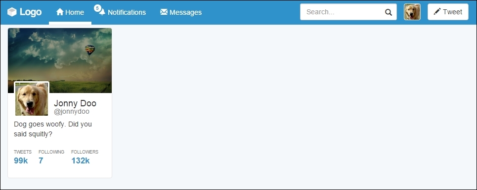
After the #profile-resume card, we will create another one named #profile-photo, which will contain photos of the user. Use the same cards methodology to place this new one after #profile-resume with the following HTML code:
<div id="profile-photo" class="card">
  <div class="card-header">Photos</div>
  <div class="card-block">
    <ul class="list-inline list-unstyled">
      <li>
        <a href="#" class="thumbnail"><img class="img-responsive" src="imgs/landscape-02.jpg"></a>
      </li>
      <li>
        <a href="#" class="thumbnail"><img class="img-responsive" src="imgs/landscape-03.jpg"></a>
      </li>
      <li>
        <a href="#" class="thumbnail"><img class="img-responsive" src="imgs/landscape-04.jpg"></a>
      </li>
      <li>
        <a href="#" class="thumbnail"><img class="img-responsive" src="imgs/landscape-05.jpg"></a>
      </li>
    </ul>
  </div>
</div>
In this card we will create a new card element, .card-header. In Bootstrap 4, you can use the regarding class, but in version 3, you will need this CSS rule:
.card .card-header {
  border-radius: 0.4rem 0.4rem 0 0;
  padding: .75rem 1.25rem;
  background-color: #f5f5f5;
  border-bottom: 0.1em solid #e5e5e5;
  color: #4e5665;
  font-weight: bold;
}
Moving on, the rest of CSS for this card is simple. Just change the image's width and adjust some margins and paddings:
#profile-photo {
  margin-top: 2rem;
}

#profile-photo ul {
  margin: 0;
}

#profile-photo li {
  width: 48%;
  padding: 0;
}
Also note that we are using the .thumbnail class in the <a> tag that wraps the images. This class is useful for nicely styled thumbnail images. It can also be used to wrap text along with an image.
The photo card should look like what is shown in the following screenshot. Again, we will use some more cards in this web application, although we'll talk about that later, when needed.

Learning cards in Bootstrap 4
As was mentioned before, Bootstrap 4 provides Cards components. To make use of them, create a div.card element and start adding elements such as .card-block and .card-img-top:
<div class="card">
  <img class="card-img-top img-responsive" src="imgs/landscape.jpg">
  <div class="card-block">
    <h4 class="card-title">Name</h4>
    <p class="card-text">About text</p>
    <a href="#" class="btn btn-primary">Can add buttons</a>
  </div>
</div>
For the preceding code, the output will look like what is shown in the following screenshot. As we can see, the Card component is pretty simple and straightforward. The component offers some other options as well, but we will talk about that when needed.
Like the famous quote, if you have lemons, make lemonade, in Bootstrap version 3, we do not have the Card component. However, we have the tools needed to make our own Card component for sure! So let's have some lemonade!
We will use the same classes and structures of Bootstrap 4, playing with only the CSS. Therefore, if you are using version 3, you will see the page render like this for the use of the same HTML from version 4:
To squeeze the first lemon, let's create the CSS for the .card class:
.card {
  position: relative;
  border: 0.1rem solid #e5e5e5;
  border-radius: 0.4rem;
  background-color: #FFF;
}
Following this, just add two CSS rules for img.card-img-top and .card-block, as shown here:
.card-img-top {
  border-radius: 0.4rem 0.4rem 0 0;
}

.card-block {
  padding: 1.25rem;
}
Done! We have our own card component ready for Bootstrap 3. The next screenshot presents the final result. Of course, there are some differences of typography and button color, but these are the differences because of the version; the component is perfectly done.
Getting back to the web application, let's add the Card components inside div#profile, at the main container. The HTML code for this section will be as follows:
<div id="profile-resume" class="card">
  <img class="card-img-top img-responsive" src="imgs/landscape.jpg">
  <div class="card-block">
    <img src="imgs/jon.png" class="card-img">
    <h4 class="card-title">Jonny Doo <small>@jonnydoo</small></h4>
    <p class="card-text">Dog goes woofy. Did you said squitly?</p>
    <ul class="list-inline list-unstyled">
      <li id="card-tweets">
        <a href="#">
          <span class="profile-stats">Tweets</span>
          <span class="profile-value">99k</span>
        </a>
      </li>
      <li class="card-following">
        <a href="#">
          <span class="profile-stats">Following</span>
          <span class="profile-value">7</span>
        </a>
      </li>
      <li class="card-followers">
        <a href="#">
          <span class="profile-stats">Followers</span>
          <span class="profile-value">132k</span>
        </a>
      </li>
    </ul>
  </div>
</div>
Breaking down the code, we added some components to .card-block. First of all is the .card-img element, which will represent the profile photography. Following this, we changed .card-title by adding a <small> tag inside <h4>. The last change is the addition of the <ul> list, representing some stats for the profile.
There is no secret in this HTML piece; we just added some elements in a straightforward way. Now it's time for the CSS rules. First, change the position and size of the img.card-img element:
.card-block img.card-img {
  top: 50%;
  margin-top: -36px;
  width: 72px;
  border: 3px solid #FFF;
  border-radius: 0.4rem;
  float: left;
  position: relative;
  z-index: 99;
}
Since it is in the right place, let's correctly align .card-title and add some padding to .card-text:
.card-block .card-title {
  float: left;
  margin: 0;
  margin-left: 0.5em;
}

.card-block .card-title small {
  display: block;
}

.card-block .card-text {
  clear: both;
  padding-top: 0.25em;
  margin-bottom: 1.5em;
}
Tip
Can you change the card block to use flexbox?
Another challenge appears here. Since you have already learned about the usage of flexbox, try to replace the floats in the previous code with some flexbox CSS rules. Just keep in mind that it is recommended for Bootstrap 4 and works only on new browsers.
It is almost looking like the Twitter card on the left; we just need to change the list style inside the profile card. Add this CSS:
.card-block ul a:hover {
  text-decoration: none;
}

.card-block ul .profile-stats {
  color: #777;
  display: block;
  text-transform: uppercase;
  font-size: 0.63em;
}

.card-block ul .profile-value {
  font-size: 1.2em;
  font-weight: bold;
  color: #2F92CA;
}
Well done! It looks prettier than the Twitter component. In the following screenshot, we present the expected result:
After the #profile-resume card, we will create another one named #profile-photo, which will contain photos of the user. Use the same cards methodology to place this new one after #profile-resume with the following HTML code:
<div id="profile-photo" class="card">
  <div class="card-header">Photos</div>
  <div class="card-block">
    <ul class="list-inline list-unstyled">
      <li>
        <a href="#" class="thumbnail"><img class="img-responsive" src="imgs/landscape-02.jpg"></a>
      </li>
      <li>
        <a href="#" class="thumbnail"><img class="img-responsive" src="imgs/landscape-03.jpg"></a>
      </li>
      <li>
        <a href="#" class="thumbnail"><img class="img-responsive" src="imgs/landscape-04.jpg"></a>
      </li>
      <li>
        <a href="#" class="thumbnail"><img class="img-responsive" src="imgs/landscape-05.jpg"></a>
      </li>
    </ul>
  </div>
</div>
In this card we will create a new card element, .card-header. In Bootstrap 4, you can use the regarding class, but in version 3, you will need this CSS rule:
.card .card-header {
  border-radius: 0.4rem 0.4rem 0 0;
  padding: .75rem 1.25rem;
  background-color: #f5f5f5;
  border-bottom: 0.1em solid #e5e5e5;
  color: #4e5665;
  font-weight: bold;
}
Moving on, the rest of CSS for this card is simple. Just change the image's width and adjust some margins and paddings:
#profile-photo {
  margin-top: 2rem;
}

#profile-photo ul {
  margin: 0;
}

#profile-photo li {
  width: 48%;
  padding: 0;
}
Also note that we are using the .thumbnail class in the <a> tag that wraps the images. This class is useful for nicely styled thumbnail images. It can also be used to wrap text along with an image.
The photo card should look like what is shown in the following screenshot. Again, we will use some more cards in this web application, although we'll talk about that later, when needed.
Creating your own cards
Like the famous quote, if you have lemons, make lemonade, in Bootstrap version 3, we do not have the Card component. However, we have the tools needed to make our own Card component for sure! So let's have some lemonade!
We will use the same classes and structures of Bootstrap 4, playing with only the CSS. Therefore, if you are using version 3, you will see the page render like this for the use of the same HTML from version 4:
To squeeze the first lemon, let's create the CSS for the .card class:
.card {
  position: relative;
  border: 0.1rem solid #e5e5e5;
  border-radius: 0.4rem;
  background-color: #FFF;
}
Following this, just add two CSS rules for img.card-img-top and .card-block, as shown here:
.card-img-top {
  border-radius: 0.4rem 0.4rem 0 0;
}

.card-block {
  padding: 1.25rem;
}
Done! We have our own card component ready for Bootstrap 3. The next screenshot presents the final result. Of course, there are some differences of typography and button color, but these are the differences because of the version; the component is perfectly done.
Getting back to the web application, let's add the Card components inside div#profile, at the main container. The HTML code for this section will be as follows:
<div id="profile-resume" class="card">
  <img class="card-img-top img-responsive" src="imgs/landscape.jpg">
  <div class="card-block">
    <img src="imgs/jon.png" class="card-img">
    <h4 class="card-title">Jonny Doo <small>@jonnydoo</small></h4>
    <p class="card-text">Dog goes woofy. Did you said squitly?</p>
    <ul class="list-inline list-unstyled">
      <li id="card-tweets">
        <a href="#">
          <span class="profile-stats">Tweets</span>
          <span class="profile-value">99k</span>
        </a>
      </li>
      <li class="card-following">
        <a href="#">
          <span class="profile-stats">Following</span>
          <span class="profile-value">7</span>
        </a>
      </li>
      <li class="card-followers">
        <a href="#">
          <span class="profile-stats">Followers</span>
          <span class="profile-value">132k</span>
        </a>
      </li>
    </ul>
  </div>
</div>
Breaking down the code, we added some components to .card-block. First of all is the .card-img element, which will represent the profile photography. Following this, we changed .card-title by adding a <small> tag inside <h4>. The last change is the addition of the <ul> list, representing some stats for the profile.
There is no secret in this HTML piece; we just added some elements in a straightforward way. Now it's time for the CSS rules. First, change the position and size of the img.card-img element:
.card-block img.card-img {
  top: 50%;
  margin-top: -36px;
  width: 72px;
  border: 3px solid #FFF;
  border-radius: 0.4rem;
  float: left;
  position: relative;
  z-index: 99;
}
Since it is in the right place, let's correctly align .card-title and add some padding to .card-text:
.card-block .card-title {
  float: left;
  margin: 0;
  margin-left: 0.5em;
}

.card-block .card-title small {
  display: block;
}

.card-block .card-text {
  clear: both;
  padding-top: 0.25em;
  margin-bottom: 1.5em;
}
Tip
Can you change the card block to use flexbox?
Another challenge appears here. Since you have already learned about the usage of flexbox, try to replace the floats in the previous code with some flexbox CSS rules. Just keep in mind that it is recommended for Bootstrap 4 and works only on new browsers.
It is almost looking like the Twitter card on the left; we just need to change the list style inside the profile card. Add this CSS:
.card-block ul a:hover {
  text-decoration: none;
}

.card-block ul .profile-stats {
  color: #777;
  display: block;
  text-transform: uppercase;
  font-size: 0.63em;
}

.card-block ul .profile-value {
  font-size: 1.2em;
  font-weight: bold;
  color: #2F92CA;
}
Well done! It looks prettier than the Twitter component. In the following screenshot, we present the expected result:
After the #profile-resume card, we will create another one named #profile-photo, which will contain photos of the user. Use the same cards methodology to place this new one after #profile-resume with the following HTML code:
<div id="profile-photo" class="card">
  <div class="card-header">Photos</div>
  <div class="card-block">
    <ul class="list-inline list-unstyled">
      <li>
        <a href="#" class="thumbnail"><img class="img-responsive" src="imgs/landscape-02.jpg"></a>
      </li>
      <li>
        <a href="#" class="thumbnail"><img class="img-responsive" src="imgs/landscape-03.jpg"></a>
      </li>
      <li>
        <a href="#" class="thumbnail"><img class="img-responsive" src="imgs/landscape-04.jpg"></a>
      </li>
      <li>
        <a href="#" class="thumbnail"><img class="img-responsive" src="imgs/landscape-05.jpg"></a>
      </li>
    </ul>
  </div>
</div>
In this card we will create a new card element, .card-header. In Bootstrap 4, you can use the regarding class, but in version 3, you will need this CSS rule:
.card .card-header {
  border-radius: 0.4rem 0.4rem 0 0;
  padding: .75rem 1.25rem;
  background-color: #f5f5f5;
  border-bottom: 0.1em solid #e5e5e5;
  color: #4e5665;
  font-weight: bold;
}
Moving on, the rest of CSS for this card is simple. Just change the image's width and adjust some margins and paddings:
#profile-photo {
  margin-top: 2rem;
}

#profile-photo ul {
  margin: 0;
}

#profile-photo li {
  width: 48%;
  padding: 0;
}
Also note that we are using the .thumbnail class in the <a> tag that wraps the images. This class is useful for nicely styled thumbnail images. It can also be used to wrap text along with an image.
The photo card should look like what is shown in the following screenshot. Again, we will use some more cards in this web application, although we'll talk about that later, when needed.
Adding Cards to our web application
Getting back to the web application, let's add the Card components inside div#profile, at the main container. The HTML code for this section will be as follows:
<div id="profile-resume" class="card">
  <img class="card-img-top img-responsive" src="imgs/landscape.jpg">
  <div class="card-block">
    <img src="imgs/jon.png" class="card-img">
    <h4 class="card-title">Jonny Doo <small>@jonnydoo</small></h4>
    <p class="card-text">Dog goes woofy. Did you said squitly?</p>
    <ul class="list-inline list-unstyled">
      <li id="card-tweets">
        <a href="#">
          <span class="profile-stats">Tweets</span>
          <span class="profile-value">99k</span>
        </a>
      </li>
      <li class="card-following">
        <a href="#">
          <span class="profile-stats">Following</span>
          <span class="profile-value">7</span>
        </a>
      </li>
      <li class="card-followers">
        <a href="#">
          <span class="profile-stats">Followers</span>
          <span class="profile-value">132k</span>
        </a>
      </li>
    </ul>
  </div>
</div>
Breaking down the code, we added some components to .card-block. First of all is the .card-img element, which will represent the profile photography. Following this, we changed .card-title by adding a <small> tag inside <h4>. The last change is the addition of the <ul> list, representing some stats for the profile.
There is no secret in this HTML piece; we just added some elements in a straightforward way. Now it's time for the CSS rules. First, change the position and size of the img.card-img element:
.card-block img.card-img {
  top: 50%;
  margin-top: -36px;
  width: 72px;
  border: 3px solid #FFF;
  border-radius: 0.4rem;
  float: left;
  position: relative;
  z-index: 99;
}
Since it is in the right place, let's correctly align .card-title and add some padding to .card-text:
.card-block .card-title {
  float: left;
  margin: 0;
  margin-left: 0.5em;
}

.card-block .card-title small {
  display: block;
}

.card-block .card-text {
  clear: both;
  padding-top: 0.25em;
  margin-bottom: 1.5em;
}
Tip
Can you change the card block to use flexbox?
Another challenge appears here. Since you have already learned about the usage of flexbox, try to replace the floats in the previous code with some flexbox CSS rules. Just keep in mind that it is recommended for Bootstrap 4 and works only on new browsers.
It is almost looking like the Twitter card on the left; we just need to change the list style inside the profile card. Add this CSS:
.card-block ul a:hover {
  text-decoration: none;
}

.card-block ul .profile-stats {
  color: #777;
  display: block;
  text-transform: uppercase;
  font-size: 0.63em;
}

.card-block ul .profile-value {
  font-size: 1.2em;
  font-weight: bold;
  color: #2F92CA;
}
Well done! It looks prettier than the Twitter component. In the following screenshot, we present the expected result:
After the #profile-resume card, we will create another one named #profile-photo, which will contain photos of the user. Use the same cards methodology to place this new one after #profile-resume with the following HTML code:
<div id="profile-photo" class="card">
  <div class="card-header">Photos</div>
  <div class="card-block">
    <ul class="list-inline list-unstyled">
      <li>
        <a href="#" class="thumbnail"><img class="img-responsive" src="imgs/landscape-02.jpg"></a>
      </li>
      <li>
        <a href="#" class="thumbnail"><img class="img-responsive" src="imgs/landscape-03.jpg"></a>
      </li>
      <li>
        <a href="#" class="thumbnail"><img class="img-responsive" src="imgs/landscape-04.jpg"></a>
      </li>
      <li>
        <a href="#" class="thumbnail"><img class="img-responsive" src="imgs/landscape-05.jpg"></a>
      </li>
    </ul>
  </div>
</div>
In this card we will create a new card element, .card-header. In Bootstrap 4, you can use the regarding class, but in version 3, you will need this CSS rule:
.card .card-header {
  border-radius: 0.4rem 0.4rem 0 0;
  padding: .75rem 1.25rem;
  background-color: #f5f5f5;
  border-bottom: 0.1em solid #e5e5e5;
  color: #4e5665;
  font-weight: bold;
}
Moving on, the rest of CSS for this card is simple. Just change the image's width and adjust some margins and paddings:
#profile-photo {
  margin-top: 2rem;
}

#profile-photo ul {
  margin: 0;
}

#profile-photo li {
  width: 48%;
  padding: 0;
}
Also note that we are using the .thumbnail class in the <a> tag that wraps the images. This class is useful for nicely styled thumbnail images. It can also be used to wrap text along with an image.
The photo card should look like what is shown in the following screenshot. Again, we will use some more cards in this web application, although we'll talk about that later, when needed.
Another card using thumbnails
After the #profile-resume card, we will create another one named #profile-photo, which will contain photos of the user. Use the same cards methodology to place this new one after #profile-resume with the following HTML code:
<div id="profile-photo" class="card">
  <div class="card-header">Photos</div>
  <div class="card-block">
    <ul class="list-inline list-unstyled">
      <li>
        <a href="#" class="thumbnail"><img class="img-responsive" src="imgs/landscape-02.jpg"></a>
      </li>
      <li>
        <a href="#" class="thumbnail"><img class="img-responsive" src="imgs/landscape-03.jpg"></a>
      </li>
      <li>
        <a href="#" class="thumbnail"><img class="img-responsive" src="imgs/landscape-04.jpg"></a>
      </li>
      <li>
        <a href="#" class="thumbnail"><img class="img-responsive" src="imgs/landscape-05.jpg"></a>
      </li>
    </ul>
  </div>
</div>
In this card we will create a new card element, .card-header. In Bootstrap 4, you can use the regarding class, but in version 3, you will need this CSS rule:
.card .card-header {
  border-radius: 0.4rem 0.4rem 0 0;
  padding: .75rem 1.25rem;
  background-color: #f5f5f5;
  border-bottom: 0.1em solid #e5e5e5;
  color: #4e5665;
  font-weight: bold;
}
Moving on, the rest of CSS for this card is simple. Just change the image's width and adjust some margins and paddings:
#profile-photo {
  margin-top: 2rem;
}

#profile-photo ul {
  margin: 0;
}

#profile-photo li {
  width: 48%;
  padding: 0;
}
Also note that we are using the .thumbnail class in the <a> tag that wraps the images. This class is useful for nicely styled thumbnail images. It can also be used to wrap text along with an image.
The photo card should look like what is shown in the following screenshot. Again, we will use some more cards in this web application, although we'll talk about that later, when needed.
Moving on, we will implement the main content in the middle of the page. This content will hold the feeds while allowing new tweets.
We need to create the input to send a new message. To do this, create the following HTML code at the div#main element:
<div id="main" class="col-sm-12 col-md-6">
  <div id="main-card" class="card">
    <form id="new-message">
      <div class="input-group">
        <input type="text" class="form-control" placeholder="What is happening?">
        <span class="input-group-addon">
          <span class="glyphicon glyphicon-camera" aria-hidden="true"></span>
        </span>
      </div>
    </form>
  </div>
</div>
For that, we created a form, again making use of input groups, icons, and cards. Can you see the ease provided by Bootstrap again? We just placed the elements with the right classes and everything went perfect. The next CSS takes place with some rules regarding the color and padding of the form:
form#new-message {
  border-radius: 0.4rem 0.4rem 0 0;
  padding: 1em;
  border-bottom: 0.1em solid #CEE4F5;
  background-color: #EBF4FB;
}

form#new-message .input-group-addon {
  background-color: #FFF;
}
At this point, the result should be as shown in the following screenshot. Next up, we will create the other elements.

We have made cool things so far, but the feed is the core of the page. We will create a nice and friendly feed for our web app.
As usual, let's create the HTML code first. The feed will work inside a stacked list. With that in mind, let's create the first element in the list:
<div id="main" class="col-sm-12 col-md-6">
  <div id="main-card" class="card">
    <form id="new-message">
      <div class="input-group">
        <input type="text" class="form-control" placeholder="What is happening?">
        <span class="input-group-addon">
          <span class="glyphicon glyphicon-camera" aria-hidden="true"></span>
        </span>
      </div>
    </form>
    <ul id="feed" class="list-unstyled">
      <li>
        <img src="imgs/doge.jpg" class="feed-avatar img-circle">
        <div class="feed-post">
          <h5>Name <small>@namex - 3h</small></h5>
          <p> You can't hold a dog down without staying down with him!</p>
        </div>
        <div class="action-list">
          <a href="#">
            <span class="glyphicon glyphicon-share-alt" aria-hidden="true"></span>
          </a>
          <a href="#">
            <span class="glyphicon glyphicon-refresh " aria-hidden="true"></span>
            <span class="retweet-count">6</span>
          </a>
          <a href="#">
            <span class="glyphicon glyphicon-star" aria-hidden="true"></span>
          </a>
        </div>
      </li>
    </ul>
  </div>
</div>
The highlighted code is the code added for the list. To understand it, we created an element in the list containing the common stuff inside a post, such as an image, a name, text, and options. Add the .img-circle class to the image in the list to style it using Bootstrap image styles.
With the CSS, we will correctly style the page. For the list and the image, apply the following rules:
ul#feed {
  margin: 0;
}

ul#feed li {
  padding: 1em 1em;
}

ul#feed .feed-avatar {
  width: 13%;
  display: inline-block;
  vertical-align: top;
}
By doing this, you will be correcting the margins and padding while adjusting the size of the image avatar. For the post section, use this CSS:
ul#feed .feed-post {
  width: 80%;
  display: inline-block;
  margin-left: 2%;
}

ul#feed .feed-post h5 {
  font-weight: bold;
  margin-bottom: 0.5rem;
}

ul#feed .feed-post h5 > small {
  font-size: 1.2rem;
}
Finally, with regard to .action-list, set the following styles:
 ul#feed .action-list {
  margin-left: 13%;
  padding-left: 1em;
}

ul#feed .action-list a {
  width: 15%;
  display: inline-block;
}

ul#feed .action-list a:hover {
  text-decoration: none;
}

ul#feed .action-list .retweet-count {
  padding-left: 0.2em;
  font-weight: bold;
}
Refresh your browser and you will get this result:
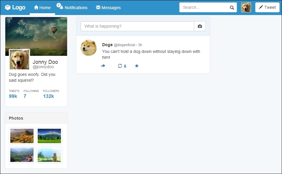
Awesome! Note that for the post, we did all the spacing using percentage values. This is also a great option because the page will resize with respect to the user's resolution very smoothly.
We have only one problem now. Add another post and you will see that there is no divisor between the posts. To illustrate this, add a second post in the HTML code:
<ul id="feed" class="list-unstyled">
  <li>
    <img src="imgs/doge.jpg" class="feed-avatar img-circle">
    <div class="feed-post">
      <h5>Doge <small>@dogeoficial - 3h</small></h5>
      <p>You can't hold a dog down without staying down with him!</p>
    </div>
    <div class="action-list">
      <a href="#">
        <span class="glyphicon glyphicon-share-alt" aria-hidden="true"></span>
      </a>
      <a href="#">
        <span class="glyphicon glyphicon-refresh" aria-hidden="true"></span>
        <span class="retweet-count">6</span>
      </a>
      <a href="#">
        <span class="glyphicon glyphicon-star" aria-hidden="true"></span>
      </a>
    </div>
  </li>

  <li>
    <img src="imgs/laika.jpg" class="feed-avatar img-circle">
    <div class="feed-post">
      <h5>Laika <small>@spacesog - 4h</small></h5>
      <p>That's one small step for a dog, one giant leap for giant</p>
    </div>
    <div class="action-list">
      <a href="#">
        <span class="glyphicon glyphicon-share-alt" aria-hidden="true"></span>
      </a>
      <a href="#">
        <span class="glyphicon glyphicon-refresh" aria-hidden="true"></span>
        <span class="retweet-count">6</span>
      </a>
      <a href="#">
        <span class="glyphicon glyphicon-star" aria-hidden="true"></span>
      </a>
    </div>
  </li>
</ul>
At the CSS, change it a little to correct the padding and add a border between the items, as follows:
ul#feed li {
  padding: 1em 1em;
  border-bottom: 0.1rem solid #e5e5e5;
}

ul#feed li:last-child {
  border-bottom: none;
}
The output results will be like this:
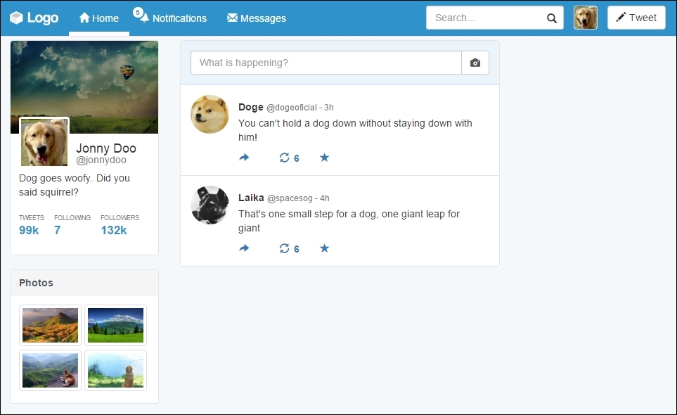
Okay, I know that web applications such as Twitter usually use infinite loading and not pagination, but we need to learn that! Bootstrap offers incredible options for pagination, so let's use some of them right now.
From the start, create the HTML code for the component and insert it just after div.main-card:
<nav class="text-center">
<ul class="pagination pagination-lg">
<li class="disabled"><a href="#" aria-label="Previous"><span aria-hidden="true">«</span></a></li>
<li class="active"><a href="#">1 <span class="sr-only">(current)</span></a></li>
<li><a href="#">2</a></li>
<li class="disabled"><a href="#">...</a></li>
<li><a href="#">3</a></li>
<li><a href="#">4</a></li>
<li><a href="#" aria-label="Next"><span aria-hidden="true">»</span></a></li>
</ul>
</nav>Thus, we must consider a few things here. Firstly, to center the pagination, we used the helper class from Bootstrap, .text-center. This is because ul.pagination does apply the display: inline-block style.
Secondly, we created a <ul> with the .pagination class, determined by the framework. We also added the .pagination-lg class, which is an option of pagination for making it bigger.
Lastly, the .disabled class is present in two items of the list, the previous link and the ellipsis ... one. Also, the list on page 1 is marked as active, changing its background color.
Check out the result of adding pagination in this screenshot:

Making your feed
We have made cool things so far, but the feed is the core of the page. We will create a nice and friendly feed for our web app.
As usual, let's create the HTML code first. The feed will work inside a stacked list. With that in mind, let's create the first element in the list:
<div id="main" class="col-sm-12 col-md-6">
  <div id="main-card" class="card">
    <form id="new-message">
      <div class="input-group">
        <input type="text" class="form-control" placeholder="What is happening?">
        <span class="input-group-addon">
          <span class="glyphicon glyphicon-camera" aria-hidden="true"></span>
        </span>
      </div>
    </form>
    <ul id="feed" class="list-unstyled">
      <li>
        <img src="imgs/doge.jpg" class="feed-avatar img-circle">
        <div class="feed-post">
          <h5>Name <small>@namex - 3h</small></h5>
          <p> You can't hold a dog down without staying down with him!</p>
        </div>
        <div class="action-list">
          <a href="#">
            <span class="glyphicon glyphicon-share-alt" aria-hidden="true"></span>
          </a>
          <a href="#">
            <span class="glyphicon glyphicon-refresh " aria-hidden="true"></span>
            <span class="retweet-count">6</span>
          </a>
          <a href="#">
            <span class="glyphicon glyphicon-star" aria-hidden="true"></span>
          </a>
        </div>
      </li>
    </ul>
  </div>
</div>
The highlighted code is the code added for the list. To understand it, we created an element in the list containing the common stuff inside a post, such as an image, a name, text, and options. Add the .img-circle class to the image in the list to style it using Bootstrap image styles.
With the CSS, we will correctly style the page. For the list and the image, apply the following rules:
ul#feed {
  margin: 0;
}

ul#feed li {
  padding: 1em 1em;
}

ul#feed .feed-avatar {
  width: 13%;
  display: inline-block;
  vertical-align: top;
}
By doing this, you will be correcting the margins and padding while adjusting the size of the image avatar. For the post section, use this CSS:
ul#feed .feed-post {
  width: 80%;
  display: inline-block;
  margin-left: 2%;
}

ul#feed .feed-post h5 {
  font-weight: bold;
  margin-bottom: 0.5rem;
}

ul#feed .feed-post h5 > small {
  font-size: 1.2rem;
}
Finally, with regard to .action-list, set the following styles:
 ul#feed .action-list {
  margin-left: 13%;
  padding-left: 1em;
}

ul#feed .action-list a {
  width: 15%;
  display: inline-block;
}

ul#feed .action-list a:hover {
  text-decoration: none;
}

ul#feed .action-list .retweet-count {
  padding-left: 0.2em;
  font-weight: bold;
}
Refresh your browser and you will get this result:
Awesome! Note that for the post, we did all the spacing using percentage values. This is also a great option because the page will resize with respect to the user's resolution very smoothly.
We have only one problem now. Add another post and you will see that there is no divisor between the posts. To illustrate this, add a second post in the HTML code:
<ul id="feed" class="list-unstyled">
  <li>
    <img src="imgs/doge.jpg" class="feed-avatar img-circle">
    <div class="feed-post">
      <h5>Doge <small>@dogeoficial - 3h</small></h5>
      <p>You can't hold a dog down without staying down with him!</p>
    </div>
    <div class="action-list">
      <a href="#">
        <span class="glyphicon glyphicon-share-alt" aria-hidden="true"></span>
      </a>
      <a href="#">
        <span class="glyphicon glyphicon-refresh" aria-hidden="true"></span>
        <span class="retweet-count">6</span>
      </a>
      <a href="#">
        <span class="glyphicon glyphicon-star" aria-hidden="true"></span>
      </a>
    </div>
  </li>

  <li>
    <img src="imgs/laika.jpg" class="feed-avatar img-circle">
    <div class="feed-post">
      <h5>Laika <small>@spacesog - 4h</small></h5>
      <p>That's one small step for a dog, one giant leap for giant</p>
    </div>
    <div class="action-list">
      <a href="#">
        <span class="glyphicon glyphicon-share-alt" aria-hidden="true"></span>
      </a>
      <a href="#">
        <span class="glyphicon glyphicon-refresh" aria-hidden="true"></span>
        <span class="retweet-count">6</span>
      </a>
      <a href="#">
        <span class="glyphicon glyphicon-star" aria-hidden="true"></span>
      </a>
    </div>
  </li>
</ul>
At the CSS, change it a little to correct the padding and add a border between the items, as follows:
ul#feed li {
  padding: 1em 1em;
  border-bottom: 0.1rem solid #e5e5e5;
}

ul#feed li:last-child {
  border-bottom: none;
}
The output results will be like this:
Okay, I know that web applications such as Twitter usually use infinite loading and not pagination, but we need to learn that! Bootstrap offers incredible options for pagination, so let's use some of them right now.
From the start, create the HTML code for the component and insert it just after div.main-card:
<nav class="text-center">
<ul class="pagination pagination-lg">
<li class="disabled"><a href="#" aria-label="Previous"><span aria-hidden="true">«</span></a></li>
<li class="active"><a href="#">1 <span class="sr-only">(current)</span></a></li>
<li><a href="#">2</a></li>
<li class="disabled"><a href="#">...</a></li>
<li><a href="#">3</a></li>
<li><a href="#">4</a></li>
<li><a href="#" aria-label="Next"><span aria-hidden="true">»</span></a></li>
</ul>
</nav>Thus, we must consider a few things here. Firstly, to center the pagination, we used the helper class from Bootstrap, .text-center. This is because ul.pagination does apply the display: inline-block style.
Secondly, we created a <ul> with the .pagination class, determined by the framework. We also added the .pagination-lg class, which is an option of pagination for making it bigger.
Lastly, the .disabled class is present in two items of the list, the previous link and the ellipsis ... one. Also, the list on page 1 is marked as active, changing its background color.
Check out the result of adding pagination in this screenshot:
Doing some pagination
Okay, I know that web applications such as Twitter usually use infinite loading and not pagination, but we need to learn that! Bootstrap offers incredible options for pagination, so let's use some of them right now.
From the start, create the HTML code for the component and insert it just after div.main-card:
<nav class="text-center">
<ul class="pagination pagination-lg">
<li class="disabled"><a href="#" aria-label="Previous"><span aria-hidden="true">«</span></a></li>
<li class="active"><a href="#">1 <span class="sr-only">(current)</span></a></li>
<li><a href="#">2</a></li>
<li class="disabled"><a href="#">...</a></li>
<li><a href="#">3</a></li>
<li><a href="#">4</a></li>
<li><a href="#" aria-label="Next"><span aria-hidden="true">»</span></a></li>
</ul>
</nav>Thus, we must consider a few things here. Firstly, to center the pagination, we used the helper class from Bootstrap, .text-center. This is because ul.pagination does apply the display: inline-block style.
Secondly, we created a <ul> with the .pagination class, determined by the framework. We also added the .pagination-lg class, which is an option of pagination for making it bigger.
Lastly, the .disabled class is present in two items of the list, the previous link and the ellipsis ... one. Also, the list on page 1 is marked as active, changing its background color.
Check out the result of adding pagination in this screenshot:
To make use of Bootstrap breadcrumbs, we will add it to our web app. Note that we will do this step for learning purposes so that you will be able to create it when you need it.
Like pagination, Bootstrap offers a component for breadcrumbs as well. For that, create an ordered list just after the open tag div#main:
<div id="main" class="col-sm-12 col-md-6">

  <ol class="breadcrumb card">
    <li><a href="#">Home</a></li>
    <li><a href="#">Profile</a></li>
    <li class="active">Feed</li>
  </ol>
  …
</div>
The cool thing about Bootstrap breadcrumbs is that the separator bars are automatically added through :before and the content CSS option, so you do not need to worry about them.
Note that the .card class was added to the breadcrumbs component to keep the web app style. The following screenshot presents the result of breadcrumbs:

Well, we are almost done. It is time to create the right-hand-side content of our web app. The right-hand-side content contains information such as Whom to follow and the about page. Let's create it!
Coming to the HTML, let's create another Card component inside div.right-content, as follows:
<div id="right-content" class="col-md-3 hidden-sm hidden-xs">
  <div id="who-follow" class="card">
    <div class="card-header">
      Who to follow
    </div>
    <div class="card-block">

    </div>
  </div>
</div>
Inside .card-block, create a vertical list:
<div id="right-content" class="col-md-3 hidden-sm hidden-xs">
  <div id="who-follow" class="card">
    <div class="card-header">

      Who to follow
    </div>
    <div class="card-block">
      <ul class="list-unstyled">
        <li>
          <img src="imgs/cat.jpg" class="img-rounded">
          <div class="info">
            <strong>Crazy cats</strong>
            <button class="btn btn-default">
              <span class="glyphicon glyphicon-plus" aria-hidden="true"></span> Follow
            </button>
          </div>
        </li>
        <li>
          <img src="imgs/ration.jpg" class="img-rounded">
          <div class="info">
            <strong>Free ration alert</strong>
            <button class="btn btn-default">
              <span class="glyphicon glyphicon-plus" aria-hidden="true"></span> Follow
            </button>
          </div>
        </li>
      </ul>
    </div>
  </div>
</div>
So, the result without the CSS is not good, as shown in the following screenshot. We need to fix it.
First, we add margins for the items in the list:
div#who-follow li {
  margin-bottom: 2em;
}

div#who-follow li:last-child {
  margin-bottom: 0;
}
Then, we adjust the size of the image and the following text:
div#who-follow li img {
  width: 26%;
  display: inline-block;
  vertical-align: top;
  margin-right: 2%;
}

div#who-follow li .info {
  width: 68%;
  display: inline-block;
}
To finish this, we adjust the content inside the .info element:
div#who-follow li .info strong {
  display: block;
  overflow:hidden;
  text-overflow: ellipsis;
}

div#who-follow li .info .glyphicon {
  color: #2F92CA;
}
The result should look like what is shown here:
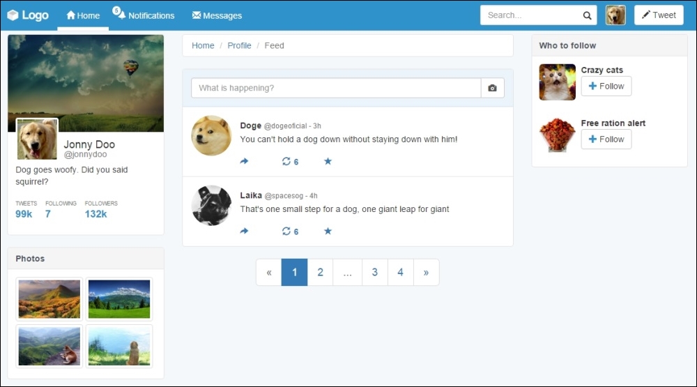
To end the main web page content, let's create another card that has content about the web app, such as help, privacy, and so on. After the div#who-follow, create another card:
<div id="app-info" class="card">
  <div class="card-block">
    © 2015 SampleApp
    <ul class="list-unstyled list-inline">
      <li><a href="#">About</a></li>
      <li><a href="#">Terms and Privacy</a></li>
      <li><a href="#">Help</a></li>
      <li><a href="#">Status</a></li>
      <li><a href="#">Contact</a></li>
    </ul>
  </div>
  <div class="card-footer">
    <a href="#">Connect other address book</a>
  </div>
</div>
First of all, note that we have just used .card-footer for this card. If you are using Bootstrap 3, add the next CSS:
.card .card-footer {
  border-radius: 0 0 0.4rem 0.4rem;
  padding: .75rem 1.25rem;
  background-color: #f5f5f5;
  border-top: 0.1em solid #e5e5e5;
  color: #4e5665;
}
For this card, we also need to add some margin within the card above:
div#app-info {
margin-top: 2rem;
}That looks great! We have finished the majority of the components in our web application! The next image shows the final result that we will cover at this chapter. Great work!
In this chapter, we started the development of another example—an awesome web application like Twitter. We started creating every component with the help of Bootstrap, while also customizing each one. By the end of the chapter, we were done with the major part of the components to be added.
First, we created a fully customized navigation bar that works on any device. Just like at every component, we took special care with different visualizations for mobiles and desktops.
We talked a lot about cards. This is a new component in Bootstrap 4, but we created our own for version 3, so we nailed it all. Cards are present in every column, having different content and placements of items.
We also discussed the use of other Bootstrap components by making use of breadcrumbs, pagination, and thumbnails.
I hope now you feel confident about web application development, because in the next chapter, we will take a step further in this kind of development by using other Bootstrap components and more customization.