
It is finally time to take our last step through the landing page example. After learning all the basics of Bootstrap, passing from side to side of the grid system, mobile-first development, and using Bootstrap HTML elements, the landing page example has come to an end. Now it is time to go a little deeper and acquire more knowledge of this beautiful framework—Bootstrap.
In this chapter, we will focus on adding components all over the landing page. We will also touch upon the flexbox option, present in version 4. After all has been said, our landing page will be ready for the production stage. Get ready for the key points that we will cover in this chapter:
- Glyphicon icons
- Navigation bars
- The Drop-down component
- Input grouping
- Flexbox Bootstrap usage
Bootstrap is such a nice thing! It provides for us more than 250 icons ready for use and fully resizable. The icons were created from the Glyphicon Halflings set (http://glyphicons.com/). They are fully rendered as fonts, so you can customize both size and color for each one of them. To make use of that, let's see the features section on the landing page. As you can see, we let this section be a little simpler. By adding some fonts, we will get a nicer result:
<section id="features">
  <div class="container">

    <!-- row 5 -->
    <div class="row">
      <div class="col-sm-12">
        <h3 class="text-center">Features</h3>
        <p class="text-center">Features headline message</p>
      </div>
    </div>

    <!-- row 6 -->
    <div class="row">
      <div class="col-sm-2 col-md-4">
        <div class="feature">
          <span class="glyphicon glyphicon-screenshot" aria-hidden="true"></span>
          <span class="feature-tag">Product focus</span>
        </div>
      </div>
      <div class="col-sm-2 col-md-4">
        <div class="feature">
          <span class="glyphicon glyphicon-education" aria-hidden="true"></span>
          <span class="feature-tag">Teaching as a passion</span>
        </div>
      </div>
      <div class="col-sm-2 col-md-4">
        <div class="feature">
          <span class="glyphicon glyphicon-send" aria-hidden="true"></span>
          <span class="feature-tag">Spreading knowledge</span>
        </div>
      </div>
      <div class="col-sm-2 col-md-4">
        <div class="feature">
          <span class="glyphicon glyphicon-hourglass" aria-hidden="true"></span>
          <span class="feature-tag">Save your day time</span>
        </div>
      </div>
      <div class="col-sm-2 col-md-4">
        <div class="feature">
          <span class="glyphicon glyphicon-sunglasses" aria-hidden="true"></span>
          <span class="feature-tag">Make it fancy</span>
        </div>
      </div>
      <div class="col-sm-2 col-md-4">
        <div class="feature">
          <span class="glyphicon glyphicon-heart" aria-hidden="true"></span>
          <span class="feature-tag">Made with love</span>
        </div>
      </div>
      </div>
    </div>
  </div>
</section>
So, from the beginning, here is the code of the modified features section. The bold text corresponds to the icon additions. It is pretty simple to add an icon. Just check out the options at http://getbootstrap.com/components/#glyphicons, copy the class code, and use it in an element. Note that you must add both classes, .glyphicon and .glyphicon-*.
Tip
The aria-hidden property
You may have noticed that there is a property called aria-hidden="true" present in all the icons. The reason for this is that the fonts are represented as Unicode characters, meaning they may represent words. Therefore, to prevent that accessibility, screen readers start reading those characters such as they are words, the aria-hidden attribute prevents that.
Even more, we made some changes to the CSS file, adding more rules for the current working section. Add the following style to the base.css file, located in the css folder:
section#features .feature {
  padding-top: 2rem;
  padding-bottom: 4rem;
  text-align: center;
}

section#features .glyphicon {
  font-size: 2rem;
}

section#features .glyphicon-heart {
  color: #E04C4C;
}

section#features .feature-tag {
  max-width: 10.7em;
  display: inline-block;
  text-align: left;
  margin-left: 1.5em;
  font-size: 1.7rem;
}
With this, we want to show some nice options that you can use with icons. The first one is that you can change the size of the icon by changing its font size. In our case, we set it to font-size: 2rem. The second one is that icons provide the option to change their color by just adding the CSS color rule. We applied it to the heart icon, because the heart must be red—color: #E04C4C.

The preceding screenshot shows the final result of the Features section. As you can see, it is pretty simple to use icons in Bootstrap. Also, the possibilities that the framework offers are very suitable for daily adjustments, such changing icons' colors and sizes.
Tip
Using other icons sets
There are plenty of other icon sets out there that can be used just like glyphicons for Bootstrap. Among all of them, it is worth mentioning Font Awesome (https://fortawesome.github.io/Font-Awesome/). It stands out from others, since it was the first icon set to use font encoding, together with a wide variety of icons.
Bootstrap offers a very nice navigation bar to be placed at the top of website, or even in places where you want that behavior. Let's change our header section to make it our navigation bar. It will stick to the top of the web page, working as a navigation menu.
First of all, let's use a <nav> element and add to it the .navbar and .navbar-default classes, which are required for the component, and the .navbar-fixed-top class to fix the element at the top. Replace the <header> HTML section with the following code:
<nav class="navbar navbar-default navbar-fixed-top">
  <div class="navbar-header">
    <a class="navbar-brand" href="landing_page.html">Company name</a>
  </div>
  <div class="navbar-right">
      <ul class="nav navbar-nav">
        <li><a href="#about">About</a></li>
        <li><a href="#features">Features</a></li>
        <li><a href="#pricing">Pricing</a></li>
        <li><a href="contact.html">Contact</a></li>
      </ul>
  </div>
</nav>
As was mentioned, the .navbar and .navbar-default classes are required for the navigation component. For the Company name link, we added a class, .navbar-brand, which has the purpose of branding the heading with an appropriate font size and padding.
Then, we created a <div> tag using the .navbar-right class to provide a set padding CSS rules and place the list to the right to appear the same way as was before. For the CSS, just add the following rule to create a padding to the <body> of your page:
body {
  padding-top: 3.6em;
}

#nav-menu {
  margin-right: 1rem;
}
The result of the navigation bar should be like what is presented in the following screenshot:

Try to resize the web page and you will see that for small viewports, the horizontal list placed in the navigation will stack vertically, as illustrated in the next screenshot. Fortunately, Bootstrap has the option to collapse the lists at the navigation bar. The procedure for doing this is pretty simple and we will do it now.
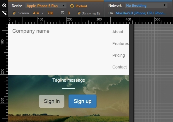
So, let's make the .nav-header collapses and create a toggle button to show or hide the list menu. Change the HTML to this:
<nav class="navbar navbar-default navbar-fixed-top">
  <div class="navbar-header">
    <a class="navbar-brand" href="landing_page.html">Company name</a>
    <button type="button" class="navbar-toggle collapsed" data-toggle="collapse" data-target="#nav-menu" aria-expanded="false">
      <span class="sr-only">Toggle navigation</span>
      <span class="icon-bar"></span>
      <span class="icon-bar"></span>
      <span class="icon-bar"></span>
    </button>
  </div>

  <div id="nav-menu" class="collapse navbar-collapse navbar-right">
      <ul class="nav navbar-nav">
        <li><a href="#about">About</a></li>
        <li><a href="#features">Features</a></li>
        <li><a href="#pricing">Pricing</a></li>
        <li><a href="contact.html">Contact</a></li>
      </ul>
  </div>
</nav>
The new code is in bold. First, we added a <button> element to create our sandwich button (the one with three dashes). On data-target, we must add the element that is the collapse target, #nav-menu in our case.
Then, we must say which is the element to be collapsed in the small viewport, so for .navbar-right, we added the .collapse.navbar-collapse classes. The navigation bar should then appear like the one shown in the following screenshot. Hooray! Bootstrap has saved the day again!

For this example, we fixed the navigation bar to the top of our web page, although we can use different attachments. For instance, we can attach the navigation bar to the bottom using the .navbar-fixed-bottom class.
The bar can also be static. For that, use the .navbar-static-* class, where the asterisk can mean top or bottom. If you are using the static navigation bars, you must place a container (static or fluid) right in the next level of the component:
<nav class="navbar navbar-default navbar-static-top">
  <div class="container">
    …
  </div>
</nav>You can also change the color of the navigation bar. Bootstrap version 3 offers an inverted set of colors. To do so, add the .navbar-inverse class to the <nav> element, as follows:
<nav class="navbar navbar-inverse">
  …
</nav>
In version 4, they added other color options. So if the background of your navigation bar has a dark color, add the .navbar-dark class to make the text and other elements white. If the background has a light color, use the .navbar-light class to get the opposite result.
For the background color, you can pass a class called .bg-*, where the asterisk means a set of colors from Bootstrap. These are default, primary, info, success, warning, or danger:
<nav class="navbar navbar-dark bg-danger">
  …
</nav>
Until the navigation collapse
Try to resize the web page and you will see that for small viewports, the horizontal list placed in the navigation will stack vertically, as illustrated in the next screenshot. Fortunately, Bootstrap has the option to collapse the lists at the navigation bar. The procedure for doing this is pretty simple and we will do it now.
So, let's make the .nav-header collapses and create a toggle button to show or hide the list menu. Change the HTML to this:
<nav class="navbar navbar-default navbar-fixed-top">
  <div class="navbar-header">
    <a class="navbar-brand" href="landing_page.html">Company name</a>
    <button type="button" class="navbar-toggle collapsed" data-toggle="collapse" data-target="#nav-menu" aria-expanded="false">
      <span class="sr-only">Toggle navigation</span>
      <span class="icon-bar"></span>
      <span class="icon-bar"></span>
      <span class="icon-bar"></span>
    </button>
  </div>

  <div id="nav-menu" class="collapse navbar-collapse navbar-right">
      <ul class="nav navbar-nav">
        <li><a href="#about">About</a></li>
        <li><a href="#features">Features</a></li>
        <li><a href="#pricing">Pricing</a></li>
        <li><a href="contact.html">Contact</a></li>
      </ul>
  </div>
</nav>
The new code is in bold. First, we added a <button> element to create our sandwich button (the one with three dashes). On data-target, we must add the element that is the collapse target, #nav-menu in our case.
Then, we must say which is the element to be collapsed in the small viewport, so for .navbar-right, we added the .collapse.navbar-collapse classes. The navigation bar should then appear like the one shown in the following screenshot. Hooray! Bootstrap has saved the day again!
For this example, we fixed the navigation bar to the top of our web page, although we can use different attachments. For instance, we can attach the navigation bar to the bottom using the .navbar-fixed-bottom class.
The bar can also be static. For that, use the .navbar-static-* class, where the asterisk can mean top or bottom. If you are using the static navigation bars, you must place a container (static or fluid) right in the next level of the component:
<nav class="navbar navbar-default navbar-static-top">
  <div class="container">
    …
  </div>
</nav>You can also change the color of the navigation bar. Bootstrap version 3 offers an inverted set of colors. To do so, add the .navbar-inverse class to the <nav> element, as follows:
<nav class="navbar navbar-inverse">
  …
</nav>
In version 4, they added other color options. So if the background of your navigation bar has a dark color, add the .navbar-dark class to make the text and other elements white. If the background has a light color, use the .navbar-light class to get the opposite result.
For the background color, you can pass a class called .bg-*, where the asterisk means a set of colors from Bootstrap. These are default, primary, info, success, warning, or danger:
<nav class="navbar navbar-dark bg-danger">
  …
</nav>
Using different attachments
For this example, we fixed the navigation bar to the top of our web page, although we can use different attachments. For instance, we can attach the navigation bar to the bottom using the .navbar-fixed-bottom class.
The bar can also be static. For that, use the .navbar-static-* class, where the asterisk can mean top or bottom. If you are using the static navigation bars, you must place a container (static or fluid) right in the next level of the component:
<nav class="navbar navbar-default navbar-static-top">
  <div class="container">
    …
  </div>
</nav>You can also change the color of the navigation bar. Bootstrap version 3 offers an inverted set of colors. To do so, add the .navbar-inverse class to the <nav> element, as follows:
<nav class="navbar navbar-inverse">
  …
</nav>
In version 4, they added other color options. So if the background of your navigation bar has a dark color, add the .navbar-dark class to make the text and other elements white. If the background has a light color, use the .navbar-light class to get the opposite result.
For the background color, you can pass a class called .bg-*, where the asterisk means a set of colors from Bootstrap. These are default, primary, info, success, warning, or danger:
<nav class="navbar navbar-dark bg-danger">
  …
</nav>
Coloring the bar
You can also change the color of the navigation bar. Bootstrap version 3 offers an inverted set of colors. To do so, add the .navbar-inverse class to the <nav> element, as follows:
<nav class="navbar navbar-inverse">
  …
</nav>
In version 4, they added other color options. So if the background of your navigation bar has a dark color, add the .navbar-dark class to make the text and other elements white. If the background has a light color, use the .navbar-light class to get the opposite result.
For the background color, you can pass a class called .bg-*, where the asterisk means a set of colors from Bootstrap. These are default, primary, info, success, warning, or danger:
<nav class="navbar navbar-dark bg-danger">
  …
</nav>
It is time to go back to the buttons once more. Now we will use the buttons dropdown. Button dropdowns are great for grouping a set of options in a single button. It can be used in several situations.
To make use of these, you just need to make some small markups and class usages. We will also go a little further and add a button dropdown to our new navigation bar. The complete HTML code of the <nav> tag is this one:
<nav class="navbar navbar-default navbar-fixed-top">
<div class="navbar-header">
<a class="navbar-brand" href="landing_page.html">Company name</a>
<button type="button" class="navbar-toggle collapsed" data-toggle="collapse" data-target="#nav-menu" aria-expanded="false">
<span class="sr-only">Toggle navigation</span>
<span class="icon-bar"></span>
<span class="icon-bar"></span>
<span class="icon-bar"></span>
</button>
<!-- <a class="btn btn-primary navbar-btn pull-right" href="#" role="button">Sign up</a> -->
</div>
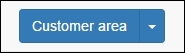
<div class="btn-group pull-right">
<button type="button" class="btn btn-primary dropdown-toggle" data-toggle="dropdown" aria-haspopup="true" aria-expanded="false">
Customer area <span class="caret"></span>
</button>
<ul class="dropdown-menu">
<li><a href="#">Action</a></li>
<li><a href="#">Another action</a></li>
<li><a href="#">Something else here</a></li>
<li role="separator" class="divider"></li>
<li><a href="#">Separated link</a></li>
</ul>
</div>
<div id="nav-menu" class="collapse navbar-collapse navbar-right">
<ul class="nav navbar-nav">
<li><a href="#about">About</a></li>
<li><a href="#features">Features</a></li>
<li><a href="#pricing">Pricing</a></li>
<li><a href="contact.html">Contact</a></li>
</ul>
</div>
</nav>The highlighted code is the new one for the drop-down button. We have to create a <button>, followed by a list <ul>, all of that wrapped by a div.btn-group. It is a pretty strict piece of code that should be used for these components.
Regarding the CSS, we must add some spacing between the button and the list. So, the CSS for the button drop-down is as follows:
 nav .btn-group {
  margin: 0.8rem 2rem 0 0;
}
The result for the button is presented in the following screenshot:

Oops! If you see the example for large devices, the new button looks pretty good, although it looks badly placed for small devices. Let's fix this with a media query!
@media(max-width: 48em){
  nav .btn-group {
    position: absolute;
    top: 0;
    right: 4em;
  }
}
After the fix, the output that you get should be as shown in this screenshot:

The Bootstrap buttons dropdown offers some custom options. The first one that we will discuss is the split option. To do this, you need to change your HTML a bit:
<div class="btn-group pull-right">
  <button type="button" class="btn btn-primary">Customer area</button>
  <button type="button" class="btn btn-primary dropdown-toggle" data-toggle="dropdown" aria-haspopup="true" aria-expanded="false">
    <span class="caret"></span>
    <span class="sr-only">Toggle Dropdown</span>
  </button>
  <ul class="dropdown-menu">
    <li><a href="#">Action</a></li>
    <li><a href="#">Another action</a></li>
    <li><a href="#">Something else here</a></li>
    <li role="separator" class="divider"></li>
    <li><a href="#">Separated link</a></li>
  </ul>
</div>
The main difference is the bold text, where we create another button, which will be responsible for the split effect, as shown in the following screenshot:
Moving on, you can make the drop-down a "drop-up". To do that, simply add the class to div.btn-group:
<div class="btn-group dropup">
  ...
</div>
Customizing buttons dropdown
The Bootstrap buttons dropdown offers some custom options. The first one that we will discuss is the split option. To do this, you need to change your HTML a bit:
<div class="btn-group pull-right">
  <button type="button" class="btn btn-primary">Customer area</button>
  <button type="button" class="btn btn-primary dropdown-toggle" data-toggle="dropdown" aria-haspopup="true" aria-expanded="false">
    <span class="caret"></span>
    <span class="sr-only">Toggle Dropdown</span>
  </button>
  <ul class="dropdown-menu">
    <li><a href="#">Action</a></li>
    <li><a href="#">Another action</a></li>
    <li><a href="#">Something else here</a></li>
    <li role="separator" class="divider"></li>
    <li><a href="#">Separated link</a></li>
  </ul>
</div>
The main difference is the bold text, where we create another button, which will be responsible for the split effect, as shown in the following screenshot:
Moving on, you can make the drop-down a "drop-up". To do that, simply add the class to div.btn-group:
<div class="btn-group dropup">
  ...
</div>
As we discussed in the last chapter, it is possible to group components together with inputs, as we did to the sign form in the home page. However, it is possible to add even more things to inputs. We will talk about some group options that can be useful.
First of all, let's exemplify the usage of grouping inputs and buttons. The main idea is almost the same—creating a div.input-group, and creating an input and a button inside this element, as shown in this HTML code:
<div class="input-group">
  <input type="text" class="form-control" placeholder="Type the page title...">
  <span class="input-group-btn">
    <button class="btn btn-success" type="button">Search</button>
  </span>
</div>
The output of the preceding code is shown in the following screenshot:

The only trick here is to add a <span> element wrapping the button. If you invert the input order with the button, you will prepend the button to the input:
<div class="input-group">
  <span class="input-group-btn">
    <button class="btn btn-success" type="button">Search</button>
  </span>
  <input type="text" class="form-control" placeholder="Type the page title...">
</div>
The output of the preceding code is shown in this screenshot:

Bootstrap also gives us the possibility to add any other kind of button. To exemplify this, let's now add a button dropdown grouped with an input. Replace <button> with the button dropdown that we just used in the previous example:
<div class="input-group">
  <span class="input-group-btn">
    <div class="btn-group pull-right">
        <button type="button" class="btn btn-primary dropdown-toggle" data-toggle="dropdown" aria-haspopup="true" aria-expanded="false">
          Customer area <span class="caret"></span>
        </button>
        <ul class="dropdown-menu">
          <li><a href="#">Action</a></li>
          <li><a href="#">Another action</a></li>
          <li><a href="#">Something else here</a></li>
          <li role="separator" class="divider"></li>
          <li><a href="#">Separated link</a></li>
        </ul>
      </div>
  </span>
  <input type="text" class="form-control" placeholder="Type the page title...">
</div>
It is pretty simple; you can add almost any kind of button, prepended or appended in an input. The following screenshot shows the result of the previous HTML code:

In version 4 of Bootstrap, flexbox support has finally arrived! However, it is an opt-in that can be used. The first step is to understand a little bit of flexbox, just in case you don't know, and then start using it.
We will not add any other element to our landing page example, since support for flexbox just begun with Bootstrap 4. We will cover it only to clarify this new option.
The definition of flexbox came out with the CSS3 specifications. Its main purpose is to better organize elements in a web page in a predictable manner. It can be seen as an option similar to float but one that offers a lot more choices, such as reordering elements and avoiding known issues of float, for example, the clearfix workaround.
For a hierarchical organization, first of all, you need to wrap the element of all the flex items (such as the columns inside a .row). It is also possible to play with the direction and axis from the wrapping element.
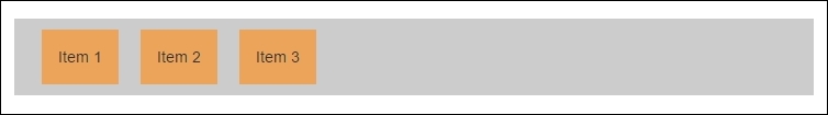
To exemplify the usage, let's create an HTML example. Create another file, named flexbox.html, use your base template and place the HTML code inside the <body> tag:
<body>
  <div class="wrapping-flex">
    <div class="item1">Item 1</div>
    <div class="item2">Item 2</div>
    <div class="item3">Item 3</div>
  </div>
</body>
So, in this case, we must make the div.wrapping-flex the flex wrapping element. Apply the following CSS and you will get the child elements placed inline:
.wrapping-flex {
  display: -webkit-flex;
  display: flex;
  background-color: #CCC;
}

.wrapping-flex > div {
  background-color: #ECA45A;
  margin: 1rem;
  padding: 1.5rem;
}
Create this is a sample HTML page and you will get the following output:
There are a plenty of options for flexbox. I do recommend the guide at https://css-tricks.com/snippets/css/a-guide-to-flexbox/ for you to learn more about flexbox, since it is not our focus.
However, let's show a very powerful use case of flexbox. Have you ever faced a problem with aligning one div inside another vertically? I hope not, because it can be a pain in the neck, even more if you made it for older browsers.
With flexbox, we just have to apply the following CSS:
.wrapping-flex {
  display: -webkit-flex;
  display: flex;
  background-color: #CCC;
  height: 12rem;
  width: 50%;
  margin-left: 20%;
}

.wrapping-flex > div {
  background-color: #ECA45A;
  margin: 1rem;
  padding: 1.5rem;
}

.wrapping-flex .item2 {
  align-self: center;
  height: 5rem;
}
We added a height: 12rem to the wrapping element and set align-self: center and height: 5rem to the .item2 element. With that, we align the second flex child <div> in the center, while the other two children continue to occupy the full height, as shown in the following screenshot:

Version 4 of Bootstrap provides two ways to use flexbox. The first one is with Sass, where you need to set the $enable-flex variable to the true state.
The other option is to download the compiled CSS version using the flex opt-in. The compiled version can be found in the Bootstrap repository (https://github.com/twbs/bootstrap/releases).
With regard to using flexbox, you will have limited browser support, since not all browsers are ready for this property. Consider using it if you will have access only from new browsers, such as Internet Explorer versions newer than v10.
Check out the currently available support for the flexbox property here:
Understanding flexbox
The definition of flexbox came out with the CSS3 specifications. Its main purpose is to better organize elements in a web page in a predictable manner. It can be seen as an option similar to float but one that offers a lot more choices, such as reordering elements and avoiding known issues of float, for example, the clearfix workaround.
For a hierarchical organization, first of all, you need to wrap the element of all the flex items (such as the columns inside a .row). It is also possible to play with the direction and axis from the wrapping element.
To exemplify the usage, let's create an HTML example. Create another file, named flexbox.html, use your base template and place the HTML code inside the <body> tag:
<body>
  <div class="wrapping-flex">
    <div class="item1">Item 1</div>
    <div class="item2">Item 2</div>
    <div class="item3">Item 3</div>
  </div>
</body>
So, in this case, we must make the div.wrapping-flex the flex wrapping element. Apply the following CSS and you will get the child elements placed inline:
.wrapping-flex {
  display: -webkit-flex;
  display: flex;
  background-color: #CCC;
}

.wrapping-flex > div {
  background-color: #ECA45A;
  margin: 1rem;
  padding: 1.5rem;
}
Create this is a sample HTML page and you will get the following output:
There are a plenty of options for flexbox. I do recommend the guide at https://css-tricks.com/snippets/css/a-guide-to-flexbox/ for you to learn more about flexbox, since it is not our focus.
However, let's show a very powerful use case of flexbox. Have you ever faced a problem with aligning one div inside another vertically? I hope not, because it can be a pain in the neck, even more if you made it for older browsers.
With flexbox, we just have to apply the following CSS:
.wrapping-flex {
  display: -webkit-flex;
  display: flex;
  background-color: #CCC;
  height: 12rem;
  width: 50%;
  margin-left: 20%;
}

.wrapping-flex > div {
  background-color: #ECA45A;
  margin: 1rem;
  padding: 1.5rem;
}

.wrapping-flex .item2 {
  align-self: center;
  height: 5rem;
}
We added a height: 12rem to the wrapping element and set align-self: center and height: 5rem to the .item2 element. With that, we align the second flex child <div> in the center, while the other two children continue to occupy the full height, as shown in the following screenshot:
Version 4 of Bootstrap provides two ways to use flexbox. The first one is with Sass, where you need to set the $enable-flex variable to the true state.
The other option is to download the compiled CSS version using the flex opt-in. The compiled version can be found in the Bootstrap repository (https://github.com/twbs/bootstrap/releases).
With regard to using flexbox, you will have limited browser support, since not all browsers are ready for this property. Consider using it if you will have access only from new browsers, such as Internet Explorer versions newer than v10.
Check out the currently available support for the flexbox property here:
Playing with Bootstrap and flexbox
Version 4 of Bootstrap provides two ways to use flexbox. The first one is with Sass, where you need to set the $enable-flex variable to the true state.
The other option is to download the compiled CSS version using the flex opt-in. The compiled version can be found in the Bootstrap repository (https://github.com/twbs/bootstrap/releases).
With regard to using flexbox, you will have limited browser support, since not all browsers are ready for this property. Consider using it if you will have access only from new browsers, such as Internet Explorer versions newer than v10.
Check out the currently available support for the flexbox property here:
In this chapter, we took a big step towards more complex elements and theory. You deserve congratulations for nailing the first example of this book!
First, we presented icons in Bootstrap! It is a very handy tool to place the perfect icon in a perfect way on your page, by customizing the icon size and color. In version 4 of Bootstrap, they dropped native support for Glyphicons, even though you can still use it as a third-party library.
Then we touched the navigations bar of Bootstrap and presented a bunch of options to customize it for our case. We played with some tricks to collapse the menu in the navigation bar, and added more components to it, such as the button dropdown.
Moreover, we again talked about input grouping by showing some more examples of its usage, such as a group of an input and a button.
Finally, we added some theory to the soup, by introducing flexbox and showing that you can use it in conjunction with Bootstrap in the new version 4.
In the next chapters, we will dive into another example. We will start creating a web app! For that, expect the use of even more Bootstrap elements and components. By the end of the explanation, you will be qualified to create any web application!